Branding ClearPoint Summit Training
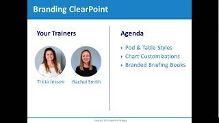
This is a YouTube video titled "Branding ClearPoint Summit Training" created on August 9, 2019. The content is a detailed training session led by Tricia Jesse and Rachel Smith, consultants at ClearPoint Strategy, demonstrating how to customize and brand ClearPoint software. The training covers topics such as editing landing pages, customizing pod styles, charts, table styles, status indicators, and creating branded briefing books to align with organizational branding. The session is instructional and aimed at helping users enhance their ClearPoint accounts with personalized branding elements.
My name is Tricia Jesse and I'm a consultant here at clearpoint Strategy.
And my name is Rachel Smith and I'm an associate consultant.
Thank you for joining us on our training session on branding clearpoint. Today we're going to walk through clearpoint together to go from a plain landing page that looks something like this to an awesome landing page that is branded for your specific organization, as well as create a really awesome branded briefing book. So back to the plain landing page, you'll see that we have some pods pulled out on the page, such as logo, mission values, a chart reference field, and a data grid field. You can always change the layout of a scorecard summary report by editing here and add additional custom fields from admin options. But for now, we're going to walk through just editing these fields that are already put out on the page. To start, we're going to add in our mission and values. I have the clearpoint mission and values saved over here, so I'm going to go ahead and just copy this first, double click on my mission field and paste in that text and do the same thing for values. But you can always just pull in your organization's mission and value for your branded page. So I've added in both the mission and values text and the next thing I'm going to do is double click in my logo field. I'm going to click on the image icon here and choose the clearpoint logo from this file. So I'm going to choose my horizontal logo here. And you can always just upload an image from your computer as well for your organization's logo. So I change the size by clicking on it and that blue box appears and I can drag and drop the corner as well as I can edit the image and choose to center it here. Now I'm going to go ahead and save and then once I have that completed, I'm going to go ahead and click on the green save check in the top right corner.
Great. So now that we have our logo, mission and vision in place, we can hide or customize the pods on this page to make it look super cool. So to add a new POD style, we'll go to System Settings, Admin Options, and we'll click into the Custom Styles menu option here. So you can see on this first General tab, you can customize the background, navigation bar and border colors of your entire account by inserting hex codes to match your organization's branding. But for the purposes of this training, we're going to click into the Pod Styles tab on the Left. And you'll see here that we have a list of all of the existing pod styles in the account, when we have quite a few. But if you'd like to add a new one, you can click on the green plus icon at the top right, and this will open a blank template here where you can fill in your own custom CSS styling. But we know that CSS can be a little bit intimidating, and especially if you're not familiar with it, you might not even know where to start. So as a shortcut, what you can do is you can actually duplicate an existing template in your account, and that will allow you to already have some of that CSS filled in. So most accounts start with at least two defaults, such as this navy box here. So if I click on the duplicate icon, you'll see that CSS is already filled in. And from here I can just adjust this to match my branding, So I could change the hex code for the background color, maybe adjust the font, the font weight, font color, and font size as well to make this match exactly what fits with my organization. And then once you're done, you can click save, of course, giving it a new name so that you know which pod style it is. And then that will be added to your list of pod styles. So quickly to show you what these would look like. Just so you can get an idea, if we go to the branded scorecard and take a look at our pod styles report, you can kind of get an idea of what some of these custom pod styles could look like. A lot of these have two colors for branding with a border at the bottom. If we scroll down here, you can see we have a fun dashed option, a borderline at the top, different font sizes and colors to really fit these different kind of branding options. So if there's any of these that speak to you, feel free to reach out to our support team and we can help you set these up in your own account. But in order to finish building out our landing page, we'll go back to the homepage that we started with Tricia. And in order to implement those pod styles, we can click on the green edit pencil at the top right, and then we can go to the page layout tab on the left. And you'll see here, like Tricia mentioned, these are the pods that we have brought out onto the landing page now, but you do have the option to bring any other field as well out onto this page. And then once we've determined what we'd like to have here, we can click on the Drop down arrow next to each field and this is where we can select which pod style to use under the custom Pod style option. So I'll click on this and you'll see all of those custom pod styles that we saw in admin options are now listed here. I'll go ahead and select clearpoint Branding to match with our landing page that we're working on. But this is where you could select the pod style that you've created to match your own branding. And I'll do the same thing for our values field. And then the last one I'll do is for our chart reference field. So once I have those selected for those three fields I can click save. And now you'll see that those awesome custom pods have really taken hold on our landing page.
Awesome. Another really great way we can brand our account is to customize a chart based on our organization's branding. So to do that I'm going to go into the measures drop down and click into the revenue measure. And here you can see on the left hand side we have our revenue chart. And if I double click to edit, I can see that there are a few different options we can customize here. On this first tab we can update the chart name as well as give it a title or change the chart type from one of our options here. Additionally, under the Chart Periods tab I could update the periods that are being displayed as well as on the Y axis format, the minimum and maximum. But we're really going to focus on this chart series tab here. So right now I can see that I have a green and red being pulled through and and I think it'd be better fit if we're using our clearpoint Navy and clearpoint Orange. So to do that I'm going to open up the actual drop down for this series. You can see there's a color wheel here, so I can always choose a color in the wheel. But for right now I actually have our hex code for clearpoint for our navy blue and our orange. So I'm going to use that and copy and paste this in place here for actual and then I'm going to do the same thing for my target. Grab that orange hex code from here and paste it for our target. So now when I click Refresh Preview, I'm going to see that chart is updated with the navy blue and the orange for our Clear Point strategy branding. And then one additional thing to note under this custom chart format, JSON. If I get the chart JSON here, I can actually add this as a Custom chart type. So what that means is if I was to add this as my clearpoint Branding chart type, it would be available for other users to set as the chart type for other measures going forward. So if I was to add this, that color scheme would be set. And when I now go back to the chart tab and open up the chart dropdown, I have this option now for clearpoint Branding as a chart type. So Rachel could log in tomorrow and set her measure within her scorecard to use a clearpoint branding, she wouldn't have to worry about setting up the hex codes. They would already be available. So I'm going to save the changes that we just made, see that again, the organizational branding pulling through, and then I'm going to jump back to our clearpoint training summary report and here I can see the chart reference field. So I'm going to double click on this chart reference field and actually choose that chart we just branded to be pulled out on this page. So I chose my scorecard and then the revenue chart under my revenue measure and, and as soon as I select the chart, I'll see the chart pull through so I can double check and make sure this is the correct one I want to show and then go ahead and click the save button. And what's really cool as well is as soon as I set the chart in this field, I can now it will automatically pull in the measure name. And when I click onto that as well, I can go directly to the Measure detail page.
Awesome. So the last field on our landing page is the Data Grid custom field. And this allows us to reference any summary report from our clearpoint account and then have it displayed on the page with our other pods. So I think it would be a good idea if we included our strategic Plan summary report, which is an objective summary report. So I can click into our Objectives top menu, drop down and select that strategic plan report. And you'll see here that we have this built out report with objectives, measures and initiatives. But the table style is this kind of a different navy blue color than our clearpoint branding and it'd be nice to include the orange as well. So I think that it would be best to create a custom table style for this report before we bring it onto our landing page. So in order to create a custom table style, just like we did for Pod styles, we'll go back into System settings, admin options, and we'll go back into our custom styles menu. But this time we'll click into the tables side panel here and you'll see Just like the pods, we have all of the existing table styles listed here in the account. But if I'd like to add a new one, I can click the green plus icon and insert my own CSS styling information here. But as a shortcut, what I like to do, just like we did for pod styles, is duplicate an existing one. So if I click the blue duplicate icon, then that styling will already be in here and I can adjust the font size, font weight, all of the that same styling information like we did for the pod style. And one important thing that I would like to point out here that's different for table styles is that there is the cell style option. And you can see here we have the font size set to 18 and this is going to determine the size of the information that fills into our summary report. So this is a great way to make those summary reports a little more accessible or easier to read when they're exported to PDF. So you can change the font size here as well. In the header style you can change the font size as well. So once you're done making your edits, you can click Save and it'll be added to these lists of table styles here. So I'm sure you're interested to know what some of those custom table styles look like. So we can jump into our table styles report here to look at these. And so again, if you you know any of these jump out at you as ones you'd like to use for your own branding, feel free to reach out to support team and we can help you get these set up. You can see here, for instance, this one has a cell style that has a light blue background. This was that thick red border, large font style we were looking at duplicating. So you can see that the font is much larger and we have a red border around the top of the table style. But for our landing page we'll go ahead and use the ClearPoint branding. So, so I'll go back to our training scorecard and then we'll actually go back to our summary report first as this is where we'll change the table style. And before we get started on implementing the table style, there was one other thing I wanted to point out that can be useful for branding and that's custom status indicators. So if I double click on this no information status indicator for office redesign and click on the drop down, you'll see that we've created a couple different custom statuses. So this under construction status here could maybe be used for strategic elements that you've added to your account. You're starting to build out, but maybe you're not ready to have any of your users report on it yet. So you'll put that under construction to let them know that they shouldn't be adding any information. And then the other is this complete status indicator. And this can be super helpful for initiatives, milestones and action items to really let your users know that this project is complete. And maybe that element is no longer in use after that. So we can click on the complete here to show that. But of course you're able to make any custom status indicators that fit your organization by just including an image for that. So super easy to do and can be helpful to really customize your account. So now we'll click this edit pencil for our summary report in order to implement the table style, and I'll quickly walk you through some other customization options for your summary report while we're here. So if we click into the Columns tab on the left, you'll see right now we're just including the objectives, measures and initiatives. It's that stage standard balanced scorecard layout. But since this is an objective summary report, I do have the ability to include any of our objective fields here, and those can just be dragged and dropped onto the report. Then if I click into the Objectives tab, this is where I can determine which objectives and from which scorecards should be included in my report. So right now we're just using all of the objectives in the clearpoint Training scorecard, but I can include our clearpoint branded scorecard objectives as well if I would like. Then in the Filter tab underneath that I can narrow down which objectives are included even further, maybe setting up criteria like only showing objectives that are below target so that I can get exactly the view that I want in my summary report. And then the last tab is Advanced Options and this is where we can set up our custom table style. So you'll see the third option down here is Table Style, and if I click on that drop down, we'll see a list of all of those table styles that were in admin options. And I'll go ahead and click clearpoint Branding here and then click Save and you'll see that our clearpoint branded table style has now taken hold on this summary report. So now the last step is to go back to our landing page and bring that summary report through on our Data Grid field. So to do this I can double click on the Data Grid field, select our clearpoint Training scorecard. For element type, I'll select Objectives since that's the type of summary report that my strategic plan report is. And then for report I'll select Strategic plan. Then I can click the green check mark here and our report will be brought onto the landing page. So this is looking really great, but I don't love that it still says Data grid field here and logo for this field. So there is a way to get rid of that in order to clean up the look of our landing page. So I can click back on our green edit pencil, then go back into page layout on the left. And just like when we were implementing the POD styles, I can click the drop down arrow for logo and this time I'll click the checkbox next to remove pod borders and header. And I'll do the same for the data grid field as well. And this will just remove those headings so that those aren't getting in the way of our landing page. When I'm done I'll click save and now you'll see that our landing page has a really great clean look and it's ready to go.
Awesome. So now we know how to make our scorecard summary report branded based on our organization. We can take it even a step farther by creating organizationally branded briefing books. So briefing book templates allow you to pull together multiple pages including both summary reports and detail pages across clearpoint into one PDF document. These reports are great for running meetings, so it is awesome to have these graded based on your organization as well. To create our own briefing book, we can jump into documents here on the left hand side and then click into briefing books. Then we'll just want to click the add icon in the top right corner and here we can call this our CPS monthly report. Now the first thing I wanted to point out is this PDF cover page option. You can choose a PDF on your computer and that will serve as the COVID page for your briefing book. So I'm going to grab this one. But there is one insider tip I wanted to fill you guys in about. You can actually upload a multi page PDF file that will be included at the front of a briefing book. So some things we see clients doing are including a really awesome briefing or really awesome cover page followed by an executive summary and some other helpful information like a glossary or table of contents. And as long as that is one PDF document, it can be added altogether as the COVID page for your briefing book. Additionally, we can change the zoom size. So I'm going to make this a little bit smaller to fit everything on the page. You can always make it bigger as well, to increase the font size, the reports that you're exporting, you can choose to include a table of contents export in portrait mode, etc. But right now I'm going to focus on this scorecards area. Here's where you can choose the scorecards you want to pull from in clearpoint. I'm going to stick with our clearpoint training scorecard and choose that really awesome branding clearpoint page that we created together, as well as my objective for we have the best team and my revenue measure that we worked on. Then I can jump into the header area and here's where I can add a logo as well as a horizontal line that will go across the header of each page of my briefing book. So to do this, I'm going to grab an image again from my clearpoint. So I'm going to grab that horizontal logo and open that up here as the header and I'll see it appear here. And I'm going to make it really small since this is going to just go across the top of the page for the header. And then I'm actually going to add in this HTML that pulls together.
The.
Colors for clearpoint with a horizontal rule. So I'm going to add this, paste it in so you can see what that looks like down here, maybe get rid of a couple spaces there. And then I'm also going to edit the logo to write a line because I think it's going to look really good with the logo across the bottom there. And then I'm going to add back a couple of spaces really quick here. And I know this HTML can look a little bit daunting, but this is always something that we can help you out with. So if you have questions around how to add in a horizontal line or drop in your logo, you can always ask us. And then the last step is just to add a few more pixels to the top margin here. So I'm going to put in 25 pixels and this just allows for there to be a little bit more room across the top of the header so that you can fit in the logo with this line as well. Additionally, you can do the same thing from the Footer tab, if you wanted to add in a logo to go across the footer of the page or horizontal line. Same steps can be followed there. But I'm going to go ahead and save this report and just click to generate it by clicking the generate icon next to the report. And while it's generating, I do want to point out this really cool report report that we have here. Cuyahoga county is a county located in Ohio which houses Cleveland. But what they have done is add a lot of really cool branding like we walked through today for each of the five areas of their Cuyahoga performance plan. So if I click on regional growth, this is going to open up their performance report. And here I can jump into regional growth and see that each of the pods is customized based on the colors of the regional growth area. If I jump into a measured, you can see that both the pods and the charts are customized based on this to show you what it looks like for another area. If I go into economic opportunity, you can see here again, it's now using an orange in here. And if I go into a detail page, again the chart is using that orange formatting. And then one other thing to point out, like Rachel showed during as you're working on the summary reports, but they also have custom status indicators. So you can see we have a legend here, but each one of these is added as a custom status indicator in clearpoint. So now that we've walked through that, I do want to show that report that we generated. So here I can click into that report and see the PDF cover page that I added here just sits on top of the briefing book. Additionally, I have the logo as well as the horizontal line that's been branded with that clearpoint orange, the landing page that we worked on together as well as an objective detail page. And what you can see here is I actually added an attachment to our objective detail page that is that image I just showed in the PDF. And so what you can do is actually create, you know, reports with other files and put it into your briefing book by adding in attachments. So attachments can be a Word, a Word document, a PDF, as well as an image. And you can add that from a detail page and choose to include it in your briefing books. Then it's going to just go right after the detail page that you've included it in. So if you are exporting briefing books from clearpoint and then merging them with other files to include documents that are outside of clearpoint, this could be something that could save you some time because you could just add the file as an attachment and have it included in the briefing book here. So that walks us through adding a customized briefing book based on our organizational branding and finishing up that branded clearpoint Scorecard summary report as well.
Awesome. Well, thank you so much for taking the time to go through this training with us. And of course, if any questions came up while you were watching, feel free to reach out to our support team@supportlearpointstrategy.com and we're happy to answer any of your questions. Happy reporting.
More from Ted




AI in Local Government: How the City of Durham Analyzes Strategy, Risk & Performance

How Coral Springs Won the Baldrige Award — Blueprint for City Excellence | ClearPoint Strategy


AI, Data, & the End of Gut-Feel Strategy: Why Strategy is Becoming More Data Driven
Strategy Needs Accountability: How to Drive Project Follow-Through and Execution