ClearPoint Cool 2.0 (Webinar 39)
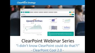
Kathryn and Abby walk through ClearPoint's advanced features: building citizen satisfaction dashboards, visualizing survey data, and creating executive summary reports with HTML and data tokens. Learn how to standardize and enhance your reporting and dashboards.
Hello everyone and welcome to the I Didn't Know clearpoint Could do that webinar series. Today we're discussing even more ways to be clearpoint Cool before we get started, here are your smiling hosts. I'm Kathryn.
And I'm Abby and as a few.
Housekeeping announcements, we will be recording this session and we'll make it available within a week. The webinar will last about 25 minutes with time for questions at the end, so submit your questions to supportlearpointstrategy.com any that we don't get to we'll follow up with over email. Now on our last installment, we introduced our first set of clearpoint Pool reports, a gauge dashboard for organization wide comparisons and a sleek layout for tracking business plan information. I highly recommend checking out that recording for more tips and tricks. You can find it on our blog, support center and Vimeo channel. Just search Webinar now Today we are getting clearpoint cooler than ever. While this is a follow up to our first clearpoint Cool webinar a few weeks ago, it's not like those movie sequels where the second one is never as good. We've got a lot of fresh new information coming at you today. So first we'll talk through standardized ways to display information from a satisfaction survey complete with custom charts. And second, we'll walk through a customized executive summary dashboard built using HTML with data fields.
So again, send any questions to supportlearpointstrategy.com and bonus points if you can. Also send us your favorite movie series, especially one where a sequel was as good or better than the first one. There's some heavy rain coming towards the Mid Atlantic this week, and what better way to spend some quality time in the Great Indoors than with a few movies?
Indeed. So let's dive in. We are strolling the friendly streets of Metropolis today.
The first thing we want to set up is our Citizen Satisfaction Dashboard. Let me show you a quick preview of what that's going to look like so you'll have it in mind as we go through each step. This is Metropolis Citizen Satisfaction Survey Dashboard where the city tracks all its metrics related to citizen satisfaction. Whether your organization is a government organization or not, chances are you collect some feedback at some point during the month, quarter or year, and that many of the questions you may ask have similar formats. So we can see here that the same three different charts have been standardized across each of our satisfaction metrics. So now let's look at a metric near and dear to my own heart. Overall satisfaction with the quality and Quantity of books in the library collection. If we look at this first chart here, we can see that it represents overall satisfaction as a percentage over time. And in order to find our actual value, we've combined the percentages of responses that were satisfied or very satisfied.
Okay, so it sounds like these questions were constructed on something like a five point score. But what if you want to show the responses you received all the way from very satisfied to very dissatisfied?
Great question. We can see a representation of how those typical survey responses might be charted across time. In the second chart, it shows the percentages of respondents that choose each answer as stacked bars. This way, we can make sure that we keep the very dissatisfieds to a minimum too. Then the third chart here lets us compare how many of each type of response we received in this year's survey versus last year's. We can see that the narrower bars in front represent the percentage value for this year, while the wider columns in the back represent the percentage for the same response in the previous year. In combination, these three charts show how satisfied citizens feel with the books the library offers. So how might we build these same chart types ourselves? Well, let's click into a measure that doesn't have any charts set up yet. Overall satisfaction. With the quality of the city's website, we can see we've already got our series added here. Our 5 Responses for the current year and then calculated series where we record the previous year's percentages side by side with the current year.
But we still need to set up.
A couple of series calculations. First, we'll set up the calculation for actual. So as we mentioned, the actual satisfaction rate will be the sum of the percentage of people who are satisfied and those who are very satisfied.
So to set that up, we'll double.
Click to edit the series and then click into the calculation tab.
We'll first add the value for the.
Very satisfied series for the current period to the value for the satisfied series for the current period. Now that we've got that calculation set up, we'll also set up an evaluation for actual. We want the measure to evaluate to on target when actual is greater than equal to target. Caution when actual is greater than equal to 80% of target and below plan otherwise. And when there's no data available, it should default to no information. So let's go ahead and save that. So we can now see those numbers showing up in the data table. And to see the terms of the evaluation reflected here, we need to go to the Edit Measure window, click into the series tab, then select the actual Evaluation for the measure overall under evaluation option. Now, next, we want to show how to set up the calculation for the previous year VS series. We've already set up the calculations for the other previous year series to save time.
Abby, remind me why we need to set up these previous year series again? I mean, in our data table, we had data back to 2016.
Good point. But in order to chart the current year and previous year on the same period in our charts, we're going to want to have the two values side by side.
Okay, so those values are going to appear in the same period. That makes sense. Yep.
So we'll go ahead and click here to edit this series and set that calculation up. So to recreate this calculation, we'll simply select VS as the series in our calculation wizard and set the aggregation to previous year and insert that calculation here. So if we go ahead and save.
That.
We can see that the previous year VS values are automatically being calculated and also that our evaluation is running. It looks like we're in the caution status this period. So now let's get those three charts set up. Let's start with a line area chart.
So you can see here that I.
Clicked again to edit the measure. And then I'm going to click into the charts tab to add that first chart, which I'll call the Overall Satisfaction chart. And this chart type is going to be the number two bar with target line. Now I'm going to click into chart series to set the actual series shape to area rather than bar. So I'll change the shape here to area and set the marker to none. And then I'm going to go ahead and grab the hex code for that light sea blue color we saw earlier in the chart. So now if I refresh preview here, the chart option in the chart type drop down. Now, since we've already got a few more of these measures set up, let's create a Dashboard summary report.
To do that, we can click into.
Measures Manage Measure Reports and click the plus sign to add a new report. We'll call this the Citizen Satisfaction Dashboard and set the report type to Large dashboard. And if we click to view that report and then click into the third page, we can see the charts we just added.
Looking good.
We can also set this report as our scorecard homepage by clicking into Scorecards, Manage Scorecard Reports and clicking the plus sign to add a new scorecard report. We'll call this report Citizen Survey Satisfaction Dashboard. And then we'll set the layout reference to pull in the dashboard that we just created. So if we sort these scorecard reports and pull the one we just created.
To the top of the list, this.
Will now be the homepage for the scorecard.
Awesome. So this is a really nice concise view of all of your citizen survey metrics. And it's a great way to standardize the data, which you can also leverage for other surveys or data sets where the metrics are all structured similarly. This is a really cool dashboard to have. Now let's switch gears and talk about another scenario in which you might be looking to compile different types of information. And that is for an executive summary view. So no matter what stage you're at with performance management or how well you've defined your process, chances are you're going to meet with your leadership to give them updates and make sure that you're headed in the right direction. But of course, they're busy and their time is being pulled in lots of different directions. So the best kind of report to use there will both pull together your most important data and make it easy to elaborate on successes and pain points when necessary. So let's go into our Metropolis City scorecard and I'll show you a quick sneak preview of what we're going to set up today. So we've done a bit of customization so that we can stay on brand with our city logo. And then we've separated our information here out by objective, where underneath the objective name and status, you can see measures with data and status indicators. And then underneath that we have our analysis and action plan for our objective going forward. And there's two perks to this report that you might not unrespond in. But really we just want to focus on the people that did respond for these charts.
We want to have the previous year series dragged up just below each series for the current year so that the charts will appear as we saw before. So now we have part of the chart set up here, but we need to add the JSON in order to to see the chart like we saw it before. So I'm going to go ahead and grab that JSON here and paste it into the chart JSON. So now if we take a look at this JSON that I've added, we can see two formatting options that control how the chart will appear. So if we scroll down to the series part of the code here, we can see a property called point padding. This is the property that determines the width of the current year versus previous year series. We also have this property called point placement which separates the groupings at equal widths on the chart. So now that we've refreshed the preview again, we can see that point placement and point padding space spacing at work. Right?
So this is pretty awesome. And again, we're going to make this custom JSON available as a text file with the webinar recording so that you can take a closer look at the formatting and learn more or just use it for yourself.
And you can also take that custom JSON that we'll send over and add it as a preset by clicking Add Custom Chart type here. And we'll leave the name as it.
Of customization so that we can stay on brand with our city logo. And then we've separated our information here out by objective, where underneath the objective name and status you can see measures with data and status indicators. And then underneath that we have our analysis and action plan for our objective going forward. And there's two perks to this report that you might not notice right off the bat. So double clicking into our data, this is all set up in one custom field where we can see that there's several tokens and these tokens are all being referenced from elsewhere in clearpoint. That's right, so there's no double data entry here. To complete this report, the tokens are all we need to gather the information that other users have already entered elsewhere. Then, looking at our saved format, any of these items in blue are actually clickable links that allow us to drill down into the detail page and find out a bit more information about why our status is the way that it is. So now that you've caught a glimpse of this end result, let's get to building this page. And all of this content actually falls into an HTML with data field, so we'll want to just add that custom field in System Settings Admin options. So I'll click into custom fields from our standard features. And since this is a high level report, we're going to add it for our scorecard report by clicking the plus icon. Now we'll call this our executive summary. And as I mentioned, our field type is going to be HTML with data so that we can reference information from elsewhere and clearpoint. Once we've got that, let's click Save and we're going to need a report where we can display this field. So I'll click into the scorecards drop down and into Manage Scorecard Reports or I can click to add a report using the plus icon. Our layout name here is going to be Metropolis City Scorecard Executive Summary and On our Page Layout tab, I'm going to click the plus icon to add our new executive Summary field. Then let's save. Now clicking on our report, we've got a blank canvas. Do you smell that? It's the smell of possibilities. So we're going to double click into the field to get started with our changes. And we'll use both this HTML formatting editor here at the top and our Insert data HTML token menu at the bottom. But first, let's get a little bit of our introductory information organized at the top of our field. So as I mentioned, we want to pull in some organizational branding. And I can click the image icon to upload the Metropolis City logo to the top of our report. And then once I've got that edited, I can click and drag to resize. Now, below that, maybe we want to have some header text. So I'm first going to alert everyone that this is our citywide scorecard, just in case we wanted to have other department reports with the same format. And then on a new line, I'm going to let everyone know that this report focuses on the strategic perspective from our scorecard that's focused just on citizens. So depending on how much information you have, you could segment it like this, or you could use the tokens to pull in as much of your scorecard as you wanted. Next, we want to alert everyone that this is our performance Data as of February 2018. So of course we'll want to update this text as we go, but this will give a sense of how recent everything is. And lastly, we've got an introduction all written out, that just explains when we're going to use this report and what it displays just to give a bit of extra context. So now let's go ahead and do a little bit of formatting. Going to make everything bold here, size up that text, and then maybe make our citywide scorecard header even a little bit bigger and use those predefined colors to match our Metropolis logo. Nice. So below our intro is where we will want to start adding our objectives and measures. And we'll just set up one of those blocks to make sure we have a kind of template in place. And then we can copy and paste that formatting to replicate it for as many objectives and measures as we need. So since we are using tokens, I do want to just get some placeholders entered first, which we can then replace with those tokens. So we'll have our objective name, status and link here at the top. And then on the next line, our measures are actually going to be laid out in an HTML table, which we can insert again right from our editor bar. So I've clicked the table icon and I'm going to click to insert table. When we click insert, we can see we've got three columns and two rows here, but we know that we want to have our measures on the left and those three rows for our data, excuse me, columns for our data. So we can add an extra column by clicking back into table here and clicking Insert column left. So as long as my cursor is in that table, I can add a column to the left of wherever I've placed it. Now, we're just going to add one measure to this table as an example, but we could always use that table icon also to insert a row above or below wherever we've placed our cursor. So in these rows let's go ahead and put some placeholders.
Leave some room.
For our indicators, then our target value, previous period data, and current period data. So instead of previous period, of course you could have a year to date value or anything else you wanted to compare. And then in each row, the first column is going to contain the measure link and name. We're going to want to display a series value for our target. And then for our previous and current period, we're going to have the series value and series status indicator for the automatic evaluations that we've set up in these series. Now one more thing to complete this data set, we're also want to leave room for our objective analysis and our action plan, which is going to draw from our recommendation field. And so now that we've got this in place, I do want to just briefly show you a couple of common ways that you can edit these HTML tables. So to do that, I'm going to use the bracket icon in our editor to pop over to the HTML side. So what I can do here, just to make this a little easier to look at, is use control S to find certain text in my browser and just add some line breaks here to separate out our table from the rest of that content. So every time we see table, that's the beginning and end of our table here. TR represents a row of that table, and then TD stands for table data, which represents each of the cells in our row. Great. So for our table, we can see that we've got a border of one. And if we didn't want to have that border, all we needed is to take border equals one out of our table tag. We can also see that we've got a width of 100%. So that's going to resize no matter what type of screen we're looking at. And we can use this same logic to add a width to each of the table cells in the first row here, which is going to copy down throughout the columns in our table. So in our first TD tag, I'm going to put width equals 70%, and then I'll copy that to subsequent table cells, where we're going to swap this out for 10% so that we've got a nice little data table in the remaining 30% of our row. Now, toggling back over to the front here, we can already see that difference. We can see our data table has been cleaned up and standardized, and we've removed the border. Now, to save some time, I've put a little bit of additional styling for this particular report into a text file, which will also be available to download with the webinar recording. So I'm just going to go into our text files, copy that formatting, and paste it back into our HTML. So we'll paste that in here. And when we go back to the front end, we can see we've got a nice strong divider line between our objectives and a gray border and header around our data table. All right, so this is coming along nicely. We've got everything cleaned up, but we still need to add our token, that is reference the information we need so our executive team isn't looking. So there's no double data entry here to complete this report. The tokens are all we need to gather the information that other users have already entered elsewhere. Then, looking at our saved format, any of these items in blue are actually clickable links that allow us to drill down into the detail page and find out a bit more information about why our status is the way that it is. So now that you've caught a glimpse of me in all these placeholders, and to do that, this is where our insert data HTML token menu is going to come in handy. So in our first drop down here, we can see that we'll be referencing information from the Metropolis City scorecard, but really it can come from anywhere in your account that you need. And under token type, I'm going to start with my objective. So the first objective that falls under our citizen perspective is a safe and prepared community. And in our field drop down, we can see that we could reference really any field that's available for this objective. But the token I'm looking for is called status. And this powerful token is actually going to combine the name, the status indicator and a link to the detail page into one. And I promise this will read in plain English when we save. But right now we can see an O for objective, an ID that clearpoint's going to use to determine what element to reference and the type of token that we've used. Now let's move down to our indicators. I'll switch out my token type here. For Measure, choose the first measure of crimes per 1,000 citizens that falls under the Safe and Prepared Community metric objective. And then under field we're going to use the link field. So this is going to show the measure name and a link to its detail page. And again we want to highlight the area where we want to put that token to replace our placeholder. So before we save here, let's fill out our data table as well. Our token type is going to be measureseries and then we can choose from each series underneath each of our measures. So I'll start with our target for our crimes metric. And for fields we can choose between our current series value and our current series current period status. So I'll highlight our target value and click insert. We'll do the same for our previous period series and our current period or actual series.
Great.
Now you can see in the remaining two columns we also want to put the status for our automatically evaluated series. So we'll just insert those last two tokens. So then let's not forget about our analysis and action plan one last time. We're going to switch the token type to objective. So I'll click into custom fields from our standard features. And since this is a high level reference, that safe and prepared community objective again report, we're going to add it for our scorecard report by clicking the plus icon. Now we'll call this our executive summary and we can filter for our analysis field and our recommendation field. And as I mentioned, our field type is going to be. Once we've got that in place, let's click save. Awesome. So things are looking pretty good. We can see our values pulling in here. And were I to go to the Crimes per thousand citizens measure and make an adjustment to any of that data. For example, taking our target from 35 to 30 since things are going well, I can see that I've made that update here on this report without having to do any double entry at all. So the last thing we'll change HTML was data so that we can reference information from elsewhere in clearpoint. Once we've got that, let's click save and we're going to need a report just to clean it up a little bit more is to remove the pod border and header. So in our Edit Layout window on the Page Layout tab where we can display this field. So I'll click into the scorecards drop down and into Manage Scorecard Reports where I can click to add a report using the plus icon, our layout I can click into our Executive Summary pod, remove that border and header, and when I save I've got a nice clean report that's ready for use. Awesome. So we are reaching the end of our time here today and we want to make sure to leave time for your questions too. So here's one that's come in. What if I want to export my Executive Summary report? Now this report can be exported like any other by clicking in next to the Edit icon and clicking Export to PDF. So maybe we want to export this in portrait mode. Name here is going to be Metropolis City Scorecard Executive Summary and we've got our page size options there as well. If you are concerned about page breaks, especially when these reports get longer. If I jump back to our example and on our Page Layout tab, I'm going to click the plus icon to add our new Executive Summary field. Then let's see. Here we can see. This might not all fit on one page. You can always use more than one. Now clicking fields to break down your report. So if I take a look on page layout, not only do I have this page set up here available, but I also have the option to add page. So were I to add additional information to the bottom, this would show up streamlined in clearpoint. But when you export, you'd have a nice page break there. So you control what information falls where. And in the meantime, if we take a look at our report, on our report we've got a blank canvas. Do you smell that? It's the smell of possibilities. We can see all the formatting we've set up from our table header to our Metropolis City logo. So we're going to double click into the field to get started with our changes. All right, so that is all we have time for today. Thank you so much for joining us on the ida. And we'll use both this HTML formatting editor here at the top and our Insert Data HTML token menu at the bottom. Clearpoint could do that Webinar series. We hope to see you next time. And happy reporting.
More from Ted




AI in Local Government: How the City of Durham Analyzes Strategy, Risk & Performance

How Coral Springs Won the Baldrige Award — Blueprint for City Excellence | ClearPoint Strategy


AI, Data, & the End of Gut-Feel Strategy: Why Strategy is Becoming More Data Driven

Strategy Needs Accountability: How to Drive Project Follow-Through and Execution