ClearPoint Strategy: Exploring the New UI
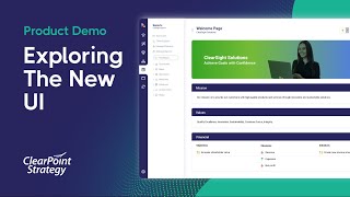
Henry and RJ from ClearPoint Customer Success walk through the new UI, showing pod sizes, quick charts, mind maps, and other features. They answer live questions about how to navigate and use the updated interface.
Hey everyone. Welcome to the I Didn't Know clearpoint Can do that Webinar series. Today we're going to be walking through in more detail all the changes coming with the new user interface, which we're going to refer to as the new ui. Just as a shorthand, we're excited to talk through some of the basics of how this will change and enhance your clearpoint experience, both for you and your end users with navigating and understanding the tool. Before we get started though, let's introduce ourselves.
I'm Henry and I'm rj. We're both members on the Customer Success team here at clearpoint. It's great to see all of you on here that we have worked with before and introduce ourselves to those we have not met.
As a few housekeeping announcements, we'll be recording this session and we'll make it available within a week. If you registered for this webinar, you'll receive an email of the recording and it'll also be posted to our website. The webinar lasts about 25 minutes with some time for questions at the end, so please be sure to submit your questions to the Q and A chat box. This is located in the toolbar at the bottom of the Zoom window. As always, any questions that we don't have time to get to at the end, we'll follow up with over email. Finally, the chat box is meant for you to add any additional insights or thoughts you may have as we go through the webinar, so be sure to add in some comments there Now. In our last installment, we hosted a webinar on automating status evaluations in clearpoint. If you're interested in learning how you can save time and avoid the subjectivity of manual status evaluations, be sure to check that webinar out. Now that we have the housekeeping items out of the way, let's get started.
First, let's talk through an agenda of topics for today. We've already gone through intros and are going through the agenda now. We will then dive into clearpoint and talk through some of the basics of the new look that you can see right off the bat without doing much navigating. Next, we will explain how navigation works through the left hand control panel and ensure you know how to get to all of the same places as before in the old ui. Once we go through navigation, we will then touch on a few new features coming with the new ui, including expanded capabilities for pod sizes and detailed page layouts, quick charts and mind maps. Finally, we will go over any questions at the end, so be sure to put any questions you have in the Q and A chat box.
Thanks rj. Let's dive into Clearpoint now and get started. So one of the first things that I wanted to mention was that if you're interested in enabling the beta version of the new UI you see here, please talk with your Customer Success Manager so that they can help you enable it for your account. As we roll out the new UI over the next several months, you'll have the ability to toggle between this new UI and the old UI as needed. So please don't worry if you feel like now is not a great time for you and your team to have to tackle learning a new ui. You'll have a multi month time horizon to adopt the new UI before the old UI is fully deprecated and retired.
Awesome. Now that the UI is set for the account, let's take a look at some of the changes that are in place here. While we'll be going over these changes in more detail, there are a few notes to make about the new UI before we really jump in. To start, you'll see that the top panel navigation that used to contain different element dropdowns is no longer there, so all the navigation can be done using the left hand panel instead. In the top we can see a few different things. First, there is the Hamburger icon which will hide the left panel navigation and give us more real estate on the page. I will leave this open for now as it's going to be very useful for navigating around the account. Next there is a home icon just like before. Clicking this icon will pull me directly to the home page that is set for my account. We can also see a search bar that will allow us to easily look up any page in the system regardless of where we are located in the account. For instance, if I type in revenue we're going to see options that match my query. Finally, in the top right we can see our Period selector which will allow us to navigate to any historic periods in the account. And to the right of that we can see our alerts inbox as well as our profile icon.
Great rj, but I did also notice that as I've navigated around I can see the pages that I visit popping up on the top of my screen.
Yep, this is a new and improved version of Page Visit History in the system. With this we can see our recently viewed pages and easily click back into any of them. Something that is really cool is that we now have the option to pin pages to our view. So if there are a few elements or reports you find yourself navigating to more frequently, you can use the pin icon to the right hand side and pin it to your view. Then when you're in your account, it's always going to display as an option to easily click into within the top Navigation as you can see here.
Great. I'm loving everything you're showing so far. Now that you've shown some of the basics of the new look, why don't I walk you through how to navigate through this left hand control panel?
That sounds great. I've already seen that a lot of these tabs are things I recognize from the old ui, so I'm glad that it won't be too hard to learn. Let's walk through it.
One of the first things you'll notice that's different on this left hand control panel is that it's a bit smaller and that they're just icons with no words. If you hover over any of these icons, you'll see text appear that tells you exactly what each of these tabs are for. As you mentioned, all these tabs are using the same nomenclature as the old ui, so you'll easily know what each tab is. Starting from the top you can see the first tab is the My clearpoint section. The top of this section should look familiar with the same four options that you've seen before. In addition to those four options, we have also now added in an Alerts inbox where you can easily see your most recent alerts. You can also click on the Alerts Inbox header to see all of the alerts for your profile. Under the alerts you can see your most recent page exports. So if you generate an export and want to come back later to download it, you could come to my clearpoint and then this page Export section to download it again. You could also click on the Page Exports header to see all the exports you have generated, rather than just the most recent. Finally, you'll notice you can access your revision history and Recycle Bin from this section. You'll also be able to access them from System Settings just like before, but here's an additional place where you could access those features.
I'm liking all the expanded features within My clearpoint. Now that we've covered that tab, let's dive into navigating between Scorecards elements and reports. The next tab down from myclearpoint is the Scorecards tab. If we click this tab, we will be able to see our Scorecard tree here in the same way that we could view it in the old ui, we can expand and contract the tree as needed, and we have the ability to easily click into any of the scorecards from here. Additionally, we also have the ability to filter for scorecards in the Scorecard tree. Or we can use this dropdown menu at the top to select the scorecard we would like to navigate to and then click Scorecard Home. The Scorecard Tree option shows us a mind map of the scorecard. We're going to spend more time later in this webinar talking through how this works and why it's useful. Lastly, as an admin user, we can access Manage Scorecards from this section as well.
That all seems pretty clear as far as how to navigate between different scorecards, but I was wondering about the top navigation. Without the top navigation, how we can navigate to different elements and reports within a scorecard?
That's a great question. The next icon under Scorecards here is the Elements tab and the icon after Elements is Reports. As you remember in the old ui, elements and reports were in the same drop down with Reports showing in bolded font and Elements in regular font.
I do remember that, but I like this way of segmenting elements and reports better because it's much clearer to me what is an element versus Report? Can you walk me through navigating both of these tabs?
Definitely. Starting with the Elements tab, you can see from the Scorecard dropdown at the top that we are looking at elements of Upward Airline Scorecard. We could switch what elements we wanted to look at simply by clicking the dropdown and choosing a different scorecard. Once we have chosen a scorecard whose elements we want to see, we can then click the dropdown arrow on whatever element type we want to view to see those particular elements. You can see the statuses of each of these elements and you can even click their names if you want to pull up that element's specific detail page.
That seems clear and makes sense. What about the Manage Elements option?
This Manage Elements option will open the Manage Elements page and while it is similar to how it was in the old ui, there are some differences and improvements that we want to walk through. First, you will see that near the top of this page there is now an option to really easily toggle between managing this scorecard's objectives and measures and initiatives, which we could not do as easily in the old ui. Further, more information is shown along with the element names. For instance, if we click into Initiatives, we can see the statuses as well as a percent complete and to the right hand side of the element we can see the Initiative owner. Clicking the pencil icon to the right of this element will allow you to edit the element, and if you click the ellipsis icon that's further to the right of the Edit icon, it's going to pull up a few options where you can either edit favorite duplicate or delete the element. Finally, sorting elements on this page is far easier than before. In the new ui, you simply need to click the six dots to the left of the element name and then drag and drop the elements in the order that you would like.
This all seems pretty intuitive. Does the Reports tab operate similarly to the Elements tab?
Yep, it operates almost exactly the same. If we click into the Reports tab, you can also select the scorecard whose reports you want to view using that dropdown at the top. Once you are in the scorecard you want to you can click the dropdown arrow next to the element report type you would like to see to view those reports. Once again. The Manage Reports page will take you to a page where you can easily toggle between managing your different report types.
Thanks for walking through that. Now that you've shown how to navigate through different scorecards, elements and reports, I can show the last few tabs we have here after Reports. This next tab is the Documents tab. In the new ui, Documents is broken into three sections. The first section, Templates, is where you go when you want to create or generate a briefing book or HTML export. This next Document section is where you go to access previously generated briefing books, HTML exports, and also individual detail or summary report page exports. Lastly, the File section is where you go to find attachments or images you have uploaded into your account.
So to be clear, the biggest difference between the old UI and the new UI here is that templates and downloadable exports are in two different sections. That seems straightforward to me. What about the Automation tab?
The Automation tab is almost exactly the same as before. You'll notice two additional options on here. One is that you can directly access the Schedule Calendar from this Automation tab, rather than first having to click into schedules. Two is that you can access the Measure library from this tab. If you're a local government participating in.
The Measure Library, that's great. That isn't much different than before, so it all looks clear to me. It looks like the last tab is the Gear tab at the bottom. This must be System Settings.
Exactly. There are a few things to note for the System Settings tab. The top section is where you can access the Manage Users option to add, Edit or Remove Users. And if you're utilizing user groups, you can access those from the Manage Groups option. For the Reporting Period section, we can access the reporting periods for the account in this Reporting Periods option. We can access our reporting frequencies from the Manage Reporting Frequencies option. If you utilize Fiscal year calculations in your account, you can configure your fiscal years in the Fiscal Years option. Finally, if you're a local government utilizing the Measure library for benchmarking, you can set your master periods in the Master Periods option here under the System Configuration section. The System Setup option is the same exact thing as Admin options in the old ui. We updated the language here to more clearly indicate what this option is meant for. Lastly, the Utility section has the Revision History and Recycle Bin options as we noted before.
This is amazing. I can't believe how great all these changes look. Back in the beginning, we talked in the Agenda about new pod sizes and ways to lay out a detail page. Can you talk more about what those changes look like and how we can make those changes?
Definitely. Let's tackle this one with an example. Let's look in the Upward Airlines scorecard at our Revenue measure. Once we navigate to the Revenue Detail page, we can click on the arrow in the top right to the right of the pencil icon in the top right and select Edit Layout. Here you can see all the pods for this measure. Now let's click on the Edit pencil icon with any of the pods. How about we choose Description? As you can see, in addition to the pod customization options that you've always had, there's now a pod width dropdown. Click on that dropdown and you can see now that you can switch each pod's width to a variety of options. Each option corresponds to how much real estate the pod will take on each section of the page. For example, if I mark the description as 1/4 width and save and I'm keeping that Description pod on page one top, that will take up 1/4 of the space on page one top. On the other hand, if I looked at this owner field in the left column and I also marked it as 1/4 and save, that's going to take up 1/4 of that column on page one left. So you can imagine that will be 1.8 of the whole total page size. So if we save here, we can see what this will look like.
Wow, the widths of those pods are totally different. That's remarkable. I can see how this would be helpful if you really wanted to customize these page layouts even more. You could line pods up on the layout so that Those that are 1/4 for example, could line up with those that are 3/4.
Absolutely. I'm excited for this page layouts feature to be rolled out soon. I know we had also talked about a new Quick Charts feature. Can you explain what are Quick Charts and how do I go about adding them in the new ui?
Quick Charts is a new feature that allows you to easily create charts on the fly from any Detail page in clearpoint. You can pull data across any measure in your account to create easy to visualize charts that fit on a Detail page. Quick Charts can also be added to any element type in the account.
This all sounds great. Can you give me a visual for how this works?
Absolutely. Let's use an example in our Upward Airlines scorecard. If I click into Elements and then click Upward Airlines, I can see the elements from that scorecard. Let's take a look at the Increase Revenue objective From here. I'm going to use the dropdown next to the Edit pencil in the top right hand corner and select Edit Layout just as we had done before. With this page open, we will now be able to see and click the new option of Place Chart. From here we can choose our chart type. If we select the Measure Chart option, we can pull a pre existing Measure chart onto the Detail page. However, the rest of these KPI options allow us to create one of these new Quick charts. Let's create a KPI Bar chart as an example. Once I select KPI Bar chart, I will then need to select the scorecard element type and specific element that I want to pull data from into this chart. For example, I will keep this as upwards Airlines Measures and Revenue as the element we want to pull data from. I will then select the series that I want to chart. Here I'm going to select Actual. For this example we can give the chart a title which for this one I will call Revenue. Finally, we do have the option to customize the color of the chart. I'm going to leave this color as the default for now. Now let's click Save and then save again and we can see how this chart look.
This is such a cool update and it was so easy to create that chart.
Definitely. Quick Charts allow us to create a basic chart where we can really easily visualize trends over time. If we hover over the chart, we can also get more information including the specific numbers and associated period of time that this was reported on.
That's awesome. I can see how this would be useful if we wanted to add in visualizations to other elements besides measures. Where it might make sense to see that data exactly.
One final change to cover before we run out of time Here is the new mind mapping capability that will allow us to visualize everything that's going on within a certain scorecard Here, if we click into Elements and then click Element Tree, we can see all of our different element types. To get more information on any of these, such as information on measures, we can click the Caret icon underneath Measures. With this open, we would very easily be able to edit any of these measures by either clicking the Edit Pencil icon or we could view the page by clicking the View Page icon. And if you do want to see what this may be linked to, you can edit any of these measures such as Revenue here and then click into the link map. This will show you more information on which specific elements this measure is aligned with in the account.
That's great. That was a lot of changes though, but I think this new UI looks a lot better and will make it easier to navigate in the long run. Let's wrap up with a few final items.
So we did want to mention a few things around the UI just so everyone is aware. First, if you are interested in testing out this beta version of the new ui, please reach out to your account manager and they're happy to help you turning it on. It's also very important to note that if you do turn this on, any changes you make within the new UI will also reflect in your live account as they are running on the same platform.
Second, while we're introducing this beta version of the new UI to you all today, the old UI is still going to continue to be supported for a long time. Again, there will eventually come a time when the old UI is deprecated and retired, but we'll be very deliberate around giving plenty of notice and support before this time comes to make sure everyone is ready.
Finally, there will be additional functionality coming in the future with the new ui, such as a clearpoint and Microsoft Teams integration, as well as a discussion feature which you may have heard about in the past. We will also be providing updates as these larger items become available for use in the system.
Awesome. So I can see a few few comments in the chat box and a few questions in the Q and A box. So I'm going to just take a quick look at those and see what you guys had to say. So I'm going to look first at this comments box here. Loving everybody that said hello when they're first coming in. I see a question from Laura for the attachments images is That a library that anyone can access. And are those attachments specific to the user who uploaded them? So anyone can access that. My clearpoint section here. And any user would be able to see those, excuse me, under the Documents tab here, anyone will be able to see those attachments or images that were uploaded into your account. So for example, if you just uploaded an image of or attachment of some Word document, etc. That was on someone's detail page that they're an owner of, they would be able to see that attachment here. Mark asked a question. If I switch my account to the new ui, since I'm an admin, will that change the UI for my users as well? This is something you can tackle with your account manager, but essentially there'll be two options. There's going to be one option where you can just turn on the new UI for your own specific user and nobody else. And then there'll be also an option as an admin in that system setup Admin Options section to enable the new UI for all of your users. So that's something that you should just talk to your account manager about about what's the best option for you, but you'll have both of those options.
Garrett, that's a. That's a good question. Is this being pushed at some date and everything will move over automatically or do we opt into it? So, like we kind of mentioned, this is. This is in beta right now, and you do have the option to kind of go in there once again, speak to your account manager and they'll help you get everything set up. But they do give you the option to basically go in and play around with it, just to kind of familiarize yourself with it at some point down the line. Like this will move over, but once again, that's not going to be for some time and we will be very, very deliberate about giving plenty of support for those folks who are staying in the old UI a little bit longer. So no worries there. But like eventually, way down the line, this will move over automatically.
I could see Peggy asks, is there a fee for the ui? No, this is just something an updated UI that we'll be adding in that, you know, if you already have a clearpoint account, you can switch over when you would like to. So no, no additional fee there. So that was in the comments box. I'm gonna move over to that Q and A chat box. As you can see, for some of these that we kind of have answered that were in the comments box. I could see a question. The custom pod sizes, are they Only available in the new ui. That is correct. They're only available in the new ui. So you wouldn't be able to change those pod widths if you were still.
In that bold ui.
I believe we kind of answered this, but someone asked if we have 25 users, can some use the new UI and can some use the old? Yes, we can do this by user or we can just across all users enable it for all of the the same time. So that's something that you can customize.
All right, it looks like that is everything for the moment here. If any sort of chats come in later, we will get back to you over email. But just want to thank everyone for joining today. I hope you're all stoked for the new UI like we are and definitely reach out to your account manager if you're interested in setting that up.
Yeah, and I see one more question. Will you have a guide to try this new ui? Yes, we'll have an updated support center that will have support articles as well as images and videos as you see in our support center that shows things for the old ui. We'll have one come out for the new UI as well with all the same help articles as before. So everyone will have access for that. And then obviously this webinar will be, will be posted to our website. And since you all registered for the webinar, you'll receive a recording within a week. I see. What are the options for clearing the top history bar? So for this you can just click this X. If you wanted to delete out a tab and you wanted to clear this up, you can do that as you navigate to new tabs. It's going to populate up here. But you know, as you can see, I had pinned a couple of these up here, so those pages are sort of always loaded and I can, I can click into them as needed there I can see a question about. Someone was asking about. They could see this app at the bottom of the screen. This is actually not what I'm running clearpoint on. I'm running it on Chrome. This is just a data loader option here that comes with a Pro package and above that can help you upload data using Excel. I know we're about to hit 11:30. If people have more questions, I'm happy to continue to answer those, but feel free to drop off as you need to. I can see another question about the drop error to the left. So, you know, depending on like what screen size you're using, it's only going to show so many tabs up here. Obviously, if you're navigating to a bunch of pages, couldn't show them forever. It doesn't scrunch up the tabs like you would at the top of like a Chrome screen. So this dropdown would allow you to have just sort of a greater view of that history of those tabs, you know, more than what it'll show sort of up here, which is like the very most recent tabs. See, might be a few more questions in the Q and A chat box. So I'll just take a look. Look.
Yeah, Nicole, looks like. Sorry, Somebody asked if, if you set two pods to 1/4 width in the same column, will they be side by side or on top of each other? That's a great question. So right now, like this, as we mentioned, this is kind of in beta. It's not finalized. In the very near future, you'll be able to stack them side by side. So we could have like a 1/4 column and a 1/4 column next to each other in the same row. But right now, the way it currently works, they do have to be stacked one on top of the other. But yeah, that, that is coming very shortly. That's a great question.
Yeah. And when, when this is all updated, when you know you have those capabilities and this sort of moves from beta to a more finalized version, you'll receive an announcement from us that, hey, this is, this is good to go. It's no longer a beta. You'll have access to all those features and you'll receive a note about that.
Another one kind of related to that with pod sizes. Can you put three pods on a single row? That's sort of similar. Right. Right now we would not be able to do that, but in the future we will.
Moving from one reporting period to another. So this, you know, you remember in the old ui, the reporting period was showing this top left over here in the control panel. Now it's over here. You could click these arrows to move back and forth between periods here as needed. And then let's say you need to move way back in time or way forward in time. You could click on the period itself. You know, you could see how you can move into the future here, or you can move way back into the past easily. And I could select this if I wanted to and go all the way back to January 2019. Can see a question, is there ability to customize chart scales, etc. So I have two answers to that. If you mean like if I could look to the revenue measure, and I mean not A quick chart just like these charts here. Yes. We'll also be able to change the pod width of these charts as well. So like we can make this 1/4 or full width or 3/4, etc. So that'll be an option. And if we go back into this objective where we created this quick chart again, same thing. Like we'll be able to adjust the pod width of this, you know, we can move this down to a column to make it smaller, et cetera there. I'm not sure if that answers your question or what that's what you were looking for, but we would be able to change those sizes for both. There's a question about if you change periods, I notice it changed all the tabs. Will there be an option to have different periods of the same element open at one time on different tabs? So when we change the period, it's going to change it across the account. So it's not like I'm just changing this period for increased revenue. It's always going to change it across all of these. So there's not going to be an option to, you know, set this one to be looking at, you know, November 2021, but set this one to be looking at December 2021. This is sort of just a fundamental, like what period are you at in the whole account?
So we know there are a few. There are a couple questions in the chat that we have have not gotten to, but we will follow up with you, with you all over email. And once again, just want to thank you all so much for taking the time to join. I hope, I hope you all are stoked to see you. I.
More from Ted




AI in Local Government: How the City of Durham Analyzes Strategy, Risk & Performance

How Coral Springs Won the Baldrige Award — Blueprint for City Excellence | ClearPoint Strategy


AI, Data, & the End of Gut-Feel Strategy: Why Strategy is Becoming More Data Driven
Strategy Needs Accountability: How to Drive Project Follow-Through and Execution