Custom Charts (Webinar 34)
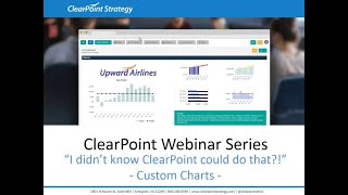
This is a YouTube video titled "Custom Charts (Webinar 34)" recorded in August 2019, featuring a webinar hosted by Kathryn and Andy. The content is an instructional session on how to customize charts in Clearpoint software, covering basic chart editing, advanced JSON customizations, using a JSON library, and creating reusable custom chart types. The webinar also includes Q&A and tips for users preparing for an upcoming training summit. The format is a single-host instructional presentation rather than a multi-speaker conversation involving Ted Jackson.
Hello everyone and welcome to the I Didn't Know clearpoint Could do that webinar series. Today we are showing you how to take your charts to the next level. Before we get started, here are your smiling hosts. I'm Kathryn.
And I'm Andy and as a few.
Housekeeping announcements, we will be recording this session and we'll make it available within a week. The webinar will last about 25 minutes with time for questions at the end, so you can submit your questions to supportlearpointstrategy.com any that we don't get to at the end we'll follow up with via email. On our last installment we walked through automating evaluations for objectives and measures, so I'd highly recommend checking out that recording on our blog Vimeo channel or in the Support center Just search webinar now you can pretty much consider today the Custom Chart Olympics and we're going for gold. So we'll do a refresher on all of the great customizations you can take advantage of without manually tweaking chart JSON. Then we'll go beyond these basics and show you some pre coded customizations that you can apply to your chart using the JSON library. We'll show you how to view and adjust the JSON of your existing chart. Then we'll even show you how to take your customizations and save them as new presets chart types.
Now, as many of you know, one of the training sessions at our annual Strategy and Performance Management Summit in Fort Lauderdale in two weeks will be on custom charts. Think of this webinar as a great prerequisite for attending this training.
Yeah, and we're really looking forward to seeing everyone. It's about time for some warm and sunny weather.
Yeah, this can't come soon enough and there's still time to sign up if anyone's still interested. Anyway, we want to make sure that the training is as beneficial as possible for everyone. So if you have charts that you want to set up in clearpoint but you aren't sure how we want to hear from you, reach out to us at Support with your ideal charts and we'll help you get going. We'll also use the selection of these charts during training, so please, please send them our way.
Yes, definitely. All right, so let's get charting and per usual, we are flying the friendly skies here at Upward Airlines today and we're going to hang out in the Eastern Division showing some love to our home coast for Valentine's Day. So let's click into our percent of on time departures measure. Andy, can you give us the rundown on clearpoint's built in chart editing options?
Sure thing Katherine. I think the best way to approach customizing charts is to think of it by levels. There are essentially three levels and each one gets progressively more complex. The first level is the normal clearpoint front end that you are all probably familiar with. This should always be your go to choice before attempting to jump into JSON. So let's just spend five to 10 minutes reviewing our standard chart features. So any chart in Clearpoint can be edited instantly by a double click. Just click somewhere such as the header and an edit window will open the chart type Drop down in the middle of the page should be your starting point when customizing a new chart. If you open the drop down you will see a list of charts or you can click View Chart Types if you want to see how your data will look on each before you select it. I'm going to go ahead and change this to our regular bar chart. On this chart tab we'll also see some of the basic options for editing the chart. You can make changes such as giving it a title, giving it an x axis, choosing whether or not the legend is going to show. Any changes that you make here can be viewed instantly by clicking this Refresh preview button. So you can see our legend disappeared. I'm going to add it back. So this Refresh preview button is definitely my best friend when it comes to editing charts.
Wait, I thought I was your best friend when it came to editing charts.
Okay, moving on to chart periods. This is where you can control which periods to include on the x axis. By default it is going to display all periods that are in your measured data table. You can also change this to a specific reporting frequency. We open this drop down or you can select which periods to display from this drop down.
So while you can choose custom periods, we recommend you exercise the same caution when creating chart reporting frequencies as you do when creating them for measures.
Yeah, definitely. Whenever possible, utilize an existing reporting frequency and then use the Periods to Display option to control what periods are included. This will just make period and reporting frequency management easier as you kind of add new charts and measures to your account. So for example, in this chart right now we have it set to display all periods and this shows us three years worth of monthly data. But if I really only care to see the most recent 12 months, I can set the periods to display to last n periods. I'm going to pick 12 and now we only have the 12 most recent data points.
And for those of you that want to see the current fiscal or calendar year, those options exist too.
Exactly. So maybe I only want to see my 2018 periods. If I select current calendar year now, I only see my months for 2018. On the Y axis tab we can control things like the title or number format, and we can also control the minimum and maximum Y axis values that will show. So clearpoint is going to try to be smart based on the values it is charting, but sometimes it might make sense to put in your own hard mins and maxes. For example, it is kind of hard to compare our values in this chart because they are so similar. If I change the Y minimum to something like 75, I can get a better view of how each period compares. To make changes to a single series, the chart Series tab is going to be where you should head. This is where you can control which series to include, as well as other customizations. To include a series, you can just check or uncheck its box and that will add or remove it to the chart. If you click on any of the arrows next to your series, you'll be able to change things about it, such as its shape, color, or whether or not the data labels are included. So let's say for my target I wanted this to be an area.
Without.
A marker, and then let's say for my actual I wanted it to be a brighter blue. Then I want my values to show. When you're happy with the chart, you can go ahead and click Save and this will apply these changes instantly to your chart. Now let's say you wanted to add another chart to your measure. This is something you can do and it's very easy as well. So if I go up to the Edit icon and I go to the Charts tab, you can use the plus icon to add a new chart. All you need to do is give it a name, select which chart type to use, and then select which series to include as well. I'm just going to plot my variant series and now when I save out of both of these windows, the chart can now be added to the Detail page by simply editing the layout.
Awesome. So this just goes to show how many options you have in clearpoint's preset options for customization. Now there may be some advanced chart options that you don't see there, like grouping stacked bars, fancy legends, and more. And that's where our JSON library comes into play. So let's swap over to the expenses measure to take a look. So what is JSON exactly Other than a common Western name for men and a line of natural body washes sold at Target. JSON is a data format that clearpoint uses to power the charting engine known as highcharts.
And for those of you that are curious, JSON stands for JavaScript object notation, right?
And JSON is text heavy, so even though there's a specific syntax to follow, it can be pretty straightforward to read what's happening in the JSON in plain English. We'll see that in just a minute. Now, we wanted to make it as easy as possible to grab some JSON options beyond what clearpoint's front end customizations can do. So we've got a library all set up where you can browse through and apply new formats. If the front end of clearpoint is the level one of chart adjustments, then you can think of the JSON Library as Level 2. You're able to make adjustments to the JSON beyond what you can do with clearpoint's presets, but you don't need to start all the way from scratch. So this is a great way to take advantage of those further customizations, even when the JSON format is brand new to you. Alright, let's go ahead and double click on our chart and we're going to be working with the chart legend, so we'll make sure that those are enabled. And then let's head over to the Custom Chart Format JSON tab. And just a quick note on the format of this tab. Any JSON being used for the chart is going to appear here in this text box. But again, don't feel that you need to start from scratch. These three buttons at the bottom are the huge time savers that we're going to be looking at today. So to see some custom options, we'll click on Browse JSON Library. This is going to show us a few things that are already built out for you using the series that are selected for this current measure chart. So we've got pie charts, split stacked columns. We've even got a waterfall chart here at the bottom. But for this example, let's say we want to adjust our legend to give it a bit more flair. We can see custom legends here, so I'll just check the box next to that and click on Use Chart JSON to apply that to my chart.
Right, so now here in this box that was previously empty, we can see some of the JSON that has been entered from this chart.
Yep, and we can see it right away on our chart here also. So let's take a closer look at what's in this box in the JSON. We can see the part of the chart that's being customized here, where it says legend. This is followed by an open bracket and then customizations for several attributes of the legend, which are each separated by a comma. And then at the end where the customizations for the legends close, we can see a close bracket. So each of these properties on these individual lines is called a key. So this is the key, and the condition specified for the key is called a value. So again, here they appear in plain enough English that we can see where we can make adjustments, which is great. So, for example, the enabled key right under legend is going to determine whether the legend is enabled or shown here on our chart. And we can see that this is set to true rather than false, which is why our legend is showing here. Then right below that, we can see align left. This horizontally aligns the legend to the left of the chart.
And now that these keys are in place in our JSON window, we can make small tweaks by changing the value specified right.
So here for our legend alignment, if we wanted to switch it from left to right, all we have to do is backspace to remove left and I can type in right instead. With a click of the refresh preview button, that change has occurred. And we can see some other properties here too, like the vertical alignment for the legend. So again, let's go ahead and make that tweak. Instead of having top here next to vertically align, I'm going to go ahead and type in middle so that the legend is aligned to the middle of our chart.
I quick refresh change in the Edit chart window Once there is custom JSON in place. So several of the default options are no longer going to be available. But don't worry, you don't need to memorize these. A message will pop up reminding you what you can and cannot edit. But we wanted to point them out here too, so you aren't surprised, right?
So if we click back on the chart tab, the first one here is that under chart type, instead of seeing a list of those default chart types, you're going to see a note to refer to the Custom Format tab. Chart periods can still be edited from the front end. You can still determine which periods you want to show, regardless of whether there's JSON in place. And on the Y axis format tab, you can still set minimums, maximums and titles. But you can't set, for example, the data type that each Y axis is using. You'd have to do that in the JSON for chart series. You can still easily turn series on and off for the chart, but any of those visual settings that Andy showed before are going to have to be edited through custom JSON now. All right, so let's go ahead and save that chart, and we'll see those changes appear here on our detail page. So, again, using the JSON library is a great way to swap out customizations without having to know too much about the JSON format. So it's a perfect way for beginners to avoid starting from scratch.
Yeah, definitely. And our custom chart library is a great place to get started with customization ideas. But we know that this library is far from comprehensive. Highcharts has tens of thousands of customizations that can be done. So if we think about library options like Kathryn just showed as level 2, we can think of getchartjson as level 3, because it will often require that you jump into the actual highcharts documentation for the answers. So let's say you've been working on a chart from the standard clearpoint ui, but it is not quite what you want it to be yet. The GetChart JSON button is gonna be your best bet. So if I open up this variance chart here for editing and we go to the JSON tab, I will see a button down here called Get Chart JSON. When you click on this, the window is going to load with the current JSON that your chart is using, based on the normal clearpoint UI that you've used so far. And just as we saw in Kathryn's example, using the library heading down this path will disable some of the other standard clearpoint ui, such as the series. So we highly recommend getting your chart as close to perfect as possible before pulling your JSON up like this. Once you have your JSON, you just need to find the place where it is that you want to make customization. So let's say I wanted to make some changes to my title. If I scroll down, I'll eventually find the title object. You can see it here. This is where I'm going to make my changes. In this example, we can see that the standard clearpoint font size is 14 pixels. If I want to make it bigger, I Simply replace the 14 with, let's say, 20 and I can watch my title grow. You could also take advantage of something like the color. And let's say we want this to be more of a red. As you make these changes, this top bar up here, it's green. Now, is going to let you know if your current setup is valid. Green means your JSON formatting looks good, red means something isn't quite right. For example, if I accidentally deleted a quotation mark when I was making changes to the font size, it'll let us know that this chart no longer works, and then we're not going to be able to save this. So as soon as I add that quotation mark back, we'll see that it goes green, I can refresh and save my chart and we're good to go.
Awesome. But what if you want to make a change to your chart for a property that doesn't pop up when we get the chart? JSON?
Yeah, definitely. So this is where you're going to want to jump over to the highcharts documentation. As I mentioned, clearpoint uses highcharts to powered charts, so this will be where you'll want to look for additional customization options. We will include a link to these pages once the webinar is published, but you can always google these as well. Highcharts demo is a great place to go for some inspiration. There's a bunch of different options on here. Not everything is going to be possible. For example, this is a line chart that plots 500,000 data points, but there are still some cool things on here to serve as an inspiration. The other useful page if you Google highcharts API, there's going to be a full list of the tens of thousand customizations that I mentioned before. For example, if I wanted to further customize my chart title, I would find the title object here and I can open it up to see what options are possible. If you're unsure of what something means or how to use it, such as vertical alignment, just click into one of the Try it examples and you'll be able to play with that property. So I can see that it is currently set in this example to bottom and we still see the chart title showing up over here. But let's say we wanted to change this to middle. I can refresh my chart just as we do in clearpoint with the run button in this upper left hand corner and we can see that it moves the chart title up on our sort of y axis up and down vertically. If I wanted to make this same change in Clearpoint, like adding some vertical align value to my title, I could just jump over to clearpoint and add it to my chart. So I'm going to go ahead and edit variants, go back to our custom chart format JSON tab, and I'll scroll down to where we were messing with title before so we don't see vertical align listed here, but we can easily add it. So I'll just find our last property underneath title. So we see margin of 10 here, and I'll hit comma enter in quotation marks. I will add the property. And right now it is positioned by default to top. But let's say I want to move that to the bottom. So once I add that, click refresh and we can see that it moves down here and I can save. And now we see it on our detail page.
That's pretty cool. So now we've got this awesome customized chart that's exactly the way we want to see it. And chances are we might want to use this chart more than once. For example, if we have the same expenses measure with the same variance chart and multiple scorecards in the account, chances are we're going to want them to stay consistent. So do we really have to restrict our front end editing options and use JSON for every chart we want to display this way? Fortunately, there's an easier way to both replicate and tweak this chart. So let's jump back in here and on the Custom Chart Format JSON tab, we've got one more option here at the bottom, and that is Add Custom Chart Type. So clicking this option allows us to take the JSON for this chart and turn it into a default chart type that you can assign to new charts, just like defaults numbered 1 through 10 in the chart type list. So once we've clicked this Add Custom Chart Type button, we can choose a name for our chart, maybe Expensive variance, and then we can click add. And clearport's going to pop up a window confirming that we want to save the chart and letting us know that our new chart type is going to be set as the chart type for the chart that we're editing now. Right away, we can see our edit window has changed. We're back on the Chart tab, and we can see our new chart type here listed as the chart type for this chart. If we go back over to the Custom Chart format tab, our JSON's been wiped clean. And here's where things get awesome. So since there's no longer any custom JSON applied here, we can make front end customizations again. So if I want to change the color of my series, I can do it without any JSON editing. But we still get to take advantage of our awesome customizations, like our title at the bottom of the chart. All right, so let's save this chart and create one more new chart type using our chart with a custom legend so that we can use both. I'm going to double click to edit this chart and we'll go back to the Custom Chart Format tab, again, click to add our new chart type and this time we'll label it right middle Legend again, click Save. And this is an especially awesome option for instances where you've used the JSON library to do some customizations, since there might be instances where the library option overwrote some of those front end customizations that we had in place. So now we can go back in and make adjustments to our chart, like the series shape, for example, so that it shows up exactly like it did before. Now we have our original chart plus a cool legend and let's go ahead and click Save. So once those chart types are created, administrators have the ability to manage them right from admin options. So let's go and take a look. I've clicked under System Settings to Admin Options and I'm going to click into Chart Options. So we'll go over to the Custom Chart Types tab and here we can see our two new chart types available right here. You can delete them when they're not in use, but since both of these chart types are being used right now, I'm going to see that the delete icon is grayed out. I can also duplicate the chart types if I want to make some changes, or I can click to Edit to make some adjustments to those chart types right here. So let's say as an administrator, I've decided that all of these right middle legend charts should have a different background color and border color on the legend. Maybe we want the background color to be white and the border color to be black. So we'll put in the hex codes here, we'll click Save and then let's go back to our expenses measure. So we can now see that that change has been made and any future charts created with this chart type are going to show that adjustment as well. So we've covered a lot of ground today and we're sure you've got some burning questions, so let's take a look at those.
Yeah, it looks like one came in about chart colors and someone asked about how do they change their chart colors with the JSON. So that's a great question. I know that while we're editing these charts and we get our JSON, we can see some colors listed here. We would highly recommend instead of pulling up the JSON to make edits this way, stick to changing things like colors and shape or marker, etc. From the normal Clearpoint UI. We designed it intentionally to cover common customizations like this, so it should be your first place to look when making changes like this.
Yeah, that's a great point. And we have got a question also about reverting from JSON back to clearpoint's default settings. So if you edit a property using JSON but later decide you want to go back to the default clearpoint settings, is there a method to override the JSON and return to the original settings? That's a great question, and the easiest way to do this is if you've already switched over to a custom saved chart type. You can simply switch your chart type back to one of clearpoint's defaults, and that's going to remove any of those settings that you put in that are only available through the custom JSON. Otherwise, if you're in a chart where you've grabbed the custom JSON so your editing options are disabled, you can always simply just place your cursor in here and I like to use the keyboard shortcut control A to select all and delete and then once there's no longer any text in that window, you can go ahead and use the options again. So it's as easy as that.
All right, well, it looks like we're reaching the end of our time here today. We have a couple of announcements left, so just kind of to recap, it is always best to look for what you need in clearpoint's default options before switching over to JSON. But when you do want to extend your reach beyond these options, you can check in the JSON library to see if the option has been set up for you already. And then finally, if that still doesn't do the trick, you can grab that JSON from the existing chart, make some tweaks, go online to highcharts to see what other properties there are that you can change or want to change, and then you can save it as a preset chart type for other users in your account to utilize in the future. So if you're an account manager and want to update sort of globally how this chart is applied in maybe your expense measures in every department, this would be a really quick and easy way to make those changes.
Yeah, that's a great point. And as a reminder, we'd still love to see and hear about the charts your heart's desire in Clearpoint. So please, please send them our way at supportlearpointstrategy.com we'll help you get going. And this is especially important if you are attending training at our annual summit. So that's all for now. Thanks so much for joining us today, and we hope to see you next time on the I didn't know Clearpoint could do that webinar series. Happy reporting.
More from Ted



AI in Local Government: How the City of Durham Analyzes Strategy, Risk & Performance

How Coral Springs Won the Baldrige Award — Blueprint for City Excellence | ClearPoint Strategy


AI, Data, & the End of Gut-Feel Strategy: Why Strategy is Becoming More Data Driven

Strategy Needs Accountability: How to Drive Project Follow-Through and Execution