Evaluations (Webinar 33)
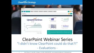
Kathryn and Brendan walk through Clearpoint's evaluation tools for tracking initiatives, measures, and objectives. They show how to customize status indicators, set up automatic evaluations, and build reports with charts to visualize your strategic plan.
Hello everyone and welcome to the I Didn't Know clearpoint Can do that webinar series. Today we are tackling an important part of keeping your strategy on track, and that is evaluation. Before we get started, here are your smiling hosts. I'm Kathryn. And I'm Brendan and as a few housekeeping announcements, we will be recording this session and we'll make it available within a week. The webinar will last about 25 minutes with time for questions at the end, so submit your questions to supportlearpointstrategy.com any that we don't get to at the end we'll follow up with by email. On our last installment, we walked through a plethora of calculations and I'd highly recommend checking out the recording on our blog, Vimeo channel or in our Support Center. Just Search Webinar Today we are exploring the world of evaluation. Chances are that you use some form of red, amber, green or rag status to quickly check on the progress and health of your objectives, measures and initiatives. Even red statuses can be good, as you can redirect focus and resources to the areas your organization needs it most. But how do you determine which status is assigned to which elements in your strategic plan? Are you spending a ton of time manually updating them each month and quarter? Are your evaluation criteria as consistent as possible across the board? Today we'll give you a few tips that will save you time and make your evaluations as effective as possible. And for those of you who are a little on edge still after the last episode, I can assure you we aren't going to rhyme anything and everything with evaluation today. Been there, done that. So we'll show you how to customize your statuses, set up various types of series, and measure evaluation. Give you some ideas for effectively displaying evaluation summaries, and we'll walk through setting up automatically evaluated objectives as well. So let's get right to it. We are flying the friendly skies here at Upward Airlines today, and I'm going to start off by going into my Initiative menu and selecting my Redesign Employee Satisfaction Survey initiative. Now, as many of you are surely aware, you can always manually select the status of an element by double clicking on the status indicator next to its name at the top of the detail page. So let's click into our list of statuses here and by default you can see we have above Plan Caution below Plan and no information as well as our default gray bar not defined.
As a quick note here, you might be wondering how no information differs from the default not defined status. Various Organizations use them differently, but one approach is to use these two statuses to differentiate between elements that still need to be addressed and elements where it was intentionally noted that not enough information is present to assign a RAC status. For example, an initiative that just started, or a new measure that doesn't have a target yet.
Yep, that's a good point. And there's one other scenario that's missing here. What if our initiative is marked complete? You might just choose to show whichever status the initiative held in the period it was completed, but it is conceivable that you might want to have another status to quickly indicate that the initiative is complete, like a check mark. And that's where clearpoint status customizations can come in handy. So let's click over to System Settings and Admin options, and we'll see a panel here for status indicators. So I'll click on that. We can see our existing status indicators and a place to add a new status. So we'll click the add icon, and this is going to be a status for completed elements. So first things first, we'll name it Completed. We'll come back to score when we talk about automatically evaluated objectives. For the meantime, we want to select a status icon, so we could use one of our defaults, but I'm going to go ahead and select to use a custom status indicator. Then I can add my own icon. And as far as image specs, you can use a PNG or a JPEG file, with one key difference being that PNG images can have a transparent background, and for image size, 24 by 24 pixels works well. So let's click to add our file, and when I open it up, I can see a preview here on the screen of that purple check mark. Then under Elements, we can actually restrict this status icon to only be used in particular element types.
That's right. You might not want to have completed confusing your users when it comes to objectives or measures, for example, because they don't really have end dates. So we can just check the boxes next to Initiatives and Milestones to use a completed status on those elements.
Exactly. And then if you have any custom fields that are using status icons, you can choose whether to display that status there as well. So now let's click Save. We have our new icon here, and we'll go on back to our initiatives. All right, so here on my page for my initiative, I've got a box here in the completed field. We'll check that complete to say that we've completed our initiative today. High five. And the completed date is automatically going to show up here. We could always change it if we wanted to, but for now I'm going to go ahead and just change my status to Completed and so we'll choose our new status and click Save One.
Thing to point out here, when we marked our initiative complete, you might have noticed a change to the initiative's current period, which you can see in the upper right corner of the detail page. Since we marked the initiative complete for a date in January 2018, any month after January is still going to display the status updates for January 2018. So that's where we've marked this completed status, and it's going to carry forward for all future periods, right?
So we're looking at February or January for our completed initiative, and if we click forward to March, it's still going to show that completed status.
By contrast, if we had been looking at November 2017 in the period selector and assigned the completed status, but the completed date isn't until January 2018, then that completed status won't carry forward. It is important to make sure that you apply the completed status to the period in which the completed date falls right on.
And with that said, let's switch gears to talk about measure evaluations.
Thanks Kathryn, for showing us how to create custom status indicators. Now let's set up an automatic evaluation for our revenue measure. I'm sure many of you are familiar with manually changing the status of a measure, but with so many measures in your account, this can become tedious and take up a lot of your time. Automatic evaluations save you this time by automatically selecting a status indicator based on the data you entered. So to set one up, let's navigate to our revenue detail page. For revenue, we can see that we want our actual series to be greater than our target series, since the actual series will determine the status for each reporting period, let's double click on its column header. Then let's navigate to the Evaluation tab. On this tab, we can select the status indicators that we want to include, and then after selecting those, we can choose how we want to set up the comparison. In the second column, I'm going to leave target series as our comparison because we want to compare our actual data against our target data. So for above plan, I'll make the inequality greater than or equal to target. To double check that I entered this in quality correctly, I'm going to read the evaluation. For my status indicator to be above plan, the actual data will be greater than or equal to the target data. That makes sense to me. So for the Caution status indicator. I want the actual values between 90% and 100% of the target to have this status for when we're almost there, but not quite. So I'm going to make the inequality greater than or equal to the target. And then in the third column I'll enter in times 0.9.
So this is where things can get kind of confusing when you're first seeing clearpoint's automatic evaluation. It seems like that would indicate that values above the target would still be evaluated as caution now.
Right, I see what you mean. But don't worry, clearpoint evaluates top to bottom, meaning it is going to assign the first status indicator in the list that fits that particular value, and then it will not pay attention to the other statuses further down.
Okay, that's helpful to know. So in this case, since everything above the target value is already going to be evaluated as above plan, our caution range will only occur when the actual value is between 90 to 100% the target.
That's right, Kathryn. So for below plan status indicator, I'm going to make the inequality less than the target. Finally, for the nil information status, I'm going to keep it as any in the first column. This means that it's going to cover any values that don't fit our other statuses. Basically only when the target and actual series are null. And again, it's important to note that the evaluation is going to read from top to bottom. If our actual data is greater than or equal to our target data, then the above plan status indicator will be selected. If our actual data is not greater than or equal to the target data, but still within 90% of it, then the caution status indicator will be selected. And finally, if the data does not meet the above plan or caution criteria, then the below plan status indicator will be selected. Another important idea to keep in mind is that evaluations work best if they're consistent across your account. This way you will know exactly what above plan actually means when you see the status on your Measure detail page. Now that I've set my evaluation up, I'm going to save the window. However, I still don't see my status indicators in my data table. This is because we have one more step to complete. We need to tell the measure to use our automatic evaluation. So I'm going to scroll up and edit the measure and then navigate to the Measure Series tab. From this tab, the evaluation option we can select to use actual evaluation, the one we just created. Now that we've selected that, we can save and scrolling down, we can see our status indicators populate in the data table.
Awesome. So not only does this save you time selecting a status indicator, but it also assures that you have the appropriate status consistently assigned for every period. Now, we're sure your updaters are not particularly devious, but as they say, there are two ways to meet your target. You can perform well, or you can lower your target numbers. So if quote unquote, minor tweaks to the target are something you're worried about, we want to point out a small safeguard that clearpoint has in place. If I double click into my target series via the series header, I have an option here to lock series for updaters. So let's check that box and click Save. Now, with this option, selected users with editor permissions and above can still assign target values to this measure, but updaters won't be able to change them when they're entering data month to month. Now you can be really, really sure the right statuses are assigned.
Thanks, Catherine, for showing us how to walk series. I'd been a little nervous that Jonah was fudging her target numbers.
Typical.
So, for the revenue measure, we are comparing whether the actual series is higher or lower than the target series. However, there are certain instances where you might be tracking proximity to a target without caring whether it is higher or lower, as long as it falls close to that number.
Right. So that might be something like employee turnover at a large organization or just maintaining your budget.
Exactly. So we can compare the actual series on the proximity to the target series through what's called a range evaluation. Let's go to our budget. Let's go to our budget measure and set up this range evaluation by following the same steps as our previous evaluation. Let's double click on the actual column header and navigate to our evaluation tab. First, I'm going to select the status indicators that I would like to include in the evaluation. So I'll select all four. And then in the first column, instead of the inequality, I'm going to select range for the first three. For no information, I'm going to keep any in the first column, which is essentially saying if the three status indicators are not selected for it, then the no information status will be chosen. I'm going to leave the target series in the second column because we still want to compare our actual data against our target data. In the third column, I'm going to enter the upper and lower boundaries for the range I want to compare against my target series. So for above plan, I'm going to enter times 0.9 comma times 1.1. So the valuation is saying if the actual data is between 90% and 110% of the target point, then the above plan status indicated will be selected. Precaution. I'll enter times 0.8 comma times 1.2, meaning if the actual data is between 80% and 120% of the target point, then the status indicator will be caution.
And just like with our first evaluation, clearpoint's still going to read this top to bottom. So we're really saying that between 80 and 90% and 110 and 120% are going to be your caution range because everything in between is already covered by above plan.
For below plan, I'll enter a very large range. Let's say times 0 comma times 100. This evaluation is saying if the actual data is any farther away than 80% or 120% of the target data, then the status will be below plan. Now I'm going to save the valuation. And let's not forget our final step of telling the measure to use the valuation we just created. Going to edit the measure, navigate to our measure series tab and change the evaluation option from manual to use actual the one we just created. Now saving it. We can see that the status indicators have populated in the data table.
This is really useful, but so far we've always compared to another series. What if we don't want to compare the actual series against the target series we or for that matter any series, but we still want it to have an automatic evaluation?
Well, there is a way that we can compare the actual series against a static value. Let's navigate to our total amount of time at gate measure here we can create a static evaluation for this measure. The criteria will be the opposite of the revenue measure. While we want our revenue to be above target Upward Airlines, we definitely want the total amount of time that Bennett gate to be below target. By following the same steps as before, I'm going to double click into the column header of actual and go to the evaluation tab. I'm going to select the status indicators I'd like to include. And then in the first column I'm going to choose my inequalities. And like before, because this measure is opposite of revenue, I'm going to make above plan less than or equal to. I'm going to make caution less than or equal to. And then bullet point I'm going to keep at greater than. For no information I'll keep at any as well. But instead of comparing my actual series to the target Series, I'm going to select static value for the second column. For above plan, caution, and below plan. Now, in the third column, I can enter in the static value, which I want to compare against. So for above plan, I enter in the value 50. So my evaluation reads, if my actual data is less than or equal to 50 minutes, then the above plan status indicator will be selected Precaution, I'll enter in 60. And for below plan, I'll enter in 60 as well. For below plan, it's reading if the actual value is higher than 60 minutes, then the status will be below plan. Now let's save it out of the window and our final step. We can edit the measure, navigate to the Measure series tab, and in the evaluation option field, we can tell the measure to use our actual evaluation. Now saving and scrolling down, we can see the status indicators populate.
Awesome. So a static evaluation is a good option for instances where you know you're comparing to a constant that is not going to change something like 100%. And that can come in especially handy if you have a really complex measure with a large number of series. You don't have to add an extra series that's just going to say 100 in every period. And in our case, this is good because there's so many other variables to the time and date, like the airport and the passengers, that we just want to keep it at a consistent 50 to 60 minutes.
Yep. Just remember, when you're comparing against a target series and your target changes, your evaluation is going to adjust with it. With our static evaluation, you're comparing against 50 no matter what.
Great. So now we've got a few ways to automatically show whether a series is on track. And I want to pop back over to our revenue measure to show you one more helpful way to leverage the evaluations that you have in place. Now, as you can see in our data table, in addition to our actual and target series, we're tracking the values for the year to date for actual and target as well. So what happens to our measure status if we're on track for the month but not doing so hot for the year overall? Well, currently nothing, since we're just using our monthly actual evaluation. But we can change that to incorporate the year to date actual series into the evaluation. So let's go back into the Edit measure window and over to the series tab. And these little blue labels show that both the actual and the year to date actual have automatic criteria assigned. And if we click into that year to date actual series, we can see that our Evaluation is comparing to the year to date target rather than just the monthly target, because those numbers are going to make more sense when you compare them to one another. Now, in our evaluation option drop down, I see that I have the option to use the year to date actual instead if we prefer to look at the measure from that standpoint. But there's also a couple of other options that are valuable when you have more than one series selected, and that is the best series and worst series option. So if I select best series from this list, then the measure is going to take into account the status displayed in both series and select whichever icon is higher to display for the month. So if we're showing below plan for the monthly actual in June, but we're above plan for the year to date, then June is going to show as green for the measure. And similarly we can opt to choose the worst series instead. So in that same example, because the monthly actual is performing worse than the year overall, the worst series would show as red for the measure in June. So you've got the option to show the glass half empty or the glass half full. But as a best practice, we'd recommend on keeping this choice consistent where possible. That way you'll spend less time wondering or double checking which measure is using which approach. Now, in any case, you're only showing one series status for your measure each month, so you might be wondering how you can easily keep track of and compare multiple series evaluations. And there are two really helpful fields that you can pull out onto your measure detail page to get a sense of how all these theories are doing, not to mention remind yourself of how they're evaluated. And those are the Series status and Series evaluation fields. So let's add those to our layout by clicking into the Edit menu and going to the Edit layout window. Here I can search for series in my fields and click or drag these out onto the page. So we'll give them some real estate above our data table, then click Save. So what you have in the series evaluation field is a list of any automatically evaluated series, followed by the options for status, the calculation they're using, and what criteria that assigns for this measure. You can also see that the status for the current period is going to be highlighted. And the series status field provides a simplified view of just the status for each of those series that the evaluations produce. Great. So you might be wondering where else you can show all your series statuses at once. And that's where Heat Map or Matrix reports come into play.
Yep, you heard us right you take the blue pill, you can keep using your current reports, or you can take the red pill and see how awesome your data can truly look. Automated evaluations not only help us save time on the Measure Detail page, but also allow us to create really cool summary reports. A matrix report is one where you can show multiple periods of data across measures using status colors or icons as a quick look at how you're doing overall. For the sake of time, I've already created automatic evaluations for five different measures. So to create this matrix report, let's go to our Manage Measures Reports page and we can click this add icon in the top right. So let's call it the Upward Airlines Matrix Report. Now we want to display the last six periods of data in the summary report. We can do this by selecting Last End periods in our Periods field and then in the End Periods field, we can put in the number six. Next we'll so let's click on the Columns tab and let's include the columns Measure and Series Status. The series Status column will show the data for all series in each measure. If we have automatic evaluations built in which we do, it will also show the status color or icon for each series. Another important step to remember is that we want to show multiple periods of data. We need to click the dropdown the Series Status column and select the option to display multiple periods of data for this column. Now that we've done that, I'm going to go to our Measures tab and select the five measures that I want to include in this report. Now that we've selected those, we can save and go into our report. And here you can see that matrix report where six periods of data are displaying and the status color for each period. It's important to remember that the status color is only showing because we created the automatic evaluations for these five measures.
Wow. I think this basically makes us the Keanu Reeves Neo of the reporting world. So what else can we do to show off how awesome and automated all of our evaluations are? Well, there's one chart type that allows us to see very clearly where we fall into the range of red, yellow and green values. And that is our gauge chart. So let's take a look at our revenue measure. We've already got some evaluation set. We also already have a chart in this measure, but we can always add another one by clicking into the Edit window and going to the Chart tab. So we'll click to add a new chart and call it our revenue gauge. Then I'm going to want to change My chart type to our number nine default chart, the gauge chart. And where you might normally show an actual and target series, you only need to select one series to show on the gauge chart. So next I'm going to go to my chart series tab and clearpoint is just going to prompt us to save our new chart. So I'll click save. All right. So you can see it doesn't look quite right yet. With these two tick marks, I'm going to uncheck my target series. And then one more step before we refresh the preview on our Chart Period tab. We want to make sure that we're just displaying one period. That way clearpoint knows which value to leverage and which evaluation criteria apply for that particular month. So we'll refresh the preview. And now it looks great. Let's save. And for our last step, we'll add that chart to our detail page. So back into edit layout, we'll find our gauge chart and give it a good spot. Great. There you have it. And if we toggle over to our expenses measure, we have a gauge chart set up here too, and it's got a bit of contrast with the gauge on our revenue chart. So here at the top of our chart is red rather than the bottom because it's bad when our expenses get too high. So the gauge chart can be a really helpful visual of our automatic evaluation.
Great. Now, we've been speaking a lot about measure evaluations, but did you know that objectives can be automatically evaluated as well? Objectives can be evaluated based on the elements that they are linked to. Creating an automatic evaluation for an objective is a three part process. First, we need to assign scores for each status indicator. Second, we can assign a weight to each element that is linked to the objective. Using these weights and scores. The objective is given an overall score based on the weighted average. And for the third part, we can choose our evaluation criteria for the objective. To set one up, let's first navigate to admin options and then to status indicators. By editing each status indicator, we can assign each one a score. So for above plan, I'll edit it and I will give it a score of 3. For caution, we'll give it a score of 2. And for below plan, let's give it a score of 1.
So as long as these scores make sense relative to each other, you can use whatever scale you see fit. Some organizations use 1, 2, and 3. Others might use 1, 3 and 5, or even 25, 50, and 75.
That's a good point, Katherine. Now, let's save out of the Status indicator window and let's navigate to the increase Shareholder Value objective for which we're going to build the automatic evaluation on. I'm going to edit this objective and navigate to the Links tab. When we first get through the links tab, let's turn on or enable automatic evaluations. Now we can see more information appear on this tab. I can see that my objective is linked to four different measures and the status of these four measures is going to determine the status of my objective. So I'm going to give each linked measure a weight of 25. This means that each measure will have an equal share in determining the status of the objective. These weights should always add up to 100, right?
And just because there are four linked measures, that doesn't mean they all have to be equally weighted or weighted at all. You could just use two of these and weight them 60, 40, for example, if that's what made the most sense for your evaluation.
Yep. So in the next column over we can see the score that I assigned each status in admin options. So for the expenses measure we can see the score of 3 and its above plan. Looking at the bottom of the page we can see the total weight that we have given the measures, which adds up to 100 and the total score. The total score is the weighted average score given the scores you apply to your status indicators and the weights you have given your linked elements. And here you can see also how much each measure contributes to that score given its weight. Now for the third part of building evaluation, let's move on to the evaluation criteria tab. I'm going to first select the status indicators that I'd like to include in the evaluation. I can see my total score for my measures in this column. And then in the third column we are going to want to choose the scores we can compare against our weighted score, which is 2. So for the above plan status indicator, I, I will make the inequality greater than OR equal to 2.5. For the caution status indicator, I'm going to make the inequality greater than or equal to 1.5. For below plan status indicator, I'll make the inequality greater than I'll keep it greater than zero. And for no information status, likewise, I'm going to keep it as any. These evaluation criteria should make sense with the scores you've selected for your status indicators. So to go back to our early example, if you're using 25, 50 and 75 rather than 1, 2, 3, these evaluations wouldn't make sense. But with the way our scores are set up, we'll land in the caution range if we have a mix of red, yellow, and green measures, whereas we'll be above plan if we've got three green measures and one yellow.
Right. So these scores you set just depend on how you want your objective statuses to be evaluated. But just like with measures, it's best to keep the criteria consistent across your account.
Also, you may notice some indications here that your objective does or does not meet the criteria you specified, which are the X and check marks we see to the right. While there may be more than one check mark, objective and measure evaluations work the same way, that is from top to bottom. So since the objective doesn't meet the above plan criteria, the first check mark is showing extra caution. So we can expect this objective to be yellow. So once I've completed my evaluation criteria, I'm going to save out of this window, and we can see that our objective is now automatically evaluated.
That's great. And it's showing that caution status, just like we expected. So we're reaching the end of our time here today. We've covered a lot of material, and we want to make sure to leave time for your questions. So here's one that's come in. Can I use other elements besides measures to weight my objectives? Brendan, do you want to take that one?
Sure, that's a great question. And yes, as long as they're linked to the objective, you can use any element in your objective evaluation. So besides measures, you can use initiatives, action items, and risks. You can even use parent and child objectives. All of these different element types will follow the same process as we did with measures when you build out your automatic evaluations.
All right, let's see here. So another question. You mentioned the icons and colors in the matrix report. How would I switch between those displays? Yeah, so if we go back into that Upward Airlines matrix that we set up, the colors are actually displayed as a default option that can be selected by your administrator. But if you want to switch between icons and colors for a single report, all I have to do is click to edit the report, go into our report options, and I can choose this under subtable indicators. So I could have the report show color no matter what. I could even opt to show none, just to make sure that all of our rows look consistent. Or for a status icon, I would just want to select icon. And then when I click save, I'll see our up and down arrows and our crossing squares here in each cell. All right, so that's all we have time for today. Thank you so much. For joining us for this episode of the I didn't Know Clearpoint could do that webinar series. We hope to see you next time. And happy reporting.
More from Ted




AI in Local Government: How the City of Durham Analyzes Strategy, Risk & Performance

How Coral Springs Won the Baldrige Award — Blueprint for City Excellence | ClearPoint Strategy


AI, Data, & the End of Gut-Feel Strategy: Why Strategy is Becoming More Data Driven

Strategy Needs Accountability: How to Drive Project Follow-Through and Execution