How to be ClearPoint Cool (Webinar 38)
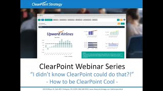
Katherine and Neil walk through ClearPoint's reporting tools: building gauge dashboards, creating business plan summaries, and customizing reports with HTML and Bootstrap to track departmental performance.
Hello everyone, and welcome to the I Didn't Know clearpoint Could do that webinar series. Today we're discussing how to be clearpoint Cool. Before we define that for you, here are your smiling hosts. I'm Kathryn. And I'm Neal and as a few housekeeping announcements, we will be recording this session and we'll make it available within a week. The webinar will last about 25 minutes with time for questions at the end, so submit your questions to supportlearpointstrategy.com any that we don't get to we'll follow up with over email. Now, on our last installment, we covered automatic initiative evaluations, a brand new capability as of Clearpoint 11.5. So if you're looking to take your project to the next level, I'd highly recommend checking out that recording on our blog, Support center or Vimeo channel. Just search webinar Now. As you know, we're learning the ins and outs of clearpoint Cool today. So what does it mean to be cool? I may have done some googling to find out, and the image search results are telling me it definitely involves sunglasses and maybe a hat and a leather jacket. Everything else is sort of up for debate.
Please don't take Kathryn's fashion device to work. She's had sunglasses on at her desk all day. I can assure you it is not that cool.
Ouch. I guess I'll take these off now. Anyway, as far as clearpoint is concerned, we think it's pretty cool when our team or our users find new and useful ways to combine the various features.
Clearpoint has to offer that we can all agree with.
And there's plenty of ways to be clearpoint cool.
For example, maybe you've thoroughly documented your reporting process and made it easy for your team to make updates, or you found an innovative way to set up pages in clearpoint that suits the specific needs of your organization exactly.
So today is going to be focused on two pretty cool reporting options you might take advantage of, which are based off of real reports in clearpoint. And these reports will help you address two use cases in particular. So we'll address how to show the overall progress of various parts of your organization using a gauge dashboard. And we'll also show you how to condense information about your business plan in a useful and appealing way with a business plan summary page. And of course, submit any questions you have to be addressed on your screen. SupportLearpointStrategy.com so with that, let's get to it. We are strolling the friendly Streets of metropolis today. And the first thing we want to get set up Is our gauge dashboard. So let me just show you a quick preview of what that's going to look like so that you can have this in mind as we go. Now, here in metropolis, We've got a few different departments that are all working hard to ensure that we are at the best place on earth to live. For example, our parks, recreation, and sustainability department and the red, yellow, green gauges we're going to set up Summarize the performance of the department by standard sizing and averaging our data into one measure per department.
We're going to show you how to get to this point so that you can build out a similar gage dashboard, Whether it compares departments, metrics grouped by goals, or another way you want to slice your data.
Right. So if we take a look in our dashboard report here in our parks and rec department, we can see here that we've got a number of measures that are tracked On a lot of different scales. So if we were to try and compare all of these, it would be like trying to compare apples and oranges.
Right. How are we going to summarize 1000 visitors to the rec center with percentage satisfaction? We're going to need a common way to communicate how each of these metrics is tracking.
Yep. And we're going to do that by adding a percent of target series to each one. So that way, no matter the data type or the size of the target, We've still got a percent comparison between our real value and our desired value. So let's click into this percentage of residents satisfied with available recreational options. And if we scroll down here in the data table, we can see that we're tracking the number of responses On a scale of sort of 1 to 5 here. Very dissatisfied to very satisfied. And then we've combined them into what we're considering. Our actual series, our percent satisfied or very satisfied. And then we've got our target. So to create our percent of target, we're going to double click into the data table, Click to add a series, and name this our percent of target. Our data type is going to be a percentage, and then we'll hop over to the calculation tab. Now we'll use our drop downs and our buttons here to take our percent satisfied or very satisfied value, which we'll insert and divide it by our target value. Then for formatting the percentages in clear point, we'll multiply it by 100. Then we'll click save. All right, so now we can see our percent of target by dividing our percent satisfied by our target, which is 85%. And if we update either one of these items, our percent of target is going to update as well. Now, to save us some time, we've already got the percent of target series set up in a few other measures. Our landfill diversion rate, our percent of municipal facilities incorporating energy efficient upgrades, and the total number of visitors to the community center. So we're going to use these series to create an average percent of target for our department overall. And to do that, I've added a measure called Parks, Recreation and Sustainability. So same name as our department. And this is where we can summarize the measures. So we've linked our four measures that we want to summarize here as children, since this is sort of our overarching or parent measure. And in the data table, we've got a target series which is just going to be 100%. And we've got our percent of targets. So here's where we're going to average the percent of targets of our linked measures. So in our calculation tab, we're going to use our drop down to select each measure, choose the percent of target series, and insert it into our calculation, adding as we go search, plus.
Our.
Satisfied residence plus our landfill diversion rate. Then, since we have four measures and we want to find the average, I'm going to put these in parentheses and divide by. There we go. All right, so now let's click save.
And we're just using four measures right now as an example, but you can easily use more, from just your key indicators to all of the measures in your department. Awesome.
So now that we've got this calculation all set up, we're going to showcase it on a gauge chart. So let's just take our existing chart and double click. And then here in our chart edit window, the first thing we're going to do is change our chart type to gauge, which is one of our default charts. Then on the periods tab, the gauge only displays one value, so we want to make that our current period value. On the Y axis format tab, we can specify that we want this to reflect our 100% scale. And on our chart series tab, we're really just going to showcase the percent of target. So we'll uncheck that target series and click save. All right, so now that we've saved our gauge, you may notice that the colors you saw in our original example are missing.
That's because these come from an automatic evaluation for whichever series the gauge displays. So we want to make sure that We've set the criteria for which percent of target values are going to be green, yellow, and red.
Exactly. So we'll set up a trustee automatic evaluation by double clicking back into this percent of target series, heading over to our evaluation tab, and checking the box next to the evaluations we want to include. So let's say that we're green if this combined percentage is 75% or above. If we're above 50% up to that 75% mark, we'll call it caution. And then anything below that is going to be red or below Plan. So when we save now, we can really clearly see where these values fall right on our gauge chart. And we've gone ahead and created a few of these gauges in our other departments as well. So let's go back to our top level Metropolis scorecard to create our gauge dashboard view where you can compare progress across departments. And I'm going to walk through two ways to set this up. There's a simpler one that won't take much time, and then a more advanced option using bootstrap. So the first way that we're going to demonstrate this is by creating a dashboard measure report. So in the Metropolis scorecard, going to go over to measures, click on Manage measure reports and click to add a new report. We'll name this our department gauges. And our report type is going to switch to Dashboard, which will show us charts for whichever measures we select. So then over the charts tab, we'll want to select all these departments that we want to include. And instead of including all charts, we are just going to select the specific summary gauge chart that we've set up in each department. So pretty easy to find them just since they have the same name as our department and most are right at the bottom of the list. All right, one more department here. And now that we've got our charts selected, let's click save. And going to that report, we can now see a really nice view of all of our gauges. So this is really useful on its own. But I want to show you how to reference this report at the scorecard level so that you can set it as a landing page and include any additional information that you want. This involves setting up some custom fields. So under System Settings admin option, we can click on custom fields to set up those fields. And I've actually got them created already to save us a bit of time. We've got an HTML text field which is just going to allow us to format text to create a sort of header for our report. This Data grid field called Dashboard Grid is where we can reference that measure summary report we just created or any other summary report in clearpoint. And our HTML with Data field is going to let us not only format text, but also pull in tokens to reference individual pieces of information from across their point. That's going to come in handy when we start exploring that bootstrap option. So with our custom field set up, I'm going to go to the scorecard level and click on Manage Scorecard Reports, and I'll add my new report here and call it Dashboard Performance. So on the Page Layout tab, you can see our custom fields that are available and we'll add the Dashboard grid and the Dashboard header. Then let's click Save. And if we take a look at our report, we can double click into these fields to edit the content. So on our Dashboard header, I'm just going to go ahead and call this our Metropolis Department Performance Dashboard. And as I mentioned, we can format that text to give it the look and feel of a nice header. We'll click Save and then we'll double click into our Dashboard grid. So this is where we can choose the summary report that we want to reference. And it's going to be that measure report that we created called Department Pages. So let's click Save here. And so now we've got a pretty nice departmental overview. There's one more thing we can do to make it look a little cleaner. If we go back into our edit window, click over to our page layout into our fields, and just remove the pod borders and header. So this is going to let that background color shine through and give it a nice sleek look. But the really cool thing about this view is that it creates a nice hierarchy as well, to be able to click into the department, see where that percentage is coming from, and then drill down even further to take a look at that data for your contributing measures. All right, so I do want to show you that one more option with Bootstrap, if you really want to take things up a notch, we can leverage a responsive bootstrap grid rather than this default Dashboard view. So this more customized option is for if you're comfortable tweaking HTML to build and maintain a custom view in clearpoint. So to get this set up, let's first edit our layout. We can just reuse this page here. I'm going to remove the Dashboard grid and replace it with that bootstrap field that we have in place. So again, this is an HTML with data field, meaning we can edit text but also reference Information from elsewhere in SharePoint. Now you might be wondering, where does bootstrap come into play? Does this mean you also have to have boots to be clearpoint cold? Nope. Bootstrap is a grid system that makes it easy to create a mobile, responsive structure in HTML. It's a 12 column grid that you can group into different widths, as well as a few preset CSS classes to apply background colors and other styling. Now, I've set up the basic structure in a notepad document and a template like this is going to be available with the recording of the webinar in our support center to help you get started. For now, we've added a bit of account specific information into this bootstrap HTML so I can copy and paste that and put it right into clearpoint. I'll double click into this field and over to the HTML side and I can use Control V to just paste in that HTML. Now, I do want to just touch on what you're seeing here. These divs are structural elements that help to structure a page. And these classes are preset styles that our bootstrap allows us to apply. So we can see we've got a row, and within that row we've got a column indicated by col. The three indicates how many of those 12 row elements are being combined into columns. So we've got four times three, we've got four quarter width columns, and then within each column we've got a box called a widget. You can see white BG which implicates that the box is going to have a white background. And within those boxes is where we put our content. So there will be placeholders for that content in the template that we'll include with the recording. Now, if we close out of the HTML editor, we can see this format start to take shape already. And we've got one more placeholder that we've applied here where we can use our tokens to reference information from our Parks and Rec department. Each one of these is going to be a dashboard gauge chart. So using our Data HTML token inserter, I can choose a token from our Parks and Rec scorecard. It's going to reference a measure link. So we want to choose measure here under token type, our measure is going to be that summary measure we set up. And I'm going to find the link field just by typing link. Then once I've got that, I can place my cursor or highlight over that text to insert our token in the right place. And for our chart, I'm going to switch our Token type to chart again, find the name I want to reference and then choose a chart height. So all of our other charts are going to be 200 pixels tall, so we'll just use that. Then we'll insert the token here and click save. Awesome. So this is looking pretty good. Bootstrap has allowed us to have four columns on the first row, three columns on the second. We've got that sort of odd number of departments. And just like we did in our last version, we can edit the layout and remove the pod border and header from our bootstrap field so that we've got that nice sleek look. So again, this is an option that gives you the maximum ability to customize the look and feel of your page. If you're not as comfortable using that HTML, you've always got that reference dashboard view to fall back on. Now chances are you might be in the process of creating some sort of awesome landing page for the purpose of publishing your information. Whether it's to your intranet or outward facing to the public.
Publishing makes you extra cool.
Exactly. So if you are planning to create an HTML export of this information, you'll just want to make sure to decide how much information you want to include. Whether it's this landing page, the summary measures that you can drill down to, or even further down to your contributing measures as well. So when you're setting up report content, that's something you want to think about. And under documents here in our HTML export, we actually set up a gauge dashboard template. So I'm just going to take a look at that export here and so we can see where export that. This would be a really nice option to send out a pre reading for a meeting or to embed on your website. You can drill down, get a little bit more sense of the data and see our gauges up close. And then we've got that really nice landing page as well. Awesome. So this is a really nice option for reporting out on the overall performance of your various departments. And if you want more ideas for what you might be able to display in this format, don't hesitate to ask. For now, we're going to switch gears and Neil is going to walk us through creating a business plan summary page.
Great. Thanks, Katherine. Even a small business can be organized into separate departments each, each one being assigned its own goals and having its own expense budget. Each manager tends to write a department business plan, usually with the guidance from the department leads and the finance staff. The managers of each department are then held accountable for meeting these goals and staying within budget. We see clients tracking this information in a variety of ways in clearpoint, but we want to show you one particularly cool approach. First, we need to decide what information we would want to show on a single detail page in clearpoint. Now, as you all know, Department business plans should serve to tell a story. So if we look at this export of what we're going to create, and we think of this plan as something someone would read from top to bottom, we can gain a sense of how this plan should flow logically. A reader should first be able to look at the plan and understand what the department does next. They should immediately see how it is performing on key indicators. There should also be some qualitative analysis here to support these charts which can be seen here with the contributing and restricting factors. And finally, there should be a section on initiatives or projects that the Department is currently working on and planning to be working on in the foreseeable future. So with that being said, let's jump into an example of how we can build our business plan. For this example, we'll again focus on a fictional Parks and Recreation department. And let's say that we have four key metrics that will define our business plan in the dashboard already. So if I click back into our Parks and Recreation scorecard and into our Dashboard report, we can see that we have four key metrics that are already being tracked, evaluated and charted. And these measures are all linked to my objective of the 2018 business plan so we can use those charts directly from the Detail page. Additionally, I have my 2018 key initiatives, which is an Initiative Summary report. These are more short term projects that can explain what the Department is planning to do in the current calendar year. And these end dates would be everything up to the end of 2018. You can see we've leveraged a few custom fields that can give you some simple yet critical high level details on the projects. And if I edit my report and click into the Filter tab, we can see that the filter dictates the end date of the initiatives is before the last day of 2018. So this really ensures we're looking at projects that are to end in the current calendar year. Similar to this report, I have a 2019-2022 Key Initiatives Report. These are the projects that are critical to a business plan because they allow for forecasting of where a department plans to be in the coming years. And since we want to be consistent, we're tracking the same items across all of our initiatives. And this report too has a filter. But this one's a little Bit different. It tells Clearpoint that the initiatives end after the first day of 2019 and before the last day of 2022. So we're really focusing on those three years. So we have all of this information from our measures and initiatives. So there must be a cool weight all of this information into a business plan of sorts. One option is a briefing book, of course, but we have an alternative, cooler approach. We can leverage objectives as a place to house all of this information. And all we need to do to turn it from a standard detail page to a departmental business plan is to create some custom fields. So, that being said, let's jump into admin options and custom fields. What we want to do is create objective custom fields for the critical questions that we would want our business plan to answer in the order that I mentioned earlier. So to recap, we would first want to answer what our department does next. We'll show how we're currently performing, along with the qualitative information on contributing and restricting factors. And finally, we'll show what we're proposing to do in the current and coming years. So now we know which fields to create. If we click into the Objective tab, because we're creating an objective departmental business plan, we can create our first field, which would be called what does our department do? This is going to be an HTML with text field along with all the other fields we're creating. So we can save this and just duplicate the field we've created. So if we duplicate this field, we can create our next field, which is asking the next question of what services does our department provide to our citizens? Again, we can save and continue with the duplicating. The next one is going to be how are we doing? This is a placeholder pod that you guys may have remembered from the PDF that just serves as kind of a header above our charts, so we can save that again. The charts are going to be pulled out under this header in just a bit, but we still have a few more custom fields we need to create before we can actually build the business plan. So the next header is going to be what is the story behind the curve? This is where we're going to start pulling in our qualitative information so we have the contributing and restricting factors which we can create again just by duplicating. And the last main section of our business plan is going to be our initiatives that we're tracking for our current year and the years in the near future. So we'll need two header fields similar to the how are we doing field and the questions it's going to be asking are what are we currently doing and what are we proposing to do in 2019-2022? And as you remember those key initiative reports, those can be pulled in anywhere in Clearpoint through data grid fields. Let's create two simple data grid fields. The first one being called 2018 Key Initiatives. And for field type I'll clarify DataGreen. And finally we can duplicate this field one more time and name it 2019-2022 key initiatives. So once we have all these set, we can save custom fields and get into our next step. From what I mentioned earlier about the questions we're asking of our department, we can see that we have three main sections. The Background Key, Quantitative and Qualitative Data, and our projects for current and future years. One great way to separate a break in section is to assign each section a POD style. So let's create a few simple pod styles. To do this we click into custom styles from Add in options and into the Pod Styles tab. So we can create a few by clicking this plus icon. And the first one will be Business Plan Orange. For the header style we can clarify that we just want the background color to be orange and the text in the header style we want to be white and we want the font size to be 14. That's all we have to do. We can save this as we know it's going to be for our top section and then we can duplicate and edit for our remaining two sections. So to do that we click the duplicate icon. We could change the color to blue for our next section and change orange to be blue. And we can do that one more time for our last section, which we can call green. After we do this, we can save and head over to our objective to begin building our business plan. So if I click into the objective that we have created called 2018 Departmental Business Plan, you can see on my detail page that I just have the measures field pulled out. And this field shows which measures this objective is linked to. And for reference, these four measures are the same ones as the charts that were shown in the earlier dashboard. So I can edit the layout and really bring this business plan to life. So the first thing I'm going to do is pull out the what does our department do? What service does our department provide? And how are we doing pods? And since these are our top section and we clarify that that would be orange, we can choose the orange pod style for each item. The next section is going to be those four charts. And since that measure is Linked to this objective, we can pull those out directly onto the detail page and we'll put two on the left and two on the right to ensure they're centered.
Yeah, so that might not be something that you knew about clearpoint, is that anytime a measure is linked to an objective, you can pull out those charts onto that objective detail page, regardless of if you're creating a business plan like this or you just want to pull out that information more generally.
Exactly. So we assign these the blue POD header, because they are the second section. Now we have the qualitative section, which is what is the story behind the curve, as well as the contributing and restricting factors.
So what Neil did there is he created a second page for this page layout which repeats that top structure that's full width and then the middle structure that's half width. And it's also just going to break this really long detail page onto a second page when you export it to PDF.
Yep, exactly. So we have one last section here, which we're going to use for our initiatives. So we'll pull out the what are we currently doing field, followed by our data grid of the 2018 key initiatives, and then our final question of what are we proposing to do? And the last data grid field. And we don't need to assign these a POD style. So once I do that, I can save and we can really see the skeleton form of our objective business plan coming to life. However, we have some fields that kind of look out of place, like the how are we doing field. And if you recall, I mentioned that these are going to be header fields. So in these fields, what I can do is retype the question that the field is asking, adjust the font size and alignment, and then change the POD visibility settings. So I have a few of these fields that I can just make centered, and I can make the font size 18 for the what is the story behind the curve. I can follow similar steps, center it and make the font size 18. And then we have the last two fields that we can make 18 and centered. And then what are we proposing to do in 2019-2022? Second to last step is pulling in those key reports that we have these data grid fields set up for. So if I double click into this pod, I can pick the scorecard that we're in, which is the Parks and Recreation scorecard, Select Initiative as our element and pull in the 2018 report. Follow the same steps for our last field for the initiative, and this one's going to be our 2019-2022 report. And once I do that, I can save. And we only have one last step. We can see that this is a little bit of repetition, so we can edit the layout and hide the POP orders like Katherine showed earlier. So for those four header fields that we created, we can just click the dropdown, remove the pod border and headers, and save. And once I hit save, you can see that the business plan is complete. These business plans can then easily be exported and distributed. And as more departments create business plans in a similar manner, a single briefing book template can be created to pull in these detail pages from across your account.
Awesome. So this is a really cool way, like Neil mentioned, to pull a bunch of different types of information onto one page to summarize it all. And hopefully this has given you a bit of a sense of what you can do with POD visibility and POD styles and the different types of custom fields that clearpoint offers for really sort of a variety of purposes. I know we covered a lot of information, so I'm sure you have some burning questions. And here's one. How would I recreate these layouts in another department if I wanted to have more than one? That's a really good question, since surely you wouldn't be doing all this setup if you didn't want to sort of reuse that business plan layout. Neil, do you want to talk about how you would go about creating another one?
Yeah, of course. So this is actually pretty straightforward to do that we would go to manage objectives and we would see our business plan right here. And all we have to do is duplicate this. We can just delete the standard copy and we can change our home scorecard. So say for community support, we want a similar layout. We don't need to copy status and links because that's going to be scorecard specific. And we can duplicate. Once we do that, we can click into our community support scorecard and once we hit the objectives dropdown, we'll see this new objective or business plan right here. It'll have the same layout. You can see that it's missing some charts, but these can be added in when the measures of the community support scorecard are linked to this business plan. And then these reports can easily be changed to reference key initiatives from 2018 to 2022 from this scorecard.
Yep. And if you want another shortcut, you could even create a template of this report to be able to duplicate it in another scorecard as well. So we really want to make sure that once you've done that legwork of getting everything set up you don't have to do a lot of work to duplicate it or maintain it. All right. So we are reaching the end of our time here today. A huge thank you to everyone who joined us for this episode of the I Didn't Know Clearpoint could do that webinar series. We hope to see you next time. And happy reporting.
More from Ted




AI in Local Government: How the City of Durham Analyzes Strategy, Risk & Performance

How Coral Springs Won the Baldrige Award — Blueprint for City Excellence | ClearPoint Strategy


AI, Data, & the End of Gut-Feel Strategy: Why Strategy is Becoming More Data Driven

Strategy Needs Accountability: How to Drive Project Follow-Through and Execution