Optimizing ClearPoint for Your Organization (Webinar 46)
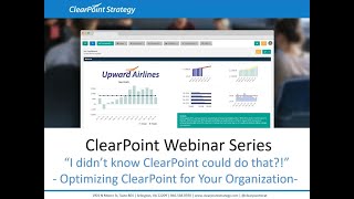
Rachel and Tricia walk through advanced ClearPoint features: customizing terminology, creating branded summary reports, new charting capabilities, and setting up custom status indicators for strategic performance management.
All right. Hello everyone and welcome to the I Didn't Know clearpoint Could do that webinar series. Today we're diving into some super cool ways to optimize clearpoint for your organization, including walking through some of our new charting features. But before we get started, here are your smiling hosts. I'm Rachel.
And I'm Tricia. And if you couldn't tell, we were really excited about the US Women's soccer team winning gold over the weekend.
As a few housekeeping announcements, we we'll be recording this session and we'll make it available within a week. The webinar will last about 25 minutes with time for questions at the end. So you can submit your questions to supportlearpointstrategy.com any that we don't get to we'll follow up with over email. Now on our last installment, we walked through the new features of ClearPoint 12.5. So if you've been curious about all those new capabilities including peer to peer sharing in the measure library and template scripting, now is a great time to check out that recording and transcript on our website or Vimeo channel. Just search webinar so today we'll be focusing on optimizing clearpoint specifically for your organization. We'll walk through customizing terminology in clearpoint to meet your preferences, create filtered summary reports with table styles that match your organization's branding, dive into our awesome new charting features, and set up custom status indicators for your strategic elements. So again, if you have any questions, please reach out to the address on the screen. SupportLearpointStrategy.com so today we'll be flying the friendly skies at Upward Air. All right, and we'll start with taking a look at the default language in our account. So we all know that the traditional balanced scorecard is made up of objectives, material, measures and initiatives. And you can see that each has a drop down in the top menu. But that's not really how we refer to our strategic elements of Upward Air.
Yeah, I was wondering where do our projects fit into Clearpoint and KPIs?
Good question, Tricia. The great thing about Clearpoint is that we can actually customize all of the terminology in our account to fit with that of our organization. So to do so I'll click into the system settings, admin options and menu and element names. This is where I can customize any of the strategic elements that appear in the top menu. So initiatives are time bound elements with clear start and end dates, key milestones to be completed, and usually a budget as well, that sounds a lot like what we refer to as projects. So I'm going to go to Edit Initiative and I'll change this to Projects instead.
So this will update the initiative naming everywhere in our account.
That's right.
Perfect. Wait, another question. The Western Division refers to Measures as Key performance indicators or KPIs. Is there a way to customize the naming by Scorecard instead of across the whole account?
I'm so glad you asked. Yes, you can customize Naming by scorecard. So for Measures, I know that the Western Division refers to them as KPIs, so let's set up that customization. So I'll click the Edit pencil again, this time for Measures, but instead of changing the naming here, I'll click on this Add Customization button. And then for the type here, I'll select Scorecard. For the Scorecard, I'll select the Western Division, and then for the naming, I can set that up here. So we'll do case. Perfect.
That makes things a lot more clear now that clearpoint is speaking our language. But what about all the other default fields in Terminology? In clearpoint, can that be customized too?
Of course. If I click into default fields, I can change the name of the, you guessed it, the default fields for each element type. I know that for Measures, we actually refer to owners as Data Leads. So if I click on the Measures left tab here and then click on the drop down arrow next to Owner, I can change this to Data Leads.
Additionally, if you want to rename any of the other terms in clearpoint, you can do so from the Field Labels menu. This include renaming things like categories, briefing books, and milestones, among others. So here at Upward Air, we refer to our briefing books as Performance Reports. So I can go ahead and rename that here.
All right, so now that we have our terminology all squared away, let's move on to something a little more fun, like creating custom summary reports. So to add a new Measure Summary Report, I'll click on the Measures top menu, drop down, and then click into Manage Measure Reports. Then to add a new one, I'll click on the plus icon here. I'm going to go ahead and name this report my Measures, since I'm going to include all the measures that I'm responsible for updating. Then in the Columns tab, I'll go ahead and I'll select Measures. I'll select that new Data Lead field. Since I'm going to be looking at all the measures I'm in charge of. We'll add the Analysis field as well. So I can make some updates and series status too. Then in the Measures tab, this is where I can select all the measures I'd like to include in my report. However, for this report we'll actually click into the Filter tab here and we'll click to add a filter where the data lead is equal to current user. So this not only shows measures that I'm responsible for, but it also depending on who logs in, they can view the same report and it will also show the ones they're responsible for as well.
Exactly. That filter is so cool. So since I can see all the measures I'm responsible for, I think this would be a great report for me to favorite. So I can favorite this report by clicking on the Star icon in the top right corner and then I can click into My Favorites from the left panel menu and I'll see that the summary report is now listed among my favorites here and I can easily click into the My Measures report directly from this My Favorites page. Another helpful page to point out for some quick navigation is the My Scorecard page. If I click into the Person icon here in the top right corner, I'm able to see all the objectives, measures and projects that I'm the owner of. From this page I can make easy updates across elements by simply clicking on the Edit icon here I could update the analysis and recommendation of the elements that I am the owner of. Switching back to the My Favorites page, I can also make that My Measures report that we just worked on creating my home page by simply clicking on the Home icon next to My Measures. What that means is next time when I log into clearpoint, I'll be taken directly to this My Measures report so I don't have to worry about any extra navigation and I can make all of my updates quickly and efficiently. This can be a huge time saver since I no longer have to go into each individual measure detail page. Open up and here you can see a wide variety of regressions that you could set up for your chart. For this example, I'm just going to grab that linear regression.
So I want.
This to be a line on my chart. So I'm going to go ahead and set that align as the shape. So to I'm going with no marker and I'm going to set the color as red just so it really sticks out against my actual data. I can go ahead and save here and refresh my preview so I can see now that I'm trending down for future periods, which is great since this measure is tracking the time of people at the gate. Once again, it is important to point out that this regression is only being added to the chart and will not be added as another series in your data table. Also, I wanted to point out you can clearly see that the linear regression is being calculated based off of the actual series here and that it's a trendline series by that blue tag. So another charting feature I wanted to point out is the ability to chart last year's data and compare it to the current year. So again to do that I'm going to click on the add icon at the top of this window. So again I'm going to use actual as the data to calculate off of and I'm just going to label this as previous year. I'm going to scroll down to my advanced options setting, open up this chart series values drop down and choose the last option which is to plot periods before or after the reporting period. So I'm going to set this offset as negative 12 since we want to look at the data from 12 periods ago since that will display the previous data from last year. To keep things consistent, I'm going to set this as a bar for the shape and then go ahead and grab the orange hex code for our upward air branding. Then I can click save here and refresh my preview again so things look really awesome here. I can see my previous year has been added based off of my actual series and that it's been offset series that's been added here. But I think it looks a little bit better to have maybe the linear regression first then previous year and actual data following it. So I can go ahead and just update the order here by dragging and dropping the series and refreshing to see.
How it all looks.
So I think that chart looks great so I can go ahead and save. So you'll notice here my chart has updated. On the measure detail page I have the linear regression displaying as well as the previous year data with the actual series. If I scroll down to the data table, I just wanted to point out we're still looking at our actual and target data. So the linear regression and the previous year that we added to the chart series has had no effect on the measured data table.
All those new charting features are super cool, but there is one you haven't shown yet that I think people will really love. So I think this new feature would work well on our number of unionized job descriptions. Measure and double click on the chart to edit it. This time we'll go into advanced options and you'll notice that there's a couple New options here, one of which is Add plot bands. So if we click on this, we can add plot bands in order to provide a visual display of the status for our series data. For this example, let's add in bands for the red, yellow and green statuses based on the ranges we have set for the status. So I'll click on Add Plot band and we'll add red first to show on the bottom. So I can just pick the red color from my color picker. And then for the range we'll do 0 to 50. And then we'll add 1 for yellow as well. Just picking that yellow from my color picker. And then that will be 50 to 100. And then finally we'll add that green for when our data is at or above target, and that's going to be between 100 and 150. So now if I click to refresh the preview, you can see that those plot bands have taken hold and it looks really cool. I can clearly see what's on target and what's not.
Wow, that is a great way to quickly see the status of each period on the chart. So while we're here looking in advanced options, there's one other thing I wanted to point out. So if we click on Enable Embed Code, you'll see an iframe appear in the field below. The iframe can be copied and easily pasted wherever you want to view the chart, like your website, an Internet site, or even your ESRI dashboard. So if I just click into a blog post that we have on our website here, you can see if I scroll down. We've embedded a chart from within our clearpoint account, so you can see it's interactive just as it is in clearpoint. You can even remove or add back the data on the chart. One thing to point out is the data on the chart is not updating live when new data is entered into clearpoint. So you don't have to worry about data being published before it has reviewed. Once the embed code is enabled within your chart, you can save it. And then if I click back into Advanced Options once it's been saved, I'll see that there's an option now to update the published data here. If I check this box and then save the chart, the data that the chart that's being published will be updated with the new data. Another important point is that Chart Embed Codes is currently a beta feature, so you need to be opted in to use it. So if you are interested in using Chart Embed capabilities, please reach out to our support team.
Clearpoint really has taken charts to the next level. Now to wrap up things today, I wanted to show you one last insider trick for optimizing clearpoint for you and your organization. I'm sure everyone is familiar with the red, yellow and green status indicators that help you track the progress of your strategic elements, but did you know you can actually customize these two? To do so, I'll take one last trip into admin options and this time we'll go to Status Indicators and from here I can rename the existing default indicators by clicking on the Edit button next to each. Most of our clients like using the default statuses, but often we see organizations adjusting the naming to better fit their lingo. A common example is renaming Above Target as Above Plan or On Track. I'll go ahead and rename this one On Track since that fits better with Upward Errors Terminology. And then to keep things consistent with On Track, I'll go ahead and I'll rename Below Plan off the Rails.
Oh man, sure is stressful when things go off the rail at Upward Air.
Agreed. I can also add a new custom status indicator. One that we see our clients use pretty frequently is a completed status indicator which we've actually already created here. So if I click to edit this completed status, you can see where we gave this a custom name here completed and then I just check the box next to Use Custom Status Indicator and was able to pull in a custom image that I picked from Upward Airs branding. Then I also selected the text code here to match with our custom status indicator. And then one important thing to point out is that this status is only being used for projects, milestones and action items since those are those time bound elements that have completed dates and would thus need to use the status indicator. So this will not be showing up for the objectives, measures or risks as an option for status. And with that we now have some really cool custom charts. Our measure summary report is well branded and filtered for optimal use and we even have custom terminology and status indicators set up. We've really accomplished a lot in the last 25 minutes and you can learn a bit more about organizational branding in particular by checking out Tricia and I's training session from this year's clearpoint Strategy and Performance Management Summit. Just go to the support center on our website and search branching now. With our remaining time today, we'd love to open up the floor for your questions. So here's one that's come in. What if I want to create a whole new field altogether rather than renaming existing fields. Is there a way that I can do that? The answer is yes. While the default fields in clearpoint are great starting points, there are limitless possibilities for custom fields. So in admin options we can click on this custom fields menu and you'll see to the left that there's a tab for each element type. So if I click into Measures, I can add a custom field that's specific for my measures. I can click the plus icon, give the field a custom name, and then you'll see we have a bunch of options for field types, including a pick list field, image field, yes, no HTML with data, and lots of other really great options to fit exactly my needs for my custom field.
Awesome. That's great. That's so flexible for your needs. So we had another question come in. Can we still save customized charts for other users to apply to different measures so do not have to go through the process of customizing them again? So that's a great question because I know the charting has changed a little bit. It looks a little different, but you still have the capability to save custom charts to be available for other users to use. So I just double clicked back in to edit our time at gate chart here. Under the chart type dropdown, I can open this up, scroll down to the bottom where I see custom chart JSON. If I click on this, I can easily click on the Add custom chart type and then rename this to something really clear like Upward Air branding so my users will know exactly what this chart will be used for. And once I add this and save, the next time a user was to log in, if they were to edit a chart, they can just open up the chart type, click on Upward Air branding to apply that same branding that I that you can see on the chart here. Awesome.
And it looks like we had another one about charting come in. So if I am publishing multiple charts, is there an easy way to see and manage all of the charts being published?
That's another great question. So of course we saw when we were in the single chart that we were able to update the data to be live. But you do have also the ability from admin options to click into chart options and then embed charts. From here you can see all the charts that are being published and you can also select all the charts and refresh all published data at the same time. Additionally, you can see from here you can unpublish any charts that you no longer want to share.
All right, well that looks like it's all we have time for today. Thanks for taking the time to optimize clearpoint with us. We hope you can now confidently say, I did know clearpoint could do that. See you next time. And happy reporting.
More from Ted




AI in Local Government: How the City of Durham Analyzes Strategy, Risk & Performance

How Coral Springs Won the Baldrige Award — Blueprint for City Excellence | ClearPoint Strategy


AI, Data, & the End of Gut-Feel Strategy: Why Strategy is Becoming More Data Driven
Strategy Needs Accountability: How to Drive Project Follow-Through and Execution