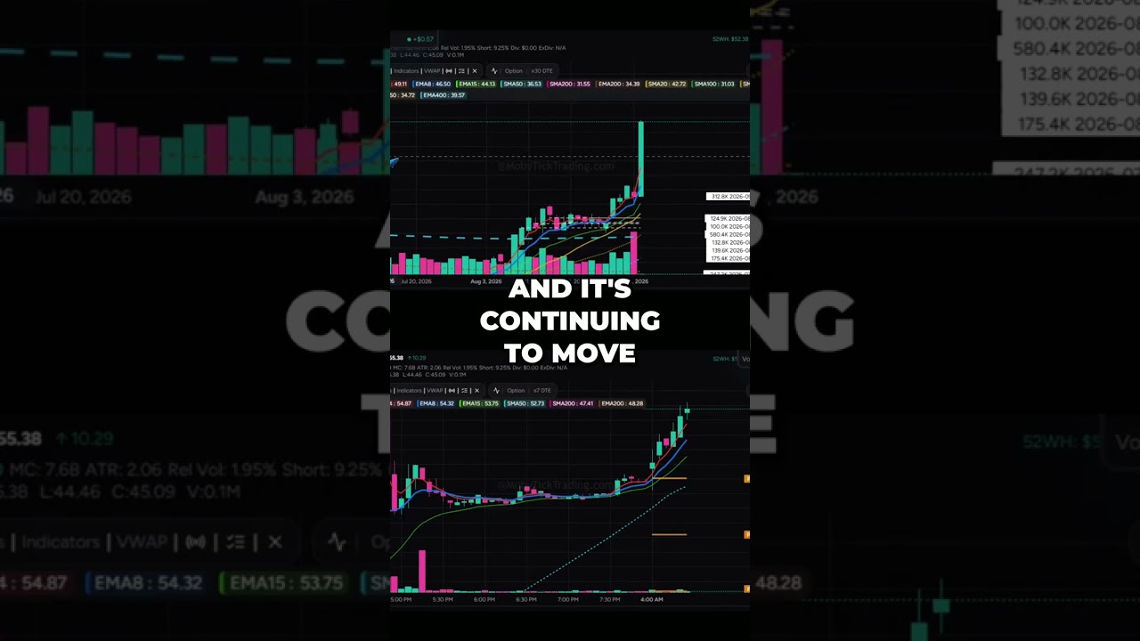
Dave Barnhart walks through building a custom trading dashboard using a platform's layout tools. You can add rows and columns, resize them, drop in charts and components like time & sales and trade mapper, link everything by ticker, and sync timeframes across multiple windows.
Chapters
Custom layouts is a great new feature that we have. Since we have all of these different options here, we have the dashboard, block trade indicator, watchlist, ETFs, opportunities, things like that. What some traders want to do is they want to be able to create their own dashboard. So if we come down here and we go to custom layouts, we can add a new layout. Now this lets us Add rows and columns. So we're going to start off here by adding a row, and we can have the row height. So this can go extra small, small, medium, large, and extra large is pretty much what you can see there. Now I'm just going to go to small like this, and then here horizontally, this is instantly 100%. So let's go ahead and put this at 33%, and I'm going to give this one a chart. This one here I'm going to add. This one can be 33%. You can pick any of them. This one also will be a chart, and then this third one I will also set as a chart. Now I can add another row. And let's put these ones as small. This one also can be 33%. This one here will be 33. This one here will be 33. So this year I'm going to do— I'm going to select a time and sales. And then this one here, I'm going to choose something called Aggregate Prints and Print Summary. And then here I want the Aggregate Prints. And we can continue adding as many things and as many rows and as many components as we like, and multiple components. So now that we have this here, we have to give it a title. I'm going to call this one 3 charts. I'm going to choose save. So now when I go to my custom layouts, I have my 3 charts, and now it says to select a ticker. I'm going to choose SPY. That's what we've been looking at. And now what happens, since we set our indicators and all of our configuration on the print lookup screen, this by default, when you add a new component, if there's no settings for it, it will get it from your print lookup, which will save you all of the customization for each component that you actually load. Now, the other thing here too is we have these colors. So notice here, this says SPY and this color says blue. Well, we can have all of these different colors here matched to different components. For example, if I wanted this time and sales to be something different, I could do that by clicking the gray button. So this instantly links to the SPY. You can have the time and sales just be completely agnostic if you wanted. It's gray by default, and when you click it, you can, you can select a color. So here it's the SPY, but I can match a color with anything that I like here. So the idea here is if I change this, for example, there's 5 minutes. This one here will be, say, a 15-minute chart, and this one here can be a daily chart. And because all of these are linked, say for example, I'm going to set this, um, these prints here at, say, 600,000. So now because these are, these are all matched together, If I click on this 562.51, it'll actually show on all of the charts that we're actually trading. So now I can watch my 5-minute chart, my 15-minute chart, and my daily chart all at the same time. So here's an example how we can mix things up. Here's a color here, so I'm going to change this one to orange, and then over here I'm going to change this color To red. So I'll set this here to orange, and now I can select a different ticker. Say we did the X for U.S. Steel, and then I can set this to red, and I can pick a whole different stock. So QUBT is what we called out this morning, and then we can have specific time frames. I'll make this one say 15 minutes. This can be a 30-minute chart. And then we can also link our time and sales to whichever we like. We can have multiple time and sales. We can have multiple aggregate prints or print summaries. I can change this if I wanted to add something specifically to this QUBT. I can switch this to red, and then I'll put this down to 50,000 to see what we have. Now anything that I click in here will show up on the red chart because of this here. They're linked together, so you can have an infinite number of ones. So you can build 5 different custom layout pages as large as you like, and when you select the row and the column size, you can choose whatever you like out of here. Top Trades is from the dashboard, Pre-Market Volume is from the dashboard, Prints also, and Economic Calendar News. These are all dashboard things. Late Prints, you can, you can show that. You can have a watch list that's in there. You can have charts, aggregate prints, print summary, seasonality, a trade mapper, and then block trade indicators there if you like. So this is fully customizable for whatever you like to see. Hopefully you've enjoyed these updates. Please like and subscribe, leave some comments. I'd love some feedback on how we're doing with making your life easier trading. Anyway, happy trading everyone. Look forward to bringing you new features in the future. Take care.