How To Use Print Lookup With Moby Tick

Dave Barnhart walks through MobyTick's Print Lookup tool for tracking large stock trades. The platform shows live pricing, charts with moving averages and 20-year seasonality data, and filters for institutional trades by size and time. A three-bar signal (price above 8-EMA, rising volume, 4-EMA crossing above 8-EMA) marks potential bullish entries.
Chapters
Hey there! In this video, we're gonna have a quick look at the print lookup feature in MobyTick. So we don't have anything selected now, but how you get there— there's a few different ways. The first thing is from the menu on the left-hand side, you choose print lookup. I don't have anything selected yet, but what I can do is come over here and put in a ticker. I'm going to put in the SPY for the S&P 500 and select it from the list. So right now what we have, we have some information across the top. It's— we're at $598.47. This is always live as long as the market is open, pre or post-market. We're getting live pricing and the chart is updating. So we're up 27 cents for the day on that. We can hover over the name of the ticker, which will tell us exactly the definition of the stock or ETF, what it actually does. We can see if there's earnings, the market cap, and the 52-week high and low. Some information there. We also have a chart here, and as we're building out the features here, this is coming with a built-in 4 exponential average and 8 exponential moving average where we're actually having a shorter-term trend. Now this actually shows you the chart on the daily so far, and then we also have seasonality on the right-hand side. So this seasonality chart The green line is the historical average over the number of years up to 20 years. This is saying 2004 to 2024, and the red line is the current year. So we're actually trying to find a correlation to see if the current year is following the 20-year trend. Now, the 20-year trend might be a little more smooth because it's averaging out 20 years. This is averaging out the previous day, the difference in movement from day to day. This will be a little more wild, but we want to see if we're actually following the trend here. And it looks like we are following the trend. I'm going to click the X there. Now by default, the 10 largest trades in the last year are added to the chart automatically. So we can see that here. We can see some of these 11 million from March 28th at 522. 516 is 10 million, 12 million at 494.38. You get the idea here. These can be support and resistance lines because remember, These large institutional trades are worth billions of dollars, and that level of commitment to the price action of the stock means that it's actually going to move. So we can actually manipulate this here a little bit with our calendar. We can say, well, I want trades just today, for the week, the month, 60 days, 90 days, 6 months, year, or all. So we could choose all, for example, And get all of the trades back from January of 2020 and then start filtering through. But what I want to look here is on this right-hand side. This is telling us that for today, November 11th, there's 1.4 million shares at $597.88 over 10 trades. So of all the trades that came through at this price, there were 10 of them for 1.4 million. So we don't miss anything at all. If I click on this, it then gets added to the chart. We can see that this was added up here. So let's go ahead and pick out anything that was over, say, 4 million in the last year. Okay, so we see that this one, October 18th, there were 5 million at 584.54. So down there. Now look, when we're looking at this year, That seems to be a bullish trend because we actually— it came in here on this day, then we went sideways, came up, tested the trade, the print again, came back down, and we closed above it. The day that we closed above it was the entry point. So this is— we're in a bullish trend right now, and these are the additional trades. So look, 584.06 and then 584. 54, that's 11 million altogether. That's thickening the line. 569.98. So you can see that we're actually forming support and resistance here just by clicking and seeing the prints on the chart directly. Now you can manipulate the chart a little bit. You can zoom in, you can zoom out just like you would on a normal chart, back and forth. And for now, this is a daily chart. We are working on adding different timeframes, different utilities, things like that. You can turn off these moving averages. There'll be more coming. You can turn them on or off. There's a signal pattern here where if the price is above the 8 exponential moving average, that gets you 1 bar. If we have increasing volume, that gets you 2 bars. And if the 4 has crossed above the 8, that gives you 3 bars. which is in some trading circles, that's a bullish confirmation of a great entry point to go long. Down here on the left-hand side are the individual trades. So this is still saying, this one's, this one here is saying September 13th to November 11th. So if I click on this, this is saying the last 60 days. So if I wanted 90 days, I could do that. 60 days, 90 days, I can do customer. If I do all, for example, let's look at that. We can choose specific share sizes. Now these are individual trades where on the right-hand side they're aggregate. So it would count, for example, this 569.98 was 29 trades totaling $4.2 million. These are the individual trades, right? So we're looking here at 597.88 and we can see these ones, 1, 2, 3, 4, 5, 6, 7. You can see those together. And the actual share size and the price. And then we actually see the condition. Now, this is a little bit different here. It gives us a little bit more detail into what's going on with the actual trades. Now we can choose market hours. So since January of 2020, we've recorded 33,477 trades that are within market hours. We could do post-market. There's 28,000 in post-market or pre-market. There's only 299. And if we do all conditions, there's 63,554 altogether trades that we have since January of 2020. So let's have a quick look at these things. Now we have conditions like this qualified contingent trade. See if there's anything else. Most of them are that derivatively priced, sold out of sequence, something like that. But let's say, for example, what is a qualified contingent trade? Well, what we can do is I am going to just open another window here of Moby, and I'm going to get us back to the home page by clicking MobyTick. This will get us to the help section on the landing page. I'm just going to click help. And here's our Help Center. So if I go down to Trade Types here on the left-hand side, we can see all of the trade types. If we wanted to see what a Qualified Contingent Trade was, we can click on it and then we can learn more about it here. What is it? When does it occur? Characteristics, impact on trading data, why it matters, accessibility and restrictions. It gives you an example. So here, a trader simultaneously executes a stock trade and a related options trade as part of a delta-neutral strategy. This combination is reported as a qualified contingent trade. So usually some combination of a, of a trade together qualifies as that sort of thing. So you'll get to learn these things if you're actually interested in that. There is the ability to learn those sorts of things. If we look at, say, pre-market, or let's go to all conditions. So we have things like the official closing price. Form T, average price trade. So we can actually go back and learn what some of these are. If you wanted to filter for trades that are specific to trade types, we can click on these conditions and we can just choose the ones that we want, right? If you were interested in just Form Ts, we could come down and choose Form T, and there's 22,000 of them, these Form Ts, if we do all conditions. Some of them occur after hours. Actually, a lot of them, 22,000 of them occur after hours. And what they are technically are trades that should have occurred during market hours. They could be reported late, something like that, but we can always see that and get the proper definition over on the help page. So make sure that you reset this back to select all so that you're not filtering out and excluding some trades when you're actually looking for them. We can choose minimum share size here, so say 400,000, and then we can actually see— we can eliminate the noise of lesser trades. And if we look at market hours where the meat of the trades actually occur, then we can see this here. So there was a 1 million today at 598.15, November 11th, so we can see that there. And if we reset this here, we'll go back up to— let's go back up to a million that we see this, and we see this here, 598.14, and we'll put that on our chart there. When we're on market hours, opening trades might not have the impact in the market movement. You see these large trades on the Block Trade indicator just as Market Center official opened, which is part of this Price discovery, things like that. Same thing with the closing trade price. So we might want to ignore those. You don't have to. You can untick them and include them in your market hours. Post-market is anything after 4 PM all the way to 8 PM. So you can see that there as well. Here's a neat example. Say for example, we wanted to see what is the largest trade on the SPY in the last 4 years during market hours. Well, let's click on market hours. I'm going to click on the date. I'm going to choose all, which we have, and then I'm going to filter by shares or sort by shares. And the biggest one that we had was on February 28th, 2020. There was one trade for 4 million at $290.63 for $1.1 billion. And then we can see all of these ones, November 30th, June 30th, 11:18. So all of these together, these are massive, massive trades. So in the last 4 years during market hours, that was the big one. If we go to all conditions, then the largest trade was $9.7 million, which was a closing trade January 17th, 2020. You can see that there. So we have other options here. We can hide our chart if you don't want to see the chart. That gives you more space for looking at this a little more in a consolidated sort of manner. We can show the chart again, and then we also have our integrated watchlist, which we can talk about later. But when you create watchlists, you have the ability to choose whichever watchlist that you like here and then pick the columns that you want to see. So actually, there's many different columns that you can choose, and here I've consolidated that a little bit for my watchlist, the current price, and then I have bullish above targets and bearish below targets. So I don't want to have a bias on the stock because we're trading the dark pool. If we go above a specific level, I have a trading plan. If we go below a specific level, then I have a, a different trading plan. So for example, if SPY broke above 586, I'm bullish. There's my first target, 587.50. And I have several targets there. And for the other thing that I have is gold. If we broke below $245, then I have, I have an entry point with specific targets. So I can just scroll down and see what's working on my watch list here. And if I click on any of these, say for example GLD, we can see that GLD didn't hold the 4 and the 8. And we gap down, and here's our signal is bearish on that as well. And then so we can plan it, we can draw more lines on the chart by adding more trades, something like that, and plan a trade setup if we choose to take that. I can remove all of the trades by clicking the X here, and I can also adjust what columns that I see. If I don't want to say the number of trades, I can remove that. And the same goes here on the left-hand side. If I'm not interested in seeing what these trade conditions are, I can just remove them if you feel that that's noise. So anywhere within Moby, since we've covered the dashboard, if we look at the dashboard and we see any of these tickers that are here, when you click on them, it actually will open a whole new different tab for Moby with the stock that you're looking at and your presets. So we can see all of that information. You can have as many tabs as you like of Mobi across the top. So with many traders that have multiple windows, a lot of people have the Block Trade indicator on one, they might be doing some chart analysis on another one, you might have your watchlist on another monitor. But the whole concept here is to get you the most actionable information in as few clicks as possible. All right, on to the next video. Hope you enjoyed this one.
More from Dave


ServiceNow $SNOW & Hewlett Packard $HPE earnings trade setups following Institutional Positions
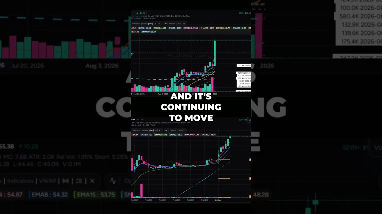

GTLB GitLab Explodes +$10.31 Breakout! vs CRDO Credo Technology Major Dark Pool Flush


Massive Dark Pool Prints on Nasdaq $QQQ and Gold $GLD! Smart Money Positions revealed
