MobyTick Trading Platform Just Got a MASSIVE Update!

Dave Barnhart walks through MobyTick's March 14th update, which adds a filterable Time & Sales window, the Intraday Trade Mapper for entry and target calculations, unlimited moving averages and VWAP, and customizable multi-row dashboards that link to specific tickers.
Chapters
Hello traders, in this video we're going to discuss some major updates that just came out with Moby yesterday or on Friday, which was March 14th. So we've got some how-to videos here and give you an overview of how trading becomes easier with MobyTick. So really our goal is to get you the most actionable trade setups in as few clicks as possible, so we're working on that. So let's go ahead and have a look. We have time and sales now, which is new. We have an intraday trade mapper. We also have indicators on the charts, and then we have custom layouts. So you can actually design Mobi the way that you want. So let's go ahead first and look at time and sales. So what I've done is looking at the print lookup here, we've entered a ticker here, which is the SPY, and we have the normal layout here. Now there's time and sales. That's here as part of the chart that you're looking at. So if I click on time and sales, then by default it's, um, all time and sales, and we can see them coming through, all of the trades here. And then you see the exchange and then the bid and the ask, whether it's at the ask, at the bid, between or below or above the ask, things like that. And use all of that is customizable. So we can see these trades actually coming in. So let's go ahead and edit this. So I'm going to click the 3 ellipses here Now this is set to all. If I untick all and say I want everything over 100 shares, I can do that. Now we can configure our colors. We have at the ask, at the bid, above the ask, below the bid, in between the bid and ask. And these are for your bid and ask colors. So when we click on the color, you can just pick one of the 16 billion colors that's available, and then you can set that there. You can also Choose which columns are visible: the time, the ticker, price, size, exchange, and the bid and ask. And we'll choose submit. So now this, the SPY is filtering for anything that's 100 and over. So if it's moving too quickly for you, like the ones, the twos, the tens, things like that, that's great. The other opportunity, what people do is say, for example, you wanted anything over 5,000 shares. So we can do that and choose submit. Now what it does is Moby tracks the number of trades over 5,000. It keeps that for the day for as far as time and sales is concerned. And what it does here is any trade that comes through that's 5,000 shares or higher, it will show up in the time and sales. So here we see that we have these trades over 5,000 and it's Kind of cool here because you can actually scroll down and see because it keeps them in the database for the day, and you can actually scroll down and see which ones were larger. So twenty thousand, ninety eight hundred, seventy five hundred, things like that. And also, if you're watching, so you can you can adjust this to whatever you like. We'll just put this back at all, for example, and you can see how quickly everything is coming in. So the idea of time and sales is quite helpful because you can see large orders come in. You can spot things. Something like refreshing, where if you have consistent orders coming in all the time on the bid or on the ask and the price isn't moving, you can learn to spot those sorts of things. You can also see real time if big trades come through while you're actually trading. It's good to see where the orders are being placed and executed at the time. The Trade Mapper is a new feature just released on Friday the 14th of March. It is a work in progress. A good portion of it does work. There's still some tweaking that's going on as of the recording of this video. Now, the purpose of this Trade Mapper is for intraday trading, and how we usually set up our trades is we use pivot points and Camarillas and major psychological levels like the 50-cent, the the, the, the dollar, the $2.50, the $5. And when we're looking at this, if we click on Trade Mapper at any point during the day, the time where it's most helpful is when you're getting ready to trade, so pre-market. And so if we click on the Trade Mapper here, what this winds up telling us is we have a pocket size of 20 cents where we'd like to make some money. So what we do is, as a, as a trader, it's like, okay, well, the SPY is is a $560 stock. Show me a trade setup where I can make at least 20 cents. Okay, and the ATR here is $10. And then in this case where it says a minimum of 20 cents, this is saying that our entry would be $564.75. So right now we're at $564.50, and here's— we could get up to $564.75, or there's $565.07. So what we would do is if we wanted to take this trade, we could click entry here, and, and when it breaks there, then you should be able to get in if that's where you want to get in. Now we can, we can add our additional targets by clicking on them. There's 565. Now this here, this, this table tells you all of the major psychological levels, and it tells you the profit in between the levels, right? So if we were If this was picking up and we wanted to get in at, at, um, at $564.75, well, the first target would be the dollar level, which is 25 cents. And then it's telling us that there's a Camarilla here at $565.07, so that your total there would be 32 cents. That's an additional 7 cents difference. And then, but the idea here is that you're making your pocket size. Now I can set this pocket size, say for example, to 50 cents Over here, so 0.5. I'm going to include dark pool trades over 500,000 for the last 20 days, and I'm going to choose apply. So now what it does is it says, okay, well, 565.25 now is a better entry for 50 cents. So 565.25, and then our target here is 565.75. 566, 566.20. So we can see here that, that 566 is the dollar, this is the quarter, this is a Camarilla R3. And so the first pocket that we're looking for where we can make our money is the closest one to where we're actually trading that we can get in and make some money on that. So this with a 50-cent pocket, if I want to get in and potentially stay in for my 50 cents potentially get in at $565.25, and I'll click that, and that shows up on the, on the chart there. Now the bearish entry says $564.50, so we would have to break down $564.50, and then we could go to $564, and then it shows you that there's a cam here at $563.94. So you can see that there's 6 cents difference, but the $564 is the major dollar level, and we would expect that we might hold this, at least bounce on the first test of that. And then it's, it's not telling you to get out of these, right? These are, these are actual targets and things for you to keep in mind. Now we can go and look here at 563.81. There's a 741K print, and you can click that and add that to the chart too. If you like any of these that you want, you can just click and add them for your trade setups. So you can actually see that there on the chart. But we can also set up alerts for our bullish entry. And so if we hover over this bell, it says create alert, and it says the alert is processed successfully. And I'll do that on the bearish side as well in case we want to take both sides of the trade. So when we're looking at alerts, that's the alarm clock here, and we can see what it actually set up. So I'm going to click on alerts, and it says trade mapping Bearish entry on the SPY, trade mapping bullish entry on the SPY, and this one says bullish above 565.25, and this one's bearish below 564.50. So what we can do is you can edit these and set them up how you like. The condition is, for example, above or below. We'll choose update, and there's a whole video on setting alerts. Sure. So if you're interested in that, then go ahead and check the video on setting up alerts. So this one actually said that it was triggered. The other option that we can do is add it to a watchlist. And so if I hover over this, it says add to trade setups, which is actually a watchlist that I just created. I have this one called trade setups, and you can watch my watchlist video as well if you would like. But here we go, add to trade setups. Whatever your current watchlist is that's selected, this will link to it. And you— and if I click on this It says, are you sure you want to add SPY to your trade setups? Now, if the ticker is already in your watchlist, it'll tell you— it'll ask you if you want to overwrite it. And so here we go, SPY has been added to the watchlist. I'm going to come back over here and I'm going to refresh. And here it is, we've got the SPY with all of the values there. It's got a bearish signal, and then it says bullish above 565.25. And then we've got all of our targets that are here. Now in my watchlist, I set 7 bullish and 7 bearish targets, and so it fills it in as needed all the way through to here. Now this, you can, you can download this to Excel. You can select your columns, you can reorder in your watchlist. So this is great for automatically setting up your, your trade setups. You can change any of this if you like. If I want to remove my lines on the chart here, I can click the X on this and it will remove my bullish and bearish entries. So once I have this on, it will show up on other charts until I come back and I click the X. The other way to see the Trade Mapper is if we look at the dashboard and we look here at market volume. So we use this market volume in mapping out pre-market trades. So after 4 AM, we'll start looking for, for trades where today's volume is actually quite high. So pre-market, this actually says pre-market, and if I click on it, if I can, if I click on the filter, then I can set the minimum volume here and the minimum price. So here it says 400,000, so we want trades that are at least 400,000. When I map out trades for the YouTube channel, I'm doing it at about 5 AM Eastern, and so I set this at 10,000 because there's not many There's not many that have this much volume. Maybe there's 4 or 5 of them, but here it's actually showing you the pre-market volume. And where we get the Trade Mapper is if you hover over one of these rows and you click on it, you'll get the Trade Mapper. If you click on the ticker, then you'll get another print lookup. So say for example I wanted to map out QBTS. Well, if I click on this, I actually get a pop-out that says QBTS and it's the trade analysis and it's saying an entry at $12. Now this is because it's taking the current price and looking for major levels. Here at the— it's an entry of $12 and then with a level of $12.50, $12.75, $13.59. You can see all of that information there. It says the initial is $11.88. The break-even is 12, and the trailing stop is 50 cents, which is our pocket size. And then the reference level is 11.90, which is the R2. So we've got the entry price of 12 with a target of 12.50, 12.75, 13, 59, 14, and the bearish setup is at 9.25. So the idea here, if there's anything in the way that could cause you a problem when you're looking at this, and if you choose that you want to map it out, Then click on the ticker. This also breaks down the price levels, the pivot levels, support, resistance, and the trade levels. And here we have the similar sort of setups here where you have your pocket size, minimum trade size, how many days back, whether you want to include dark pool, and then we choose apply, and then this updates. You can also add to a watchlist from here, which is the trade setups. You can export to PDF or you can export to Excel. If I choose export to PDF, this is what it will look like, and you can see that there. I can choose generate PDF and it shows up in my downloads. I'll open the file, and this gives us 3 pages. There's our bullish bearish trade setups, all of our levels. So there, there you have it there. So you could print this out and have notes. If we choose that we want to generate an Excel file, and it should export and download for you. A new feature in Moby is indicators. So we did have the 4 and the 8 EMA, and that's where we started with our development. What we have now is we have this indicators button here where you can add an infinite number of moving averages. So there's exponential and simple moving averages. So we do have some traders that have 10 or 15 or 17 moving averages on some of their charts. And so the idea here is that you can add whatever you like. So let's go ahead and add an indicator. And so I'm going to use a 4 exponential moving average. And now I have the intervals that I want to apply them on. If I choose intraday, that's everything less than the daily charts, the 1-minute, 5, 15, 30, 1-hour. And then you can choose individual ones if you like. Like that, you have 1 week or 1 month. So I'm gonna put this on all because that's how I do it with my chart. My line color, mine are always red for my 4 exponential moving average. And then I can do a solid line, dotted, dashed, dot with space, or dashed with space there. And then I can save the indicator. Now my red line here is on the chart. If I think that this line needs adjustment, something like that, I'll come back, I can edit it, and then I'm going to reduce this line to a 2 and choose update because it was a little too thick. So I want to add a new indicator. So I'm going to put this one up to the 8 EMA, and this will be all. This one is usually blue for me on mine, so I will make it more blue. That'll be 2. That's also a solid line. So there's the 4 and the 8 there. You get the idea. If you want, some people do the, uh, the 21 exponential. Or say the 50 simple, the 50 simple moving average. This will be on all charts, and this one that I have on mine also is a very dark blue. We'll do this one like that, and that'll be a 2. And say let's make this one a dashed with a space. I'll choose save, and then you have that there. Okay, so we, we do see those together on this, and this is a 5-minute chart. Now you also have them showing up here rather than, rather than on the price scale. They're up at top, so they're in the order that they were added. We've got this 4 EMA and it's 564.42, the 8 EMA and the 50. So that's, that's what they are there. If we look back at our indicators I can enable them or disable them, right? Or you can turn them on or off individually like that. The other option here is you have these up here. Some people who know all of what their colors are, then you can actually click this little X at the top and it says hide EMA SMA. We'll click that and it goes away. Now we have an eyeball, and if we poke it in the eye, they come back. The next indicator that we have here is a VWAP. This is just the straight volume weighted average price. You can choose a line color and a width, same sort of styling, and we could put them on all time frames if we like, like this. And then I'll choose apply, and then you can see the VWAP that's there. Now the— there's another one that's being added which should be out In the next day or two. It's called an anchored VWAP. That's usually on the daily chart and it's a longer period timeframe. So what you wind up doing is you set your anchor date and the one of the most recent ones is March 25th, 2022. Usually that happens around some cyclical pattern, like either there's a war or rate cuts or something that changes the market structure. You can add, you can update when you want the VWAP actually to be calculated. A lot of institutions use that number and it's actually quite strong, so that one will be coming out as well. The VWAP is showing up here on the price line as well. So there you have it for the new indicators. Custom layouts is a great new feature that we have since we have all of these different options here. We have the dashboard, block trade indicator, watch list, ETFs, opportunities, things like that. What some traders want to do is they want to be able to create their own dashboard. So if we come down here and we go to custom layouts, we can add a new layout. Now this lets us add rows and columns. So we're going to start off here by adding a row, and we can have the row height. So this can go extra small, small, medium, large, and extra large is pretty much what you can see there. Now I'm just going to go to small like this, and then here horizontally, this is instantly 100%. So let's go ahead and put this at 33%, and I'm going to give this one a chart. This one here, I'm going to add— this one can be 33%. You can pick any of them. This one also will be a chart, and then this third one I will also set as a chart. Now I can add another row, and let's put these ones as small. This one also can be 33%. This one here will be 33. This one here will be 33. So this year I'm going to do, um, I'm going to select a time and sales. And then this one here, I'm going to choose something called aggregate prints and print summary. And then here I want the aggregate prints. And we can continue adding as many things and as many rows and as many components as we like, and multiple components. So now that we have this here, we have to give it a title. I'm going to call this one 3 Charts. I'm going to choose Save. So now when I go to my custom layouts, I have my 3 charts. And now it says to select a ticker. I'm going to choose SPY. That's what we've been looking at. And now what happens, since we set our indicators and all of our configuration on the print lookup screen, this by default, when you add a new component, if there's no settings for it, it will get it from your print lookup, which will save you all of the customization for each component that you actually load. Now, the other thing here too is we have these colors. So notice here, this says Spy and this color says blue. Well, we can have all of these different colors here matched to different components. For example, if I wanted this time in sales to be something different, I could do that by clicking the gray button. So this instantly links to the Spy. You can have the time and sales just be completely agnostic if you wanted. It's gray by default, and when you click it, you can, you can select a color. So here it's the SPY, but I can match a color with anything that I like here. So the idea here is if I change this, for example, there's 5 minutes. This one here will be, say, a 15-minute chart, and this one here can be a daily chart. And because all of these are linked, say for example, I'm going to set this, um, these prints here at say 600,000. So now because these are, these are all matched together, if I click on this 562.51, it'll actually show on all of the charts that we're actually trading. So now I can watch my 5-minute chart, my 15-minute chart, and my daily chart all at the same time. So here's an example how we can mix things up. Here's a color here, so I'm going to change this one to orange, and then over here I'm going to change this color to red. So I'll set this here to orange, and now I can select a different ticker. Say we did, uh, X for US Steel, and then I can set this to red, and I can pick a whole different stock. So QUBT is what we called out this morning, and then we can have specific time frames. I'll make this one say 15 minutes. This can be a 30-minute chart, and then we can also link our time and sales to whichever we like. We can have multiple time and sales. We can have multiple aggregate prints or print summaries. I can change this if I wanted to add something specifically to this QUBT. I can switch this to red And then I'll put this down to 50,000 to see what we have. Now anything that I click in here will show up on the red chart because of this here. They're linked together, so you can have an infinite number of ones. So you can build 5 different custom layout pages as large, large as you like. And when you select the row and the column size, you can choose whatever you like out of here. Top Trades is from the dashboard. Pre-market volume is from the dashboard, uh, prints also, and economic calendar news. These are all dashboard things. Uh, late prints, you can, you can show that. You can have a watch list that's in there. You can have charts, aggregate prints, print summary, seasonality, a trade mapper, and then block trade indicators there if you like. So this is fully customizable, for whatever you like to see. Hopefully you've enjoyed these updates. Please like and subscribe, leave some comments. I'd love some feedback on how we're doing with making your life easier trading. Anyway, happy trading everyone. Look forward to bringing you new features in the future. Take care.
More from Dave


ServiceNow $SNOW & Hewlett Packard $HPE earnings trade setups following Institutional Positions
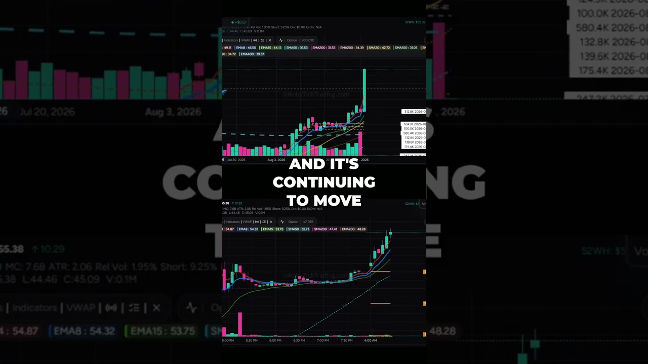

GTLB GitLab Explodes +$10.31 Breakout! vs CRDO Credo Technology Major Dark Pool Flush


Massive Dark Pool Prints on Nasdaq $QQQ and Gold $GLD! Smart Money Positions revealed
