Ep. 9 - Branding, Naming, & Design: How to Do Better
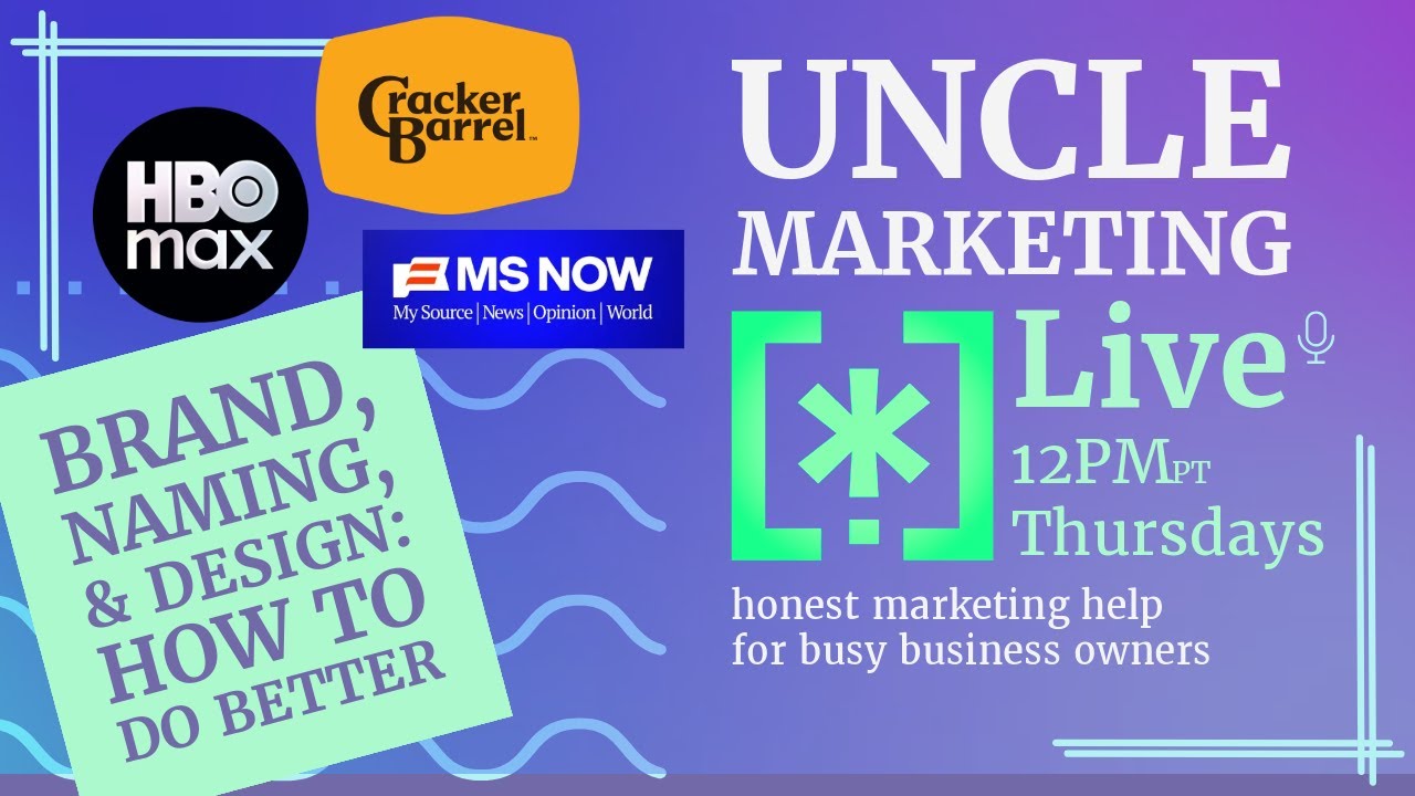
Derek Cheng breaks down why corporate rebrands fail, using HBO, MSNBC, and Cracker Barrel as case studies. He explains how groupthink and bad testing derail the process, then walks through naming, logo design, and how to actually work with designers to get it right.
Chapters
Good day to you. All right, lots to talk about. Drag it. Oh, that's running. All right. These last few weeks, there have been some pretty egregious rebranding releases. Let's get into how they happen in a corporate setting and also talk about strategies for your own brand. And branding. So I want to focus— I actually want to preface that we're going to be talking about naming and design as part of brand. Those of you who know me know I actually don't consider naming and design the entire— I don't consider naming and design the entire brand. Your brand is much deeper than that, and you can check out other content. That talks about how the brand promises— how the brand promise is everything that you do. But for the sake of this discussion, we'll talk about naming and design. So let's start with the first example, HBO. HBO is a respected name. and entertainment. They're the inventors of prestige television, going all the way back to when they launched. The concept of home box office meant you were getting theatrical-quality entertainment and premium sports from your home. And when streaming started, they added HBO Go and HBO Now, so it became more confusing. For folks, uh, but it was a way for HBO to, um, kind of extend itself beyond the cable box. And these eventually folded into HBO Max, and it became Max, and now it's back to HBO Max. So why all this back and forth? Uh, well, part of it had a lot to do with the merger with Warner Brothers. But a lot of it came from the top by someone who isn't a marketer, isn't a designer as far as I can tell from here, someone without a lot of taste. And taste is critical to naming and design. Okay, so it happens, it happens a lot, and it's expensive when it does happen. But let's keep going. Because we're on the subject of TV, let's also talk about MSNBC. It recently rebranded and redesigned itself as MSNOW, or M-S-N-O-W. MSNBC initially started as branding for Microsoft's news channel in partnership with NBC. Even after Microsoft stopped, though, they kept the MS part of MSNBC. I think the assumption is that because it's a news network, that they deal in an amount of trust and they didn't want to rock the boat or lose viewer loyalty. Honestly, if your loyalty is that fragile, it's not loyalty. More likely, I would say it was probably— I might shoot myself for this— more likely it was cowardice. Cowardice by Comcast when they acquired the MS properties. Again, Comcast is hardly a brand-forward company. They're kind of like the Borg on Star Trek. They assimilate brands rather than holistically try to take them into a direction. And for them, it's a line item— cables on the ground, shows on the screen. Logos are just things we own. Okay, that's Comcast mindset. But now NBC, which is owned by Comcast Universal, uh, what NBC, which was owned by Comcast Universal, no longer owns MSNBC. It's really complicated. This is the— this is what happens when you tie, um, brands together, uh, and then when they Split out, and this happens a lot in terms of the rebrand. So, okay, great. It's no longer NBC. MSNBC is no longer affiliated with NBC. So it's time to rebrand. So what do they do? They went with something called MS Now, which stands for My Source for News, Opinion, and the World. So, um, folks, I give this about 6 months. I think the name and design are pretty dreadful, like a fireable offense in my mind. It's a, it's a laughingstock, and it's just an echo of whatever Comcast people are in charge there. Okay. Here's the big one. Let's talk about the Cracker Barrel, or the Cracker Barrel. It's not a name change, simple logo revamp, and it caused a stir. They hit into some kind of political zeitgeist issues, and so, uh, All hell broke loose. They took a 50-year-old logo that honestly was a bit cluttered and tried to streamline it. The man in the in the logo is Uncle Herschel, no relation to me, who I'm guessing most people couldn't have named if you paid them, including. The people who would go to Cracker Barrel. But folks got into a tizzy. Uh, honestly, I don't mind the new logo. Simple, clear, it maintains most of the aesthetic, and, uh, more modern, honestly. That said, any long-term vision in people's minds that they have can create pushback, and people don't like change, particularly certain kinds of people. And there have been some folks who, let's say, want— don't want the world to be a specific way, and they get mad when you change that on them. Um, I don't think most people would care. I think if they had swapped it out And never told anybody, uh, they were swapping it out. I think probably 50% of people would be like, okay, whatever. Um, it's a corporate restaurant. When you go to Cracker Barrel, some old uncle doesn't come out of the back and sit with you to tell you stories while you eat. Although I will say, that's a— that could be a very franchise-saving concept. So. You know, get more gems like these when you work with me, Uncle Marketing. I can we can take things like that and go, hey, what if we actually did this? What would that look like? It would actually be kind of fun to do. But you know, Cracker Barrel's not hiring me, so I don't care. But the concept of this kind of homey place that you go and it's. of a certain era. I guess if it would be equivalent to, uh, when you go to those— they used to have these restaurants where, uh, you could dress— the people would be in medieval garb and you'd like eat medieval food and it would be a kind of a show. Um, that's not Cracker Barrel. I mean, Cracker Barrel is like a glorified Applebee's, probably. Um, With a general store built into it. I've been to one out in Tennessee. But the point is, it's a corporate restaurant. It's the food to your liking with the level of service you need at the price you expect. That's kind of the brand. That's all it needs to be. And as long as the company executes on that, that's the brand promise. They don't have to promise that your image of their design should be untouchable as the consumer. You know, consumers don't own that. That is owned by the business. And it's a weird thing that they actually pulled back from that design, the new design, and went back to the old one. I guess that they didn't really anticipate, which is again a very strange thing for a business to do. And but it happens, and I'll explain why later. But I actually don't think it's that necessary and that of a big deal to go from one logo to another. Sometimes you change the name. It's okay. As long as you do it in a, in a, in a way that makes sense. And you can explain yourself. So, and maybe they didn't do a good enough job explaining. I'm going to use Taylor Swift as an example because she's great to use as any kind of marketing example. So in a Taylor— by the way, congratulations, Miss Swift, on your Engagement. Every album, every Taylor Swift album is different. The design is different, titles are different, songs are different. Even Taylor's versions are different from the other version. So, and no one freaks out, oh, this new font, or oh, this new image. They can appreciate it, but it's still Taylor Swift. It's not like She has a logo that needs to be emblazoned somewhere. Why? Because designs and names and things, they're just of a moment. As long as you meet that moment, you're fine. Your brand isn't the name or the logo. I mean, there's certain expectations for design language that you want to build in, and there are certain echoes, but You need to be able to modify those things for time, for new technologies that come your way, for the design can't be stagnant like that, which is why Cracker Barrel moved to that new logo idea concept, but they didn't. They didn't figure out how to line it up with their core audience or their core customer base because they've never done it before. 50 years they've kept that logo. If they had every 10 years changed that logo, it wouldn't have been such a big deal. And that's a problem too. It's like you sit on something for so long It's almost impossible to move people off of it. Now, is that true for small businesses? Probably not. Small businesses, you have a real advantage in that you can reboot constantly, and most people will probably be okay with it. It might be more expensive for you, so you still want to get as much value out of a design as possible. But you also want to be able to refresh at will. You don't need to like trademark every logo design as a small business. You can just kind of promote yourself, get it out there. Most people walking down the street won't notice that big a difference as long as you are evolutionary with what you're doing, because again, Your brand isn't the name or the logo. It's what you are promising people. So I want to talk about how a rebrand happens. By the way, chime in if you want. Watching the chats, and I apologize, I'm getting over a cold. So most changes happen— most changes don't happen without major investment by companies. It is a big deal to rename and redesign the brand for big companies. So this is the corporate world, not the small business world, but we can learn something from them. You know, businesses bring in agencies, they go through all kinds of focus group testing. There are hundreds Of rejected designs and names, yet you can still get something back. Like my source for news, opinion, and the world. You can still end up backtracking like HBO and Crate and Barrel. Cracker Barrel. Oh, there's there's a there's a collab. Crate and Barrel meets Cracker Barrel. That would be fun. For this. You have to understand partly how groups think in a business. So somebody says we need to change the brand. Who is it usually? Usually starts at the top. Head of the company nearly always wants to make their opinion known. They want to put a stamp on what they're doing. If they like something, Even if their taste is terrible, it's actually very hard to push back on that person. So I'm talking about CEO, chairman, president, owner, whatever that level, right? And if you're outside, you're an outside agency, of course you wanna please the client, right? That's like basic. But if your client is a CEO or chairman, that means that person's opinion Probably gets ten times, fifty times the weight. Never mind that that leader may just be someone who's really good at operations or finance. So, but the problem is that the desire to please them outweighs the desire to challenge them. You don't want to rock the boat. Sure, CEO person, you are you're making the right. We, we want to please you, right? So the, the concept of utilizing that person as a valid feedback person, valid person to get feedback, kind of low for something as aesthetic as your visual brand and your name. Okay, but let's say they They check their ego. They're like, I wanna be even in this process. I don't wanna influence it. I want to, as a CEO, I wanna make sure that we go through the process properly and I don't wanna be a big influence on it. Just tell me what you believe as a designer, as an agency, as a marketer. Just work, just figure out what the right answer is. This actually causes a secondary issue because good CEOs want to know justification. So they're going to want data. They want to know what the people want. And in most cases, we test. I love a good A/B test. Do you like this one better than this one? Do you trigger on this one or that one? And it's all part of how auctions work on Google Ads or other kinds of things like that. So the aesthetics, however, it's one of the hardest elements to measure. Even if you could mathematically determine what perfection looks like, what ends up happening actually is a race to the bottom. You end up with the blandest option because you're asking, what do you like? What do you like? What do you like? And then the lowest common denominator Is no longer— is the killer of something that needs to be vital, it needs to be exciting. It's a weird dichotomy that happens. And if you know that in place, you can actually solve for that to some extent. I mean, there's— it's design, so there's always some potential that design Falls on its face. We see that, but you can reduce that likelihood with some structural changes. So I want to share something. So this was so my first job out of college. I worked at a company called Symbol Technologies. They were the forefront of scanning barcodes and eventually became known for wireless networking. And that's because you want— you'd want to connect a wireless scanner in supermarkets and warehouses so they could take inventory and such. Anyway, they had a lot of money and we were able to— we had to produce these manuals for administrators and programmers. So the COVID of the manual was farmed out to an agency or somebody, I don't know, some designer. And the cost, believe it or not, was over $100,000. And this is back in the early '90s. So In today's money, that's $220,000. I couldn't find any version of the COVID online, so maybe that's a good thing. Maybe they decided, this is not good. We don't want this out there. And we would never want to share this out there. But this is my best approximation of what it looked like. And honestly— and I'm not saying this is a sketch. This is as close in fidelity as the real cover that was produced. And this is a manual that went out to just about every large business that had our product. The 3D in that image is It's actually better than what was on the original because my tools for creating 3D images are better today. I wasn't going to redo everything, but the actual printing of the manual and whatnot caused the 3D to change. But this is how— this is what you got for $100,000. Back then. I'm not sure how many iterations we had for the design, but this is what the company got. And so somebody had to pick this, right? How did it happen? Well, again, it's that race to the bottom when it comes to aesthetic feedback. You get to a point in which everything that you've The things that you think you wanted, you know, you needed something, you're on a time crunch, and the— it's just a cover. I mean, that's— there's all these trade-offs you're making. In addition to that, it's like, well, we can't do it this way because it's too out there and we're a conservative company. And we can't do it this other way because it's too plain, needs to be something else. And so there's all this kind of groupthink mishmash. And what ends up happening is the lowest common denominator becomes the lowest interest in originality. There's no fire because no one wants to push the envelope. There's no fire in it because no one wants to upset the apple cart. I mean, I can go through all the metaphors, but you know them, that you get something closer to what you see today with AI. Actually, you're generating images, you're going to see slop, you're going to see Things that somebody programmatically thought is the right thing. Could be. It's not saying that you won't hit it, but if you only base it on a test that people take and only base it on narrow view of what you want to do with your brand designs, then everything will start to look the same because the algorithms will give you what you want. And algorithms can be— I mean, they can exist in the computer, but algorithms also exist socially. Our social algorithms are about kind of stay in your lane, do this thing. And that's not really how design needs to work. It actually needs to break from that sometimes. To actually get excitement going. And so that's the biggest issue is when you're designing, if you don't push yourself a little bit and allow yourself to be pushed a little bit. So what do you do if you are designing and redesigning or naming? Let me hide this. You're probably tired of looking at it. What do you do if you want to redesign, if you want to rename? How do you get something good? And good, I mean, it works technically, visually, sonically. And yet can still be vibrant enough that people go, oh, interesting. Okay. First thing. First thing is you have to check your ego as a business owner. Unless you yourself are a designer or have a very deep understanding of design. You can give your weighted feedback. You have to know yourself. And you have to— especially if you prefer looking at spreadsheets or watching sports or having drink meetings and shaking hands and all that stuff, if that's your business, You probably need to recuse yourself from the design decision and the naming decision. Your vote should count as like one person, just like everybody else. You need to trust the process that goes into it. Okay? Get out of there. Secondly, you want to still test But how you do that test and who you do that test becomes critically important. Test with the people who actually— you need them to care. Let me put it a different way. The people you actually care about, those are the people you want to test a concept with. And even with those people, you have to recognize that their feelings— and it's always about feelings. Yes, there's logical play and whatnot, but most people react with feelings. Feelings need to be taken in context. They might just be having a weird day. Uh, you don't know for sure. Anyone with feelings is subject to everything surrounding their lives. This is why the Cracker Barrel design failed. Not failed as a design element, but failed as a launch because they didn't anticipate— or maybe they did and they didn't take it seriously. They didn't anticipate that their core customer base Felt a sense of erasure, I guess, is what most of them are feeling these days. And so that sense of erasure hurts now that you— oh, you're changing our logo now too. It's too W-word, right? Um, Or it's just, it becomes politicized because of how the world is, how they're responding to the world, the current world. And so if this had happened 10 years ago, probably nothing would have— nobody would have cared. But the fact that it's happening now in the space, see, this is why Design is of the moment. You have to design of the moment. And so the Cracker Barrel issue and response makes total sense, even though from a design standpoint, it's great. So these things are happening. You have to be able to gauge them and know that when you do test something, That you're getting a view. Okay, you're not getting reality. There's something called the observer's effect too. In the moment you ask someone for an opinion, you've already corrupted honest dialogue. Their feedback is now potentially unreliable because you created an artificial situation for them. To express your design or experience your design. I'll say that again. Your feedback is— their feedback is unreliable because you created an artificial situation for them to experience what you're testing them on. You need to test as if nothing's ever changed. So how do you do that? Oh, well, one way is to change the name or change the logo for a little while and for a limited audience of people you actually respect and care about. Don't tell them that you've changed it. Just see what happens. Look for that. It's a smaller subset. It's a way to test In the wild. And again, know that whatever tests you're running can be flawed because there's other issues going on. But potentially, yeah, let's just show this up for a little while just to see what would happen. We would do this on our website all the time in my last company. We would just throw stuff on the help page just to see, like, hey, did that get a reaction? And we had no intention of ever keeping it, but it was a way of learning because we had a nice flow of people coming in. So it's like, okay, well, let's limit our run there. You could do the same thing with ads. You can limit your ad, a small set of ads to target to hit your target, but burn it basically on testing some idea, some piece of messaging or a name or something like that. It works really well if it's already in context of everything else. So what do you do with all that? Well, this is the last part. You need to have a comprehensive dialogue with your designers and your creative folks. You need to work— you yourself as a business owner need to work on understanding the design decisions that are being made, not just reacting to it. You need to understand why they're being made. In any case, you want to be able to articulate and buy into what those decisions are or challenge them properly so that they know how they They know how to respond to you. Don't just take it at face value. Don't just say, I like red more than this. It's like, no, you need to have a reason. It's got to be that red, or it's got to be that blue, or it's got to be that angle. It's got to come from that way. And you yourself either need to participate in the logic of that— Excuse me. You need to participate in the thinking and in the justification for all of that. And your marketers do too, and designers need to just as well, because otherwise they're just going to want to please you. You're the boss. And they'll give you, oh, you like it? Good enough. It's out. I got other things to do. That's not right for the brand. That's just work. And it's not the same thing. There are simple rules for logo, for example, to be recognizable, quick, easy to see, should be something that works in a variety of color schemes. It should be reproducible at various sizes and resolutions. I'm going to use my logo as an example. I wanted— here, let me bring it up. Actually, you can see the Uncle Marketing logo, but I'll bring up the Wildcard logo. So when I first launched, this was the Wildcard CMO logo. I needed to express wildcard, and part of it was tied to how I see what I provide to the business world. The asterisk in computing is a wildcard. So this area, these elements, that asterisk, asterisk, dot, asterisk is actually a pattern from the old MS-DOS days. MS-DOS, MS-DOS, MSNBC. When you were looking for files, And you want all of them, you want to see all of them, you would say star dot star. So there's a technology angle. It's kind of classic. Same with the square brackets in code. It's a way to kind of contain those options. And I kind of like that the way I arranged it kind of looks like a face, right? And it's like 2 eyes and a nose. So I like that kind of personality to it. The asterisk is also the 42nd character in ASCII code. ASCII is a way that each character has a, has a value. And 42 in The Hitchhiker's Guide to the Galaxy is the answer to the ultimate question of life, the universe, and everything. So I really like that. I like being the answer. I like playing with that idea. It's part of the brand promise around it. But then I also wanted a version for uncle marketing that kind of took off from there. Stop that. And that's where you see the asterisk dot on their own. So like up on the screen here, I needed it for a variety of things. I needed it for social media. The Wildcard CMO logo is too big for containing a little tiny icon. So thinking iconography, I created the logo through and just kind of condensed it. Same echoes, but what I really like about it is I can use it to— it kind of looks like an exclamation point. That's what it reminded me of. It's like, boom! And particularly for marketing, that was important. It's bold, clean. Strikes— striking, I guess, if I do say so myself. It's a very flexible logo. I drop it in different places. I'll put it as backgrounds. I'll twist it and turn it. It works really well for me. And there's a ton of narrative again that still applies through the asterisk. So it really, really suits what I like to do with logos. And again, you know, your business will vary. That's fine. But the concept of how did you take these graphic elements— that's the other thing. I didn't think of it so much as a logo, but as a graphic element that I could utilize in different places. It's very, very flexible from that standpoint, if that's what you need. Right? If you're just a retail shop and you need a sign, that's a different kind of design that you want to be able to articulate with your designer. So I will sum up kind of in a broad way everything. If you're going to do a redesign or rename your brand, don't trust yourself. Don't trust others. Instead, just try and have honest conversations about it. And don't just react, or don't ask for a reaction. Identify clearly in your head and in everybody who's working on this what you're ultimately going for. And make sure That fits what you want, where you want to take your business. And I'll leave it at that for today. If you want me to help you plan a rebrand of some type or even launch a new brand, let me know. I'm happy to do that. Just send me an email and we can connect that way. Otherwise, I wish you well and I'll see you next week.
More from Derek

Yeah… about that Taylor Swift Super Bowl theory… #taylorswift #traviskelce #superbowl