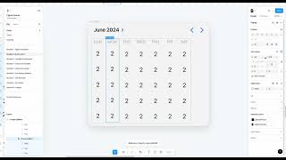
John Rodrigues builds a responsive calendar widget in Figma using Auto Layout. He sets up columns for weekdays, adjusts spacing and gaps, toggles between Hug and Fill containers, and applies constraints like min width 350 and max width 620 to make it responsive.
All right, so let's go and create this component. This is just a heads up. This is going to be a little complex thing to do, but if you really get stuck at it, feel free to kind of skip this part and go to the next lesson. But then if you want to kind of follow along and do this component, go ahead and do it. Because I kind of, you know, tried this multiple times. It takes a lot of trial and error to get it right. And so. But let's go ahead and start building it because, because it has a bit of the complexity to it and then there are multiple ways you can do it as well. So let's start with this and then let's go ahead and so if you see I've created rows like this, but I found out like doing that might add more complexity. So let's make columns so it's much easier. And so let's go ahead and add an auto layer out to this one. And then let's go ahead and duplicate it. So we have 1, 2, 3, 4, 5. So 1, 2, 3, 4,. So that's good. And then you can. The thing about auto layout is you can go and do those minor adjustment. So to this one, let's do, instead of hug, we do fill container. And and then let's try to make it a fill container. That's good. And then what we can do it. We can center everything. Okay, so now we wanted that center. So I did some trial and error here to do the center. And then so this is fine. So we have this going on here. And let's go ahead and kind of reduce this space to eight. And then what we're gonna do is we're gonna duplicate it. Okay, so we have Sunday, Monday, Tuesday, Wednesday, Thursday, Friday, Saturday. Okay, we have this here and apply an auto layout to this one. And then let's make it zero, maybe not. So let's do maybe four. Four looks good, that's perfect. And then let's change the content if you want to. Let me just copy from here. Okay, so Friday and then the final one, just copy from here or just add your content anyways, it's fine. And now let's go ahead and create this top section. So let's go ahead and duplicate it from here. And then let's bring it here. And then what we're gonna do is we're gonna take this two arrows here and then paste it so they don't. They shouldn't be here. So let me take it out from here. And then. Okay, this is all good. So apply auto layout to this one. And then the gap between instead of auto, if you click X on this, it takes out that auto and then you can do that adjustment of maybe 16 and then hug. All right, so keep like do trial and error. Let's say, let's break it. And then, you know, that's the width, but we don't want that. So we can hug it. So keep trying that it whenever you get stuck. And then that kind of gives you to ability to kind of play around, trial, do trial and error and stuff. So whenever this auto happens, like it adapts to like the frame. So it's always. If you're adding another container, then when you have the auto, it kind of adapts to that. I'll show you how that works. So we have this here that's going on. And then what we're going to do is I'm going to see if this, you know, works. Yeah, this works. That's fine. So we can take this frame and this frame and then add an auto layer to it and then click on zero. But that's not what we want. It's not that good. So maybe 16 is fine. And then if you want, we can align this to this one. So what I can do is I can add another auto layout to this one and then kind of give that margin a little bit. And then let's say let me go and use the ruler here. And then you see. Okay, eight. Perfect. Oh, that. That worked out perfect. So yeah, so we have that. And then let's go ahead and add an auto layout to it. Why? Because we want to create this kind of background to it. And then you add an auto layout to that one. And then let's select this color so we have that component. So then we can add a corner radius of 16. Okay, so this look, this is looking good. Now let's see if. And let's add a shadow effect, drop shadow. And then let's go ahead and. Okay, so we have this. And then let's say we want to make that app work. Right. So let's go ahead and. Let's see if. Can I add a hug here? No, that's not going to work for us. Right, so what can I do to make it work? So let's say we need to apply the fill container to individual cells. So let's go ahead and apply. You might not see the impact of it, but it's gonna work as we kind of do trial and error a little bit. And then let's apply fill to this and then this container we apply the fill. So now you see it got adjusted. So you gotta like play around a little bit. That right. And then now if you see it's working and it's responsive, that's perfect. We can add more elements like this here to the bottom. So I would just create an auto layout and just drag it in here and it will get adapted to that so you can go ahead and update the content. But here this kind of, you know, completes this component and then you can just update that content. And then now you have the calendar widget. So here you go. And then we can add minimum width to it. For example, let's say 350min width. So what it means is after that it won't, you know, go below that it will like stop you. And the max width probably could be 620. Yeah. So now you have the max and the min width. So now you have your responsive component and just go and update the content and then you have it. So maybe we'll do the last part as well. So let's go ahead and bring it here and then let's create a divider on top of it. So let's make it zero degrees and then bit lighter. And then what we're gonna do is let's add an auto layout because we want to adjust this space between and everything. Right. Like if you just go on an auto layout it'll get like it might work but it's no, it's like bit of a gamble. So let's apply an auto layout here and then let's select on the gap as 16 and then let's go ahead and add an auto layout. So that's perfect. And let's go ahead and add it. And then let's do fill container so we have it here so we can. Yeah, so let's go ahead and then manipulate this a little bit here and then we have it here. So we can also do the adjustment as we want to all the padding and margin and everything. So let's go ahead and just do those adjustments. So here we go. And then your calendar is ready and then you can rename it from by double clicking on here and click on and write let's write calendar. So yeah, and then you can go update the content and then your widget is done. So this is awesome. Perfect. So I'll see you in another module where we are going to learn about creating a data table like this.