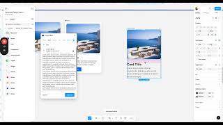
John Rodrigues walks through building a customizable card component in Figma: duplicating an image, adding and styling title/body text, using Auto Layout for layout and buttons, creating a button with padding and color, grouping elements and converting into a component, and adding boolean and text properties (e.g., appearance, button visibility, card title/body). He demonstrates creating instances and modifying properties, and shows effects like drop shadow. Numeric settings mentioned include font sizes (24, 16, 14), corner radius 16, and padding ~8–16.
Chapters
Okay, so now that we know how to add boolean and text property, so let's go ahead and create this component here and which has the property of ability to hide the. The image, the button, and then change the content based on whatever we want to. For example, place one. Gotcha. Got it. So now let's go ahead and create this. Let me go delete this. So let's duplicate this image here so we have the image that's perfect. And then let's go ahead and add a text that says car title and let's change the number to 24 and let's make it semi bold. That's great. And one more thing is you'll be able to modify the text from here if you want to make it underline or straight strike, things like that. So. And change the vertical trim and everything. So it's pretty. You can modify all the properties of the text from here. So we don't need that. And then we'll keep it standard, so we should be good. And then let's add some text to it. So let me go to. I'll show you a plugin how you can get Lorem Ipsum. So go to Content Real, or you can just like copy and paste any text there. But I'll show you this workflow as well. So you can use this and apply here. We don't need that big of a text, so we'll kind of reduce that. So, okay, and then let's change to regular and then change to 16. And then we won't need all this text. Let's take it out. You can select and delete. And then let's go ahead and change the color a little bit to a light gray. So that's good. And then let's make it light or maybe medium. And then 14. Okay. And then you'll be able to change line weight from here. So you can also put percentages. So I usually put for percentage. So that's perfect. So okay, so that's there. And then add auto layout to this one. So shift and a. And then select auto layout and add an auto layout to that one. Now let's quickly create the button. Learn more. And let's change the size of the button to 14. And then let's go ahead and change to medium or semi bold and change the color to white. And then add. Select it and add an auto layout. And then you'll be able to change any color here. So let's go ahead and maybe select this color itself from here. Okay, that's nice. Looks a little Faded. Maybe a different one. Yeah, that should be good. And then let's go ahead and add a padding. Now at this point you'll be really good at your auto layout skills. So maybe eight. Okay, that's good. So now let's go ahead and add this to this one. So now we have this component and let's add a fill. So you'll be able to see we want this like spacing here. So what we can do is let's remove the fill from here. And then let's add another auto layout to that one. So you'll be able to have that. And then let's make it. That's fine. So let's give a corner radius of 16 from here. Okay. And then we can change the padding from here. Perfect. And then let's make it 16. Good. So we have this card here. And now let's add properties to it. So select the image. So in order to create the property, we need to make make this as a component. So click on here and click Create component. So we have the component here. Now we can go ahead and add properties to it. So appearance True or false. That's great. And then for the button as well. True or false? Create property. True or false. Again, false. And you will be able to. We can name this as a button that will name the property. And then we have that. Now let's take an instance. Let's take an instance here and you'll be able to modify it from here. It's pretty cool. And then now we can also change this to a text property. That's great. And card title, create a property that's there. So now let's see if you want to change this naming right to whatever you want to. So we can call it as body from here. And then when I click on this, I can name it Card header or Card Title. You'll be able to modify everything here. So if you mess it up so that's completely okay, you can always go and modify it. So now this does a card with the property. And then we can also add effect and a drop shadow. You can see it's reflected in the child as well because that's an instance. Okay, now you'll be able to modify this and then you have like a basic card and only with the image. So you have the card with the image and if you want the button, you'll have the button. And then if you do any modifications to this one, it will adapt to the the instance as well. So that's awesome. And then now you'll be able to modify the designs the way you want it. So it's pretty cool, right? So you'll be able to create this, you know, cards with different properties. And in the design system, you will have various. What do you say? Setups for each component and based on different use cases and everything. So I'll see you in another lesson.