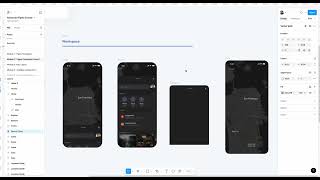
John Rodrigues demonstrates building an app sheet in Figma and introduces foundational auto layout techniques. He creates a mobile frame (393×430), adjusts corner radii (16, 32), chooses colors, and uses nested auto-layouts to build a search bar with profile avatar. The walkthrough covers padding, gaps, width behaviours (fixed / fill container / hug-content/auto), duplication, masking into a parent frame, and basic positioning shortcuts. The lesson is positioned as a foundational preview with a deeper advanced auto layout session to follow.
Chapters
Let's start creating this app sheet and I'm gonna, you know, show you a little bit of the auto layout as well. So don't worry. There's an advanced auto layout session from here, you know, soon after this one. So we're gonna, you know, dive deeper into auto layout. But let me show you a little foundation, a sneak peek into the auto layout and then we'll get, you know, familiar with and confident with all the auto layout functionalities and everything. So let's create an app sheet. Let's go to frame or you can click on F and then let's create this frame and then we can make it 393. It could be same width as this one. So you can always like take some reference here. And then this is 430, so we can do this 430 as well. So 430. Okay. So you're good. So I hope you're good till here and then, you know, just see how it fits here. So that's fine. It's perfect. It fits the entire width. So what we can do here is let's add a corner, you can corner radius to this one. So we don't need corner radius on all the edges. So we don't need that. So let's go ahead and add only to this one. So let's make it 16. We'll use that multiples of eight for the eight point grid system. We don't need it here and then we can do that iOS 60% and then okay, this does not look like a significant radius. So let's try 32. You can able to change all the values from here and any corners that you want you can change from here. This is super helpful if you want to like have radius on the one side and don't have to want to have radius on the other side. You can control it from here. So that's good. Let's go ahead and change the color and let's select from here for now. This is a color picker so it's perfect. So I'm going to, you know, build this by help of auto layout and then let me name it before that. Let's call it app sheet and select this frame and click on shift and a or go here and add auto layout. So you can see it add in an auto layout. What we are trying to do, we are trying to have some margin here. So you can see that there is the spacing. We're going to do that. So let's make the margin as 16. So you know, just Follow this. If you are not familiar with auto layout, I'm going to, you know, break it down for you and then make it easier for you to understand and be more confident with auto layout. So add horizontal padding. You'll be able to have this consistent spacing so you don't have to worry about. Is it like properly in the center and. And the styro space and the margin and everything? Yeah. So let's go ahead and bring this. Duplicate this here. So I'm holding on option and from my mouse and it duplicates it. So what we can do is we can drag and drop it here and it'll fit to it. So you can see oh my God, what happened there. So don't worry, just, you know, bring it back here. So we're all good. And this maintains the spacing. This also build with auto layout and you know, we have a dedicated model for it. So don't feel overwhelmed. So, you know, let's get, you know, familiar you with some of the basics of auto layout. And then let's create this search bar and the profile picture. So let's quickly create that. So let me go here, bring that search icon. So I'm just copying it and then paste. Okay. And then let's go and type on T. So if you. I want to add text and you can click here or use the shortcut T. So let's try search and then in the future lessons we are going to, you know, add variables, typography, variable colors and everything. But for now, I know I want you to feel comfortable with all the panels and everything. You'll be able to move, modify the size of the text from here and also you can select the font of your own. So I've selected SF Pro text. You can select sometimes. Most of the systems might not have the SF font. I have installed it, but you can use any font of your own, DM, sans, inter or anything. And let's make it 14. And then you'll be able to modify the weights from here and. And you'll be able to change the colors from here. So you'll be able to. Let's pick this color. So here you can see it kind of highlights, you know where it's selecting. So that's pretty nice. So let's select this one and this one and. Or select all and click on shift and A. So it adds the auto layout. And then let's set up this to 14. So here you can see you'll be able to change the gap between them. So this is panel is Dedicated for auto layout. So let's do 12 and we should be good. And then let's add another auto layout to it. Select this frame and click on auto layout. So it will create another auto layout here. And then we can expand it. We can fill this. We can. Let's select this color. Awesome. We are almost there to have that frame ready. And let's add a corner radius here. You can go and add the corner radius. So that's perfect. So that's the profile picture as well. So let's grab the profile picture from here, copy from here, and then let's paste it. And we're going to add an auto layout to that as well. So select all of this and then add an auto layout. So now we have that and then we can select this has auto. I'll tell you why, because we are not defining the width it based on the length of this container. So let's select as auto because it will adapt to that. Adapt to the container effectively. So we can name this has Search plus profile. So if I can rename it from here. Okay, so we have that thing, we have that element. And then let's go ahead and drop it here. So now it's like, oh, that's not in the center, John. How can I bring it in the center? What can I do? So what you can do is instead of fixed width, the width is fixed fill container. Once you do that, it will adapt to this container length we have. And then we can also use fill container, but we don't need that. And then maybe fixed, we can do a custom width as well. Or you can add the padding and margin here. We can do all sort of stuff, but we don't need that for now. And then if you want a padding around it, you can add auto layout. And then you can add 16 pixels here. And then it will have that vertical padding applied to give it a breathing space. So that way you'll be able to create that. And let's go ahead and. Let's take this, duplicate this and then bring it here. And now you can see how smoothly you'll be able to add all these elements here. So yeah, let's go ahead and drag it here and then let's add it to the frame, which is awesome. And then let's bring this one as well and then drop it here. So we have added everything, which is awesome to get started. And we have the app sheet. And it's not just like a regular app sheet. You made this with auto layout, which is awesome. Right so we have this app sheet here and now. And then if you, you know, are stuck here, feel free to ask that during the live sessions. And then also, if you are not able to accomplish, just make a frame with the sheet and then create this quick prototype for you to feel a little comfortable with Figma. And if you didn't get exactly right of this one, that's okay. And, you know, I want you to just feel comfortable using different tools and looking at the panels and everything from here. So, you know, do your best and then, you know, try to create this. If you're stuck, feel free to ask the questions and everything. So let's just take this app shape and let's mask it into the frame so you can check here whether if it's in the frame or not. And then, okay, so it's within the frame, so that's awesome. So let's keep it here in the center. That's perfect. So now what we can do is click shift and then down arrow and you'll be able to move that here at the bottom.