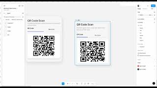
This is a tutorial transcript (YouTube) by John Rodrigues demonstrating how to design a responsive/adaptive card component in Figma. The speaker walks through creating a QR-code card: building header and barcode, grouping elements, applying auto layout, setting fill/hug constraints, minimum width and corner radius, adding strokes and drop shadows, and testing responsiveness across frames (e.g., iPhone 15). The goal is to make a scalable component that adapts to different frame sizes.
Chapters
All right, so now we gonna design this responsive card. And this is so well designed. So you'll be, you know, once when your designs are responsive so you'll be able to, you know, just leverage that. Add this to your, you know, any of the frames and it will adapt to that one. So it's a pretty, pretty cool, pretty cool thing to design your components with. Design your components that are scalable in nature. So it's like adaptive to your frame and you don't have to keep changing it all the time. So we're going to create that. So if you see, let's say I have this component here this way and then the frame is larger and it will just adapt to that. And then I can click on fill and then it will adapt to that frame. So which is pretty cool. So let's design this from scratch. And then let's break it down further. So let's start with the. Creating the header. So let's name. This has a QR QR code. Code scan. And then let's name this. Make this. Let's see what size we are using here. 24. Okay, let's do 24. And then let's select SF. Select any font of your own choice. Font of your choice. Sometimes you might not have the SF font and everything. I had to install it. So let's copy this from here. Click on text. And let's add this here. So now we have this section. Let's apply an auto layout to it and Change the length to 8 pixel. So we are good. So that's sounds perfect. So now let's create this section and let's go ahead and click on Q text and write QR QR code. Cool. And then we gonna have, we're gonna have this bottom section here. That's the line. And then let's make this a different color. Let's change the stroke. And then let's add some radius to it. Okay, we don't need the radius. So this is good. And then let's go ahead and create a barcode. And let's change the color of it to show it's not being active. Okay, that sounds good. So now we have this and then we can create a divider and then make the angle has zero and then Cool. So we have that going. So now let's go ahead and create this section. Select here, add auto layout and. And then let's auto layout this one. Let's auto layout this and this first. Okay. And then we'll add auto layout to this. So now we have this Created. So make sure you kind of keep an eye on how I'm grouping things. You know, it takes a lot of trial and error and comes with a little bit of experience. So try to group similar things and you'll get likes, you know, as you go, you will get good at it. So now let's create a frame and then add a corner radius to it. Let's steal this barcode from here. Keep double tapping it till you reach it option and then just copy it here. So that's perfect. And let's add the auto layout. So you can see it added all the margin and padding and everything. So that's great. So now we have this section. Now what we can do is add auto layout to all of them. So that's perfect. That's looking good already. And then we can center align. We can make this as a fill container and then fill container. Okay, perfect. Now, now we have this. So add auto layout to that. Then fill container and then add a corner radius. So we have this going on here. So we can change this margin to 16 and then see if it's broke. Anything looks good for now. And then 16 and then let's add a stroke from here and then let's make it an outside stroke and then let's change, make it very subtle and then add effect and then drop shadow. And then let's go ahead and create that nice looking drop shadow. And then let's reduce this here to make it a little softer. So we have our card here and we can change this color from here. Apply this color to show that difference here. Okay, so now we have this card. So now you can see this card is responsive. You might be wondering, John, is this card responsive? It's not right? Something is really wrong with this. So let's apply. Why? What's broken? So if you see nothing is expanding, maybe the outer container is not, you know, has a auto fill container. So you can see if you click on it, it will show you what it's going to do, what's its next step. So here you can see it's adapting. So we can also make this container has a fill container. So, so it's kind of adapting to it. So maybe like, you know, this kind of feels very strange to us. So maybe what we can do is this has a fixed width and let's hold. Okay. So now it's adapted to that one. So but here you can see that something is wrong with the container. So you can see it keeps breaking. So let's, we need to. Let's add a minimum width to it. So because we don't want it to like go this small. So let's add maybe this has the minimum width at 277. So let's go ahead and add a min width and that this 277. So it's not going to go below that. Some components are, you know, better constraint and then maybe this one, right? It's like hug, but it's not working. Let's do fill container and then let's apply fill container to it. So you want to keep experimenting with like applying fill and hug to different layers and break it and then try to fix it. That's how you kind of learn auto layout. So here you can see now it's a bit responsive. So it's similar to this one. It's a bit responsive. So here you can see we can also like fix this instead of, you know, stretching it. So we can do that has a fixed width of 182. So it's not gonna like change. But what we can do is we can center align this like this. So so here you can see it kinda stays in the center and does not change because we fixed. So you can experiment with lot of them like this to make it like, you know, scalable component. And then we have it here. Perfect. So now let's create a frame, an iPhone 15. Let's add. Let's add auto layout to that one. Shift and A and apply 16. So we have that auto layout and then let's put it in here and then if we do it fill container, it will fill to that and it makes it a scalable, scalable component. So which is pretty good. So that's. That makes it responsive and if you like change it to this length and then add it here and then add it here and then you'll be able to, you know, play around it a little bit and then you can do whatever you want with it. Fill container? Yeah, just keep experimenting. Fill and hug container and then you'll be able to see. You can see if you see I'm just messing around with fill and hug container. With that itself I'm able to accomplish a lot. So keep experimenting with that and you'll get good at it. And then that's how you will be able to make this responsive component. And I will see you in another lesson. We are going to then dive deeper into prototyping, which is another exciting topic to learn.