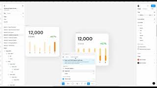
A step-by-step Figma tutorial by John Rodrigues demonstrating how to design a reusable widget component from scratch. The instructor covers creating and styling text and frames, applying auto layout, aligning and spacing elements, adding effects (stroke, shadow), converting the layout into a component, and briefly mentions creating variants and publishing updates to a design system.
Chapters
All right, so let's get started and design along with me if you want to. You will always have the design files as well. You can just go around and directly even create a component if you are familiar with it. So but we'll get started from scratch because I also want you to get familiar with the past topics such as auto layout and everything. So you build like the strong foundation and kind of practice as you go. So let's take this widget for now and then just start, you know, creating this. So it start from text, click on T and let's try 12,000. And in the future class we learn about variables and everything. And for now we'll just like go ahead and create this a simple text. Okay, let's make it bold. So you can go here and change the weight of the font. So let's make it bold and let's change the color to a little lighter black. It's just a preference thing. You can keep whatever you like. And then let's create view. I'm just using the text. And then let's reduce the size so you can go here and drop down and select different size. You can see at the real time how it's changing. And then let's do 24 and then you can do medium, regular and everything. Let's keep medium. And then you can change the font as well. This, this is one of the update that happened last year that you know, you can see real time which the font change and everything. So let's make it medium and then change the color to a lighter gray here. You can select the color from here and then let's go and add an auto layout to it. So this is grouped together in one thing. So select this layer, select this layer. Click on shift and shift and a auto layout. So you add an auto layout here and you can adjust the spacing if you like it 4 to follow that 4.4 point grid system and we can even name it as KPI if you want to. And then let's go ahead and create this one. So let's click on + 6.7% and then let's go ahead and select the green color here or just go ahead and select here. So we have this. So that's perfect. So let's go ahead and then add auto layout to this one. So now here you can see I taught you all how to use this for the alignment. So you can also click on W when you are like here. If you go to W it goes up and then A and D. So you can S And you can like change the different alignment. So the alignment here is good. That's how we want it. So that's perfect. So play around with the alignment by selecting this container. And then we'll have this module here. So that's perfect. Now let's quickly go and create this graphs here. So let me go ahead and create a frame. I'm clicking F on the keyboard and then creating the frames. So let's go ahead and create this. This is pretty going to be pretty fun. And then let's change the color to. To maybe orange. That's too much. Okay, perfect. And we can reduce the opacity from here. So if you want to change the color opacity, you can change from here and then comma, and and D. And then for the windows I'll include that conversion in the description. If you get confused, feel free to refer to that. And then let's change the color to a bit darker and maybe we'd make it dark. And then let's select on the word text here. And then let's make it 16. So we have that going here. And then let's go ahead and create. Add an auto layout to this. So now we have an auto layout here. And then we can, we can just duplicate it. Okay, let's duplicate the entire thing. Let's go ahead and duplicate it. And then I'm clicking on command and D. Okay, so now let's create 1, 2, 3, 4, 5, 6. So we have three. And then let's do three more. Yeah, make sure you are copying the frame together this way. So this is three. So that is good. And then we can do seven. Because seven days a week we can just keep it till Saturday for now. And then the goal is to understand the auto layout and everything. So let's go ahead and add an auto layout to it. I'm clicking on shift and A. And then we can set this to auto. Okay, so now, now we can name this as graph. And then you can change, change the letters Monday, Tuesday, Friday, Saturday and Sunday. Let's call it a day off. And then let's go ahead and add auto layout. So we have the auto layout added here. So we can make this 36 and then fill container. And then let's make it 24 and let's make this 24. And then let's make it hug. Alright. And then let's add 24 pixel margin. And then let's say something is not working here. Right. So let's try to troubleshoot this. And this is the important thing about Auto layout is we got to troubleshoot it. So let's try maybe adding a margin here. Okay, that seems to be working. And let's try to make this has a fill container. So and then let's make this 24. So and let's fix this to 24 as well. So we have that, you know, proper alignment that's happening here. And let's go ahead and add a corner radius. So we have this corner radius applied here. So we have this component just perfect. So now if you want we can add a subtle stroke as well. Let's add a subtle stroke, make it outside. So that's good. And then let's go here and click on effect and add a drop shadow. So you'll be able to manipulate the drop shadow values from here and here and then make it, let's make it blur and then reduce the opacity. That's one of my hack to make beautiful shadows. So there's a plugin also here called Beautiful Shadows. So let's see if it shows up. Okay, there you go. Shadows. SHA W yeah, Beautiful shadows. So you can select the component what you need here and then click on Run. So it applies shadows on top of that you can adjust the shadows from here. So for now we'll use the shadow and then you can try different, you know, styles and angles and everything. So we should be good. So let's apply that. Maybe it's too harsh. We can go ahead and remove some of the shadow values. Yeah, I think this is fine what we started with. So we can name this as widget. So now we have a widget. So we designed this using auto layout and now let's go ahead and make this a component. So this is the core part of the lesson of how to make it a component. So, so there are different ways you can make it. You can select this and then click on this one so it creates component. Or you can see the shortcut there. It shows that option command and K. So that also makes it a component. So let's go ahead and click create a component and then the component is created. So the icon here will change. That's a variant. I'll show what a variant is in a bit. And there are, there are different, you know, let me go back here. There are different ways you can leverage creating components. I will show you how to use, you know, creating multi components and everything in a bit. But for now let's go ahead and create a component. So now when you see the sign here, this one. So that means it's a component and then we can bring this component into our design from here. So if you go to assets on the local library, so we are on the scalable components part. So let's name find the widget component, it should be this one. So let's bring it here so you can see you'll be able to bring any number of components in from your design and then you'll be able to efficiently design without having to redo everything again and again. So now let's say there's some kind of change. You do it here and let's say you want to do right view instead of views, so you change it here and it updates everywhere. So we can maybe change the number here. So here you can see, you'll be able to see the update happening real time. So you when the in the design system you can publish this update and it updates throughout the design. So build once and reuse it again and again, kind of a concept. And then you know, any modifications you do here, it updates, updates the design. So that way. Okay, so that's perfect. And now let's go ahead and delete it again. If you want to use the component you created, go to your assets and find it from there. And then if you are lost, you can even search here and search the component. And when you're working with design system, most of your time is spent searching for the right component. So now that we have this component, we can create a variant of this. For example, if you want a different version or the variation of this, that's called a variant. And I'm going to show that to you in the next lesson.