John Rodrigues shows how to build components and variants in Figma, from simple components to multi-component sets. Learn to create instances, understand parent-child relationships, detach instances when needed, and use "Go to main component" to jump back to the source.
Chapters
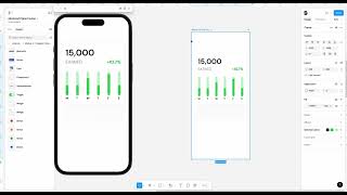
All right, now that we made a component, so congratulations, we made our first component. That is awesome. And now let's go ahead and create a variant. So if you see this, this is going to tell this is a component. Even if you see the layer the symbol is going to show tell you that that's going to be a component. So now let's go ahead and create a variant of it. So if you see the sign here, add a variant. So it's nothing but the variation of it. So maybe change the color in the variation of this instead of orange we can make it green. Let's go ahead and change this. Let's go ahead and make it different color and then we can also change this one. So we are just making the variant variation of the main component. So let's make it lighter and then just copy this one. You can bulk select this and then let's see if this works. If not we'll just. Okay, it works. So this is the variant of the main component. It's nothing but the variation. And, and let's see for the reference here. Yeah, and instead of views we can do it has earned. So this is going to be the variant and then we can also name this. So now this is going to be the earned component. And so now we can name here the component from Here instead of variant 2 we double tap on it and then earned widget. All right, so and then we can name this as views. Okay, perfect. So you can double tap on it and name it. Now we have a component and a variant and also when you are designing like a button, there's a hover state, there's a press state. So that's how it's created. And also I'll show you a different way of showing creating multi components. So let's get to to that in a bit. But we have the component and now we have the variant. So you can also change any value here. So we should be good. So let's go ahead and do some modification to show that difference and everything perfect. So now if you go to the assets, you can see the widget here, rename it to the right spelling. And then we have this widget here and let's go ahead and use this. Okay, now you can create a variant of this by selecting other variants. So here you can see this is the views widget and this is the earned widget. So you'll be able to create variant of it. So now let's say you have like a frame, then you have this widget here and then you want to change this to a different widget. So you'll be able to do that. That's how you create a variant of the component. Let me show you another trick here. So now let's go ahead and just like let me take this out here. So let's take this out here and let me delete this. I'll tell you how to create an instance in a bit. Let me go ahead and detach instance. I'll show that to you the how to use the instance and what it is and everything in the next lesson. So I want to show you this concept of creating multi component and this is super helpful while creating a design system for icon, library, your button library and everything. So let's select everything here and then let's select on. Instead of selecting create component, let's go here and create multi component. So now it creates this multi component and we need to select combine has variants. So now it kind of creates. This has a variation of this. So instead of you clicking on this create variant so you can, if you have like multiple UI elements, you can just do that by creating multivariant multi component from there. So that's another way of doing. You'll get the same result, it's another way of creating it and you'll be again able to switch between different variants. So now if you see this layer here, you can see this is a different symbol, right? So this is the parent, this is the component and this is the instance. So it's like a child feature of this, right? So this is going to be the parent. That's why the symbol and this is going to be the child and that's called has the instance. So you can instance copies the values from the parent. So let's say I change this to a different value. It changes here, right? However, if I change the value here, it changes does not update the parent. So it's kind of independent on its own. And that's going to be like super helpful. While, you know, while designing your local UI and everything, you don't want to change the main, right? You want to use the local. So that's going to be super helpful. So this is the instance and you will be able to detach the instance. And this is something people always like. They try to break the component from the design system so you can detach the instance and then it's no longer would be related to that one. So if I do any changes here, it's not going to change here, right? So it's independent on its own. So usually many designers Break the component from the design system to do the modification. But then you lose out on the various properties and everything, which is not good. So let's go ahead and delete the this and then let's go ahead and bring this widget. Now it's connected again. So whenever it is a component or an instance, you can see the purple line. So while designing, go to make sure most of your design have this purple line because they, you know, we got to think in systems and the code is also associated with it. So the moment you break something, you are making a custom component that adds more engineering time for the development and everything. So you'll be able to create multiple instant. You can click on option. If you select it and you click on option on your keyboard, you'll be able to see those two arrows there. So you'll be able to duplicate them if you want to. And it will still maintain that property from here. So whatever you change here, it will update here. And then if you, if you click, if you click, if you want to detach, you can detach from here and then it will remove it. Sometimes this will remain in a dedicated library in a design system. So if you want to go to that, you can go to, go to the main component and it will take you where that component is. So this is a really good way of finding things in a design system as well. So if you have like an instance and, and click on go to main component, it will take you to the main component. And yeah, that's about the component. And in the next lesson we are going to dive deeper into, you know, understanding component properties, which is a very interesting topic. I'll show it to you in a bit. Here I will. Okay, comp. So in the next lesson. So in the next lesson we are going to learn. In the next lesson we are going to learn about creating component properties, text, boolean, instance, swap and everything. And then we're going to end this module by learning interactive components. So I'll see you in another lesson.