John Rodrigues redesigns a cluttered UI card by fixing typography hierarchy, spacing, and alignment. He lightens the background, adjusts stroke weight and corner radius, and makes the progress bar taller to create a clearer, more focused layout.
Chapters
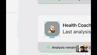
So welcome to this redesign series where I'm going to take a badly designed UI and redesign it by solving some of these UI issues. So let's get started. So here we have this card which we're going to design today, redesign today. So if you see the typography hierarchy is pretty bad. The users would know where to read and where to start. The gray, the colors has no hierarchy. So everything seems to be like taking the attention. And we can see that in the UI most of the time in many places out there, which all the colors are competing for each other. Happening here with a different gray, the spacing is off, the alignment is off. So let's go and fix that and see how that's gonna look. So this gray is dark. So let's start from there and make it white. And then the stroke is too strong and could be too harsh on the user's eyes. So we can reduce the stroke gray and even make it 0.5 if that helps. But let's see. Yeah, subtle. Yeah, subtle gray. And that looks good. And then we can increase the corner radius to make the UI look modern. And then corners moving to 60%, which is good. And then this gray is taking too much attention here. The focus needs to be on the person. The person, the focus needs to be on the person here. So let's go ahead and reduce that to the lighter gray to maintain that consistency in the ui. We can have the same gray over here. And now it's starting to look good. But the typography, the users would not know which text to focus and that does not, you know, lead to a good user experience. And, you know, users kind of skim through the ui. So let's create some hierarchy here. So let's make it 14 and then let's make this 16. So here you can see now there's some hierarchy, but it's not that good. So. So we're going to go ahead and reduce the opacity. Now the hierarchy is much more clear. And then we can see the alignment and everything. So here, this icon need not have that much attention. The users need to know that exists, but don't have to take too much attention. So we can reduce that gray and this one is not aligned. So let's center align this. And then now it's kind of, this text is taking too much attention. What we can do is we can make that 12 and then reduce the opacity to lighter gray and we can keep that the number 20 to be different colors so the users can quickly focus on that number. And, yeah, it's already starting to look good. This progress bar does not look like a progress bar. Looks like part of a broken border to. Just by increasing the height, we can make it look like a progress bar here. So there you go. It's already looking good. And then let's move it here. And then we have our redesign card. So this is before and this is after.