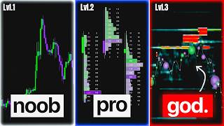
In this tutorial, the presenter walks through five increasingly sophisticated charting tools used by professional traders to gain an edge over retail participants. He starts with the basic candlestick chart, explaining its four data points (open, high, low, close) and how most retail traders rely on simple support‑resistance rectangles, a method that he argues leads to a 99% loss rate because it offers no informational advantage. He then introduces the Volume Profile chart, which visualizes the amount of money traded at each price level, highlighting high‑volume nodes where institutions have been active. Next, he demonstrates the footprint chart, which adds order‑flow details (contract sizes) behind each candlestick, allowing traders to see large seller or buyer activity being absorbed before price moves. The deep‑trades view further filters out small orders, showing only large “bubbles” that indicate significant market participant actions, enabling precise timing of entries and exits. Finally, he presents the liquidity heatmap, which maps passive order‑book liquidity and predicts where large trades will occur, allowing traders to anticipate price rejections or absorptions before they manifest on the price chart. Throughout, he emphasizes that these tools let professionals see the market ahead of price‑action traders. The video concludes with a promotion for the DeepDome software, which bundles these advanced visualizations, and announces a May 8th release with a link for a discounted launch price.
Chapters
In this video, I will show you the number one absolute best trading charts that exist and how it works to get absolute sniper entries. But we'll also see the second best type of chart that professionals use every single day and much, much more, all the way down to your good old boring candlestick chart. This is a candlestick chart. Every trader starts by learning how this works. Each and every one of these candlesticks provides you with 4 pieces of data you need to know. The open and the close will create the so-called body. Body of the candle. The high and the low are these little wicks you see on top and below, which means that price started here, went below here, all the way up here, and then closed around here. Open, low, high, close. And most traders will analyze price action charts by looking at highs and lows and highs and lows in how this price action unfolds. And they will try to buy when price is low, putting a stop loss below the previous low, and take profit when price rises. And then they will draw rectangles wherever price is bouncing. So if price from going up starts going down, that will be a resistance area. If price goes down and then rises, that will be a support area. Support, resistance, and so on and so forth. And most retail traders that trade like this end up never making money, really. And 99% of traders who use these kind of candlesticks typically lose. Because everyone can look at these charts. And if you have the same information as anyone else in the market, it's likely that you're not gonna have a great edge on everyone else, because in the market you need to have an advantage. And the next type of chart solves exactly this problem. So let's activate the Volume Profile. This chart is called the Volume Profile chart, and it basically shows you not just where price went, but how much money was traded at that price. I can also just get rid of price and just look at these areas these orange levels that tells me where most money was traded. This is a low volume node, a place where little money was traded. This instead is the place where most money changed hands, where big banks in financial markets and the institution that moves markets actually did business at. So I can see how money moved upward and upward the entire session, not based on highs and lows on random price candlesticks, but based on the money. That's why professionals use this type of chart. But the next type of chart is even cooler, and it's called the footprint chart. So in a platform like DeepCharts that have footprint charts enabled, if you zoom in close enough, you're gonna start noticing some interesting details, which are all these numbers. And I know this might look complicated, but stick with it because this is where the money is made. This type of chart doesn't only show you candlestick, but what happened behind them. And you can clearly see something big happened right around here where sellers who were dominating the markets and pushing price down made a huge effort over here with this 2,600 contracts. But these thousands of contracts of sellers didn't push price down as you'd expect. They were all absorbed up on this level, which means there's a buyer behind, a very big buyer, absorbing all of this selling pressure. And right after that happens, price moves up for the entirety of the session. And with a normal— and with a normal price action chart, you would not be able to see this. That's why professionals love this type of chart, and you can see this every single day in the market. A big seller is absorbed and then price moves up. Another big seller is absorbed and then price moves up. So with candlesticks, you're always late to the party. With footprints, you can actually see things before price action traders can realize. But to zoom in and actually look at these big orders can be a little bit of a headache. So the next level of chart, which is even cooler, is called deep trades. So with this type of chart, you get rid of all the small numbers and you only fill filter out the big ones, the only orders that matter. When you see big bubbles at the bottom of candles, it means there's a huge buyer stepping in, pushing the auction up. And when a big seller tries to sell and push the auction lower but is completely absorbed, price then booms up. And price stops exactly where these big buyers are getting absorbed by passive sellers. And price drops always stops when a big seller is being absorbed. So with this type of chart, you can time the market by following what big market participants, aka the smart money, are actually doing with their orders. But this isn't even the coolest part yet, because there's a way to see these bubbles before they happen. And that's exactly when the Liquidity Heatmap steps in. Let's take this chart as an example. Right above here, there's no big bubble, really, but we see price approaching the high and then get immediately rejected. And in this case, neither price or the bubbles can tell us the story of what's happening behind. And that's where our heatmaps comes in, because the heatmaps gives us the final piece of information that you actually need to take informed decisions. And this type of chart shows you with these hot areas if there are some big sellers in the order book, which is the passive side of the market, willing to sell huge amounts of orders. And if you actually look at the numbers below— above here, you had thousands and thousands of sell orders being offered at these prices. So of course, buyers were scared of approaching all of the sellers because these huge sellers might know something you don't. So you cannot see this from the exact same price chart. You can only see this through liquidity areas. So you see price approaches this level and then immediately shies away. And as soon as these sellers could not get their fill, they canceled that order and opened market instead. And this huge bubble appeared. So they were not willing to wait anymore, so they sold market and then reloaded more sell orders right here. So these areas act as an attraction level and as a rejection level. You'll see price gravitating towards these areas, and if they're strong enough, price rejecting immediately from these areas. So right over here, we could see that a big bubble of buyers got absorbed from a huge sell liquidity, which is exactly this level over here. But with the heatmap, we knew that a big trade was going to happen here way before it appeared on the chart. And as you can see, price gravitates towards the area, buyers get absorbed at that level, and price melts for the entire session and melts all the way down to the furthest liquidity areas there is. And as soon as you see big buyers joining the party on the passive side, that's exactly when price reverses instead. This software is called DeepDome. It's very easy to use, very easy to understand, and doesn't have 100 different things to manage. It only shows you what matters. And we're finally about to release it on May 8th. And if you want to join the launch and get your hands on the same software at a ridiculously low price, you might want to click the link in the description. And that is the final level of charts. That's all for today. I'll see you in the next video.