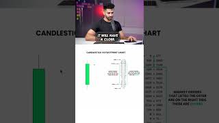
Short tutorial comparing 5-minute candlestick charts to footprint charts. The speaker explains candlestick anatomy (open, high, low, close) and states that footprint charts represent the same high/low/open/close but additionally contain intra-candle detail — a "story within the candle" — that can be read for more information.
Chapters
Is here's a five minute candlestick. Obviously if it's red, opening price, closing price the lowest, the candlestick one to the highest, it went to vice versa here. But if it's a green candlestick, this is where the price open on the five minute candle. This is where it closed high and low. Right? Real simple. Now a footprint chart is essentially taking the same movement. So if this is a five minute candle, the footprint chart will have a low, it will have a high, it, it will have a close, it will have an open, very, very similar. So we look here at these exact footprint charts. You can see the big red candle, open, close, high, low, open, close, high, low. Same exact thing. But the footprint chart as mentioned has a story within the candle that we can read. This is what the footprint chart shows. Now let's dissect that.