Forget Candlestick Charts... Use THIS Instead!
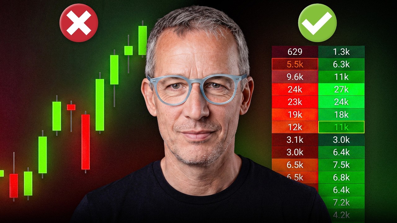
Candlestick charts miss crucial detail. Footprint charts show buy-sell imbalances and liquidity zones at each price level, revealing whether the market is accumulating or exhausted. Combine footprint with volume profile across multiple timeframes to spot reversals and make sharper entries and exits.
Chapters
Stop using only candlestick formations for your trading. Yes, there are some that work quite well, provided they are at the right price level. But how do you handle it when there's a strong trend and you want to trade the continuation? Are candlestick formations really enough in that case? I can tell you, most likely not. And if they are, then you just got lucky. But if you use the footprint chart and look much deeper, you'll see if liquidity is actually there? What do the highs and the lows look like? And where was the most liquidity traded, or rather, where are the zones where the market has no liquidity at all? What information does that give you? And that is exactly what you need to know. First, where is the highest liquidity? Second, what do the highs and lows look like? And finally, what information do the price areas provide where there was absolutely no liquidity? And that is exactly what I am going to show you in detail today. I know that many traders work with candlestick formations, and I also know there are models that can work quite well, but only if you are operating at exactly the right locations. However, if you want to see exactly if a trend or an overshoot is ending, or if it will continue dynamically, a footprint chart helps immensely because you can see the liquidity. And to present this to you in depth, I have recorded exactly that for you, and we will go through it together now. So before we go into depth, we have to start by looking at what Tom is even talking about here. What is it that he is trying to explain to me today? And I can tell you it is about the following. This candlestick here with this impulse and the following inside bar, which is great info that many candlestick traders like, is ultimately nothing more than a trend. And then within a previous auction, depending on the time frame, it is just a waiting station. A waiting station is nothing more than a price range where a market usually accumulates volume. And now let's do the following and examine this exact area here using our footprint chart. Now we have this strong impulse right here. That is all well and good, yes. And this strong impulse is this impulse from the footprint chart. Nothing else. But what can you actually see in a footprint chart? You can see how many sells on the left side and how many buys on the right side were traded at each price level that you see over here. Then, if you are smart, you also have the turnover shown in a volume profile corresponding to that specific price range. There you see immediately when something about the liquidity is extreme. And now we're going to go deeper into it. If you want to see a graphic display, for example, of how much volume occurred within these timeframes with disproportionate liquidity, then you can color-code it by price like this. And you can see that right here within this footprint chart. Here, for example, 104 sales, 147 purchases. Why is that blue? Because there's a large buying imbalance. You wouldn't see that with just the Volume Profile alone. But now it gets even more exciting. At the highs and at the lows, the market gives you further information. It's called Finished and Unfinished Auction. This information shows you if there's real exhaustion at the top. And what does it mean when real exhaustion is present? Well, it likely means no more liquidity is being played there. And if no more liquidity is being played, that's a sign that a reversal could be coming. Now the question is always, at what point do the people who traded large positions up here actually give up? And you would never be able to pinpoint that for yourself within a candlestick like this. There you can identify that the probability exists for the market to turn now, But can you also pinpoint exactly where the liquidity is drying up? And you can do that very precisely in a footprint chart. And you can see that here too, in relation to the volume profile. There were a lot of sales here, and from this point on, there's no more liquidity. And if the market then runs below such a price range, like here, and continues to have constant liquidity, what's the likely result? Yes, of course. It looks down at all that liquidity again to see what the deal is. And you see that very, very, very often. And I'd like to briefly repeat the whole thing once more. Here again is this time frame from the 5-minute chart in the S&P, where you can see exactly how much liquidity is at the top and how it looked at the bottom. Okay, a lot was accumulated here, and then the market was pushed up aggressively with a buying imbalance. What happened then? Up here you can see very clearly that the selling imbalance is dominant. Of course, you wouldn't see that in such detail with individual sales from the volume profile. And now comes the crucial essence: what happens at the top? Yes, and that's exactly the beauty of it. If you see now that the liquidity is really drying up, you can make a decision and say this candlestick formation I predefined seems to make sense. Let's go back to this image. Before we get back into it, a quick notice: World Class Edge just launched, and if you want to know how really institutional traders and market makers actually trade, click the link below and secure your spot at World Class Edge. All right, back to it. Now within this candlestick formation that has formed here, you suddenly have some really great information. And very often, as you can see, the market likes to head back exactly to where it picks up this information, namely where the greatest liquidity was. And if you look at this in depth for yourself, then you can do that across different timeframes. Let's take a look in here. Here we have, for example, a 30-minute chart, and you can already see down here, oh, there's a candlestick formation. And what does this candlestick information tell me? At first, it tells me relatively little. But if you look at the liquidity, you see that down here there was a lot of liquidity at the low. That means that a lot, lot, lot, lot of volume was accumulated there. However, the market didn't go any lower, even though there were significantly more sales than purchases in total. And now the crucial thing happens. You can see here that the market has established several strong buying levels, and you wouldn't be able to see that within this candle. In the footprint chart, you can see that perfectly. You can see exactly, once you've studied the product a bit, how many contracts on the buy side and the sell side indicate to me that this is really strong buying. And then in the next step, you can go and localize. If I have a lot of liquidity up here, what information Does that give me? Does the market want to go higher, or is there a selling overhang up here? And so suddenly, from such an impulsive candle, you have information that tells you, "Oh, be careful and watch out." Even if there were large buys here, it was probably just short covering because the big seller is still dominant. And so you have confirmation in a large time frame that the trend continuation could proceed, provided you're currently trading the short side. And that gives you great information. Let's look at another image. Here, for example, in active day trading on the 30-minute chart, you can once again wonderfully observe this information for yourself and see that exactly this price range I just showed you is being traded further. So what does that mean now? Please remember, we just had an image where we said the liquidity could run back down. Yes, but only if the market also goes below this point. If it continues over as it's doing now, then there's a higher probability that it's still striving for further highs. Why? Because these sellers here haven't actually switched to a short position yet, but instead they have only been busy collecting liquidity for themselves while waiting for the market to develop further. And what does that mean? It means, and this is very clear to see, that this entire range here is much more important important to evaluate than a single move. We really have to evaluate exactly where the liquidity is sitting at the top of this range, and then we also need to determine where the liquidity is resting at the bottom of this same range. And then we have an opportunity that would be rather difficult for us to obtain using a simple candlestick formation system. And we can see, let's assume the market gives us the chance to do a pullback Then we can say yes, exactly at this price area here there were strong buys, and here below this range there was rejection. And so we have the possibility to claim now that it's more likely to go long here because the market has given me this information. You can only do that if you look at a footprint chart. You can't do that if you just look at the candlestick chart. Nevertheless, these candlesticks also provide you with good information, of course. But if you need deeper information as a highly active day trader, and let's jump into the 5-minute chart now, then it helps you immensely to see what liquidity was played where, for example, at the market opening. And then, if you take a closer look, you can clearly see there was a significant selling surplus right here. Because of that, I won't be looking for a long position in this price range. Now, notice there were some big buyers stepping in here as well. And then you can say, aha, from 71 onwards, it makes sense to look for a trend continuation. And no one can tell me that you would have seen that within this candlestick. You only see that if you use the footprint chart. And that's why I say quite clearly, if you simply place a footprint chart next to your candlestick formation and check it according to this concept, you have a great advantage in the market. And then you just set up the picture like that, depending on whether you want to trade very dynamically in a smaller timeframe. If you're going for, let's say, longer swings, you just use the 30-minute chart, which, by the way, is always very smart because it's based on market profiling. I hope you enjoyed that. I hope this gave you some insight that it's sometimes useful to look deeper into markets, that it's not enough to just use a candlestick formation as an entry, and that it's also always very good to see where the whole thing takes place. But if you want to trade in a trend-following way, always look at where the liquidity was that can provide you with exactly these price ranges. I hope you enjoy this video.









