I Tested 1,000 Trading Indicators – THIS One is the BEST!
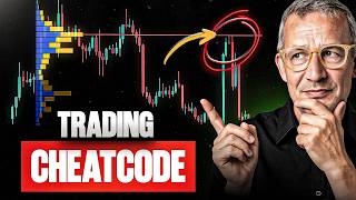
Tom Voelwald shares a volume-profile indicator he built to spot liquidity imbalances and time trades. He reads high-volume nodes, low-volume nodes, and single-print areas on charts to find supply and demand zones, using gold, the S&P 500, and Bitcoin as examples.
Chapters
Do you actually know the only indicator that can really help you locate markets and analyze them so that you have an edge, a knowledge edge? Today I'll show you exactly how you can bring liquidity, supply, and demand into consensus so that you can derive ideas and also implement those ideas for yourself when the right moment has come, when it's time to pull the trigger. And who am I? I am Tom Voelwald. They call me the Trader Maker. I've trained many people like Patrick Nill, 2-time winner of the World Cup Championships of Trading, or Christoph Radecker, all big names in trading. But I've also supported many people in finding their way as traders who aren't in the spotlight at all. And if that's exciting for you today, stay tuned because this will open your eyes if you want to take a different look at the markets for once. See you in a bit. What are capital markets all about? I can tell you, in the end, it's always just about which side currently has the upper hand, the buyers or the sellers, or if the whole thing is in balance. What results from that? Target trends or also balance. The question is always how long such a trend lasts, or what has to happen for a market to break out of a balance. And that's exactly what we're going to look at together today: which indicator I use to make a pre-assumption about whether markets are still fairly priced technically or not. And yes, that's exciting. Currently, we have a situation where many seasonality traders say, "Sell in May and go away." That means liquidity is often taken from the front in May, where a lot of money is currently flowing in. The stock markets then tend to go into a consolidation, and whether that's the case, that's exactly what we'll look at. And when that happens, that's the all-decisive factor to evaluate it correctly. First, I'd like to show you the gold chart. Why the gold chart? Because it shows us very well how the market behaved in this extreme here. You can see that in the volumes here, and up here you can already see there was simply nothing going on anymore. Here the market played with very, very little liquidity, and that was this price range here. Then the market ran down here and started to build up turnover. You can always read turnover here. Yes, that means it's nothing other than the volume profile. And the volume profile is really very, very helpful to us because it indicates the market phases where there was a lot of liquidity. It indicates the market phases where there is no liquidity. And it shows me where the wheat is separated from the chaff. You can always view these market phases here as balanced market phases where there was a lot of liquidity, traders were able to exchange. And these market phases here are fast market phases where the market likes to just zip through, or it makes a quick reversal because it's returning back to equilibrium. And if we project the whole thing over here And that's why I'm showing you this on the chart first. Then you can see immediately, here was the market phase where the market simply had no liquidity at all, and we used this market phase here to first take the springboard and then continue to run upwards. Now the market has done something, and it likes to do this very much. Down here at this last volume high, it basically touched down again and then ran back up. That means, for now, it definitely doesn't want to go any lower. Up here, there seems to be fair price discovery. What we don't know yet is, will it go lower again after that, or will it go higher? But what we definitely know is that the market likes to have a reaction there. So we keep in mind, at the last price range of the highest turnover, before we enter a low-volume node, meaning an absolutely low-priced area, a market likes to stop. And now let's take a look at the current market situation. Let's start with the S&P 500. And that's very exciting because up here there was turnover last time, especially in the last few days. Here we have a higher volume price range, and the truly fair prices, they took place down here. This isn't exactly rocket science or anything special, but it gives us ways to orient ourselves. And these prices here, they're exciting for me now. What's also exciting for me is how does the market play in these absolute low volume price ranges? Because those are the price ranges where the market likes to bump into things. And you can already see that here, the market had consolidated here, immediately reacted at the absolute low volume, and ran back up. And what's still exciting for me, and this is what I really want to show you, is How does it behave in terms of turnover here? And you can already see the turnover is going down, and when turnover goes down, it means supply and demand are no longer being played so excessively. And what does that mean for up here? Up here, it means we'll most likely see a pullback first. And since we've already tested the level, we can enter this price range. But what should we wait for here? And for that, let's take a deeper look into the market. I really like to use what's called market profiling for this. In the end, what it actually shows me is nothing more than just the turnover and the temporal price structure of these profiles. So, market and volume profile overlaid. The black part I'm drawing now is the volume profile, and you can already see up here the market has a lot of liquidity. But what else is exciting for me? Look at the VPOCs. So these are the price areas where the market was valued most fairly during these time periods. Yes, they're rising, and whenever something is rising like that, it indicates it's extremely stable, especially when liquidity is increasing. What else does this show me? It shows me that the structure of this market is extremely bullish. But, and this is the most important part, these are single print areas. The market only spent a very short time there. It ran up extremely fast, and something like that is often corrected later. And you can see that there's an absolute buying surplus here. And now let's jump back and take a look at this here, and we know for ourselves, okay, there's absolutely stable buying present, but there are predominantly buyers That means the sellers are significantly fewer, and that shows us when we see volume dropping that the market simply isn't being played fairly anymore. And that's why I assume we'll soon see a reaction here that leads to a pullback. And if I look at this further, for example, in the NASDAQ, I see the NASDAQ looks like a surface-to-surface rocket. There's absolutely no substance there. Look at what normal trends look like. And now look at this here. That is very, very steep. And when something is that steep, the moment eventually comes. You can see it in the volume up here where no more liquidity has been gathered, or only very, very little. It's absolutely imbalanced on the buy side. This shows me there's a high probability that the moment will come now where the market turns. I can read all of this very simply with the corresponding volume profile. But that doesn't mean I can time it yet. To time it correctly, I have to wait up here. When is absolute exhaustion reached? And either absolute exhaustion is seen with a volume spike, or a lot of volume is suddenly generated at one price level and then it goes below the balance. By that I mean the market goes up, generates a lot of volume, and suddenly drops below it. It often does a pullback and then runs back to the next substantial level and price area. And that's exactly what I'm waiting for now. And when that moment has arrived, then the time has come where we can say the market is turning. And that's what it could look like now. That's why I made this video, and I just wanted to show it to you. Last but not least, my leading indicator, which is currently Bitcoin. And you can see Bitcoin clearly. Bitcoin has moved down here. Briefly up, down, more steadily up. And when you see where we stand here, you can see that a market decision is about to, well, take place. It's risk on. This means that currently more money is still flowing into riskier assets, but we have inflationary concerns, and Bitcoin will show us where the journey is headed. I'm very confident about that, and therefore let's wait and see together. Let's wait for the right moment, and then we'll have a huge advantage. I hope this video helped you, and we'll certainly dive deeper into it again. What exactly am I waiting for here then? But I think the idea is perfectly clear to everyone for now. And so we all know, now is the time to take a look. I'm happy to be able to present all of this to you and say, see you very soon.









