STOP Using Candlestick Charts, Use This Instead
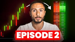
Candlestick charts miss the real action in short-term trading. Footprint charts and time & sales show who's actually aggressive: delta measures ask volume minus bid volume, and large negative deltas at lows often signal reversals or failed breakouts. A custom three-column footprint cuts noise and reveals the imbalances that lead to higher-probability trades.
I encourage you all watching this to stop relying so much on a candlestick chart and to start relying on the tool that I'm going to show you all in this video. In the first episode of this Order Flow Trading series, I go over how the stock market works and what strategy I would use if I had to start over back in 2016 when I first began my trading career. In this second episode of the series, I'm going to go over a tool that I use every single day that helps me understand how strong buyers and sellers are and which participant is in control. That way I can follow the footsteps of large buyers and sellers and then take high quality trading setups. Because of this, things that cannot be seen off of a candlestick chart can be seen off of this tool and this is where the real powerful strategy comes in. If you're new to the series, I recommend subscribing to my channel and also check out the links in the description below. You'll find all the videos to the series and you'll also find the links to my social media. I would recommend following me on there because you will stay up to date on all all future episodes in regards to this order Flow series. But now let's get right into this tool. So a little while back I made this post about Once I stopped relying so much on candlestick charts and started relying more on reading the volume and how it affects price, I noticed a huge difference in my trading. The point of this second episode of the Order Flow series is to not completely avoid candlestick charts or completely remove them from our trading arsenal. It's to simply understand that candlestick charts alone can be slightly misleading and they do not provide the clearest or most important information that we have to use to our advantage in the market. Candlestick charts are great to show a picture of where the market has traded in the past, and it's great to show where the market is currently trading. But price doesn't move because of the candlestick charts. The candlestick charts simply move because of price, price leads and the chart follows. The chart doesn't lead and price moves because of the chart. The order flow and the volume and the transactions will provide the most important information because this will give us a good feel of how other participants are perceiving the market at those specific prices. This is where the real intraday short term advantage comes in in the market. Just think about it. When price moves, the candlestick chart changes, the candlestick chart doesn't change on itself and then price doesn't move because of that what a lot of traders are going to say is, hey, we see the market selling off, we see this lower wick down here. But Carmine, there's a lower wick. I could easily see that there's buying here because of a lower wick present in the market. And again, reading this information alone doesn't understand or doesn't provide the information that's needed to understand why. Big question mark here. Why did this lower wick form? If this lower wick formed by actual strong true buyers, then it's very likely the market will eventually potentially reverse and rally and continue moving much higher. However, if this lower wick right here got put in by a failure of sellers to move the market lower, then it's not as likely or maybe a little bit of a lower probability that the rally to the upside may not last. So yes, you can technically say that there is buying pressure by looking at a lower wick, but you don't know how strong or the effort behind buyers or sellers that that form these wicks. And once you can understand the effort and how other participants perceive these prices by reading the volume in the transactions, this is where the edge comes in. Like I talked about in episode one of this order flow series, we have water going into the funnel, we have stuff coming into it, and no matter what happens at the end of the funnel, water is going to come out. We could have indicators, we could have lower wicks, higher wicks, ICT trading, algorithmic trading. No matter what, somebody has to place an order. So reading this will provide the clearest, most organic and natural information to create a buy or sell thesis from these orders. Think about this. If you're looking to short the market at this resistance level, you have a level of supply, a level of resistance. If the market's coming up into this level of resistance, how can you truly tell who is in control of price? You cannot understand how strong sellers or how strong buyers are by strictly looking at a candlestick chart. If I want to know, hey, the market's rallying up into this supply zone. Are sellers strong? Are buyers strong? Yes, you could see how price is trading and where it's currently at, but you really will not understand deep behind the candles of what's causing the market to reject this? Or if the market doesn't reject and we keep moving up, what's the reason or what's the cause? The real advantage to this is understanding the question mark aspect to a candlestick chart. From a candlestick chart alone, the question mark is really how strong are participants and how are other Participants feeling about prices trading here. This information cannot be found on a chart, but could only be found by using order flow data and reading the volume because volume will show us how other participants are feeling. This is a footprint chart, and this is probably one of my top three favorite tools. Because if we were to compare both of these charts, you could see as the market sold off in the morning, we then rallied up. And if I were to go to the footprint chart, you could see the same exact information as a candlestick chart. Right. We could even portray the candles with the footprint. These charts are identical. I'm going to go back and forth. You can see here the market has rejected this level of supply and resistance. We have a little bit of a lower high here, then we have a higher high, and then we have some more higher highs. If I go to this chart, you can see the same exact thing. You can see the lower high here, you can see the higher high, and then you can see even another higher high. So these charts are identical. One is showing just the candle body and another is going to show the volume inside of each candle body. And this is a footprint chart, one of my favorite tools. Now, like we talked about in episode one, if you have to go back to that episode and revisit these concepts, I would recommend doing so. I'll post a link for this full series in the description if you have to go back and if you missed the video. But in episode one, we really talk about how passive buyers buy on the bid and aggressive sellers market order hits the bid. And if you're a passive seller, you're going to be selling on the ask. And the only way you could sell if somebody comes in aggressively and the buyer buys on the ask, there's always going to be a buyer and a seller for every transaction. There's never more buyers than sellers and there's never more sellers than buyers. Now, a lot of people always say, well, volume could be spoofed, or there's a lot of spoofing or fake orders or fake liquidity that gets pulled and it may not really show true intention. And that's true. And this is why I don't focus on certain tools that can be easily faked or, or spoof. A time in sales essentially shows the order book of completed transactions. Think of this as your receipt. The only way an item is going to show on your receipt is if you go to the cash register, complete the transaction and buy or sell that good. Think of a time in sales as your receipt. That anything that's on our Receipt has been bought or has been returned, it's a completed transaction. If we bought something, we bought it from somebody who's selling something. If we sold something, we are selling it to somebody who bought that good. This is important is because we can spot who the aggressor is in each transaction. In every transaction there's an aggressor, there's a participant who is very aggressive that doesn't care what price they are paying. And then there's another participant who is very passive that is a little more reserved that cares about the price they pay for that good. And when an aggressive participant hits a passive participant, this is when we have a completed transaction which then gets reported on the receipt, which then is in the market's terms, a time in sales. So on a time in sales, what we're going to see is the time, the price and the quantity of goods or contract size in this case. So if we see a red print on the time and sales for 130 contracts at 9:30am Eastern time at 5539, that means there was 130 aggressive sellers. These are the aggressors hitting 130 passive buyers. We have a buyer and seller for every transaction. Now leading this into footprint charts. This essentially shows an aggregated view of the time and sales based on the time frame that we are looking to trade at. So this is a good introduction to what a footprint chart is, especially a normal footprint chart. Now, on the left side of the footprint highlighted in the red, we have market sell orders that hit the bid. So anything on the left side is a very aggressive seller present in the market and a completed transaction. What we see on a footprint chart are completed transactions. Nothing can be spoofed, nothing can be faked. They are completed transactions from aggressive participants hitting a passive participant on the left side. Anything that is red and no matter the quantity shows aggressive sellers present in the market. Anything on the right side, anything in the green is aggressive market buy orders that hit the ask. So these are the aggressors. But to the buy side, this information is represented in real time. This is important is because no matter the time frame, a five minute footprint, a one minute footprint, maybe even a range footprint, we can see who is aggressive. We can see where a lot of the volume is being transacted and we could see where there's less volume transacted or where there's an imbalance present in the market where there's more buying or more selling. And, and use this to our advantage again, we still care about Candlestick charts. We're not voiding them and completely destroying them from our analysis. But when you dig deeper into a candlestick chart and understand why this candle was green or why did we start rallying up via the order flow and reading these quantity of orders, this is where the advantage comes in. Now, on a normal footprint chart, we could see the same thing that we see in the candle. We could see see the open, we could see the close. We could see the high, and we could see the low. If it's a green candle, obviously we open lower than where we close at. And the same thing is here. If you split the footprint in half, anything on the left side are aggressive sellers and anything on the right side are aggressive buyers. We are looking who is the aggressor in the market. Because if you're aggressive, you are showing intention to be present with an agenda to move the market up or down. Essentially, the goal with this is reading imbalances and reading where large buyers or sellers are present. At that, we can use that information to our advantage. To understand how other participants are feeling about the market's auction. Let's act like the market's rallying into a level of supply. And right see how the footprint chart looks identical to the candlestick chart. We're just reading the orders behind this candlestick charts. Well, if the market's rallying into a level of supply, what I want to see is how strong the sellers are here. If they're strong, then this is a bearish position that I would be looking to open. Well, if the market rallies up here and the sellers are not strong, which could only be spotted by reading the volume of the order flow, and I notice that sellers are a little weak. Well, then maybe I'm not interested in taking the market short here despite it coming into my level of resistance or supply. Now, to simplify this even further, because there's hundreds of different numbers that we could have on our footprint charts, our objective is to remove the noise. And what I've seen a lot of traders do is they look at every single number at every single price. 504, 604. They look at every single price and every single color and every single number. We have to remove the noise and focus on what's important. The first step in removing the noise is understanding the delta. If you ever hear me use the term delta, what this shows us is ask volume minus bid volume. So we are essentially subtracting all of the aggressive buyers by all of the aggressive sellers. If there is a positive delta, that means buyers are more aggressive. And if there's a negative delta, that means sellers are more aggressive. So in this example up here at 57.28, you can see the price 57.28.75. There was 51 aggressive buyers because the buyers are on the right side and only one aggressive seller. So 51 minus 1 equals 50 at this specific price, 57, 28 and 3/4, there's a positive delta of plus 50. Now down here, 57.24.50, we can see two volume, two contracts, two lots of on the ask. So there's only two aggressive buyers and 100 and two aggressive sellers. Ask volume, which is 2 minus bid volume, which is 102, gives us a negative delta of minus 100. So at this price, there's a negative delta and the sellers are more aggressive by minus 100 contracts. This is delta. And this is the most significant thing for my footprint charts. Similarly, we could do this example all day long. Ask volume minus bid volume. 97 minus 75 is 122. 1145 minus 1253 is minus 108. And we could see this here. So we don't even need to look at an Ask vs Bid footprint chart, which a lot of traders are used to. We can just look at a delta footprint chart because we are looking to remove the noise. Now, this is my personal footprint chart. This is the only footprint chart that I use, and I use it on Sierra charts. It's a custom footprint that I created myself. Column number one, which I have highlighted here in the middle, shows total volume at that specified price for that bar. So up here, the first footprint bar, let's call it 57, 97 and a half, there's 84 total volume. We're not splitting it between bid or ask. We just know that there's 84 total volume. Now, the reason I do this, and I have it sheeted that in lower quantities of volume, the gray is a little darker, and when the quantities are a little higher, the gray is a little lighter. For example, 1108, right here, 5795. 1108 is a little lighter in gray. That indicates that when the gray, the color is lighter, there's more volume at that specified price versus six down here at the low, you could see it is in darker gray. I do this because when there's little volume, I could see where the auction essentially was cut off. And when there's a lot of volume, for example, in the light gray, I know that there's fair value in the market. Now, column number two, this is the most important column is number two is Delta @ that specified price for that bar. Now I also want to mention that I Personally use a 20 tick or a 5 point range footprint chart, especially when I'm treating the S&P 500. Column number two shows Delta, which again is ask minus bid volume at that specified price. So we have 84 total volume up here and our delta is 84. So what that tells me is 84 was done on the ask and 0 was done on the bid. 84 minus 0 gives us 84 positive delta versus down here we could see a 216 positive delta versus 366 total volume. What this tells me is there's 216 more aggressive buyers than aggressive sellers. I use this to see how aggressive either buyers or sellers are at the specific price. Now column number three is a volume profile that is colored by the delta. So if the delta is positive, you're going to see the color be blue. And if the delta is negative, you're going to see the color be red. But the distribution is done based on the total volume. So what I mean by this is the larger the profile, the more volume that we see. That means the larger or the thicker the profile will be. Here you can see 1108 and that's the most amount of volume for this specified bar. Which means the volume here is the greatest versus let's just call it six. This volume bar down here is the lowest and the color is represented by if it's a negative or a positive delta. Now why is this all important? Well, this is the basis to my trading strategy is I'm looking and I'm feeling out how aggressive the participants are. If there's a lot of aggressive participants entering the market at a certain price but no follow through, it's a sign of a possible reversal in the market if the market has a lot of strong selling volume but the market's not moving lower. So let's just say we're moving down, we're moving down. And right here we see a lot of selling volume. But the market, as soon as we see the greatest selling volume of the day, it's not moving down. Well, we're seeing a lot of aggressive participants. Maybe somebody's buying this move and it's a good chance a buyer is active. Remember aggressor hitting a passive participant and it's a good chance the market may want to reverse. And we can use this information to our advantage. And maybe this is why the lower wick forms and you only got that lower wick after it was placed. But by reading this volume, you could get in in real time saying, hey, if I'm correct on this thesis, maybe a lower wick will be placed here because there's true buyers active in the market. And this just leads to those sellers who are aggressive in the market. If you're so aggressive and you're not making money, you become trapped if the market moves against you. And this is how we can look to capitalize on reversals, especially in the market. So this was a trade that I took. This was a $21,000 profit off of about $2200 worth of risk. It was a 9 to 1 risk to reward ratio. And I'm able to get great risk to reward ratios when I use the order flow to confirm the setups here. Looking at my Delta footprint again, 5 point range or 20 tick range, I'm looking for outliers in the data. A lot of people always ask me, hey Carmine, like are you looking for a specific number? Are you looking for greater than 100, 500,000? And I don't have an answer to that because what I am looking for is unusual activity or outliers. In my data down here we could see the greatest negative delta of the day, which was minus 735 and minus 1171 as the market was making a low. So as the market's selling off and moving lower, the greatest volume or the most aggressive the sellers were all day was at the low of day. So think about that. If a lot of selling is coming in at the low of the day, ideally in an auction, you would see it continue moving lower. Now this is what the market looks like despite all of this selling down here on the footprint chart at the low. Again, very relatable. The market's selling off. This is where all the selling comes in. We cannot see this selling strictly looking off of this candlestick chart. Like, I don't see anything right here that indicates sellers are present in the market or even buyers for this case. But reading the order flow, you could see that the selling was the most aggressive down here. Negative 735Delta, negative 1171Delta. Eventually the market reversed. Strong buying came in thereafter and these sellers at the low became trapped. There were tons of effort but no reward by those sellers. And this is the only option for the market to do is then move up. I talk about this a lot in the first episode of the order flow series about how an auction works. This just complements those concepts so well. And this is the basis to my Trading strategy. Here's all that selling, right? Would you buy the market right here at this moment, right down here? Would you buy the market? Honestly, this looks weak, right? We're making lower lows. We're also making lower highs. This looks weak. Nothing here tells me to buy the market, but everything right here tells me to buy the market. And this is where the advantage comes in. And this is how I was able to catch the market long down here. Not up here, not up here, down here, where all the selling volume came in and how I was able to make a $21,000 profit off of 20$200 worth of risk. So if you want to see what this looks like in real time, what we're going to see here is the market's going to sell off. And down here at the low, we could see some selling volume step in. It's really not aggressive just yet. Minus 367, minus 339. It's about average or up to par what we were seeing previously in the auction. But watch as I play this. The market's going to come into the low and the selling volume is going to build. Right there. Somebody hit the bid aggressively. Aggressive sellers just came in. Despite those aggressive sellers. I'm actually going to come back a little bit here. So we see -367 despite those aggressive sellers coming into the market. The market actually bounces right there. Hit the bid aggressively. The delta got stronger, got more negative. So more aggressive selling came in. But we didn't even move lower despite all that selling. That's. That's a red flag a little bit. If you're looking to capitalize on a downside move. This to me is starting to warm up for an upside reversal because we're seeing all the aggressive sellers not successful in bringing the market lower. So we're going to see here again is some strong movement down, right? And now the delta is building even more. Let's fast forward this. We're seeing the negative delta minus 254. Then boom, right there. Minus 1100. That just went from minus 200 to minus 1100. That means 900 more aggressive sellers just came into the market and the market did not move down. This is a little concerning to be a seller. And this is a little bit of a green flag to start looking to buy the market. If we put those sellers in pain and if those sellers become trapped. And here you can see the market rallying up. All that aggressive selling with no downside follow through, and then the market eventually rallies up. And this is how I was able to capitalize on that strong upside move. Now how about this example. How many of you would say that this is a bullish move breaking above a resistance level. We got a strong breakout above it with strong green little rally candle, right? You see this really large rally candle here and everybody's buying the breakout. You see volume here to confirm it and you're thinking this thing is going to go to the moon, it's going to break out and you're going to make a lot of money. Longing this to the upside. Well, reading the volume would tell you that this breakout is not very strong. And this is how you would be able to capitalize on a short position or a bearish move capitalizing on a sell off. As the market breaks out, the volume dissipates and the volume gets weaker. And in real time when this was breaking out. Let's act like you don't know what happens next or we're just looking at this chart in real time. It looks strong with a candlestick chart. But reading the volume, you would see here that there's a lack of interest. There's almost like a volume tail. And I use this term again in episode number one. If you have to go back and reference that this volume tail shows that nobody cares about the market above this resistance level. If no buyers care about this move, then sellers are going to be forced to lower their prices. And this is how you're able to capitalize on an upside reversal and looking to short the market and become bearish volume tail. Selling steps in there after. And again like this is just simply reading the volume and not even looking so much at the delta. This volume tail right here tells me that the buying got shut down, the buyers became exhausted and nobody cared about this move. Nobody cared about the market being up there. And this is what it looks like. The market is breaking this resistance level. So let's speed this up here. The market just broke this resistance level and watch when the volume builds and we leave a volume tail. So we're trying to. There's a lot of volume trying to come in here. We tried to move up. It immediately got shut down and now things are starting to turn red and indicate that nobody, no buyers want to buy this move. And sellers are now active because things are turning red. And this is how you're able to capitalize on a downside sell off move shorting this failed breakout. I'm telling you all the greatest edge for short term trading comes from understanding the responsibility or the perception of price from other participants, and the only way you can do this is reading the volume and the transactions coming in. A footprint chart is a good visual, but it's just one of the tools to be able to read the volume and the transactions coming into the market. So a footprint chart gives me all of this valuable information. Now there's other tools that we use. In episode number three of this Order Flow series, I'm going to go over two other tools that give us the same information, just a little bit of a different visual. And sometimes a different visual will provide clearer information that maybe we can't see off of a footprint chart. So if you're new to this Order Flow series, I would recommend subscribing to my channel. Check out the previous videos and also follow me on my socials, which I'll link in the description below so you don't miss when I post episode number three. If you have any comments, let me know in the comments below. If you learned something from this video, drop a thumbs up. And if you're new or you're enjoying this series, I would just it appreciate appreciate you to subscribe to my channel. That way I can continue making this series and provide value for everybody else watching. I'm going to end it on that note. Peace out.









