The BEST Day Trading Indicator - Beginner Guide to GEX and Option flow
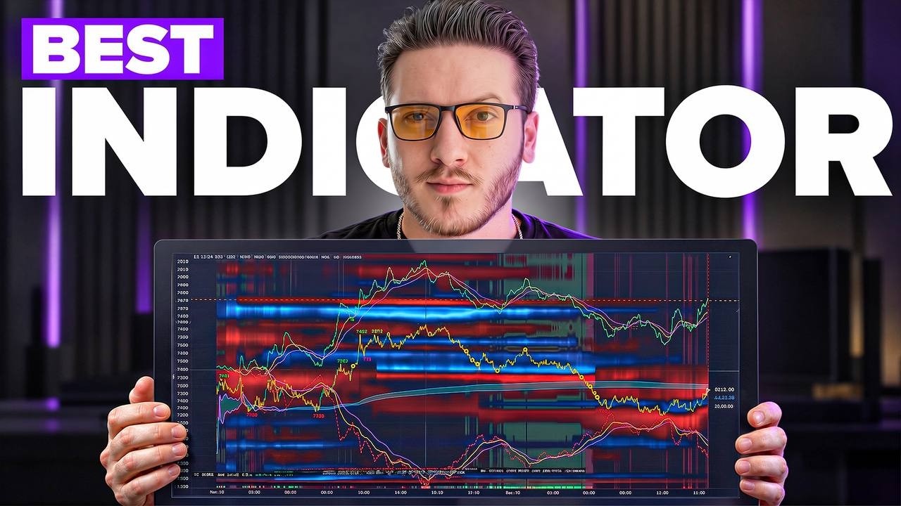
Gamma Exposure (GEX) shows where market makers must buy or sell the underlying asset to hedge their options positions. With $3.2 trillion in daily options volume, tracking dealer hedging flows through put/call walls and gamma regimes reveals support, resistance, and reversal zones that day traders can exploit.
Chapters
If you're trading NQ or ES, there is this one indicator that can be an absolute game changer for your day trading. An indicator that if you're new to the channel, you probably never heard of, called GEX. And I've had the luck to trade side by side with some of the best traders in the world. Not fake TikTok Lambo scam gurus, but actual professional hedge fund managers, world trading champions, and former market makers. And after 8 years of trading, I'm now in the process of opening my first fund. And this indicator, this layer of data, is one of the things that many of these elite traders that I've traded with always have on their chart. A data point that up until recently, 99% of traders ignored, that sort of became popular right after the last live trading video I've made with Fabio, where he used that live to make over $7,000 in a single session. And it is a tool that professionals use very often for their day trades or the their swing trades because of 3 crucial reasons and purposes that we will cover today. To know if a session will be a volatile one or a choppy session, to know where price is likely to accelerate or slow down, and to find the best areas for entries and take profit. In this video, we will see exactly how it works, the science that backs this up, and exactly how to use it to potentially radically improve the precision of your trades and your overall awareness of the context Of this session's order flow. And before you start commenting, no, this is not another Bollinger Bands, MACD, RSI type of oscillator. It's not something that makes some form of average of the last 20 candles. Nothing like that. Explained in simple terms, it's like having a treasure map that tells you before it happens where market makers of options will be forced to buy and sell massive amounts of contracts or stocks or futures and move prices. And you too can use this to get more precise entries, smarter position management, and an almost unfairly better context awareness than 99% of retails out there. And to get started with this, you really need to know one thing. You need to get this one thing in your head to truly understand and appreciate why it is so powerful and why it should even work. This represents the notional volume of the entire United States stock market. This is your individual stocks, and it's approximately $500 billion per day. This instead is The notional volume of ETFs, around $200 billion in notional volume per day. And these are your ETPs, your exchange-traded products, your ETFs, your ETNs, your ETCs. And this is the one of index futures. This is your ES, your NQ, approximately $750 billion in notional daily volume. And you might think, well, that's a lot of money. And you'd be right until you look at the notional daily volume of options around the stock market that amounts to around $3.2 trillion. In notional volume traded every single day, this is almost twice as much as these combined. And here's why it matters. According to CBOE data, around half of this notional trading volume is generated by retail traders and institutions, mostly by the way retail traders. The other half is traded by market makers or market making firms. And market makers or market making firms are firms like Citadel whose only job is to provide liquidity to the market, which simply means. To be the other side of anyone's trade. For example, they might be offering to be always sellers of an option at $120 and always offering to be a buyer of an option at $100. But they would quote the bid price and the ask price. So a trader might come who wants to buy, for example, this option, and he will accept market maker's sell offer in the ask. And then another trader might come and he will need to sell, and the market maker will buy to him at $100. So the market maker is always selling at $120 and buying back at $100, pocketing a net $20 on this transaction. Now imagine this done millions and millions of times a day, and imagine this done with options that typically have a 100x leverage. This is an extremely profitable business model. Quoting the ask, so always offering to sell, quoting the bid, always offering to buy, facilitating the transactions to traders, and cashing in this difference between bid and ask called Spread. So everyone's happy. The traders always have someone that will buy and sell and be the liquidity for their bets, and market makers will cash in the small difference between bid and ask. But this business model, of course, comes with a risk because let's say this trader is buying a call option, which is basically making a bullish bet. So if price starts rising, he will start making money and win on his long bet. But the market maker who sold that option is now losing money because he's in the other side of that trade. So to hedge this risk, this directional risk that if price starts rising, they will lose money. To avoid this loss, they will hedge it. They will cover this loss by buying an equal amount of the underlying asset. Let's say, for example, this is an S&P call option, an SPX call option. So the market makers being the seller of this option is basically short the market. To avoid this directional exposure, they will buy, for example, the equivalent amount of ES futures, which is one tradable version of S&P 500. So they will buy it so that if price starts rising, that position will earn them money and their delta will be neutral because this money will cover from this loss. So because of the sheer volume that is traded in these options, a considerable amount of the flows in the single stocks or in the index futures comes from the hedging activity of options market-making firms. And what a gamma exposure indicator shows you is a sort of map, a profile of how much exactly their exposure from these option trades is at each price, hence how much they will probably need to hedge. Let's start with the very first basic layer. So when it comes to reading these type of flows, also known as hedging flows from market makers, there's typically 2 routes that people go through, 2 ways of accessing this option flow data. The first one is to use option flow as positioning data. The second one, which is The more nuanced and more interesting topic for this video is dealer's exposure, which is the main thing we're talking about. So the first one, option flow as positioning data, is basically taking a look at what retail traders and institutions, what the whole market is doing in the option market, and analyzing that flow to understand what's the sentiment of the market. And dealer's exposure analyzing the other half of those trades, which is market makers that are facilitating those bets and their necessity to hedge. So we take a look at the option flow of the market for sentiment and positioning, and we use the flow we can attribute to market-making firms to understand how these dealers or market makers will join the underlying market through hedging flows. These are basically the 2 dimensions of option flow analysis. So when we're looking at option flow and positioning data, the most common type of tools that we use are put and call walls, big trades analysis, and the cumulative flow. This is for positioning data. For dealers' exposure instead, that's where we dive deep into the actual gamma exposure. And gamma exposure can be analyzed in many different forms and many different ways that we will see throughout this video. So let's start from the very basic stuff, analyzing put and call walls. So this is DeepGamma and it shows an example of the first layer of option flow. We have the chart of the S&P 500 SPX, which is one of the most traded options in the entire option market. And we have these 2 main levels that are detected from DeepGamma that basically sources CBOE option flow to simply understand where are the levels where the biggest amount of volume of calls or puts was traded. And all of these levels are taken from the option profile, which is this thing over here that basically shows how much volume was traded at each strike price in the option chain of SPX 0 DTE, which is the options expiring today. And as you can see, in combinations with the biggest level of volume, that's where it plots this put walls. So a big put wall over here, another big put wall over here, A call wall above here, and another call wall right over here. So these levels represent huge bets made by big market participants in the option market. So the expectation is that they will defend these levels, that these levels will sort of act as support and resistance. So this is basically just like volume analysis, just having a profile of the total open interest of options traded by the entire market. And if you move forward through time, this is sort of a backtester. You can see that the call wall is exactly the level that market could not break through. So it acted as this resistance area. Now, more puts were traded around this level, and that's where the first sign of resistance appeared from buyers. The next level at that point would be here. And this is, of course, happening because the session probably just opened. So as we can see, this put wall acted many times as the only level where all of the selling pressure could find some form of resistance. And the second level where it found resistance is at the following call wall. Of course, these are levels that, you know, can change throughout the session, that not all the time will act as support or resistance. But for example, on this level, we just accumulated a lot of calls, and that's exactly where price bounced back from. So this is the main idea. We use put walls and call walls to understand where's possible areas of institutional support or resistance because of all of the option bets that are done at that specific strike or price level. Now, another Cool way to look at the volume traded in option is with the option volume and the option delta. And what this is, is nothing more than just a volume chart, volume bars, but not from the futures flow or the stock flow, but from the option flow. And this is where you kind of want to look for anomalies, for levels where we kind of go above the average and where we want to look for outlier levels like this one. And you're going to be able to notice that approximately at these Peaks in volume is exactly where you have most of the reversals. Super high peak in volume, this in this case from the put side, that's where you had the biggest reversal of the day. And the delta is basically the net flow of options, just like the cumulative volume delta but of options. And this is calculated on the entire premium of both calls and puts traded in the market. So this is somehow the overall sentiment in the market. And as most of the zero DTE traders are retails, this is basically some form of retail retail sentiment, but in real time, of the option market. And we can clearly see that throughout the entire way down, retail traders basically went long, as they often do. So those were the put and call walls and the cumulative flow. Now on to the big trades analysis. We want to look at option flow and understand what are the big guys doing, not just the retails. And we can check what the big guys are doing thanks to an indicator called Big Flows, which basically plots inside of the charts the actual trades that happened from big market participants on your chart. And this is set on a minimum premium of $1 million. So now let's get rid of the total volume. Let's get rid of the delta of the option profile open interest, removing also the walls and just focusing on these trades. So all of these squares and triangles and all this stuff is nothing more than option trades. The blue diamonds represent call options that were bought, the red ones call options that were sold. The little squares represent put options that were sold or put options that were bought. For example, here someone has sold a put to close that position, which means that probably he had a bearish bet that was very successful and he simply took profit. And that's exactly where price basically stopped. And as you can see, there's 2 main differences: squares and diamonds. Squares are put options, diamonds are call options. Of course, if you're familiar with options, you should know what these terms are. If you're not, I made a video explaining exactly all the basics of options that you should watch. But the first main difference is the shape. Squares are puts, diamonds are calls. Now, an empty square or an empty diamond means that that's a closing trade. So that's a trade, buy or sell, Put or call to close that position, to close that trade. And these are okay. I personally do not look at them that much. I like to look way more at the new positions that are being opened. So not hollow shapes, but filled shapes, like just like this one. And what this guy has done is he has bought a call at 7745 and sold a call exactly 5 points below. This is what we call a spread or a bear call spread. And if you're not familiar with options, this is basically a bearish bet. It's a bet that price will stay below this level by expiration, which is 0 DTE. So this is basically someone betting $4.2 million that the price will stay below this level. We're talking about 4,000 SPX contracts. If you don't have an idea of the magnitude, it requires a trading account worth tens of millions of dollars just to open a trade like this. So this is someone with a lot of money, probably very well informed, that bet On price staying below that range, and the more you spend time looking at option flow, the more you're going to see that these trades most of the time are super profitable. So another strategy that someone could take is just mimic what these trades are doing. This is not financial advice, and I'm not saying it's successful, and you're going to win 100% of the time. But you know, you could at least see what these big guys are doing and see what happens. For sure, if someone this big just placed a bet that we will stay right below. I mean, it might as well be. It's a thesis that we can evaluate and test. Now, everything I've shown you up until now is simply option flow data taken from the trades that happen in the option market to assess what's the sentiment. And this is an extremely cool type of analysis, but still somewhat surface level because these are only half of the picture and technically just half of the market. The other half of the market is market makers. And they're not taking these bets. They're not taking directional bets. They're not betting on an outcome. They're just providing liquidity so that people are able to have these bets. And as we said, because they take the counterpart risk, they need to hedge it on the underlying asset. And that's the realm of gamma exposure. So this is the first realm of option flow analysis. The second realm, which is the main, let's say, topic of this video or the One that is going most popular recently is gamma exposure. And honestly, I call it gamma exposure because that's the keyword that people search on YouTube because they don't know anything about options. So they hear people talking about GEX, GEX, GEX. So they just search for GEX. You're here because you want to understand really what is behind this gamma exposure. And gamma exposure is just one of 3 very important things that determine the hedging of market makers, together with charm exposure and vanna exposure, which are 3 separate formulas, 3 separate mathematical derivatives that ultimately boil down to the mother of all Greeks, which is delta. The way that these dealers deal with this exposure is called dynamic delta hedging. And we're going to get into What delta is, what gamma is, what charm is, what vanna is. But before we get into the math, I want to start from the practice. So we distinguish two main regimes when it comes to dealer exposure. They could be having a positive gamma exposure or negative gamma exposure. And to summarize, this basically means they're net long options in the case of positive gamma and they're net short options in a negative gamma exposure scenario. And the way they will hedge this is to diametrically opposed Hedging regimes, because if they're net long options, so they're they're buyers of options, they will be long gamma or they will have a positive gamma exposure, which simply means that if price rises, they will sell; if price drops, they will buy instead. So they will basically sell into rallies and they will buy the dips. So because they will sell the rips and buy the dips, the resulting effect of this order flow. into the price action is it will result in a compression of volatility. In a negative gamma scenario instead, they will do the opposite. So if price rises, they will have to hedge by buying the underlying asset. So they will buy the rips and contribute to the expansion of that rip. If price starts falling instead, in a negative gamma exposure scenario, They will have to sell. So they will buy the rips and sell the dips, contributing to the expansion of volatility. So as we will see in the charts, the blue areas is where they will tend to compress volatility and where these areas might, for example, act as support and resistance. The negative gamma areas, as we will see, are the ones where you can expect price to drift even faster and to accelerate. So positive gamma levels are typically more used to look for reversals, negative gamma levels for continuation. Now let's take a look at an example. Let's go to DeepGamma, which by the way, you can try for free for 15 days. And we're currently the only platform doing this with licensed CBOE data. So that's fucking cool. While other platforms charge $600 a month for the same level of data. Link is in the description. Just so you know. But if we now activate the option profile GEX of market makers, this is how it looks like. Let's remove the overall total option volume and just focus on this one. As you can see, let's, let's move this a little bit before so you can see how it evolves through the session. Now, as you can see from here, let's remove the put walls and call walls and remove delta and volume and just keep the big flows and the GEX. This GAX profile shows you 2 types of area. The blue ones are positive gamma levels. The red ones are negative gamma levels. And so how they will typically interact with these areas is exactly as we said. These are the areas where it's likely that price will accelerate. These areas instead is where you can expect price to bounce back from. And these are the 2 main gamma levels. And if you notice, they're actually the opposite of these 2. Someone bought a call and the market maker had to sell it. And he has a $5.7 billion gamma exposure deriving from taking the other side of this huge trade. And when this guy sold an option, the market maker had to buy it, resulting in a long gamma exposure. And you can have this same thing, this profile in the shape of a heatmap. So I'm going to activate the Option GEX heatmap. So this is basically the same thing, but as a heatmap. Now let's move on with the session. What we could expect is these areas to act as a resistance. And let's see how it behaves in the red areas instead. So a few hours passed along. This long gamma exposure area acted as the main level of resistance. And in this entire long gamma area, price was very, very choppy. And you can see it as an effect of the hedging activity of market makers, because in this area, this blue area over here, is where they bought the dips and sold the rips, resulting in a compression of volatility that up until then was pretty straightforward. And if we move even More, we can see that price eventually dropped. And look at where it started accelerating even faster. It pierced through a short gamma level, and you see price accelerates even faster. And right when it bounces off of this long gamma level, it pumps back up, goes back onto the negative gamma level, and accelerates again, and again stops around that same level that acts as the ultimate resistance for the entire session. And as we approach the final stages of the session, which is where there is the highest level of we call gamma sensitivity. That's where we typically see a lot of these super high volatile moments during the closing auction. Yeah, there you go. And where again, a super negative gamma level resulted in a huge acceleration in price. And in the final moments of the session, that's where the session closes and where all the gamma ultimately sits. But that's— this is just a— this is just an order flow dynamic because of the theta decay that we will learn later. But this is the main idea. We use the blue areas as areas of potentially support and resistance, or areas where price will be more choppy, more compressed, and the red areas as areas of acceleration instead. Of course, this is not the only factor in place because as you will notice, yes, here there was the biggest gamma level and that's where price dropped. Right. But still price pierced through a lot of these areas that were supposedly resistance. Right. Or support. So you shouldn't see this as it always happens, like every gamma level will always work. So another thing you can do is you can add the overall gamma regime. So I will add the option summary GEX, and this will give you instead an idea of the overall gamma exposure, not just by the single big levels, but also the overall net gamma exposure of market makers. So as you can see, we started the session pretty flat. There was not a huge There was not a huge either positive or negative gamma environment. And as soon as the negative gamma started rising, that's where you started seeing more directionality. And throughout this entire super fast fall, the negative gamma exposure grew and grew. And as soon as we dropped back into a positive gamma regime— so this is the overall regime. It's not just the level, just the area. That's where price started being more and more fluctuating. So one perspective is on the single level. Of gamma exposure and how it will behave at that specific level, and it mostly works with very very strong levels, not with mid-level like like 700 million, 100 million. Those are not great gamma exposure levels, but gamma levels where you see billions and billions, those are the one you want to actually take into consideration. And the overall gamma regime is how they will behave on a more general level in the rest of the levels where there's not. A big, big level. So the net gamma exposure tells you the overall regime of the session or what you can expect regardless of the big levels. And by the way, there's a lot of other super cool stuff that you can do with option flow. For example, the option exhaustion detector. You could imagine this as liquidation levels. So whenever there's situations where a lot of small options are closed out or where you could say retail traders get stopped out of their option positions, This automatically detects it. Then you have also dynamic levels where you can check where softwares like DeepGamma makes a sort of VWAP of the option flow. So a dynamic level calculated on the option flow or the overall option market maker pressure that basically tells you what market makers are likely to be feeling in their overall gamma exposure. And as you can see, the market makers here started exerting an upward pressure Even before the price plotted the bottom, or the options expected move, which is basically giving you the overall range where the market expects the volatility of this session to be like. So it basically takes the option premiums and derives the implied volatility for today and basically tells you what is the range where you could expect some movement from that point on based on option prices. So this is not an ATR. This is implied volatility from options derived by the actual sentiment of the market on the bets that the markets are making. So to summarize, we use option flow and positioning data such as put walls, call walls as levels of support and resistance, the cumulative flow to assess what the sentiment of the market is, and big trade analysis to understand what the big boys are doing from the options side of the market. Level 2 is dealer's exposure, understanding the 2 main scenarios of negative gamma and positive gamma to assess what is the regime of the day, if positive or negative, if expansion or compression, and what are the exact areas of gamma exposure, either positive or negative, where we can expect reversals or accelerations and continuations. Now, I thought that in this video I was also going to explain you CHaRM and VaN exposure, plus the different types of GACs that exist. But I will keep it for the next video and I'll just save it on a playlist for you to rewatch so you can digest this huge bunch of new information you might be not familiar with. In the next video— but in the next video, we're going to talk about why CHaRM and VaNA are extremely important, why we use them in the calculation of the hedging profile, which basically means how time and changes in implied volatility influence the delta hedging. So we will get deep into that, and we will also understand why most gamma platforms don't actually show you GEX. And we will get into the nerdy details, but you have to know that there's 2 types of gamma exposure platforms. There is platforms that are fed CBOE data, like DeepGamma and a few other ones, but very few of them. Majority of GEX platforms use OPRA data, and there are 2 completely different data feeds We will also see in the next videos, and the OPR data is simply undifferentiated option flow. So imagine it like a tape of the total volume of bought put and calls. So one contract sell call, two contracts. No idea who opened these trades. We just know the size, the strike, and the time. This is OPR data. CBOE data instead is way cooler and way more expensive because it tells you the trades of market makers, the trades of professional customers, the trades of brokers and dealers, the trades of normal. Customers, the trade of big firms. And it basically tells you who's who inside of that option flow, something that 90% of GEX platforms do not have because this little thing over here costs approximately $30,000 a month. So you will see a lot of these GEX platforms with CBOE data costing upwards of $300, $600 sometimes a month. And these ones to be sometimes cheaper and sometimes even This pricey deep gamma instead is the only one until now where you at least can have a free trial with the link in the description. Plus, you would expect because it's free, it's Oprah data. No, it's CBOE data. It's the expensive one. It's the cool one. So in the next video, you're going to understand why this difference is crucial and why unfortunately the only really gamma exposure we can get confidently is the one from the S&P 500 and the one from. The Nasdaq, for example, like NDX, QQQ, or even SPY, or the NQ futures, or the ES futures. All of these can only be calculated with the so-called naive version of the GEX. And naive—it's a very generous assessment, a very generous word. But again, we will see this in the next video where we'll go deep into the nerdy details, into all the science that is behind and backing up the effectiveness of gamma exposure. We're going to get deep into what the convexity is. So if you haven't yet, subscribe to the channel. That's it for today. Today, and I'll see you in the next one.









