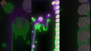
Kardec Trader shows how professional traders use an x-ray visualization tool that displays buy and sell liquidity as colored bubbles, instead of standard candlestick charts. Price moves based on how much liquidity exists and how hungry traders consume it, like customers at a butcher shop. He offers a free YouTube course on using the tool.
Chapters
This is a normal price chart that every single trader looks at. These are indicators they use to feel less insecure. This instead is what professional traders use. This chart literally uses x-rays to show you all the information you need. Here's a stupid simple example to understand how it works. On this side, you have buy and sell liquidity. Imagine this like the meat counter at the butcher full of turkeys. These bubbles are like really hungry customers before Thanksgiving. They will consume the meat being offered. So hungry buyers will eat all these sell liquidity areas. Hungry sellers will eat all of these buy liquidity areas. If there's a hot area, that means there's a lot of buy meat. So hungry sellers will tend to eat all the way down there. Once they get there, they either get full and leave rooms for hungry buyers to eat up, or if they're still hungry, they'll look for the next big chunk of meat. So prices in finance move based on how much meat there is and how many hungry customers there are. But with normal candlestick charts, you're literally blind to all this. If you want the link to a free YouTube course that I made on how to use this tool, comment "meat" and I'll send it over in your DMs.