Find Out What a Remarkable Difference Certain Colors Can Make for People Living with Dementia!

Lisa Skinner explains how color and contrast help people with dementia navigate their environment and manage daily tasks. High-contrast paint on doors and bathrooms, careful color choices for furniture, and color-coded pills can reduce confusion and support memory. Age-related vision changes like lens yellowing and reduced contrast sensitivity make these design choices especially critical for dementia care.
Chapters
Are you caring for a loved one with dementia? You don't have to figure this out all on your own. Welcome to Truth, Lies Alzheimer's, the show that helps you reimagine a new relationship with your loved one, a relationship a little more free of stress and anxiety. Join host Lisa Skinner and her 30+ years of experience as she guides you on a new path to a better relationship with those you care for. Here's Lisa.
Hi, everybody. Welcome back. As promised, I'm here with another brand new episode of The Truth Lies and Alzheimer's Show, and I am Lisa Skinner, your host. Did you all know that people with dementia are even more likely to link visual memories and emotions than individuals who are not experiencing cognitive decline? This has been found to be absolutely true. Our everyday experiences are shaped consciously and subconsciously by the environment that surrounds us. Especially when it comes to color. It's important for people with Alzheimer's disease and other types of dementia to reside in a space that promotes physical and mental well-being. Certain memory care paint colors and patterns are able to evoke emotions that can reduce agitation, combat aggression, and even stimulate memory. Intentional color selections can dramatically change the way your loved one interacts with their environment. Isn't this amazing information? Who'd have thought? So why do colors matter to people living with dementia? Because Color has an everyday impact on our psyche, and it has the ability to shift our mood. This shift is especially evident in seniors, as older adults are most likely to form connotations between emotional memories and positive colors. And that is according to Harvard University research. Why? Because as other senses diminish, color may be more easily distinguishable than other environmental cues. Not only can color influence emotion, but it can also enhance a senior's understanding of their environment. Cognitive abilities and eyesight diminish over time. Objects may become more difficult to differentiate, and things that a person without dementia would easily be able to tell apart may become harder to distinguish. This can lead to difficulty discerning a bathroom from a bedroom, finding food on a plate, or dressing in matched colored clothing. There are 3 general categories of change in cognitive ability that makes it harder for people with dementia to maneuver through spaces. Number 1 is people with dementia perceive color differently. This has been proven. Color preferences may change as their dementia progresses. In other words, vibrant, hot colors like neon shades can cause confusion and stress. And this is according to the journal Frontiers in Psychology. Number 2, dementia compromises a person's depth perception. In the late stages of dementia, vision may become limited. Individuals with memory impairment often have trouble judging distances or seeing contrast between similar colors or properly identifying a dark object in a dim area, and this can lead to increased falls and increased wandering. Number 3, motion blindness is a common side effect of dementia. Motion blindness, for those who aren't aware of that term, is a type of visual impairment that makes it difficult for people with dementia to see where they're going or even if they're moving at all. According to research from the University of Rochester, when paint colors shift between rooms and hallways, a senior with cognitive decline blind is able to perceive spatial changes they may not otherwise notice. I think that's absolutely fascinating. As a person with dementia moves through different spaces, the use of contrasting colors can help promote behaviors. For example, the muted blue of a sitting room can induce feelings of calm and relaxation, whereas bright yellows and greens of a kitchen or dining area send energizing cues to the brain, perhaps stimulating their appetite. All of a sudden they feel hungry. There are so many factors that are out of our control when it comes to dementia, things that we can't fix or make better. But color stimulation or de-stimulation is one thing we can control and we can do really well. So choosing the right palette of paint colors can, as been shown, can dramatically influence an environment from a safety standpoint as well as an emotional one. So here are some things to keep in mind when choosing colors to keep people living with dementia safe. Now, to prevent what's called spatial misperception, you want to avoid dark rugs, bathmats, and other floor coverings— and other floor coverings. Dark colors can look like vacancies to people living with dementia, and they may perceive these objects as holes in the floor to be avoided and attempt to navigate around them, causing both anxiety as well as potential falls. Keep contrast, color contrast in mind. A person with dementia with limited eyesight and depth perception may not be able to distinguish a white toilet from a white wall or strawberries from a red bowl. Using contrasting paint colors can help clearly define objects, preventing bathroom falls and/or toileting accidents. You want to identify doorways. Since people with dementia may have trouble with wayfinding, it's important to distinguish spaces with color and design to avoid anxiety and confusion. By differentiating resident doorways with paint colors, posters, memory boxes, rather than just nameplates, it's easier for individuals to find their own rooms. And this prevents the potential fear or aggression that can come from entering another resident's apartment. Equally important to understanding which colors to use is knowing which colors not to use when designing a space for our elderly, especially if they live with Alzheimer's disease and related dementia. Now, this is because certain colors can inadvertently cause fatigue or increase stress, can bring on a headache. It can actually decrease a person's visual perception, cause eyesight damage, and increased user interface errors. Another important thing to realize is the effects of aging on a person's vision can be profound and needs to be considered when designing a space for the elderly. From about the age of 40, the lens of the eye begins to harden and lose its flexibility. This is a condition that's referred to as presbyopia. Presbyopia. Now, presbyopia causes images to be focused behind the retina with a resulting loss in visual acuity. This is a part of normal aging that makes it increasingly difficult to focus at short distances, hence the need for reading glasses. With age, our pupils shrink, resulting in the need for more light and diminished capacity to adjust to changing light levels. For example, a 60-year-old retina receives only 40% of the light that a 20-year-old's retina receives, and an 80-year-old retina receives only around 15%. Hence, older people also have lower light sensitivity and increased sensitivity to glare. The older eye is less able to make out low-contrast patterns. And according to the National Eye Institute in the US, from the age of 40, contrast sensitivity starts to decline until around the age of 80, it may be reduced by up to 83%. This can have profound implications when designing spaces for our elderly. For example, as certain text colors and background color combinations are extremely difficult to read for older people who are experiencing low contrast sensitivity. In addition, compounding the effects of presbyopia, visual sharpness also worsens with declining contrast sensitivity. Declines in contrast sensitivity cause the older eye to have slower accommodation transitioning between dark and light places. Older eyes have more difficulty seeing thin lines and focusing on hard edges. Beyond affecting reading in general, this would make it extremely difficult for seniors to distinguish between similar icons, buttons, and other user interface element shapes where edge— edges and lines are critical visual cues. Color confusion also increases with age. The most common form of color blindness in the general population is difficulty in distinguishing between colors containing red or green. According to the National Eye Institute, this affects approximately 1 in 12 men, or 8%, and 1 in 200 women in the world, or 0.5%. These percentages increase with age, and severity also increases with age. Although this condition is known as red-green color blindness, it does not mean sufferers mix up red and green. What it means is they mix up all colors that have some red or green as part of the entire color. For example, purple is made up of blue and red, right? Well, because the eye does not see the red component, to somebody who is experiencing the red-green color blindness, the purple to them will actually only look blue. Then what happens as we age? Is there is a thickening and yellowing of the lens of the eye that comes with age. The result is similar to viewing the world through a pale yellow film, approximately the color of ginger ale. This makes it harder to differentiate between colors in the green and blue shades because green is made up of blue and yellow. This yellowing also makes things in a green environment look much more yellow to an older person. So due to the effects of aging on vision, the older eye is less able to make out low-contrast color combinations and patterns. Now, this could have a profound implication when we are choosing colors and background color combination that can be read by seniors who suffer from low contrast sensitivity. In addition to text, color contrast may also play an important role in differentiating graphical shapes. This is particularly important when such shapes are are used as user interface targets. For example, if they're using buttons, arrows, data entry boxes, et cetera, and in simulating cognitive function. These principles have been used by interior designers for many, many years to create living and gathering spaces for elderly people. They can also be used when designing spaces for seniors. So in general, older people have been found to be drawn to soft pastels, but these may not have the vitality of colors needed to stimulate the mind and mood. Bear that in mind. Visual problems, particularly the yellowing of the lens can also impair how soft pastels are perceived by elderly people. And here are some examples. Blue happens to be the number one preferred color by all age groups and all genders and ethnicities. Navy blue, sky blue, and aquamarine are particular favorites for seniors. Blue is a restful color with a calming effect. Blues can also instill trust and confidence. Soft blues connect to the spiritual or reflective mood. Blue can reduce mental excitability and help with concentration. Research suggests that the use of blue in the physical environment actually lowers— can lower blood pressure. Blue is interesting in that people tend to choose it as a favorite color, even though it's often associated with sadness and depression. So be careful using too much blue because that can create melancholia. You know, they just become melancholy. Now, green reduces the central nervous system activity and is also a calming and restful color. Green gives a sense of life and new beginnings. It can be stabilizing, nurturing, healing, and revitalizing. Pale greens have been found to be soothing colors. Dark greens can enhance concentration. However, as examined further, green is the preference of younger age groups, and this preference drops off with age, particularly after the age of 70. That's interesting. So in this 70-plus age group, the preference for red actually increased. Increases dramatically. No empirical data could be found on why this happens. Perhaps we appreciate the positive attributes and effects of red more as we get older. Red is a stimulating color commonly associated with warmth, strength, competition, excitement, energy, speed, power, importance, and youth. And studies have shown that red can cause increased heart, respiration, and metabolism rates. Red can inhibit relaxation and increase alertness. Lighter shades emphasize the energetic aspects of red. The darker shades of red emphasize power. So it sounds like somebody tells you their favorite color is red and they're considered part of the elderly population, that might not be the best choice of color. Purple inspires people and is thought to be thought-provoking. It is often described as exciting and intriguing. Mauve colors, which are a mix of violet and red, are nurturing. They promote intuition, they're meditative, and induce insightful thinking. Lighter shades of purple bring to mind spring and romance. The darker shades of purple add mystery, which can symbolize creativity. But purple can be polarizing. It's either loved or hated more than any other primary or secondary color. So some of the other effects of, um, colors I'm going to go over with you real quickly. These are really interesting. Reds. The effect of reds have been shown to arouse stimulation. It increases heart, respiration, and metabolic rates and will inhibit relaxation. The lighter shades of red emphasize the energetic aspects of red, and the darker shades emphasize power. Orange. Actually, orange— this is really intriguing— it triggers alertness. It's stimulating, but less so than red, and deeper oranges are warming. Yellow is also warming, cheering, and stimulating, and it triggers alertness, but it can cause anxiety, agitation, and anger. Bright sharp yellows can be tiring and trigger headaches. Lighter shades play on the happiness aspects, reminding people of the summertime and the sun, and then our darker shades, including gold, add more weight and give a sense of antiquity. Green also is considered stabilizing nurturing, healing, and revitalizing. The pale greens are soothing, where the dark greens can enhance our concentration. Green can make reading easier. Meetings in green rooms are perceived as being shorter. Blues are considered to be calming trust-inspiring, and cleansing. It reduces mental excitability and therefore helps one to concentrate. Pale blue is cooling and encourages rest, but cannot be used indiscriminately as too much of it again produces melancholia. Indigo blue is used where fear is hindering activity. Purple or violet also is thought to be inspiring and thought-provoking. Mauves are nurturing, meditative, and insightful, and promote intuition. The lighter shades of purple bring to mind spring and romance. Darker shades of purple add more mystery and can symbolize creativity. We haven't talked about pink yet. Pink is subduing and flattering. Depending on use, pink can be either stimulating or calming. The connotations with childhood and with sugary treats gives it a sweet sometimes innocent appeal. Traditionally used with love and romantic themes alongside red and light purple. Brown. We haven't heard anything about brown, and surprisingly, brown is considered to be comforting, soothing, and friendly. It denotes dependability, can make a space feels secure and stable, and— but it can also be depressing unless used with other colors. Black is considered empowering, rest mind and body, but too much black can be frightening and depressing unless used with other colors. Gray is reassuring, Cool and rational thinking, but too much gray can be dulling and demotivating. And then white, good old white, our vanilla ice cream. White's considered to be attention-getting, helps the mind to be open, clear, and receptive, cheering when used with red, yellow, or orange. Too much bright white can produce eye strain and, uh, headaches. Now, colors can also be used to stimulate memory and other cognitive functions. For example, the color of medications— this is important— can help elderly people remember to take them. Researchers are studying the effect of linking pill color to the condition being treated. For example, calming blue pills for pain medication. Similar color linkages can be used for seniors. Now, once again, because red increases brainwave activity and can stimulate the production of adrenaline into the bloodstream, Red and yellow are sometimes used in dining rooms to stimulate people living with dementia to remember to eat. Note, however, that dark and severe reds do have the ability to overstimulate and agitate people. Purple does not appear to have consistent effects on our nervous systems. Now, a few articles have been published on color perception in people with dementia. These conclude that people with dementia do significantly worse on tests of contrast sensitivity, visual attention, and color naming compared with people who don't live with dementia. But otherwise, basic visual functioning acuity, and motion direction discrimination is similar for people with and without dementia. Color preferences, for example, how much we like or dislike color, are also similar for people with and without dementia, blue and green being the most preferred colors. Wow, that's really fascinating, fascinating, and information, and certainly information that can be implemented into the everyday lives of our loved ones and the people that we care for who are living with Alzheimer's disease and related dementia to uplevel their quality of life and to stimulate things in them that we probably would never have given a second thought to. And as it turns out, many studies have been conducted on color and light with many contrasting results. However, for the most part, the use of various colors, particularly in the environment for living— for those living with dementia, can be helpful in providing quality of life and quality of care. Color preferences for individuals with dementia are red, blue, and green. For instance, blue again is considered a very restful color with a calming effect. Research has shown that using blue in the physical environment can actually lower somebody's blood pressure who is living with dementia. And that blue rooms are seemingly cooler to them than rooms painted in shades of red or even orange. Blue also appears to increase the size of the room, and blue is a good choice for dinner plates and utensils, as it does produce a contrast to the food. Red again increases brainwave activity seems to decrease the size of a room and increases the perceived temperature of the room. And don't forget the elderly population, their skin is much thinner than younger, uh, populations, and they feel cold easily. So if you want to get the attention of an individual with Alzheimer's, or dementia, use red. It is also a good color for dinner plates and utensils, as it offers good contrast with food and stimulates the appetite. Finally, green again is symbolic of growth and life and is the most restful of colors. It reduces the central nervous system activity and helps individuals remain calm. Using green makes rooms also appear larger. Particularly lime green is effective with individuals with Alzheimer's or dementia for visual attention. Let me give you an example. Um, use them as visual cues for bathrooms, bedrooms, walkers, etc. For the affected individual who may have aggressive tendencies, using pink in their personal space is great because it tends to ease aggressive behaviors. The use of contrast is extremely important for marking edges of things, drawing attention to furniture or other tripping hazards, and making it easier to locate food on a plate or find a toilet seat in a white-on-white bathroom. Bathroom. Contrast can be used to help define objects more clearly. This is something that we know and use on a regular basis. Using a color that contrasts with the background draws attention to the key features. For example, using a contrasting wall color so that it can be easier to locate switches and sockets, railings, and handrails. Doors of the bathroom can be painted a different color than other rooms in the house for easier identification. And also, by using a contrasting color in the kitchen, you can highlight edges of the cabinets, um, helping affected individuals locate themselves within their surroundings and reduce accidental injuries from those edges. In addition to the environment, look at other ways of using color for the affected individual. You want to incorporate color in the individual's wardrobe using his or her favorite colors. Reports actually show that individuals feel happier when wearing colors such as corals, peach, and variations of orange. Bear in mind that due to the natural thickening of the lens of the eye with age, as I, uh, talked about earlier, older people may experience colors as being more washed out and find blues, greens, and purples harder to differentiate. Additionally, people's color preferences can change, and the person with dementia experiencing increased sensitivity to all things can also create— help create a balance throughout the journey of their disease. So why is it that some colors have the ability to either make us feel better or more depressed? Is it true that different hues have the potential to make us feel different in completely different ways? The answer actually is yes, in many different senses, due to the fact that our brains perceive colors and hues in a variety of ways, with some having a significant influence on how we feel at any given instant, while others have a more subtle influence. Researchers have spent a tremendous amount of time and effort over the years looking into impact that different colors have on the human brain and the behaviors. The environment tremendously influences how a person with Alzheimer's disease and related dementia interact with it, how they respond to it, and how much enjoyment they actually get out of life. It is common practice for caregivers to look for helpful hints and strategies for behavioral management. These are some great ideas. However, what if I said that the use of color could change and even help decrease behaviors connected with dementia. Well, let me clarify that for you. The findings of the numerous research that has been done on light and color— well, it actually has been somewhat varied, but the majority of specialists, however, agree that the use of colors, particularly for a person with dementia, may actually assist in enhancing their quality of life. And that's what our goal is for everybody. And that sums it up for, uh, this episode of The Truth, Lies, and Alzheimer's. I hope you've enjoyed this episode on how colors actually influence us as people, especially if we are living with Alzheimer's disease or dementia. I found this to be absolutely fascinating, and because it has such a significance in how it impacts people with dementia, I think this is really, really important information to be aware of so you can implement some of these tips into the daily lives of your loved ones or people you're caring for living with dementia. So that wraps it up for today's episode of The Truth Lies in Alzheimer's Show. I'm Lisa Skinner, your host. As always, I will be back next week with another new episode. For you and hope you'll join me. Have a great rest of your week and stay healthy and safe.
Bye-bye. Thank you for listening to Truth, Lies Alzheimer's. We hope you found something in today's episode that helps. We understand that caring for a loved one with dementia can be the challenge of a lifetime, but you don't have to do it and allow me. If you're ready for exclusive access to even more great content and resources, head on over to Facebook and join Lisa Skinner's Minding Dementia support group. We're a community of like-minded caregivers, and we're here to help.
More from Lisa


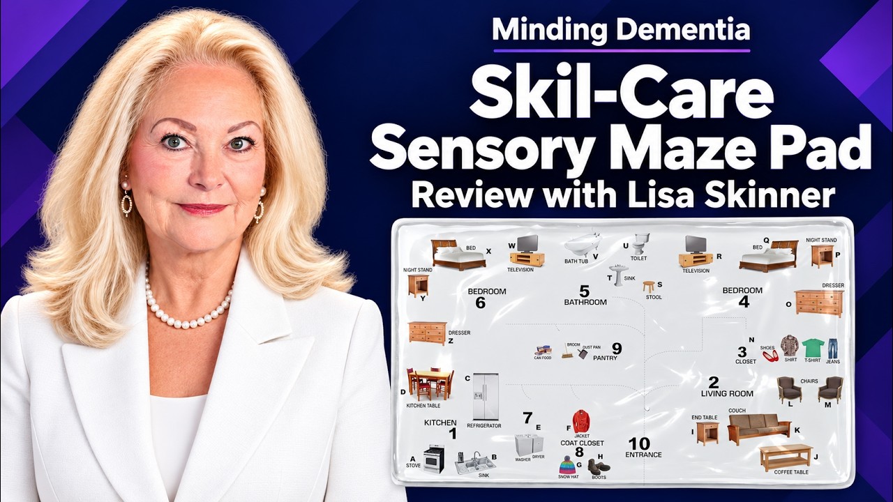
Fidget Apron for Elderly, Sensory Aprons, Products for Elderly Demo with Lisa Skinner

Skil-Care Sensory Gel Pad for Light Box, Mini Fidgets, Set of Five Pieces for use with Dementia