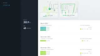
Gyroscope pulls data from Fitbit, Runkeeper, Moves, and other apps into one dashboard. You get interactive maps of your workouts, color-coded calendars of daily steps, and monthly breakdowns by venue type. Click anywhere to drill down into your location timeline or see your top photos alongside activity stats.
Chapters
Alright, I'm going to provide you with a quick tour of Gyroscope. This is the settings page where you choose all the different services that you want to connect to your account. Right below that you see the actual data that's going to be imported from that account. Here you also see settings for public and private. If you set it to public, anybody with the URL will be able to see all your data. If you choose friends, then only friends that you have within the service will be able to see your data. And it's private to everybody else. Now I'm gonna go really quick here to the dashboard. The dashboard will take you to your profile, and within the profile here you have 3 different sections broken down. We'll start with the sports section, and here you can see some summary of the data that's in here and some of the latest information. As I click in, we can now see Weight, which actually is— this data is coming from Fitbit if you have an Aria scale, or I believe Withings if you import. And it'll show your current weight, the last time it was captured, whether you've gone up or down since the last measurement, and a graph showing the progression over time for your different weight. Also, you'll see the last gym check-in here. Only gym and workout areas are displayed in this area. And then you also see the last run that you did if you were importing data from Runkeeper. Here we also see the different gym check-ins for the month of March. You also see the duration. Now the duration I'm pretty sure is being calculated by how long I'm at the gym, which is data coming from the Moves app, which is interesting. As I scroll down here, you can also see here all the different Runkeeper workouts being tracked, and if you mouse over you can get some information about that workout. Actually, if you click on it, it'll actually redraw the actual path of your workout on a map, which is really cool. Then we'll click back here, and then in this calendar view, you can also mouse over to get the actual steps for that given day. And the color coding shows whether you reached your goal or did not reach your goal, which is also a good, real quick, high-level view of that. So now we're going to scroll— go back to the main dashboard, and we're going to go to the Explorer section. I'm going to click on that. And this gives you summary information about all your location data. And it's broken down by month. What's interesting too is it'll also summarize that data by location type. So here you'll see gym fitness, 3 check-ins so far for March. And then you'll see a mall check-in. And so some other category breakdowns with how many times you've checked in. So it's probably showing you the top categories for locations you're going into. It will also show you some summary view of the images taken. Now if I click into an individual month, it will show those top photos being shared from either Twitter or Instagram. It will also show the step count. Just an extra feature to see that here. And then this is really neat. You can actually mouse over and see these different little check-ins or locations that you've been on a map, which is kind of neat. If I scroll down, you can actually see each of the daily breakdowns. And one of the really cool things is if I— I'll go here to an interesting day where if I mouse over, you'll see all the locations on the mouseover. But if I click in even further, now you'll see the chronological breakdown of the locations for that given day. So that's pretty really cool feature. And you know, I just recommend just mousing over and clicking things everywhere. This is a thing I just discovered where you can actually see locations up here and then click through to them and it'll take you to the actual day, which is a really cool feature. Sorry about that. Alright, so now we'll go over to— go back here. The digital I'm not going to show, it really just shows some high-level stuff. That's not, not really too interesting at the moment, just kind of showing your Twitter and Instagram account and some data there. What I want to do now is I'm gonna flip over here to the reports. So every week it's going to give you a weekly report, and if you click on that weekly report, you'll see some summarized info here as well. So there's a different view here now for steps. Where you see a different kind of chart here. And also give you some analysis here. So it's saying low, that I need more walking. That's probably because I don't have all my data being imported right now. My Garmin Vivofit step data isn't coming in. But anyways, it just— it's a cool different visual way of just getting a high-level breakdown for the week. Also here shows RescueTime data, which is kind of interesting, and top photos and other location info. Anyways, just wanted to give you guys a high-level view of the Gyroscope app, and I recommend you check it out.