Your Church Website Isn’t for Members—Here’s Why!
11 Jan 2025 · 1 min

1:00
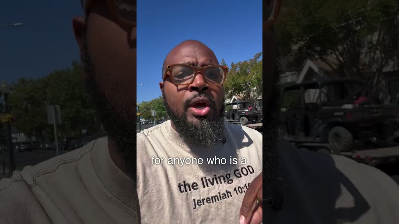
Justin R. Lester argues that a church website should be designed for prospective visitors, not current members. He recommends that within 10 seconds a site must show location, meeting times, and what to expect, and offers practical steps (welcome videos, pastor greeting, and a "Plan Your Visit"/RSVP feature) to make the site outward-facing and welcoming.
Chapters
More from Justin


youtube.com
AI gives you hours back every week. Most people's first move is to fill those hours with more work.
2mo ago

youtube.com
Most people stall out on AI at the exact same step. They don't know where to start.
2mo ago

youtube.com
Thank you for the follow-ups, the messages, the emails, all of it since the New York Times piece. Gr
2mo ago

youtube.com
The New York Times spent a weekend with me. Digital twins, AI, the local church, all of it.
2mo ago
See all content
