In this instructional video, Sasha from theautismhelper.com demonstrates how to use Google Forms to collect academic and behavioral data for a student, export the responses to Google Sheets, and create customized line graphs that reveal trends and inform instructional decisions. The tutorial walks through setting up a form with separate sections for academic goals (language arts, math, science, social studies, social‑emotional) and behavior metrics (frequency of aggression, running, on‑task minutes, break requests). Sasha explains why the default summary view in Forms is often insufficient for tracking growth, especially for math accuracy and prompting levels. She then shows how to link the form to a spreadsheet, organize the data, and build line charts with titles, axis labels, and optional trendlines for both academic scores (e.g., double‑digit addition) and behavior frequencies. The video highlights the dynamic nature of the charts—new form submissions automatically update the graphs—making it easier for multiple staff members to input data consistently and for educators to make data‑based curricular decisions. Sasha concludes by recommending the workflow of using Google Forms for data entry and Google Sheets for visualization as a user‑friendly, error‑reducing solution.
Chapters
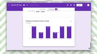
Hi, this is Sasha from theautismhelper.com, and this is a video tutorial of analyzing your data using Google Forms. So I've done a few other tutorials on how to set up and use Google Forms, but this one is specifically looking at the finished result, so after those responses are submitted. So I created a Google Form for academic and behavior data for this student. So I have academic data here. I'm gonna show you my questions. Here's my academic data. I have language arts, math, science, social study, and social-emotional goal. I separated into two sections for ease when submitting responses. And here's the behavior data: frequency of aggression, frequency of running, minutes of on-task independent work, and frequency of asking for a break. So I've already put in my 10 responses here. Now this is a question I get a lot, is some of the way that Google Forms will automatically summarize the data is not necessarily helpful to you. So this is showing the 10 responses over time. So it's showing me that 3 of these 10 responses were 8 out of 10 correct, 2 of them were 10 out of 10 correct, but it's not telling me much about the growth. So this might not be helpful for this type of goal. For a math type of goal, this isn't very helpful for me. For something like prompting levels, for my science and my social-emotional goal, I looked at prompting levels. This is helpful because it's telling me that 60% of the time the student's needing 1 or 2 prompts. Okay, cool, good to know we're still needing a lot of prompts. Same with this social-emotional goal. We were a little bit all over the place on how much prompting we needed, how many independent peers were greeted. For the social studies goal, this was navigates independently throughout the school. This also I do find helpful because it's showing me the percentage of places that are independent. So the most independent place is between the art class and the classroom, between the classroom and the bathroom. Okay, now I know that I can target these other locations more. So the goal of this is that We want it to give us information about what to do next. That's the whole point of taking data, remember, is to make data-based decisions to plan your future curricular decisions. So for her behavior data, again, this is not maybe the most helpful. This is the same information you were getting on your data sheet, this list of frequency. Same with running totals. Again, we're seeing that most of the time she's running out twice. Not as helpful maybe as we'd like. So what you can do, don't think, oh, I don't need to use Google Forms, or this isn't helpful for me. You want to make a spreadsheet and it's going to make— I just making the spreadsheet alone, I think this is a lot easier to use Google Forms and then create a spreadsheet from your Google Forms because the process of creating a Google Forms is so simple. The process of submitting all the information is so, so user-friendly. You can have a variety of staff members do it really consistently. Whereas if you were to just have a spreadsheet and have people submit their information on a spreadsheet, there's a lot more room for error. So I highly, highly recommend creating the spreadsheet through Google Forms and then making your graphs. So if you click here, it will give you the option to create a spreadsheet. I've already done it, but it'll ask you if you want to make a new one. Um, so here I have all of my responses. Since I've already made one, it just pops right up. So it's going to have the one we put the data, what the date is, and then it has all of my goals right here: language arts, math, science, social studies, etc. From here you can create your line graphs to really see the trends. So for example, for math I already made a line graph and I actually set it up in a different tab so I can see it really easy. So here's my math data. This is double-digit addition. This is number correct. I'm doing discrete trial. There's 10 possible. I even added a trend— trendline to show that we have upward growth. Here I'm able— this is only 10 responses, but I'm able to see really well, okay, yeah, we have some upward growth. Let's keep going. So I'm going to show you how to do this with frequency of aggression, because again we said this isn't particularly helpful, this list of numbers. We could have just looked at our data sheet and seen this, but we can make a chart right here. So Insert Chart, click Line Graph, and then Customize. So I'm going to change the, the first, the chart title, Frequency of Aggression, and I'm gonna actually make this Daily frequency of aggression. My vertical axis is daily frequency. I have no max number because I don't know how long that will be. Horizontal is dates. Series, I'm not going to add anything here. Legend horizontal. So you can customize a lot of things here. In the other one, I added a trendline. I might go ahead and do that as well. To show that, okay, overall our aggression is decreasing. You can public— move this to its own sheet and then name this, so aggression, so it's right there. And then whenever you add more responses, this sheet will update. So let's say I just add some more right here. So we ended at 3, but I'm gonna add a day of 0, another day of 0, a day of 2, a high day at 12, and a day at 5, and a day at 3. It's gonna populate right here. So these were all new responses. The 0 wasn't here before, but it automatically updated in my chart. So if you're thinking that Google Forms was not the right fit for you because you want to see that line graph and be able to see that, you can have that here. And these will stay here. You don't have to add this every time. I did the math before I made this video and it was still here. So you could have language arts, math, aggression, running, have this all here and have a chart for every single, um, top thing that you're working on, it will automatically populate as your staff continues to add responses in the Google Forms. So this was a video tutorial of analyzing your data and developing line graphs for academic and behavior data from theautismhelper.com.