Are You Hitting the "Property Management Growth Wall?" Use This Free Tool to Find Out
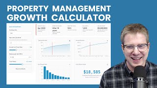
Peter Lohmann explains the growth ceiling where property management companies stop adding units because churn equals new acquisitions. He built a free calculator showing your maximum size and when you'll hit the slowdown wall. Adjust churn or unit acquisition to push that wall further out.
Chapters
So for years, I've been obsessed with the idea of a growth ceiling. This concept that you're only adding a certain number of doors per month and you're churning out a percentage of your units under management implies that at a certain point, you're going to reach a size where every month you're adding the same number of doors that you're churning. Basically, you're stuck. You're not going to grow anymore. You've reached your maximum size. And a couple of years ago, I put together a blog post with the formula on how to calculate this., and I was pretty proud of myself. I put it out there into the world and nobody cared. I think a lot of that had to do with the fact that no one wants to take the time to put numbers into a formula and then try to understand what that means for their business. So if you've struggled with growth at your property management company, you feel like you've hit a wall and you're not really sure what to do, or if you are trying to forecast growth at your business and understand, um, how many doors you're going to add and what that's going to look like. I just built an amazing tool for you. It's free. I built it on Replit in about 2 hours and I couldn't be happier with the results. So what you're looking at here on the screen is what I've built. I call it the Property Management Growth Calculator. All you have to do is put in the starting units. So your current unit count over here on the left, how many doors per month you're adding and your annual churn rate. And if you don't really know what your churn rate is, I would probably use around 20 to 25%, which is about the industry average. If you know what it is exactly, then you can adjust the slider to your actual unit churn rate. And then if you want, you can put in your revenue per unit, which adds a little more value to the chart. And your revenue per unit is simply take the total revenue for the last 12 months and divide it into how many units you had on average per month. Or a different way to do that would be like, if last month was an average month for you, what was your revenue? And just divide by the total doors under management. During that month. You may or may not want to include maintenance revenue in that. It's kind of up to you. It doesn't really affect the details of this result that much. So once you do that, the graph is going to populate, it's going to adjust in real time to whatever changes you're making here. But the really interesting thing about this is it helps you understand what's going to happen with your business over the next few years if nothing else changes. So take this example here with 500 doors under management and adding 12 units per month with an annual churn rate of 19%, meaning 19% of the doors you start the year with depart throughout the year for one reason or another. This is what you can expect given those conditions. If nothing else changes, the maximum size your company could ever be is 690 units, which is not that much bigger than you are now at 500. The maximum revenue you could ever generate is about $2 million a year, and you have 110 months until you hit that ceiling, until your company is stagnant. What's more is the way that this formula plays out in practice is as you approach that growth ceiling, your growth stalls and slows. So in other words, as you approach your ceiling, your growth slows, and the closer you are to your growth ceiling, the slower your growth becomes. To say that differently, you don't want to get close to your growth ceiling. Before you get close to your growth ceiling, you want to make changes in your business so the growth ceiling is farther ahead, it's far out in the future so that your growth picks back up. The way— there's two levers to pull here. One is your unit churn rate and the other is your units added per month. So obviously churn, that has to do with customer service operations. I've talked at length about churn and then growth. How many doors per unit are you adding? There's a lot of things that actually go into that. It's not just your sales and marketing activity, but it also has to do with your existing owners. Are they adding doors, right? It— because our experience has been in our property management that we can expect about 3 to 5% unit growth per year just from our existing portfolio, just from existing owners adding doors. So you can include that and you can also include sales and marketing efforts into this as well. But basically you want to come out with a net of, if I look back through all of last year, the last 12 months, on average, how many units did I add per month? Doesn't matter how you got the units, just how many units on average, and use that in this calculator. So if you want to push that growth wall out, then you need to either increase your units per month or decrease your churn. So let me just talk about the growth wall, and then I want to explain how to use this chart kind of holistically. So the concept of a growth wall, I did not invent this, but you know how I mentioned that the closer you get to your growth ceiling, the slower the growth is. The growth wall represents 75% of your maximum size. And if you look at the chart of how this, you if you were to like chart out the formula that goes into this, you'll see that as you pass 75% of your potential maximum size, that's where the growth really starts to slow. So we use a growth wall at 75% to help visualize that and help you understand how close am I to hitting this growth wall. So if we, if we put the churn rate in this example at 18%, you can see that the growth wall is in January of 2027, which is only 1 year away. So we are 1 year in this example from hitting that growth wall and, and growth slowing way down. And you can see that down here. So the first year you're gonna grow about 10%. That's decent, not great. In year 2, you're down to 7%, in year 3, you're down to 6%. You're barely keeping up with inflation. And so you want that growth wall again to be far out in the future. So what can we do here? Well, one thing I really like about this visualization is it's easy to adjust and play with these things and see what kind of impact it has. So rather than having to like plug numbers into a calculator or a formula to figure out like, oh, what would happen if we decreased our unit churn from 18% to 16%? 2%. I mean, is that really going to make that big of a difference? Well, before you would have to like get out your calculator and Excel and like try and figure out this formula. Whereas now all you have to do is adjust the slider and you can see, wow, that actually made a pretty significant difference. That increased our maximum revenue, that pushed out our growth wall. Our growth is looking much healthier for the first 5 years or so. And you know, of course you can really have fun with this and move it all over the place and you can adjust your new units per month as well. So let's put the growth rate back to where we had it, which I think was 18%. If we increase our new units per month from 12 to say 16, again, that has a pretty significant impact. So, and you can play with both of these. If you want to adjust the unit churn by just 1 or 2 clicks and the new units per month by 1 or 2 clicks, you can play with different scenarios and try and understand the impact that's going to have on your business. This without having to run a bunch of calculations. So I really love this thing. I put it out there for free. I want everyone to take advantage of this. I welcome any feedback you have. If there's anything you think that could make this visualization better, happy to make updates and changes. Or if you have any questions about it, let me know. I'm happy to answer. And I hope you find that valuable.