Sean Twizer shows how to read candlestick charts on TradingView, breaking down what the body, color, and wicks tell you about price movement. He covers four key patterns—hammer, doji, dragonfly, and gravestone—and warns that candlesticks alone won't work; combine them with volume, fundamentals, and level-2 data.
We're going to start by opening TradingView, which is a great platform for you to analyze charts for free.
In the home screen, we can search for stocks we want to look at their charts at the search bar.
I am just going to open BTC, which is a Bitcoin chart, for the demonstration. Now, before doing anything, I want to explain about time frames.
When we open a chart, we can choose what time frame we want to see. For example, we can choose a higher time frame of a weekly chart and then every candlestick represents a week. We can go even higher to monthly, and then every candle will represent a month. And we can dial down to shorter timeframes of even 1 minute, and then every candle will represent 1 minute. It's important to look at different timeframes when you're charting because different timeframes will show different signals and ideas. As a rule of thumb, the higher the timeframe, the more powerful the move. For example, If we see a breakout on the weekly chart, it's going to be much more powerful than something that happened on the 15-minute chart because like a stew, that pattern took more time to cook and simmer. When using this, it's also important to know when to use what.
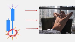
When I first look at a stock, I start with what the stock did in the last year on the daily chart. This allows me to recognize the price range of the stock, the volatility, and what is the current trend of the stock. When Day trading, I heavily use and rely on the 5-minute timeframe as it allows me to get insights to where and what the stock is doing in that day. And I actually use the 1 and 2-minute charts as well in order to understand what is going on right now with the stock. Okay, so Japanese candlesticks are like visual stories of a stock price movement over a certain period of time. So if we choose at the top a weekly chart, every candle is going to represent a week's worth of price action. If we choose a 1-minute chart, every candle is going to represent 1 minute, as you can see by the time on the x-axis. When we read the chart, it's from left to right. Now, each candlestick has a body representing opening and closing price of that candle. The body is the fuller part of the candle. A green or white candle means the price went up during the time interval. The bottom of it is the opening price, and it starts in the bottom left part. And the top of the green candle, top right corner, is the closing price. It is also known as a bullish candle. For a red or black candle, we read it the other way around because price went down. So it's going to be like this. The opening price, top left part, and the closing price is at the bottom right part. Remember, it's because the price went down. This candle is also known as a bearish candle. So green is good and the stock is going up and red is bad and the stock is going down. Wicks, tails, and shadows. Those are three names for this little part. These are thin lines sticking out of the body representing the highest and the lowest price reached during the time interval before it's closed. For example, let's say we have a candle that opens at $100, then it goes down to $95, and then it goes up to $115, and then it retraces to $110 and poses a dead price. The way we will see that is a green candle with an opening price of 100, a wick to 95, a closing price at 110, and a wick to 115, because the price has traveled inside that range. Now I am going to say and remind you, the more you're going to practice and see more candles, the more intuitive it's going to be for you. And now that we know how to read a candlestick, let's look at some specific candlestick patterns. Hammer. As the name suggests, it looks like a hammer indicating a sharp price drop followed by a recovery, as we can see by the long wick and the short body, potentially signaling an uptrend or a reversal if the stock is in a downtrend currently. A doji candle. It's when a candle has no body, indicating that the opening and closing price were the same or very close to each other. It suggests indecision in the market, or as we learned earlier, current status of equilibrium, meaning that buyers and sellers currently currently have the same amount of strength. The next two candles are the same, but the opposite. A dragonfly. It's similar to a hammer, but with a longer tail at the bottom and no body, which is a doji, indicating a sharp price drop followed by a strong recovery back to the opening price. That means price went down, but buyers took back control and moved it back up to where it started. Gravestone, similar to a hammer, but with a long tail at the top and again, no body, indicating a sharp price increase followed by a drop back to the opening price, which indicates buyers were in charge, yet the sellers took control and pushed it back down. So basically, a dragonfly and a gravestone are the same patterns, just opposite. Understanding these candlestick patterns can help you anticipate potential price movements and make better decisions in the market. It's like learning to read the language of the market itself. So keep in mind, though, that these patterns are supporting and we cannot base our decisions solely on them. And even though technical analysis is a big part of trading, it's not everything. It's only a piece of the puzzle. And I highly recommend not trading only based on that. When I trade, I usually use a combination of fundamental trading, level 2, volume, and several more things. You may not know it now, but we will get there shortly.