Visualize This: Crafting Impactful Data Stories
Paul Barnhurst and Ron Montero show finance professionals how to pick the right charts and tell stories with data. They cover common visualization mistakes and walk through practical examples to make financial presentations actually work.
Okay.
Foreign.
Welcome to those that of you that are with us this morning or afternoon, evening, depending on where you're at. We're really excited to have you here. We're going to give it a couple minutes here before we get started on the presentation, but if you could just let us know in the chat where you're coming from, that'd be great. So just go ahead and tell us in the chat, where are you coming from today? And in a couple minutes, we'll get started here on this presentation about Visualize this on this webinar I have here on the call with me, Ron Montero. Ron, thanks for joining me.
Thank you, Paul.
All right, so again, we're going to give it a minute or two before we actually get started into the presentation, but if you're out there and you can hear us, please let us know where you're coming from. We'd love to know your location and your name. All right, we have Ron from Toronto. Thank you. Ron, I was wondering where you're coming from. And here I'll even tell you guys where I'm coming from since, you know, we have a minute and then I might tell an Excel joke or two if we. As we wait for people to join us. All right, what do you call a broken spreadsheet? The new employees problem. If any of you have started a job, you can probably relate to that. So there's my first Excel joke of the day. We'll have more throughout this session because I know that's why everybody joins these, is to listen to me tell jokes. Right, Ron?
Exactly.
Oh, you want to come join the webinar? Hannah, come on in. You sure you don't want to join? Close the door, sweetie. All right, there's my daughter. So we'll go ahead and get started here for a minute.
Hi, Abdullah. Nice to see. Nice to hear from you.
Welcome. All right, well, why don't we go ahead and jump into things here Again, as you join us, just please go ahead and put where you're coming from in the chat. We have Abdullah. Thanks for joining us. Where. Where are you located, Abdullah? If you could let us know in the chat, that'd be great. I'm gonna go ahead and bring up our presentation here. So if you guys can see that on the screen, please let me know if you're able to see the presentation. Perfect. So this presentation is called Visualize this. We're gonna discuss some best practices around visualization. This comes from a course that Ron and I teach on best practice, FP&A, and also Courses we teach to corporations throughout the world on data visualization. This is a critical skill for finance and FPA professionals. And you can see here I have an example of how not to build a graph. We have something kind of resembling a pie chart and it's supposed to be showing I guess Nobel laureates prize winners and then how many go to each different profession. So we have, you know, this many that won for economics, here's the Peace prize literature, and you can kind of see each country a little confusing, not very clear. So that's probably an example of how we don't want to do it. A lot of color that we don't know why. So let's jump in and talk about visualization. But before we do that, we want each of you to tell us in the chat. Can you let us know what is your favorite Excel function or feature? I mean not function or feature, sorry, what is your favorite chart? Visualization? Pie chart, Waterfall chart, Bar chart, Stack bar chart, other. Ron, what's your favorite?
I, I think I'd have to go with the waterfall. I was going to joke around about the pie chart because I know you don't like them, but I think the waterfall chart's super effective in many different ways now.
I agree, waterfall chart's a great one. There's a lot of good ones. So let us know in the comments. We have more people joining us. We have Manhip that's joined us, Navient Carolina and others. We have from Hyperbad, from Egypt, from Winnipeg, another one from Toronto. So one of your fellow constituents there, Ron.
Yes, yes. And what we did today is we, we tried to do a really early webinar. So 7am Toronto time is actually 5am Paul's time. And I, I see there's a couple other Toronto people and somebody from Winnipeg as well as India and Egypt. So pretty cool to have a bit of a global audience here.
Yeah, no, thank you so much for joining us. And we wanted to try to make it available for other times beyond our normal group in the US So here what we have just this chart that I love of why is visualization important? And what's amazing is 90% of what the brain processes is visual. So think about that. Processes visual 60,000 times faster than text. And studies show again and again people are much more likely to retain what they see, even more so than what they read or what they hear. So they're one of the most effective, if not the most effective way to get our message across to others. So here, this is a chart that we really A graph that I love. It's by Brent Dykes. And so, as you can see here, using Legos, I'm sure we can all relate to Legos. Probably everybody's played with them or seen them or, you know, watch somebody play with them or if you had kids, you stepped on them, right, and felt the pain of a Lego. So we start with, yeah, Ron's laughing because he can relate. I did that the other day. My daughter had some out, so still fresh wounds. But, you know, that first picture shows data collection, and then you prepare the data, you kind of organize it a little bit. Okay. You do an initial visualization, you do your analysis, and a story starts to come together. But when you do, when you put it all together, that's when you're really telling that story. Right? This pile of Legos now has a very clear story. And where we got this image from is Brent Dykes. He's the author of Effective Data Storytelling. Highly recommend his content, his book and all that he shares on visualization. He's a global expert out there. So next, presenting data visually, it starts with knowing your question, right? What's the question you're trying to answer? Then you need to know your data, get to know the data, talk to the subject matter experts, understand which each different piece of data means. Figure out what that message is you want to tell from your data. Then when you've done that, you can go ahead and prepare the charts, the graphs, the visuals, and then finally, you're going to want to test and refine before you present. Just like any other process, it's not a process where we just throw something together and move forward, creating visuals that really help enhance the story. Take time and take practice, just like anything else. And so here are seven design principles that we love to share. But before I go through those, I just want to share a few more of the favorite charts you can see. Here we have Vlookup. We have a vote for waterfall. We have here one of waterfall and column chart. We got a line chart and another for waterfall. So not surprising with the finance audience that we love our waterfall charts. So as we talk about design principles, there's really, like I said, seven that I want to talk about. And it starts with think like a designer, right? When you're building a chart, you're designing something, just like when somebody has a house built. Often you may use a designer, an architect, people to help with that process. Next is keep it simple. I'm a big believer that simple is hard, complex is easy. It's easy to build a complex graph, often that's what you get at first. It throws all the information out there. You have to take the time to think about it and say, what is important? What's the key message I want to deliver to my audience? And then once you have that, you want to ruthlessly reduce clutter. Ron can tell you probably drives him crazy. He'll send me a graph and I'll go through and clean it up. Being like, ah, here I think this looks a little better. And usually what I'm doing is reducing clutter. If grid lines don't add to my story, I get rid of them. If the axis doesn't add to my story, I get rid of it. The box around the graph, I'll usually get rid of it. Any colors? If there's not a specific reason for them, I'll get rid of them. My goal is to have only what is necessary to understand the story because that enhances processing for the. For the brain. The next one is use color sparingly. And we're going to walk through a great example. This is one Ron created that I think really gets home the point of color. And then we'll talk about using contrast effectively, which often goes together with color. And then the last two, you need to select the right visual. Right. There are some limited cases where a pie chart could be the right visual. In most cases, it's probably not. In other cases, you might want to scatter plot. If you use the complete wrong visual, it really makes it hard to get the point across. And we'll walk through some recommendations and thoughts of when to use which graph in which case. And then last but not least, context is important. You need to make sure you give your audience enough context to understand the graph. We often forget that we've spent sometimes days, weeks, months with this data. We know it forwards and backwards. That's not always the case with our audience. And so that's something to keep in mind. And so next we're going to do an exercise, and I'm going to turn this over to Ron real quick here to do an exercise and show you an example of one of these principles in use.
Fantastic. So I'd love everyone on the call to tell me how many eights are on this page. So if you look at that row and you know that block of numbers, how many eights? Let's see. Who's the first person? Paul, you're not allowed to answer that.
78.
Let's see, a couple of people just put in how many eights they think are on the page.
Go ahead and, go ahead and throw those in. And there may be a couple second lag sometimes. So just put them in and we'll get them here in a minute. And I'll answer Lewis's question while we're waiting for people to respond. Yes, this is recorded. James McCoy says by year. No, just how many eights in total are in the.
So I understand what Jane is saying because it looks like 1983.
Yeah, yeah, yeah.
Right. So. So anyway, what nine. So Lewis is put in the number. So. So the reason we put this chart here is a lot of times in finance, we have these heavy charts with lots of numbers, right? And look, even as I give you this exercise, I know it's a painful exercise and most of you don't want to do it. So what we want to stress is sometimes with finance, we end up with these charts that think about an audience and they just don't want to look at it because it's not well designed. So, Paula, I'd love you to advance the slide. And so if, if I advance it one more time. So this is bold. It doesn't pop out as much, but go to the next one, Paul, please. Yeah, so if you look at this one here, it pops out right away. Right? So number. You said nine. It takes a couple of seconds, right. Whereas on the very first chart I showed you, it takes a long time to decipher how many eights. So what we. We're trying to say here is, look, if you have a row of numbers versus budget versus forecast versus prior year versus versus pre Covid year, there are ways to still have a lot of numbers on the page by using shading and color very, very effectively. Right? So this is a nice way to do that. And Paul, if you advance the next slide you see, you could also use color to say if there's certain things. Let's say you want to highlight the first column, you can bold it or put in a different color, and that will really take the audience to where you want to go. So even if you decide you do want to row a number, sorry, a block numbers, there are ways to use color and contrast very, very effectively to get your message across. Okay, so let's have a touch of fun here as well. So what color pops out at you when you look at this image? Just put in the color of the balloon that jumps out to you first. Paul, what jumps out to you?
I was just going to put it in the comments. Red. Red jumps out to me today, but it varies. Sometimes it's blue, sometimes it's yellow, pink. I mean, they kind of all. Nothing really stands out.
Exactly. So this is when I, when I first used to do charts, my charts had all kinds of color on them. Right. And if you think about this chart, everybody's eyes are in different places based on the color they naturally gravitate towards. Right. You can see blue, red, pink, Nepal. If you go to the next slide, you'll see that even when you want to use color, you can use it super effectively.
Give me one second here. It's not wanting. There we go.
There it goes. So if you look at this chart, generally people's eyes will focus on that red. Right. To say, look, we can really want to use that color very, very intentionally on our charts. So again, you know, a lot of those charts have tremendous amounts of colors and stuff. Very distracting to the average stakeholder. This one's super helpful. Right. So if Joel is saying blue, most people will say red or blue. Right. But it's one or the two, not five different ones.
Yep. So, you know, that's an example. We talked about those seven principles. And at the end here we'll show some more. But next we want to just briefly touch on what are the common visualization mistakes people make. And I'd love to have any of you share in the chat. Is there maybe one of these you struggle with? Another one you see when you look at graphs. But we have six common ones listed here. The first is overly complex graphics. We've probably all seen them. The one I showed at the beginning and we'll show another, was hard to understand. Sometimes the graphs just are really complex and they don't need to be. It gets back to what I said. Simple is hard, complex is easy. Misuse of color. We see the abuse of color. We just walked through that example and you could see when color is used correctly, it makes a huge difference. And you'll notice I did this slide because color has no U on the prior one. Ron did that slide because color has a U. We both play to our native English speaking skills here. So, you know, next is information overload. There are times when you look at a graph and there's just so much information you can't process it. Remember, your audience needs time to process. And that's again where the simple comes. Modifying the axis sometimes to manipulate data. We see that being done too many numbers, graphs that lack context. These are examples of the common mistake. So we see Carolina here, shellered information overload is one. She definitely sees our experiences. So please, you know Share any others that, you know, come to mind for you as we go through these?
Yeah, and I totally agree with Car Carolina there in terms of it's tempting to have a lot of info on it. And especially, you know, as I was pretty junior in my finance way back finance career, I used to have so much information on, on the chart that my users would probably get lost in it. So what's really, you know, you shared it one simple message if possible and super easy to understand. Every single person in the room, virtual or in person, should understand it.
Yep. And Lewis makes a great point that I think is a mistake. You know, changes against previous versions, especially if the external users are used to the previous version. Right. Sometimes you just make change for change sake, and that's not a good thing. If everybody's used to a format, it's. It's working and it's conveying the information. Be very careful to change it. It does not mean there might be times that it makes sense to change it, but you want to change with caution. All right, so next we're just going to walk through a few mistakes. And I like to ask this question, and I realize this is a little big, so it's probably hard to read, but this was, this came out when Obamacare or the US Health, the new health care proposal in the United States, for those of you who are not familiar with it, this was your new health care system. Somebody drew this up as a way to describe the health care system. And I remember I saw this and I'm like, how is anyone supposed to understand this? Right. There are literally 100 different things. There's four, what, four different, five different legends down here. One, two, three, four, five. Then a note, and it's like, all right, nobody's gonna read that and try to figure that out. I'm gonna guess for you guys, it's not quite as clear as I'd like, so probably a little blurry too, which doesn't help. But that's an example of just overkill. It does look like a microcell. Thank you. Yes. I, I'm not surprised, Louis. So, you know, there, there's the first example and you. This is the second misuse of color. You know, generally when I see the color red, I think stop. When I see green, I think go. Or good as the, the number of shootings went up, which is obviously a bad thing. The, the colors started to become more of good colors. Right. Totally makes no sense from a color standpoint. Not to mention the last four years have the exact same number but completely different bars. Right. So this is just a train wreck of a visual. How not to build a visual.
What's your philosophy on. See how it starts. Doesn't start at 0 and 336 looks almost like double 269. Do you typically start your graphs at 0 or how do you handle that?
Yeah. When it comes to the axis, I, I say always start at zero. And then if for whatever reason it does not convey the message you need adjust the axis. But make sure to document it and make it clear what you want to prevent is for people thinking you're manipulating the data are misleading the story. So I, I caution people to only use it when absolutely necessary. Sometimes in waterfall charts to really, you know, bring it in and show the key changes. It may make sense to move away from zero, but I, I'm always leery of doing it just because I've seen so many axis that have been manipulated to try to tell a story and make things look better than they are. What's your take, Ron?
Yeah, no, I totally agree. I was going to say the waterfall charts is where I typically will adjust it because you're focusing a little bit more on the changes versus the base and the endpoint, right?
Yep.
But I think it's very important to call out and be very clear when you have done it.
Yeah. All right, so there's that example misuse of color. Here's the next one. Ron loves this graph because he's a soccer guy. And this is 2013 MLS salaries. And if you spend enough time with it, you'll start to understand it. But again, it's probably another micro sell for everybody out there. So what we have is we have every soccer team in the US Major League Soccer. Then we have the players that make up their salaries and what percentage they make of each salary and then different colors for different type of players. And then here's a quick comparison of each team. So, you know, probably a lot better way to present this, you know, than just using this, this graph here. So again, overload. It could have started with one graph showing all the salaries and maybe showing the top player, or a lot of ways they could have done this to make it easier to read. And then the next one here, too many numbers. I always like to laugh. And if a number comes to mind, let me know. Where does your mind go, Ron, is there a number that stands out to you? What number?
I actually turn away when I see this graph.
Why is that?
Yeah, it just doesn't do anything. Right. Like, it's just a Bunch of numbers without a purpose.
Yeah, exactly. I mean if, if you present this to your senior leader, your executive, what you should be asking yourself when this came up, when the system generated this is you should have looked at it and said, okay, what's the point? How does somebody take anything away from this? Like oh, is 8.8 important or is 5 important or is 3 important? I don't know, couldn't tell you. Right. There's just, there's just way too much information, too many numbers for any of them to be valuable. So those are some of the common mistakes, what we want to jump into next. And before I do that, I'd love to ask in the chat if anyone's willing to just kind of share, maybe type, how do you select what graph you're going to use? What's your general thinking? Do you just have a go to graph you use 90% of the time? Do you use waterfall whenever you're doing variants, line charts for time and any thoughts or anything, please, you know, go ahead and put those in the comments and I'm going to talk about really what I'll call five categories for charts and then we'll show you the most common charts used in each of those categories and hopefully it will help you be able to figure out what chart to use. There are others beyond what we're going to share. Doesn't mean you have to use one of them we share, but we just want to share some of the common ones. So. Right. The first type we have is your comparison. That's probably the most common thing we do in FPA compared to prior year, compared to budget, you know, compared to actuals, whatever it might be. James, like that depends on the question. Yes, the data does help drive the graph and what you're going to use and I agree, you know that that's the best way to do is we should be looking at the data we have. The question we're trying to answer then making a decision. If we're doing a comparison, we have some certain graphs we'll use if we have some kind of relationship, like hey, what's the relationship between volume and revenue? There are generally a few different graphs that are most appropriate for that. There are some that are more appropriate for parts to the whole. So maybe the parts are how many Star wars characters did we sell? And the whole is the Star wars universe. So you can have Luke Skywalker and Darth Vader and Han Solo. Maybe those are your parts you're trying to describe data over time. So this is again, this is probably the second most common we do in finance is what's my revenue look like by month or week or years, quarters, some time element. You're trending something over a time period. Revenue, expenses, stocks, whatever it might be. Louis, you know, great point there. I like that. And I'm just gonna share this real quick. He said graphs are mainly used in a long term use. If a quick analysis, sparklines is easier for me. Yeah, I agree. If you're trying to do something quick and dirty, sparklines are great. And if we have a minute, we might show that at the end. But I think that's a great one. In Excel, the sparklines that you have. And then the last category is distribution, right? Some kind of statistical distribution of the data. Could be a scatter plot, a histogram, things like that. So what I want to share here next, actually we're going to skip that and we'll come back to that in a minute. Comparison visuals. So these are the four most common when you're comparing something against something else. Column and bar chart are very common. Right. You can see the regions here. If I want to show a northeast, southwest, it's really easy to see them, see which one's done best. Both work bar and column. A lot of it comes down to preference. There are some times that one data set might look a little better in one or the other, but there is no hard, fast rule. Waterfall chart, obviously great, as we mentioned for showing like budget versus actuals and then another one, one we probably don't use very often in finance. But it can be really efficient when used correctly as a word cloud. Right. If you have some kind of survey and there's a bunch of different words and you want to show what word was used most often, this is a great way to do that. So these are the four most common visuals for comparing data. So what about correlation when we're correlating something? There's three here that I would say are probably most common for me to use. I love a good heat map, much like the sparklines, as Lewis mentioned, I can create a heat map without creating a graph. It's super easy. I go to conditional formatting in Excel and select the heat map and then I can see, oh, US has the most millionaires, you know, Cuba has the least. And you can flip the colors. You can do red to green, green to red for high to low, depending on your data, you know, bubble charts. When I'm trying to show a lot of data and I really need those three or four different dimensions where I can have revenue, volume, profit and then kind of the, you know, the labels. I'll do that, I'll do a bubble chart, but I use those sparingly just because they can be a little harder to understand. But they're great when you have multiple visuals and you want to be able to show them all on one chart. And then last, you know, scatter plot, right, that shows correlation. Here we drew a line to see. Okay, this is probably pretty highly correlated between my two variables. There seems to be a relationship. So it's great there when you're doing statistical analysis, parts to whole visuals. So again we have four we listed here. You know, first is the pie chart. And while we're talking about the pie chart, I just want to go back for a minute and share the earlier guide on pie charts. There's a lot of debate around pie charts. You know, Ron, put this together to pie or not to pie. And I'll share my thoughts on pie charts. Then I'll let Ron talk to this for a minute. I like to joke, the pie are good for two things, eating and playing Pac Man. Yeah, I, I'm personally not a big, big fan of pie charts. I encourage people to try to use other ways. But I'm going to let Ron take us through this slide and he's walking us through a little bit about pie charts. Let me know in the comments. Are you a big fan of pie charts? Do you use them? Why or why not?
Yeah. No. And so Paul, like, you know, the evolution, we joke about it because I know you don't like pie charts, but I think it's really important to think about continuous improvement. Improvement from a finance perspective. And I think there's some common thinking. If the pie has more than three to five slices, it's probably not the best visual to use. So if you look at the, the left part of this top, left part of this graphic here, very difficult to ascertain which of the slices of the pie are bigger. Right. So that's where Paul, if you flip to the next or that other alternative, this is an alternative that we say is actually way more effective than a pie chart where this one still has the flavors of pie, but it's very easy to tell which one's the largest one, the smallest one, you can sort it, you can put the numbers in there. So as much as pie charts are very common, limit it to when it's three to maybe five slices at the most and then you can use a chart like this, which is super effective. Right. So think about this chart versus the previous one. Way easier to understand right from the get go.
Yep. And all this is, is just. This was created in Excel, just taking your typical, you know, bars and putting the axis up top, showing the numbers and the percentages. So it's relatively easy to do something like this. And again, you know, we have some comments here on pie charts. Nelima is just a simple no, so she gets my vote. Lewis is a little more nuanced, which is probably the way to be. I only use it to provide quick visuals on the elements that say expenses of total expenses, rather having just present percentages against each line. Fair enough. There are definitely some cases where it may make sense. You know, there's a lot of different opinions there. The important thing is to understand the pros and cons and know when it doesn't make sense to use it. If, if you choose to use it, just make sure you're using it in a situation that it makes sense. Right. That's the whole point here of going through each of these different visuals is to help you know when to use them, because using the right visual at the right time makes a huge difference to your story. So we have the pie chart. This is probably an example not to use a pie chart where you have a ton of different elements. Tree maps. Tree maps can be really helpful just to give people an overview of something. So here we have category and subcategory of cells, and I can quickly see, okay, electronics is the biggest category. And we got appliances, clothing, toys. And I can look at each of them and start to understand the data. You know, it's a lot of information. It can take a minute, but it's one way you can categorize things that allows you to use color and size to help them understand. Thank you, Tim. I appreciate the humor. Pie charts can't be too busy, but can also look too simplistic, as if drawn with crayon. Hadn't thought of them as crayon, but I do like that, you know, a gauge chart. Again, super simple chart. It's a little. It takes a little bit of work to build in Excel. There's a lot of videos out there if you're using Excel. But it's great because you can immediately be like, oh, we're in the red, we're in the yellow, we're in the green. Okay, we need to do something. We're red, we're in good shape, we're green. Right. You can immediately and just right away take something away plus the arrow. And if you put goal, you know, a Number like goal on one side and something on the other. It makes it super easy to understand, you know, the next. You also have a stacked column chart here. Again, you know, another way to present things. It sometimes suffers a little bit from the pie chart in that it can be difficult to tell the difference between each of the, you know, the stacks within the column. And that's why labeling it can be really helpful. Right, so then data over time, visuals, you know, here's some common ones. Line chart, I'd say by far is the most common we use. If anyone is using something else for data over time, most of the time, I'd love to know. And then, you know, sometimes an area chart can be helpful when you have multiple visuals that are changing over time. It can help with the color and the way you do it. It can help things stand out. And then finally, there are some cases, particularly like maybe daily stock market. Using a candlestick chart is another one you could use. And we had someone share that. They prefer the tree chart for different arms of something. Yeah, tree chart is something you could use as well. Here we have distribution visuals. You know, a histogram chart, box plot chart are common for distribution. So these, hopefully this helps you if you're struggling to know, you know, hey, I have this type of data. What are some visuals I should use? This will give you some general ideas of visuals. Next here Ron's going to walk through just an example, kind of bringing this together of the power of visualization.
Yeah, fantastic. Thank you, Paul. So I went into this company and essentially what the finance team was doing was providing a whole bunch of numbers to the manufacturing team and the executive team. Right. So this is just a representation of it. And if you think about it, what this has is the weeks down the left side and then it has three production areas and the margins associated with it. So what happened was essentially when I went in there, the owner and the executive team were essentially just ignoring all the finance numbers. So what we did was we, instead of using a block of numbers like this, Paul, if you don't mind flipping to the next slide, what we did was we just said, look, instead of having just a number of numbers in there, we're going to use a very simple chart. And anybody would understand this chart in some seconds, right? Very, very clear. There's a black line which is a target. The red are below the target, the greens above the target. So instead of the executive team and the cross functional stakeholders, essentially ignoring that previous page, it led to number one, quick understanding, and importantly, number two, Natural questions, right? So when most people see that, they'd say, hey, what happened in week 1, 2, 3, 6, 10 or 12? Why were we below target? What products did we produce? And on the other side, hey, what happened week 11, we overshot our target by a lot. And what was brilliant about it is just with a simple tweak of using a very simple visual, we started getting to business conversations. So the whole point here is really around visuals are a tool in a finance person's toolbox to help the business first understand the data, but then to take action. Right. So this was a real world case where we did that and then, Paul, if you don't mind flipping to the next slide, this is exactly what was on the first page. But what we then did, we said, let's use conditional formatting to say under the production areas A, B and C, if you look at the top, which area is struggling? And it was very clear that production area A was struggling. And so what we did was we went from, you know, really, you know, tough situation on production area A. We, we put the best supervisors, best maintenance people. And what was brilliant about it is good business conversation, business action. And the results got a lot better in future weeks. Right? So just a simple example where simple visualization actually simplifying what you're showing to stakeholders leads to what you actually want, which is business partnering and making decisions together and improving the business.
Oh, sorry, let me. Supposed to be on the other screen. No. Great. Any, any thoughts from anyone on this as they see this? You know, can you. Any, any thoughts or comments here, let us know. I love this example, Ron. I'll tell you why I like it so much is right, you start with something that is just numbers, which is so common for finance, especially when we start is, oh, I can look at all the numbers, right? I could look at this and see, okay, week six is a problem that's low. And if I spend a few minutes, I can figure out a. But it's not easy. It's just, it's basically just regurgitating the data. Right. Kind of threw up on the page. And I love what Tim said. Incredibly clear on would save a ton of time, right? So to go from something like that to this is just a world of difference. And it's the same basic, same data. Yes, this is summarized, but just it's summarizing that data to really get across the point. You know, notice a few things here. When I talk about ruthlessly reduced clutter, you'll notice there's no grid lines. There's no axis over here. There's no legend. Right. And you have to be careful with red and green. You understand? People are colorblind. So they're, you know. You know. Hence you have a target line here and you have the black numbers. So they can understand it as well. It may take a little longer. James, how did we get the black line in a visual? What. So what we did here, it's a great question, is what you could do is you can put a secondary visual in here where the number. Let's say the target's 550,000. You put every single element. So week one through 12 is all 550 in. And then you put it on the secondary axis of a chart and it will go right across the middle. And so basically what you're doing is you have two. Two different axis here. You have your first axis. That's a line chart and a data set. So column one is this data. Column two has your target. Let's say it's 525. And so every single one of these is 525. You put no data labels on it. You put it on your secondary axis and you make it a line chart. And then it will go right across the middle of your line.
Yeah. And. And this is where it's interesting. So Paul's. Paul's much more theoretical and he's great with visuals. Sometimes, you know, the. The line was fixed. I would just literally copy and paste a shape and put it where I need it to be. Right.
Sometimes, you know, there's certain labels on it. You put it on your secondary axis and you make it a line chart. And then it will go right across the middle of your line.
Yeah. And this is where it's interesting. So Paul's. Paul's much more theoretical and he's great with visuals. Sometimes, you know, that the line was fixed. I would just literally copy and paste a shape and put it where I need it to be. Right. Sometimes, you know, there's certain ways. Because that number wasn't actually going to change. And there's some good questions in there. Right. So I think if. What Lewis was saying at the end, if you highlight the comment. Good idea. My struggle is having over 100. Paul, if you don't mind highlighting that.
Sorry, Highlighting what?
You know, I think I can do it. Yeah, Perfect. So I think you're showing. Okay, got it.
Okay.
So the comment there, sometimes you have over 100 tabs and all kinds of metrics. So interestingly enough, I was talking to a former CEO who used to be a cfo. And his point is we over complicated with way too many KPIs, way too much data. And I think a big principle is around simplification to say what are the. Call it five to seven metrics that really make sense. And this is me. Look, I've had 20 years of experience where I had this one manufacturing KPI sheet which was literally like 25 metrics. We didn't even understand half of them right. So I think it's really finding that right balance to see which KPIs are truly moving the needle on the business. Focusing on those and maybe putting the other ones deeper in the deck or in the appendix is my thought on that. Because when you have way too much information like 100 tabs, most people are not going to review those hundred tabs.
Yeah, I would agree. And the one thing I'd add is, I mean, if you do have to have all hundred tabs, try to automate as much as you can, the graphs and all the work and then make sure you have a summary. Because like Ron said, the average leader is not going to read that. They're not going to go through it. I'm going to guess if you polled everybody that was going to maybe 5% are looking at it. You know, some might, some more might be looking at certain sections. But the question I would really ask is not so much how do I streamline the visuals or how do I make it more appealing. I would start with how much benefit is it providing? Is it really being used? Then if that answer is yes, okay, next is how do I automate and simplify this? And then from there you could worry about are there ways to improve the graphs and things? Because sometimes we have to start with, okay, is it valuable? Two, how do I reduce the time? If it is, then three, how do I improve the process? I think there's kind of a natural flow you can follow also, you know. Sorry, go ahead.
Yeah, no, it made me think of one of our clients, Paul, that we work with where it's a huge global company, but it's privately owned and the owner essentially loves the data chart. So, sorry, the number, you know, the pages with all kinds of numbers and not visuals. And so that's one where, yes, you can try to use visuals, but the owner itself is used to these heavy, heavy data charts, you know, 100 tabs, all the geographies, all the products. And so it's very circumstantial to say there are certain stakeholders where you may not be able to use visuals. Because they're used to that. Right. So again, as a strong business partner, it's being able to figure out how do you find that right balance with your stakeholders. Yep.
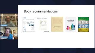
Great. You know, and so just real quick getting back to one second. You know, Louis, I think in making it more efficient, the key is looking for ways to automate it and streamline it. If it's something you have to do, that's where I would focus. Whether it's using PowerQuest query, whether it's having the data easily structured so each of the graphs can just be refreshed. Is it something that could be moved into Power BI and be 100% automated or some other BI tool? Tableau, obviously, without knowing a lot more about it, couldn't answer the question. But those are some initial thoughts for you, so I hope that's helpful. Someone also mentioned a pivot table, so those are a few thoughts there. So, you know, we want to wrap up a few minutes early today. We know it's early for everybody kind of come to the, you know, key takeaways. Feel free to just share a takeaway. No problem. Louis, we appreciate you being willing to share. No problem there. Taking some time, as he said, he apologizes for taking over time with his own case. We get. We all have our own cases and situations. They can be difficult. That's where here is to help people. So what we'd like to ask you guys as you watch this session, was there any key takeaway that you could implement, maybe something you saw or that you liked that would help you improve your graphs? If there is, let me know in the comments. We'll give you. Give you a minute here. We'd love for you guys to share. And then we have just a couple other things and we'll wrap up. So we'll let you guys think about that as you're doing that. Put those in the chat. Just one takeaway from today. One thing you can do going forward that will improve your graphs, your presentations, your visuals, and we want to leave you with some resources that we recommend. So we have five books here. I currently own two of these books, and I'm, you know, pretty familiar with four of them. I know Ron owns a couple of them. I think you own two as well, right, Ron?
Yeah, exactly. So Storytelling with Data is the one that, Paul, you recommended. It's just phenomenal. So I highly recommend it.
Great. Yeah. So Storytelling with Data is great. Show Me the Numbers by Stephen Few. He's one of the founders of the visualization field, as is Edward Tufte. The Visual Display of Quantitative Information. A much more recent one Great follow on LinkedIn is Kate Stranchi. She did one about using color and then the last one, painting with Numbers. So these are all great books. We encourage you to look at them mentioned earlier. Effective data storytelling. And so then last, just as we wrap up here, we just want each of you to know that we do a lot of training and if you ever, you know, need some help for your company, we'd love to come in, do some training. If you want to join one of our future courses, we have our cohort coming up in April where we talk about this and other information. We dig into this deeper along with analysis for best practice. FP&A. We'd love to have you join us. So just know Ron and I are very passionate about teaching principles and skills that will make us better FP and A professionals. And I'm just going to close by sharing a few of the things people said they learned. James said, pie charts are now removed from my charts. All right. He also mentioned coloring tips. I love this one. Simplicity gets the message across easier. From Charlotte. Jose, Use colors and highlight key message numbers. You know, colors, use of appropriate colors. So it seems like there's a clear theme here. I think everybody really liked that color example and how, you know, using color can make a huge difference in our presentations. So I hope, like I said, I hope all of you enjoyed this. Thanks for joining us today and, you know, feel free to reach out if you have any questions, any last thoughts from you, Ron, that you want to add before we close?
Yeah, no, I. I really like the participation. I think it's just another reminder to say, look, be very intentional with visuals, use them as a tool in our toolbox. And it's just another way of being a great business partner. Right. For finance people. So, yeah, really enjoyed the session.
Thank you, everyone. Enjoy the rest of your day.
Have a great day, everybody.