How To Use The Powerful NEW Custom Dashboards
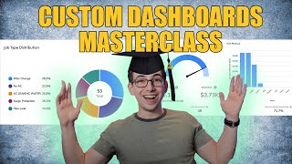
Richard Kohberger walks through ServiceTitan's Custom Dashboards, showing which license levels get access, seven pre-built templates, and how to build one from scratch. Add KPI modules, reports, and visualizations like pie and bar charts, then control who sees what with master filters and permissions.
What's going on everybody? It's Richard Kohberger here, the blue collar nerd. And in this video we are going to be going over a killer new feature in Service Titan called Custom Dashboards or more accurately, new Custom dashboards. Because there were technically custom dashboards before, but they were pretty bare bones. They were basically just replacing your dashboard with a report. This new version however, is much more powerful. So as you'll soon see, we do have the full power of the Reports 2.0 engine at our disposal here. But we, but we also have things like visualization, so charts and graphs as well as showing individual KPI metrics. And we can add modules from the original modular dashboard as well. Now before we dive in, I do want to point out that to get all of the features that I'm about to show you here today, you will need to be on the works package. So Service Titan is sold in three packages. Starter, Essentials and the Works. So no matter which package you're on, you will get new pre built dashboards. I'll show you what these look like in a moment. But there is a new business owner Dashboard, Sales Manager, Dashboard, CSR Manager, Dashboard, Service Manager Dashboard, a residential template if you're residential, as well as a construction dashboard and commercial dashboard if you are in those areas. So no matter what package you're on, you get those. Now if you're on Starter, you get those and that's it. You can't make any edits, you can't create your own dashboards. If you're on Essentials, you can create your own dashboards, but you only have access to report modules, you can't make visualizations or KPI modules and you'll better understand what that means by the end of this video. And of course if you're on the works, then you have everything. And for this feature, if you're a legacy customer, meaning you signed up for Service Titan before Service Titan was sold in packages, that means it's as if you are on the works, so you will have access to everything. All right, now with all that out of the way, let's jump in. So here we are on the standard modular dashboard that we know and love. Now once ST54 is live for you and your account, if you come up to this dropdown here where it says Modular Dashboard, you should see some new options as well as a button that says Create Dashboard. Now I have more options here than you'll see because I have some test stuff going on in here. But the pre built dashboards that you'll have in your account include this business owner Dashboard, Sales coordinator dashboard, the residential template, the Service Manager dashboard and the CSR Manager dashboard. And again, if you're in commercial or construction, you might have those dashboards as well. So for example, let's take a look at the Service Manager dashboard here. So you'll see we have some familiar elements here. We have the revenue gauge and the 18 month trend, but we also have some new KPIs down here. So we have some technician job count information for completed jobs, canceled jobs, recalled jobs and warranty jobs. We've got an overview for $0 jobs. The sample account is not doing well today. We've got 100% $0 jobs, tech generated leads, tech conversion rate. Here we have the familiar tech scorecard module, then a section for membership information and a section for a year over year analysis. So as you can see, these pre built dashboards are already pretty robust. So you very well might be perfectly content just using the ones that are already built for you. But if not, you can build from scratch or you can use one of these as a jumping off point. Now if you wanted to do that, if you wanted to use one of these and then build off of it, you can't directly edit the pre built dashboards, but what you can do is make a duplicate version and then edit that copy. So in order to do that we would go into our settings, we would look up Dashboard, we would come over here to this custom Dashboards tab. And then next to all of the dashboards we have this duplicate button. So we were just working with that Service Manager Dashboard. So I would find that one, come over here, hit duplicate by default it's going to call it Copy of Service Manager Dashboard. I have a permissions related checkbox. If I just want to share this dashboard with the same people that the other one was shared with, hit apply. And then if I come back to the dashboard, if I scroll down here, you'll see I have this copy of Service Manager Dashboard. And if I open that up you'll notice now I have this Edit Dashboard button which I didn't have before. Okay, so that's how you would do that. Now for the sake of these examples, I'm actually just going to start from scratch just because that's going to give me the opportunity to show you as much as possible. So to start one from scratch, I would come down to the same drop down and hit create Dashboard here at the very bottom. The first thing I need to do is name my dashboard. So I'm going to Call this one my Field QA Dashboard, my Field Quality Assurance. So Field qa and then I get this blank slate. Now the main idea of this example dashboard is going to be making sure that the text out in the field are doing everything that they're supposed to be doing. So we're minimizing recalls, we're filling out invoice summaries, we're keeping good numbers. Now in reality, this is going to be pretty similar to the already built Service Manager dashboard. So in practicality, in real life you would probably just want to build off of that one or just use that one again. I'm just starting from scratch because that gives me the most opportunity to show you how to build these things. Not because I necessarily think that's the best way for everybody to go. For some people it might be, but but for most, I think building off of the pre built dashboards is going to be the way to go. So these custom dashboards are going to be broken up into sections. If I click this three dot menu here, I can change the name of my first section. We'll call this first section the Job Quality section. I'm going to click Add a module here. And then in this dropdown you'll see I have four options of the types of modules I can choose from. So I can do a report, a KPI, a visualization, or I can choose a module from the modular dashboard. For this I'm going to go with KPI because I just want to see numbers. Then I have to choose a data set template. And these are the same data sets that we have for reports 2.0. So if you're very strong on reports, if you've taken a deep dive into reports and really done your homework there, then these custom dashboards are going to be much easier for you. So I'm going to want a count of my recall jobs and and account of my warranty jobs. Because I'm familiar with the reports. I already know that that's going to be found under the Technician performance data set. So that's what I'm going to find, Technician Performance. And then I get a big list of KPIs, but I have a search box here at the top. So I'm just going to type in recalls there. And there it is, Recall jobs. So I'm going to check off both recall jobs and recalls caused, because let's say I had my dashboard filtered for an entire week. Recall jobs is going to tell me how many recall jobs I actually ran in that week. Whereas recalls caused is going to tell me how many recalls we know were caused in that week. But the job itself for the recall might be booked later on. So to get the overall big picture of how we're doing, recalls wise, I want both of those metrics. I also know that I'm going to want warranty, so let's check that off and then I will hit next. So here they are. I can change the order around if I want to. You'll notice that next to each One of these KPIs, I have a dropdown. And that dropdown is where I choose the aggregation method. Now, by default, it's set to sum. And SUM is what I want for all of these KPIs, so like recall jobs, right? I just want to know how many there were. Add them all up, give me that number. But I do have other options. These options don't really make sense for these particular KPIs, but for other KPIs, they might. For example, if my KPI was like invoice total, well, sum is just going to add up all of the invoice totals. That's probably not what I want. Maybe I would want the average or the minimum or maximum. But again, for these, we're just going to stick with sum. That's what makes sense here. All right, let's go ahead and click add. Okay, so there is our KPI module that we just built. So if I wanted to, from this lower right hand corner here, I can adjust the size if I wanted to stretch it out or shrink it down. From this upper right hand corner is where I would be able to drag it around. There's really no place to move it because it's currently the only module on the dashboard. If I click this settings cog here, I have some options to edit it. So I could rearrange stuff from here or I could change the title. That bold where it says Technician Performance, I could change what that says. Or if I check off this box, it will just hide that title altogether. I think that's actually what I'm going to do for this one. I don't really need that. I think it's just kind of in the way for this particular module. So there it is. Now it's gone. I also have this filter button. So if I click this, I can set the filters for this module. Now, the only available filters here are the date, the, from and to, and the business unit. You'll notice that those are both grayed out. And that is because those two filters are both going to be set from the Main dashboard filter. And we'll get a little bit more into filters later. Don't stress too much over that. All right, now let's go ahead and make a new section and we'll call this one Tech Performance. So first under here, let's just make it easy. There's already a perfectly good technician scorecard module that's part of the default modular dashboard. So let's just add that to this dashboard. So for that, I'm going to choose modular dashboard modules and I'm going to choose technician scorecards and click Add. And then there's our old friend. All right, let's add another module. Now let's say that I want something on my dashboard to help me make sure that technicians are not closing out jobs without filling out their invoice summary. So if a job is closed out and the invoice summary is blank, then I want to see that pop up on my dashboard. So I'm going to choose a report module. I need an invoice related data set. I'm just going to go with invoices for this. And then the report I want to work off of. I believe invoice detail by date should work for this. Click next. I can edit the module name in the description here if I wanted to. I'm not going to. And then we get this guy just a mini little report right here on our dashboard. So the first thing I want to do is make sure that I have the columns on this report that I'm going to need. Now keep in mind, any edits that you make on these dashboard reports, you're only making that edit on the dashboard. You're not affecting the actual report. So you don't need to worry about messing up your reports by changing columns or filters or whatever. So the main thing I'm interested in is the invoice summary. So let's make sure I have that. Check that off. I'm also going to want to know the technician so that I know who to spank. So I'll check off primary technician here. I'm also going to want to know the job status because I'm going to want to filter that down by only jobs that are completed because obviously a scheduled job or a job that's currently being worked on that might not have an invoice summary, but that's okay. So job status. I might uncheck some of these other ones because I just want to keep clutter to a minimum. So maybe add the job type doesn't really matter. Subtotal tax total. None of that matters for this customer. Name and address, that's okay. Location, state, doesn't matter. City, zip code, zone. Okay, let's apply. We can rearrange these if we want to. So I'm going to put summary over here right next to primary technician. Okay, so summary I'm going to filter down because I only want it to show up here when summary is blank. So is empty filter. And then job status, I'm also going to filter, I'm going to say contains completed filter. Okay, so now what I'll have is a list of all of the invoices where the job is done, but the invoice summary is blank. I'll have the invoice number that I can quickly click into to see the details of the job. I'll have the name of the technician right there so I can call up and deliver a swift verbal spanking. Very handy little module right there. All right, let's, let's move on to a different one. Let's save that. Keep in mind, anytime you make a new dashboard, you want to check out this share access section here to make sure that everybody you want to have access to this is going to have access to it. So you can do that either by role or by individual users. I'll just do it by role. Let's make sure all admins, maybe all service managers, I don't know, and I'll dispatch have access to that, just for example. Now if you want that to apply to everybody who's already in your account, make sure you check this off. Otherwise it's only going to apply like going forward. And it's giving us a warning here that some users who we're trying to give access to, they might have trouble seeing some of the modules on this dashboard because of their dashboard permissions. And of course that gets into dashboard permissions, which is another update that comes with this, that'll be a different section in the video. But let's keep this in the back of our minds and we'll fix that later. All right, now let's make a new dashboard and let's make a dispatcher dashboard. So for the sake of this example, I'm going to assume that we're working in a company where CSRs and dispatchers are separate roles. So I'm not going to put any like call related metrics on this dashboard. But of course, if you have combined roles where your CSRs and your dispatchers are in one person, then you would put call metrics on here as well. So our first section, let's call that job info. Okay, so let's add a new module here and let's check out these fancy visualizations. So here you can see the types of visualizations that we can do. We can do a pie chart, we can do a bar chart, we can do a multiple bar chart, or we can do a horizontal bar chart. For this, let's do, let's do like a pie chart. And let's say we want to see like how our job types are distributed. Like I want to see how many no cools do I have booked versus maintenance calls and stuff like that. So we'll call this module job type distribution. The data set I want to work off is the jobs data set. And then I have this first dropdown where I need to select a KPI and that's the dimension. The dimension is what I want my pie slices to be. So I want my pie slices to be the job types. So that's what I'm going to put in here. Job type. Okay, now I get a second drop down and that is for the measure. The measure is the KPI that I want to be determining how big this pie slice is. So for example, let's say on a particular day I only had two no cool calls, but I had 10 maintenance calls. But I made way more revenue on the no cool calls than I did in the maintenance calls. So let's say the no cool calls made me $5,000 and all of the maintenance calls combined only made me $2,000. So if I set my measure to be the distinct job numbers, how many jobs did we actually run in each of those job types? Then the maintenance pie slice is going to be much bigger than the no cool job slice. But if I set my measure to invoice subtotals, then the no cool pie slice would be bigger because that's what we're measuring by how much money we made. So for this particular example, I just want the distribution of job types. I just want to know how many of each type of job we're running. So I'm going to set my measure to job ID and then count distinct. Now what's the difference between count and count distinct? Let's say one job had two appointments on it within whatever date range I'm looking at. If you, if I set this to count, that's going to count two. But if I set to count distinct, it's only going to count as one because both appointments are on the same job, they have the same job id. Okay, now I'm going to hit add and then this is what that looks like. And if I hover over any one of these job slices, it gives me a little bit more information. So this is no ac. There's five distinct NOAC jobs in this theoretical period that we're looking at, and that is making up 25% of my total jobs. Okay. For the sake of this example, that's all I'm going to put in this section. So let's stretch that out so that it takes up that entire width. Now, it's also important for dispatchers to be able to see technician performance so that they can see who's hot, so that they can be assigning the jobs with the highest potential to the technicians who are really killing it this week. So let's add another new section here. We'll call this one Tech Performance. So we could of course add the technician scorecard module. That's from the D default modular dashboard. I already showed you how to do that though, and there's really not much to it. So let's try something different. For this example, let's do a visualization again, but this time let's do a bar chart. Let's click next. We'll call this one tech SLM. So SLM is one of my favorite KPIs in Service Titan. SLM stands for Sale Lead or Membership. SLM gives techs credit. They give text a point on a job as long as they either convert the ticket, obviously. But it also gives them credit if they don't convert the ticket, but they do turn over a lead or if they sell a membership. So basically, if they do anything productive on that job, they get a point with slm. So if I was only going to be making decisions based on one metric, that's the one I would pick. So the template that that lives in is the tech performance template. So on the x axis of this chart, I want the technician's name, so name and then the bars. I want to be showing the SLM conversion rate. I'll hit add. Cool. So now this is what that looks like. So if I'm a dispatcher, I can take a look at this and I can pretty quickly know, okay, Chris, Hunter and Mike are doing pretty good this week. So if I've got a job with a lot of potential, probably give it to one of those two guys. David's not doing so hot though. Maybe he's got something else going on in his life. So let's maybe not give him the big potential jobs this particular week. Okay. But let's not just give our dispatchers that chart to work with. Let's also show them how much revenue every tech is bringing in. So we'll add another module, another visualization will make this one a bar chart as well. We'll call this one Tech Revenue. Again, the template is going to be Tech Performance. We still want name across the x axis, but let's be measuring completed revenue this time. Just going to set it to sum for this particular example. Okay, so now there's the revenue chart. You see it kind of stacked them on top of each other, and that kind of looks like trash. So we can just simply drag that right over there next to the other one, and that looks much better. So now that I have this information, I might give Adam a little bit more credit because he seems to be bringing in the most money this week. All right, let's add one more module to this section. We'll do another visualization. Let's do horizontal bars this time, because I think it'll just fill the space better with three modules in a section. And for this one, I just want to see who has the most unconverted jobs. Again, I think that's under Tech Performance. I want to see the tech name, and I want to see unconverted jobs. Let's just do count distinct, and we'll name this module the list add. Let's stretch that out so it doesn't look so weird. And weirdly, everybody has exactly one unconverted job. Why, yes, that is weird. Very weird indeed. Hi, future Richard. Here to tell you that this guy, he messed up. Oh, I've learned much since then. Ah, to be so young and naive. You see, the reason that past Richard is getting one for every technician's unconverted jobs is that he chose a count style of aggregation method when he should have chose some. It's not true that every technician here has exactly one unconverted job. Had past Richard chose some, he would have gotten accurate numbers. To understand why that is, let's take a look at a report based off of the technician performance data set, which is the data set that this chart is looking at. We can see that each technician has their own individual row. And here we see the On ConvertedJobs column. If we choose Count, we'll always get one because it is simply counting that that row exists. If we were counting something like job numbers, it would be different because every job number would be its own individual row. And so if there were five jobs, there would be five different rows. But here, every tech always has exactly one row. And so count will always give us exactly one in order to make it actually pay attention to the number that's inside of that row. Under the unconverted jobs column, we want to choose sum so that it adds the numbers together. So take that as a lesson. If you're running into this problem where all of the numbers are showing as exactly one and that seems suspicious, try changing your aggregation method from count to sum. All right, goodbye. You'll notice this little bar on the side here that just kind of zooms in for you. So if you just wanted to focus in on a certain section, you can kind of bring these two dots in or spread them back out. Okay, let's hit save and we'll call that done. All right, now let's talk about filters for a moment. So you have your main filter up here. You're used to using that, but you also have a filter button on every individual module. If I hit filters here, there's options, but they're grayed out. That's because the only filters available for this module are the from and to date and the business unit. Both of those are already grouped in to my main master filter up here. But if I go back into the edit mode, I have this custom filters dropdown here and I have two options. I can either manage custom filters or I can set default values. Okay, so let's say I have my dispatchers separated by business unit or trade. So maybe this is an H Vac dispatcher and they don't need to see any information that pertains to electrical or plumbing. If we have those trades as well, they only work with H Vac. Well then one, I would probably want to rename this to the H Vac dispatcher dashboard. But two, I could then come over here, I could say set default values and I could check off all of these H Vac business units here under the business unit filter and hit save. And now by default, anytime this dashboard gets pulled up, it's going to already be filtered to to only show those H Vac related business units. Or let's say I wanted to be able to filter by specific dates and business units by module and not using the master filter at the top. Okay, so then I can come in here, custom filters, and manage custom filters. And the two defaults that are already there are the date and the business unit. And if I hit this dropdown, then it's going to show me these checked off here. These are the modules that are going to be affected with when I change this master business unit filter. So let's say that for this tech SLM module, I don't want that to be affected by the master business unit filter. I want to set that one individually. I could uncheck that here, hit save. Make sure to hit the main save button on our dashboard here so that our changes stick. And tech slm, that's this one right here. This module, let me set this to last seven days so we actually get some data here. So now the business units here are selected already. That's what I set up to only be H Vac, but let me suddenly, Let me throw in electrical here and hit apply. Everything adjusted except for tech SLM to change that filter. I would now come over to this filters button here and then I'm able to filter this module individually. Okay, so hopefully that made sense. The custom filters, they are your master filters. So by default there are already two master filters, the date range and the business unit. These are the filters that when you change them, the they affect all of the modules on the dashboard unless you go in there and you uncheck some so that those modules aren't affected. Now, the reason they're called custom filters is that you can add new ones. So let me show you what I mean. I've got another dashboard here. I simply called it the custom filter example dashboard. There's one section, it's a membership section. And inside of that I have three report modules. Now the thing with the report modules is there's usually more things than you can filter the than simply the business unit and the date range, which is all that the master filters by default are going to give you. So at the top of all of these report modules, you'll see all of the available filters for those individual report modules. So like this membership sold on, we've got membership type, membership status, the deferred revenue as of day, all kinds of stuff. And same thing with the other two, there's lots of filters besides just the master filters that we have at the top, which are the date and business unit. Okay, so you'll notice that sold on from to sold on to, that's grayed out because that's the date. That's what's going to be controlled by our master filter at the top. And the membership business unit is also grayed out because that's controlled by the master filter at the top. That's the same across all of these modules. But that means for all of these other filters, I would have to come in and filter it individually by module one by one. So let's say I only wanted to see metrics for one Particular membership. So I would say come to membership type the sample account. They're both called default. But let's say I only wanted to see default one. So I'd have to come in here, filter. I only want to see that one membership type come in here, filter. That's kind of annoying, right? You don't want to have to do it for every individual module. So the solution to that is we can create a new custom master filter. That way we can change those all at once. Let me show you what I mean. So we would hit edit Dashboard. We would come over here to custom filters. We would. We would say manage custom filters and then we would say add new. And over here it says select filters to combine. Okay, so let's hit that dropdown and then it's going to show us all of the available filters that exist for all three of these report modules that we have on our dashboard here. So I want to be able to filter the membership type on all of these report modules all at once. So I'm going to scroll down to membership type and I see membership type three times, one for each of the report modules. So I'm going to check off all three of those. I'm going to name this filter. I'm going to call it membership type. Make sure to hit this blue check marker. It won't save the name. I'm going to hit save down here and I'm going to save the entire dashboard. Okay, now you'll notice I have this button right here that says custom filters. So I can click on that. And then there's the custom filter that I just made, which is all of the membership types combined into one filter. So now I can simply filter from here, hit apply, and then that's going to filter the membership type on all three of these reports all at once, versus me having to do them all individually. Hopefully that's making sense. This is definitely the most advanced part of custom Dashboards. It took me a little while to wrap my head around this. So if you didn't quite grasp that part, don't worry about it too much. Don't let it stop you from using custom dashboards. Just go ahead and jump in there. You can always come back to it later. Okay, last thing, let's go check out the dashboard permissions. So I'm going to go to Settings and Dashboards. So under this main permissions tab, I have my general dashboard settings. Here I can change who's able to view dashboards in general, edit dashboards in general, and export the modular dashboard drill. Downs I can manage that by role or individual user. Then here under the modular tab, I have a section of settings here. Definitely come in here and hover over these and read the description of what they do. These settings will affect how things are calculated on your dashboard. And so I definitely recommend everybody come in here and read these and make sure that everything is being calculated the way that you expect. Okay? Under that we have settings for the individual modules on the default modular dashboard. So let's say for example, on the main modular dashboard, I only wanted certain roles to be able to see the 18 month trend and the revenue gauge. So 18 month trend, I would come in here and hit edit. Maybe I don't want CSRs to be able to see that. So I would uncheck that and hit save changes. I would check off apply to existing users so that it goes retroactive and it's not just for new users. And I would do the same exact thing for revenue gauge on check CSR save changes apply to existing users. All right, so this middle tab, modular, these are the settings for the default modular dashboard that you're already familiar with. Now over here I have a tab for custom dashboards. Now, if you remember, we got an alert earlier when we were setting up the sharing settings for our dispatch dashboard. It told us that some of the users we were trying to share that dashboard with weren't going to be able to see all of the modules inside of that dashboard. And so here is where we would go to investigate that. So here is my dispatcher dashboard. I would click this lock button, that's the share access. I want to change this dropdown to manage by individual users so I can see which users have a problem. And you'll notice right here next to Amy, Jamie and Sally, I have this little alert icon. And if I click on that, it tells me what the problem is. So let me zoom in here. It says to be able to view the following modules, you need to give this user view permissions to the corresponding templates or modules. So it appears that this person doesn't have access to the technician performance data set. And so therefore all of these modules that are based off of that data set, they're not going to be able to see them unless of course, I give them permission. So I can give them permission individually here or I can just click give all permissions right up here. And once I do that, it changes to a right revoke all permissions button. Then once I click out of that, that little alert disappears. So I want to do that for every user who has this issue and now that takes care of that. Okay, that is my overview for the new custom dashboards. I know you might still have some questions. The fact of the matter is this is a beast of a feature, so I acknowledge that I've only scratched the surface in this video. My my best advice to you is play around. The stakes are really low here. There's really no consequence for making a dashboard and then scrapping it with something like this. My personal opinion is that the best way to truly understand it and internalize it is just to play around with it, make some mistakes, trial and error, and eventually it'll all just click. Also, keep in mind you're going to get those pre built dashboards so don't be afraid to lean on them, duplicate them and build off of them or or if you're already happy with them, just use them as is and you don't even have to worry about making your own. Anyways, that's all I got for today. Be sure to hit like if you liked the video, be sure to subscribe to Service Titan's YouTube channel. If you haven't done that already, hit that bell icon so that YouTube notifies you anytime we upload a new video. And leave me a comment down below. What do you guys think of the new custom dashboards? Your engagement through likes, comments and subscriber numbers are the ways in which my success is measured. Appreciate it. Peace.
More from Bill



Capturing the 80%: How SmartAC’s Gen-2 Targets Non-Membership Homeowners | Podcast Ep. 296
Build better customer data with every booking in ServiceTitan | TAD Tune-Up Series

The Biggest Change for Roofers Coming From Other Roofing Software to #ServiceTitan?

