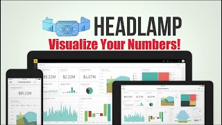
Richard Coburger demos HeadLamp, a customizable dashboard that pulls financial and operational data from QuickBooks Online and Intact. It shows trade-specific views with pie charts, bar graphs, maps, what-if sliders, and simple forecasting to help contractors track performance by business unit.
Questions this video answers
QuickBooks Online; intact; in development to pull data from Service Titan.
info collarprofits.com
Foreign. What's going on, everybody? It's Richard Coburger here, the blue Collar Nerd. A little bit of a different video today. I just want to show you something that the team over at Blue Collar Profits has been working on. If you don't know what I'm talking about, Blue Collar Profits is a group that I work with, separate from Blue Collar Nerd, and we help people with their Service Titan issues, onboarding, you know, ongoing issues, whatever it is. This is a little something the team's been working on for quite a while now, and I just wanted to show it off for you guys. So this is the Headlamp dashboard. Now this dashboard that I'm showing you guys right here, this is pulling data from QuickBooks Online. It can also pull data from intact, and it is in the works to get this functional with pulling data out of Service Titan as well. So let me kind of walk you through what we've got here. Now, this is just an example dashboard. These dashboards are all customizable. But this one you can see we're separated by trade here on the left. Here at the top, we can separate by business unit. We can filter for time. And we've also got separate pages down here at the bottom. So here we've got kind of a pie chart of our total income coming in from the different trades. And then right there underneath that, you get a visualization of total income by department. So install, repair, maintenance, whatever it is. And then over here in the top right, that same data set, but visualized differently, visualized as a horizontal bar graph. And down here on the bottom right, we've got total income year to date. So you can kind of see a breakdown of what month the most income is coming in. If we click on this arrow down here, we go to the next page of data sets. So this page is where we're able to play with targeting and kind of move some numbers around to see what it would take to hit our targets. For example, you see here our gross income, our progress towards that target. And down here in the bottom left, we have these sliders where we're able to edit percentages as like a what if scenario. We can kind of drag these numbers around and it will live update our scenario for us. Now here on the third page, we've got some forecasting. So this one's pretty cool. This shows the total income trend from the past several months, and then it also analyzes that trend and gives you a high and a low range for forecasting. So over here on the right side of that graph we see this kind of gray area that's the top and bottom of our trend and then it draws a trend line right in the middle. So about there is where we can expect to land. We've got our different vendors broken up by bill total, so we can see where we're spending the most money. We have our invoice totals on a map so we can see what areas we're bringing the most in from. This one down here again is vendor bills just visualized differently. And over here we have customers by spend, so we can see which customers are giving us the most revenue. Any one of these, by the way, we're able to click on this and make it full screen to look at just that data. And every data set is also filterable, so we can filter to different date ranges or different vendors, whatever it might be within just that data set. And every data set is also filterable, so we can filter any of these data sets by certain date ranges or certain vendors or whatever it might be, depending on that data set. This thing is really great for visualizing your numbers and it's really cool how quickly you can change what you're looking at. So like, let's say I only wanted to see what my numbers look like for H Vac installs. Okay, cool. So I can just filter H Vac up there and install over there and now that's what I'm looking at. I don't know about you guys, but I'm a very visual person. So just being able to see my numbers visually like this really helps me out. Anyways, that's all I got. Just real quick wanted to show it off. If you are interested in this, send an email over to info collarprofits.com somebody over there will be able to give you more information. Appreciate it. Have a good one. Peace.