Acrylic Painting Technique for Beginners | How to Paint Without Blending
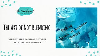
In this 30‑minute YouTube tutorial, Christie Renee Hawkins of The Social Easel demonstrates a beginner‑friendly acrylic technique she calls “the art of not blending.” Using only an angled brush and a small round/liner, she shows how to layer visible brushstrokes to build depth in a sky background without creating muddy, over‑worked areas. She explains brush handling (lifting and placing strokes, quick rectangular pulls), the importance of letting layers dry before adding new colors, and how complementary mixes can desaturate if applied wet. Throughout the lesson she addresses common pitfalls such as over‑working a section, staying connected to the canvas, and rushing, offering practical tips for patience and speed. Hawkins also shares personal anecdotes about rescued paintings, encouraging viewers not to discard “ruined” works but to revisit them later. The video concludes with a brief promotion of her Painting of the Month Club and VIP community, inviting viewers to share their own results.
Chapters
Hey everybody, it is Christie Renee Hawkins with The Social Easel. I am going to talk to you a little bit about what we are going to learn today. I'm going to start putting some of my colors on my palette, a couple different types of teals and blues down. Can you guess what I'm going to be doing with those teals and blues? I love these colors, by the way. I just grabbed some random ones. These are not necessarily exactly what I used in the original painting, but they are similar and close. To what I used. And this fun color here is a metallic copper. Okay, and we're only going to use 2 brushes today for our techniques as well. So this is my angled brush from my set as well as my small round or liner. Painting. This is what we're talking about today. If you happen to read the description, my tip and technique for today is teaching you the art of not blending. And what I mean by that is learning to layer your paint in such a way that you can create depth with different colors that are showing through, but without over-blending it so that it— so that you see no brush strokes. For this style, I want to see the brush strokes. I want to see that energy. I want to see that movement with the brush strokes. So it's learning how to create layers like this without overblending and without creating a muddy mess. So I hear this a lot, and so I thought this was a great lesson for today. I'm going to show you today some basic techniques. This is the way I break down all of my paintings so that anyone can do it no matter what level, um, you are at. So super excited about it, and without further ado, we're going to jump into the lesson. I'm going to scoot this over just a little bit so I can fit some more on the camera. I've got my mixed media pad here in the middle that I'm going to be practicing the brush strokes on. If you don't have a mixed media pad, I recommend getting one. You don't have to get one this big. This one is an 11 by 14 You can also get a small one if that's more convenient for you. I just got this one at Walmart. Um, so all mixed media means is that you can use different mediums, whether it be pen and ink, watercolor, acrylic. You can use them all in here. It's like a sketchbook for painting. So I recommend everyone that paints with me to get one of these, no matter what size you choose, so that you can practice brush strokes and practice painting before going to, you your canvas. Um, so we're gonna start with the sky. So if you're looking at this one closely, you can see lots of colors underneath here. It wasn't just a plain white canvas and then just blue brush strokes over top of it. You can see some of these warm rusty colors kind of peeking through. Now part of that was plan. Part of that was me working through the original painting, which is— I think sometimes people don't give enough credit for the process of creating art. Sometimes you have an idea in your head, and in this case, I started placing leaves on my canvas, and then as I did it, I was like, no, I got too much. I want to go back. I want more blue in the sky. And it ended up being what I love most about the painting, is that you can see some of these colors and different brushstrokes underneath this, and I just think it adds to the dimension and the interest of the painting versus just having it completely covered in blue. So we're gonna mimic this sky a little bit. We're going to start with— I'm going to show you kind of how I lay down these colors. I'm using an angled brush today, and then I'm going to show you how I'm going to let that dry and then add layers over top of it. Again, going back to the art of not blending, learning to not overwork your brushstrokes and continue moving around on an area of your painting when it's still wet, learning to walk away, work on a different area, and to not overwork a section of the painting. Does anyone out there have a problem with overworking an area? I'm guilty myself, and sometimes I have to remind myself, okay, stop, walk away, let it sit, let it dry, and then come back to it. So I'm just going to grab some of my different colors here and just start laying some little brush strokes down. So the reason I use an angled brush is because it kind of just does the work for me. When you lay down an angled brush, that's the brush stroke that you get. They're beautiful little brush strokes, and I thought they looked pretty as a representation of the leaves. So I'm just going to put some kind of all over. And you may have painted this style with me before. I use this technique in several of my paintings because it's just kind of a style that I like working with, and it teaches you to just have patience with your painting. Um, so I'm just going to lay those down. That's, that's all I'm going to do right there. And then just to give you an example of the difference of what this will look like if you didn't overlay any warm colors like this as your background, and then if you just did it straight on canvas, you're going to be able to see the difference. So I'm going to take that same angled brush. I rinsed my color out, and I'm going to start coming in with some of my blues, and you'll see I'm just kind of going all different directions with this. The important thing I want you to notice about what I am doing right now is that I'm picking up and putting down. And what I mean by that is I'm picking up my paintbrush and then putting it down. What I'm not doing is staying connected to my canvas or my painting surface. So this is what I'll see a lot, is people they're watching me, they think they're following what I'm doing, but yet theirs looks like this for some reason, and then they don't know why. It's because they're staying connected. You're blending all those brush strokes together, so you're creating no separation, no layers. Can you see the difference versus over here? Same— I'm using the same motions, but the difference is I am lifting my brush and then placing it, lifting, placing, lifting, placing. I'm not overdramatic about it. You're not going to see me lift it up this high, but each one of those is a separate different brush stroke. So let me know in the comments, can you see the difference here between the two? Okay, and then you'll notice it even more so when you start adding in other colors. I'm not rinsing that first blue out. I'm going to go over top of it, but I'm still lifting and placing my brush down. And it creates that depth and that layer. Now over here, this is going to be where I start. See, it's even hard for me to stay— naturally I want to lift off the page. But if I just keep blending, and it doesn't mean there's anything wrong with this, I want to explain that too. What I'm trying to teach you is the difference between the two. You can definitely blend. There's nothing wrong with blending. I blend in a ton of paintings. But if you want this type of look, if you want more of an impressionistic style, then you're going to want to follow this type of technique versus me just continuing blending. Now all I've done— I'm just continuing to work it, and now I've just created one color of blue. So it's just not as exciting, right? It's not as appealing. Now let's take some of our lighter color in here. And when you work with the different values— values meaning dark to light— you can really start seeing a difference in those brush strokes. Okay, so I love this, it's super pretty, but what I love even more is this with with a little bit of that dark behind it that I'm going to show you. And then again over here, if I stay connected and I'm still moving in the same directions, but I just get a different look. So again, nothing wrong or right, I'm just teaching you two different styles and why when you're doing something you may be getting a different result than, um, what you're expecting. And it's little differences like that that can make a big difference. So I'm just going to hold that a little closer so you can see the difference of blending and not blending, laying those brush strokes down. You can see the depth in this, you can see the layers of paint in this, and that is just for me a personal preference. I just love the way that it looks. And you can do that with an angled brush, you can do that with a flat brush, you and even in my chickadees, you can do that with a round brush and small brush strokes as well. You're just gonna— again, the trick is continuing to pick your brush up and down and laying those brush strokes in. So that you can see each stroke individually. Okay, all right, so this may not be dry in all areas, but I'm going to go ahead and paint over top of this as well so it will mimic a little bit more of what what my sky looks like over here. So as I'm going along, let me know if you have any questions, whether it be about this technique, whether it be about Painting of the Month Club, how you can sign up. It's very simple. It's only— this is also the only— these are exclusive paintings that are only available in Painting of the Month Club or as a tribe member of my VIP group. Okay, so I'm gonna go back to my blues. I'm glad you guys can see the difference. What do you, what do you prefer? And you don't have to agree with me. You can tell me, do you like the not blending or do you prefer blending? Either way is fine. And I want you to remember, it's your painting. When you go to the page to sign up, you will see other tribe sisters on that page holding their painting, showing their work, and everyone's is different. That's what I love about it. So I encourage you, even if you're you're not going to sign up, go to the page so you can see other women's artwork other than just mine and see their interpretation. It's one of my favorite things is when we gather everyone's pictures of their paintings, especially them with them. You guys get bonus points because I love to see your faces too, um, to see everyone's different interpretation of it. Already this is so pretty because the blue over top of that like burgundy wine color just creates a very pretty kind of purple. I'm not doing any flicking. Sometimes I teach techniques where I'm taking a brush like this. See how my wrist is doing a flicking motion? I'm not doing that. What I am doing is just quickly pulling. Okay, so just making a quick brush stroke. Think of it as like little rectangular shapes in all different directions. That's how I would— like mosaic almost. So it's not a dab, it's not just a— that is what a dab would look like. Or if I was making the leaf shape, so when I'm doing the background, I'm doing the width of the brush like this. When I'm doing the leaves, I'm still going to do it in blue so I don't have to rinse. I'm holding it where the skinny side of the brush is. So that's a good question. You guys see how many different brushstrokes I just did with one paintbrush? So that's a great question because it's important to realize how I'm— not just how I'm holding the brush and that I'm lifting up, but what am I doing with it? I'm doing quick pulls. Like I said, think of like rectangular type shapes. They don't need to be perfect rectangles. Tell that part of your brain to stop. Rectangular-like. Okay, so we've got our dark on there. Let's add a little bit more over here. I was trying to avoid this a little bit to let it dry some more. Okay, let's take some of that medium color. And don't forget, you can make your own colors. You can mix those two blues together. I'm adding some white in. You do not have to use exactly what is out of the tube of paint. Now, because some of that is wet underneath, it's picking up some of my burgundy. I am totally fine with that because I know that it is just going to create a pretty more like deeper purple type color when those two colors mix. But do you see how quickly I'm doing it? That is another thing that I would recommend so that you do not begin to overthink it. Like, okay, she said make these types of shapes, and then you start going that slow, right? Correct me if I'm wrong, but whenever I teach live, like in person, that's what I see. I'll teach a technique and then people are really thinking about each brush stroke. And here's what happens: it starts looking too perfect and too planned. You want this— if you want this style, you want to move quicker and you want it to be looser. Okay, so in order to do that, you have to increase the speed at which you paint and not focus on each individual brushstroke, overthinking it. Quickly move around and start filling in. Instead of focusing on your brushstrokes, I want you to think more about focusing on covering the canvas, not leaving any white showing through, that type of thing. So the trick here to get it to not over-blend— remember when I talked about creating muddiness at the beginning of this? If I did not let that dry all the way and I was too quick to move, especially with that orange color that I put underneath, let me show you what would happen. Here is some orange, okay, which is the opposite of blue. So what that means is when we mix the two together, we're going to create a neutral. We're going to create a muddy color because they desaturate each other. Blue at its strongest is its purest, right? And if you add orange to it, you're taking that blue away. That's how I want you to think about it. Same with orange. You start with a very vibrant orange, you add blue to it, you're taking the orange away, and it's going to meet in the middle And it's going to create browns, neutrals, depending on what opposites you use. So this is still wet, and then I go in with turquoise right over top of it. Look what's happened. Look how different this corner looks from this. And what was the reason why? Not letting it dry. You guys got it. Because it was wet, because I wasn't patient, because I was trying to rush. Right? And that's what happens sometimes to us in our paintings. Let's not rush. Let's like just relax. Let's slow down. This is our chance to slow down. This is our chance to decompress when we paint. So let's enjoy that slower pace and let our paint dry. Move to a different area of your painting. I do that a lot. It doesn't mean you have to literally step away from your painting, but step away from that section. A lot of times instead of just blow drying, which you can do too, you can blow dry it, um, but instead of doing that, I'm like, okay, that's wet, I'm going to leave that alone. I'm going to come over here and I'm going to work on this branch, or I'm going to work on my leaves over here. Okay, so that is— that's the difference. That's where you get a muddy mess and where you just get pretty layers of colors, and you see some of those warmer tones coming through, but they're just layers, layers of color which are creating the depth in the painting. So I hope you guys enjoyed that lesson. I hope it answered some questions for you. One question that I'm just going to go ahead and assume someone's going to ask is, okay, so let's say this is my painting. And I did that. I wasn't patient, and now I've ruined my painting, and now I'm upset, and now I just want to walk away and throw my canvas away. I don't want to do it anymore. So I'm speaking from stories I've heard, from comments I've heard. How many of you have ever felt like that? And by the way, that's okay. All part of learning the process. This does not mean it's over. It does not mean you're done. It does not mean you need to to throw it away or start over. And I really want to emphasize that because, in fact, actually, while we're talking about it— don't mind my reach across the camera here— sometimes your best pieces of artwork come from mistakes, come from frustration, come from not giving up. And pushing through. So there are a lot of canvases. I should just do a tour and show you guys sometime of all the canvases in my stash of finished paintings, not finished paintings, paintings I personally had to walk away from. Sometimes even a year or 2 years later, I will come back to those paintings and I'm ready to tackle them and be like, fine, whatever. I didn't like how that turned out that day. I had to put it away and walk away. I never throw them away. I put them away. But that is what happened with this little beauty. But I did another version of her before she got to this stage. This whole canvas was painted black. I had started working on my spread Love Like Wildflowers, which is another girl I painted with some sun rays and stuff. And so this is what it looked like when I pulled this out of my stack of canvases. It was black. It had the shape of a body on it, and it had all these different colors of rays shooting out, and I just didn't like it, and it frustrated me, and it bothered me. So I came across it last month, and I was like, you know what, I am, I am ready. I'm ready to repaint that painting. I kept the black background, I repainted black over top of that, I reshaped my girl, and this whole new idea came to me from that moment. And I don't think that would have happened, that spark wouldn't have happened if I would have thrown that canvas away. This painting wouldn't have happened because it was seeing that painting and then all of a sudden seeing a new inspiration for it that caused me to create this. And now this has turned into a 3-day Bible study and painting workshop. So that's my encouragement to you is don't throw your, your artwork away. Keep working through it. And like I said, you never know when you're going to come back to it and you're ready to do it over. So all that to say, this isn't ruined. Gotta let it dry and you can paint over it. So I use that time to chat with you guys for a little bit to let that dry so that I could show you. You can go right over top of it, and what originally looked kind of like a muddy mess We're really not going to consider that a muddy color anymore. It's just a toned-down color of that teal. And it can still work, especially as what I would call an underpainting, letting that little bit of darkness show through where the orange and the blue mixed. And then you can just paint right on top of it. So don't ever give up on your paintings. Don't ever throw them away. Keep them, keep them as reminders that you can make all things new. So that is all I have for you guys today, but that was just a quick— I always go over a little bit— quick little lesson on the art of not blending and how I did the background of the sky. Glad you guys enjoyed the tip today. It's one of my favorite, favorite techniques to teach. You guys have a good day. Bye.