Budding Artist Owl Painting with Christie
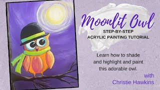
In this 2021 YouTube tutorial, Christie Renee Hawkins of The Social Easel walks viewers through creating a Halloween‑themed owl painting on an 11×14 mixed‑media pad. She begins by explaining the Inner Tribe membership’s “Budding Artist” level and how the lesson fits that stage. Christie demonstrates how to transfer a printed template onto the paper using graphite (transfer) paper, outlines the owl with Sharpie to protect the lines, and sketches a simple tree and moon. She then builds a night‑sky background using a limited palette of purple, black, white, and later yellow, showing color mixing, dry‑brush techniques, and the importance of letting layers dry before adding highlights. Throughout, she emphasizes proper brushstroke mechanics—using the whole arm for smooth circles rather than just the wrist— and provides detailed blending, shading, and highlight methods for the sky, tree bark, and owl feathers. Christie also discusses brush selection (rounds, liners), color theory (complementary colors, using warm tones for shadows), and practical tips like taking photos of work in progress. The video intersperses community interaction, answering viewer questions, promoting the Inner Tribe membership benefits, and encouraging viewers to share their finished owls.
Chapters
Hey guys, how's everyone doing? It's Christie Renee Hawkins with The Social Easel, and I teach women how to paint. And tonight we are gonna do this cute little bird a couple different ways. So tonight we— let me show you last night. This was my not last night, two nights ago. This was our first version. And so this is a really, really simple version of the bird. And then tonight we are going to do a little bit more. So we're going to add a background on there, and I'm going to show you how to do some shading. So you're going to learn a few different things tonight. And as we're going through these paintings, we're talking about the different levels of the success path inside my membership. This was our little birdie night one. Tonight we are going to transfer another version on here. I'm doing this in my mixed media pad, so this is an 11 by 14. Okay, so how many of you have done a template before? For a lot of people, um, they weren't sure how to do this, so I'm going to show you how to utilize the templates. We have these inside the Tribe membership. So it doesn't come with all the paintings because some of the paintings you don't need a template for, but some of them, like all the trucks that we do, the flamingos, the birds, things that are a little bit more difficult to freehand, I provide a template for you. So I'm going to show you how to put that on here as well. So all you need, you're just going to print this off the computer, and I made this smaller so I can kind of scoot him around here. I think I want them somewhere like about here, but I think I'm going to put them somewhere like right here, and I'm going to have a little tree that's going to come out, and we're going to do this really cool, um, night sky. I think I want to do like a Halloween version of him, so I'm going to go ahead. All you need is graphite paper, so this is called graphite paper or transfer paper. You'll see it both ways. And I'm just kind of eyeballing here. I think that's good. I think we'll do them about right here. Once you get it where you want it, all you do with a pen or pencil— it doesn't matter which one— you're just going to start tracing the lines on here. So before we get started, I told you I think I want to do like a little tree tonight. So I'm just going to come across here and I'm just going to do a quick little sketch with my pencil. We'll see how far we want that to come out, maybe a couple branches off like that. So I'm thinking I want to come kind of like that and then maybe have the tree kind of going up the side here. It's kind of what I'm thinking I want to do. And then we're going to create a big moon out here. So this is a really fun technique that I'm going to be teaching you guys tonight as far as doing backgrounds and shading. We're going to do some shading inside the bird itself. So the next thing I'm going to do before I start on the background is go ahead and outline my owl. In Sharpie. And I do this so I don't lose the lines once I start painting, because you may lose the graphite lines. They may get covered up with paint. And if you're worried you're not going to be able to see where they are, you might want to outline it in Sharpie. And if you're confident, you know, like, your placement of things, then you don't have to do this part. All right, so I was thinking for the background, because I was kind of wanting to do like a Halloween theme— do I have my dark purple over here? I love purple for Halloween paintings. I'm gonna get some purple and some white. I'm gonna need more than that, I can tell you that already. And then we're going to get some black. Okay, so I'm going to start— those are the 3 colors I'm going to work with my sky at first, and then we'll decide if we want to add anything to it. So tonight what we're talking about is the second level in membership in my success path in the Inner Tribe. So when you come in, not necessarily everyone, but a lot of people, when they come in, they're at the very beginner level, right? You're an excited newbie. You are ready to get going. You know nothing about painting. You just know that you want to do it. And that is where I start with people. So if you've never picked up a paintbrush before, if you have said the words I can't draw a stick figure. You fit into that category of the excited newbie. Tonight I want to talk about the second level is the budding artist. And so we've got this success path that— where do you see yourself? That when you come into Tribe, you can kind of look at this and kind of figure out what place you are in the group. And so through this week, through tomorrow night, we're talking about these different levels. Inside the membership, and the one we're talking about tonight is the Budding Artist. This is where you maybe have painted for a while, 3 to 6 months. You've done several paintings, or you've gone to paint nights, but you're ready to— you know your basic brushstrokes, right? But you're ready to learn some more advanced techniques. You're getting comfortable with color mixing. You feel confident in that. You're supportive in the community. You're working on shading and highlights. And so that's why We're adding those things to our painting tonight. So last, or the last lesson I did with you guys was just very basic beginner, and tonight you're going to be learning a few more techniques to correlate with that, that level of the membership. Okay, so what I'm doing, I'm loading up a bunch of white in my brush and I have some purple in there and I'm kind of going around in a circle right now. My logo is over me— underneath. That's not a word, is it? Over top. So this is going to be the start of my sky. Now I'm not worried about the fact that that's lavender. I know I can come back to this once it's dry and either add yellow to it or just make it a white moon. So it can be white or yellow. We'll decide that later. Right now I want to get this circle shape down. Okay. So I don't know if you can see what I'm doing here. See this movement I'm making? My arm is moving. I'm making big circles because here's what happens a lot when people— when I show this in class, I've been teaching for 7 years and I used to teach local paint nights. And what I would see, I would teach this and then people would be frustrated. They're like, why doesn't mine look like yours? Mine is like an oval. Mine looks like an egg. Mine looks like an eye. And when I would watch them, I was like, okay, show me what you're doing. They were doing this. Okay, so only their wrist is moving. So when that happens, you're making more of an oval shape. But if you move your whole arm, you're making a big circle, and that's what we want. We want this big circle to just keep coming out. So you're going to see me overlap the out a little bit. I'm not worried about that because I know I can come back and cover that up once it's dry. So does that make sense, what I'm saying about moving your arm nice and big? So right now I'm just doing regular purple, but see how I'm still staying with this curve, okay, even though I'm skipping through the bird. A little bit here. I'm still staying with that curved motion. And you want to have plenty of paint in your brush while you're doing this. That way it's going to blend nice and easy for you. I'm going to go ahead and cover the whole sky because I don't know exactly where my tree is going to be yet. So we'll come back to that. So see how you can still see those curved lines. And I'm just going to overlap those edges just a little bit. You can streak back in here. You have a little white in your brush and it'll add those streaks in if you want them. And we're going to come back to this. So we're letting this get a first coat and we're going to let that dry. And then we'll come back and we'll edit this area up here. So right now we're not completely worried about that. We know we can come back to it. Now I'm starting to pull some black into my purple a little bit. Okay, a little bit of black goes a long way, and we want it to be darker down here. So we're transitioning from Dark to light. I want it darkest down at the bottom, away from the moon. Hopefully I don't miss any little spots here. Get in between the scarf here. You guys see how we're starting to transition so far? I'm going to pick up a little bit more purple. A little bit of that mixture that I made as we transition to where we just had the straight purple. Trying to keep my curves similar here. And as I'm going back over top of this, see, I just keep blending. So this is a good blending lesson if you haven't done much blending with your painting. Then I'm going to pick up just some more of the purple again. So remember how I told you we're kind of doing like a second coat thing here? This is where this is coming in. The bottom is not going to need a second coat, but we might want one up higher. So I'm coming back in with some more purple. This has already dried, so this is why I'm able to come back in with a second coat. You don't want to do it until it's dry. Then let's start picking up a little bit of the white with our purple. Now, if you wanted to do your background first instead of putting your owl on first, you absolutely could. You would just want to make sure that your background is 100% completely dry. So you can use a blow dryer to do that, but then feel it. Make sure it's not tacky. You should not feel any, anything on there other than it just feeling like painted paper. Okay, dry painted paper. And then you can transfer your image on top of the painted surface. If you do it and it's not all the way dry, you're going to see that graphite paper stick to the surface that you're painting on. Okay, I'm going to clean this out. I'm back to that lighter area. So I've rinsed, I've rinsed that all the darker color out. I have dried this really well, so there's no darkness in there. There's no water or anything in here. Now I'm going to come back with white, just plain white first, and I'm going to start with a small circle, and then I'm going to start getting bigger. I'm trying to decide. What do you guys think? Should we add some yellow to the moon tonight, or should we just leave it white? I'm gonna pick up a little bit more white for that center where I want it really, really white. Kind of feather this out. So you get to see how this is getting like a feathery look. Now that is because I don't have very much paint in there, so it's kind of doing like a dry brush effect, which kind of gives a cool little like— what's the word I'm looking for— the light casting out from the moon. So we could leave it like this. Or we could come back and pick up just a tiny bit of purple with our white, so we've got like a lavender color here. I like doing this because then you can make that moon really stand out. See, my shape's looking a little wonky. I gotta fix it. See, I'm moving my arm, big brushstrokes out like that. And then we're going to go even more purple the further out we get. So again, you just kind of keep, keep blending, keep adding paint as you're going out. And then I think I want to do Even a little bit more out here. I love that kind of dry brush look where it puts the lighter color over the dark, and then we'll leave it kind of dark at the bottom. So what I'm doing when you see me pause and look up here, I'm looking at this in the camera because it helps me see if I want to change anything. So if you're painting at home, I really recommend taking pictures of your painting while you're in the process of doing it because it helps you see things in a different way that you wouldn't necessarily see just looking at it straight on. So I think I'm going to leave it like that. You guys like the way the light's coming around there? So I'm liking the sky so far. Do you guys like this technique? And then I'm going to put my big brush in there. You guys want me to do some yellow, right? Let's grab— I don't want a bright, bright yellow. I want a pale yellow. I don't think I have one. Um, Kay's saying if you put yellow on it, it will turn brown. Yes, if you do this while it's wet. We are going to let this dry 100% before we come back and add any yellow to it, because yellow and purple are opposites on the color wheel, so they look really pretty when they're together because they're complementary colors, right? If you mix them together, they turn into a neutral. So that's the same with any colors opposite on the color wheel. You mix them, they turn into a neutral. That can be any kind of combination of gray, browns, blackish colors. So we're going to let this dry all the way. So I've got my yellow there. I'm going to go ahead and get some dark brown next to my black, and we're gonna— I think I'm gonna use a round brush for this. And I'm just gonna— I've got my dark brown and my black. I always, always add black to my brown. It's just never quite dark enough for me out of the container. And you could even do this straight black. You could just have a black, like, silhouette of a tree. So I'm gonna have a tree come down the side here. Let me get this straight for you guys. I may have to reposition myself just a little bit. So I'm just going to load up plenty of paint here, come down the side, and I'm not worried about this being straight at all. Okay, I actually kind of want it to have a little bit of wave and curve to it. This is going to be really fun to be able to show you guys the shading and the highlights that we can do on the tree as well. And then we need a little branch for him to sit on, so I'm going to come out of the tree here, kind of pull it across. I'm going to stop about right there because I'm going to use a smaller brush a smaller round to get some finer branches there. So I'm kind of using a fat round right now. This one's a 10, and these are the Nik Pro— is the brand that they are. They're in my Amazon store if you want a good set of rounds. I love these. You can use them for watercolor or for acrylics. So it might look a little funny right now because we can't see where he's going to be sitting. So I'm just going to come out and add a couple little branches here. Let's go ahead and pull those off the page. I'm just lightly dragging my brush That's looking pretty good, don't you think? I think I might have another one come down. Linda said, can I get too much paint on the paper? You can if it's like really wet, so you don't want it like gloppy and wet. That's too much. So you want enough that your brush can glide easily, smoothly, without tugging, but not so much that it's just like gloppy. Does that make sense? I think I want to have another little branch come down here. See how I kind of am just lightly laying this down, kind of almost like flush, and I'm just kind of dragging it. And that gets me— I'm not putting very much pressure on the brush, which is giving me those skinnier brush strokes. This is a number 2 round. I think that's looking good. I'm going to come in with some straight black on this side, so it's going to be a little darker over here, and same on the bottom. And this may not show on video. I'll have to kind of see. It's so, um, the glare is so bad, so I'll hold it up for you once it dries. If you guys can't see the difference, can you tell where I'm adding black versus where there's a black brown, or does it look pretty much the same? So I'm just lightly dragging that black across, across the bottom. And it doesn't have to be on every single branch. You can decide. And then I'm going to rinse the black out of there. And we're going to grab a little bit of our brown. Actually, I'm going to show you a couple different ways you could do this. Let me grab my yellow. Because we know we're going to use yellow in the sky too, right, for the moon. So I could do a highlight with the yellow and a little bit of the burnt umber, or I could do the burnt umber and a little bit of the white. So I'm going to kind of show you the difference and we'll see which one we like better. So I'm going to just grab a little bit of my brown A little bit of my yellow here, and it's just going to make a totally different color brown. We're just going to kind of drag this down. I'm not sure if I'm crazy about this color. We may change it. We may just do burnt umber. And white. Now I'm going back with more burnt umber because I kind of want like mid-tone there. You're starting to see the color pick up a little bit more because the black is drying. Okay, same here. So now let's do the burnt umber with a little bit of white and decide how much of a difference you want that to be. There's no right or wrong for for it. So see how those are two completely different colors? This one obviously has more of a yellow undertone to it, and this is just white and brown mixed together. I'm just gonna kind of— same thing, just kind of drag across here. You can add a couple little lines kind of throughout just to give some definition to the tree, let that bark kind of show up a little bit. I think I definitely like the, the white and the brown together better than I like the yellow. See how that creates that highlight and that glow on the top of the branches? Isn't that cool? Just a couple little brush strokes. So I'm going to try to hold this up. So you guys can see a little bit closer. So up close, I like to show you guys up close because look how big those brushstrokes look, and you probably wouldn't think that. You probably think they were super, super tiny. So keep in mind, that's why I like you to take pictures of your work as you're going, because you can see what it looks like from further away. Let's add— I'm going to go to a different round. We're going to come back to this pale yellow. So I'm taking this pale yellow, avoiding where I stuck my brown in there. I'm going to grab some white because I want it like super, super pale. We're gonna start going a little in here. You can add more white right onto your canvas and blend that out. So we're able to do this now because our our purple is completely dry. How's that looking? A little bit darker. Oh, that brighter yellow is pretty on there. Can you guys see that? So as I'm going out, I want it to start looking a little wispier. And I'm just touching down here and there. See, I'm picking up my brush and touching back down, picking up, touching back down, so it's not all staying connected. And then we get that halo glow again. I'm liking the yellow in there. Yes, I'm digging the yellow. I'm going to take a little more white and go right in the middle, and it's going to make it glow. It's going to give it that contrast that we want. I can even do some of that white So I have a lot of yellow out here. Throw some white in, and you could take this out as far as you wanted. What time is it now? Where— how are we sitting? Okay, it's looking pretty good so far. So that's just a fun different kind of sky that you can do. Um, now we're gonna paint in our owl. I'm gonna start with his eyes. Marmite. Black a little bit bigger than this one. We'll pull that out a little bit more. I can always come back to it, right? Oh, he already looks so cute with the black. All right, so now decisions. Last night I changed my mind and wished I would have done the owl a different color. So let's think this through a little bit. I wanted to do like a Halloweeny fall owl. So I've got some orange. These are fun colors. We've already got purple in the background, but we could do black and white and maybe some orange and lime green and hot pink. Now it's just trying to figure out what order and what I want to be what. I've still got a little yellow over here I can play with. I'm gonna put just a little dot of orange on there. I'm thinking I'm gonna do a black hat because I want that contrast, especially up against that bright sky. So let's start with that because I'm pretty sure I know I want that. So I got plenty of paint in my brush and I'm just kind of pushing it down and around. That's how I get that nice smooth line. They are sold individually in my store for $37 apiece, but it's only $47 a month to be a Tribe Sister, and you get 3 new paintings every month plus all those other ones. So the savings is huge for you to be a Tribe Sister and the value that you get compared to buying them individually. But you do have the choice. Deborah said, will cotton fabric work okay for mixed media? Yeah, if you glue it on there, definitely. Does it matter where you start with the owl, inside or outside? Dark? No, it does not, because everything that we're doing we can always paint and cover back up. I'm going to go into my white first and go ahead and fill this in where we had purple over top of that, and then decide what color I want. And by putting white down first, It's kind of giving us a base coat there, and it's going to help us cover that purple better. And then we're going to do the same thing with the rest of our lines here. That picked up a little bit of brown. We'll just wipe that off. You guys could do this a million different ways. You could also make a Christmas owl with this cute little template. You could use this for every holiday you wanted. Now I've got his little legs down here. I can't forget about these little triangles. Let's get a smaller brush for that. His little ear sticking out over here. All right, I'm thinking orange too. Let's— so I'm just getting a little bit of regular orange. I don't know if I like this orange. We'll see. It's a little— I don't know. We'll see if I like it. No, it's not as bad as I thought. So I'm just going in with one base color first, and then we'll come back and add some shading and highlights to it. Get his little legs down here. I'm thinking he's going to be pretty cute. Let's go around the outside here. Maybe I will do that little inner ring blue. Throw a little teal in there. I try to sneak it into almost all my paintings. So I want you to notice while I'm doing this, I'm not worried about having the perfect coverage or all my lines being perfect right now. I'm just getting a base coat down. Okay, so not everything when you do it needs to be just exactly the way that you want it to be finished, okay? You're still going to be adding to it. So I say it all the time, you gotta trust the process. We're not done yet, we're just getting started, um, filling in the colors. Yeah, let me get some pink. And speaking of pink and orange and my color mixing that I love, look at the colors that you can make with pink and orange. I love color mixing. So you get kind of like a really pretty coral color. So completely different, right? We could come in here, make his belly a little pinker. Maybe even add a little bit of white to that pink. Let's come back and add a little bit of white to our orange too. See how you get that little mix of the orange and white together. You start seeing a little bit of shading coming in. There's a little pink in there too. This even picked up a little bit of that yellow. I like it in there. Let's add a little yellow in the middle of the wings. So just play with your colors. Know that as long as you're on the warm side of the color wheel, your warm colors, just think of fire. Any of those can be blended for you to make new colors with, okay? So keep that in mind, you're just playing here. Let's go a little darker with the pink and the orange on the inside. Maybe a little bit more pink over here. So see how quickly you start adding in that character with just playing with a little bit of colors and throwing them in here, just going back and forth until you like it. I really like this yellow and orange together though. It's making like a really pretty highlight. Maybe add a little bit extra over here where the moon would be hitting his little feathery arm. Give him a little glow. We could take that a step further by picking up a little bit of white. Isn't that cute? Just add that little bit of shading in there. So I'm choosing to do the yellow up higher up here. So we don't have that straight edge. Maybe a little on his belly. So I kind of like that hot pink over on this side where this is the darker side of them that's not getting hit by the glow of the moon quite as much. So instead of using like black and making it darker that way, you can use color to be your difference and be your shadows as well. I could even, if I wanted to, grab just a tiny bit of purple streak some of that in if I wanted to create a little bit more shadow there. Now I feel like the rest of his wing needs more yellow here. What do you guys think? Is that looking better? Maybe use this side of his belly to be a little bit more yellow too. I think I'm liking that. I want to real quickly show you the difference of how this owl is looking tonight. Again, this is kind of stepping up the level of painting, right? So this is learning a little bit more about shading, adding more detailing in, versus this owl last night. Still super cute. But a totally different style. So these are just pretty plain colors, and then this is when you start adding in some shading and highlighting. I'm going to grab a turquoise, and the turquoise is going to look really good because— because can anyone tell me? It's quiz time to see if you've been paying attention. Why is this going to look good? I'm gonna get my smallest round that I have here. I also have a great set of liner brushes in my store if you want super skinny brushes. I love them. It's a whole separate set and they're all just liner brushes, but they are amazing. This piece of hair is driving me crazy. Let's just tuck that back here. Because it's opposite on the color wheel from orange, so it's going to look really good on this painting. I'm liking it already. Now I'm going to come in with white with this and kind of let the blue go a little bit inside of here too. If I feel like I got it too blue, I know I can always come back and add more white to it, but not until it's completely dry, because if I just started adding white to the blue right now, it's just going to continue to be blue and I'm just getting a bunch of paint on there that I don't need. So we're going to go around like this first, and then we'll come back and add some more white. He's looking pretty cute, don't you think? I think he needs some lime green in his life though. I'm thinking he needs some polka dots. We did plaid last, last time, so maybe some polka dots this time. So anywhere I go over the black and I didn't mean to or went a little bit too far, I'm not going to stress about it because it's going to be super easy to cover up with black at the end. So I try to get you guys to let that type A go just a little bit. Just have fun. It's okay if you go outside of the lines. It's not going to kill you. It's not going to ruin your painting. You can fix anything with acrylic painting as long as you let it dry. You can paint over this entire thing if you wanted to. So there's really not a mistake you can make on here that you can't come back and fix. That is some neon lime green here. Look at that, he's looking so cute! Can you guys see how me putting that base coat of white, how much that's helping now that we're adding in the green on here? Because if that green was just trying to cover the purple, you'd still see a little bit of that purple coming through. So for this, for the highlights on the scarf and the hat, I'm going to pull in a little bit of that yellow again. This is what I love about, you know, yellow can go towards the green side, even blues, and then you can use it on your warm colors as well. Can you see that on there? He's looking pretty cute. And then, um, maybe we do— so for the darker side of him, let's take a little bit of the blue and the green together. You guys see that? So it's making a little darker green that we can use to kind of be the other side, a little bit darker on that side. Maybe even at the bottom. I kind of like the blue just straight on there. What do you guys think of the blue? Looks good. So you can see, just adding these extra details, what a difference it can make in your painting. And like I said, this is not difficult, it's just the extra time, you know, that it takes. And I'm not using a ton of paint right now because we're doing so much blending. I'm liking it. All right, so I'm gonna let that dry a little bit, go back. I'm gonna— this blue inside of his eye is dry, so I'm gonna come back and lighten this up with more white. So again, I let that dry before I came back to try to add more white to it, because otherwise it would have just blended with the blue that I already had on there while it was wet. What color should his nose be? Maybe like really hot pink. Someone asked me— oh, Dawn said, will you be fixing the white? So I didn't even see that, Don, but yes, I can. I don't know how I missed it. There we go. I got way too much paint on that. And let's give him a little mouth here. Look at— he's so cute. The little yellow on the pink nose, it even makes it look like it's kind of going out a little bit on camera. It does. Let's add a little bit of white up here. Maybe even a little yellow. So I'm just coming back with my black, kind of pulling that over anywhere I need to. I feel like I got too much, more than I wanted up there. So you just come back and cover it up. You can always change your mind. Or maybe I just need to blend it a little bit more. Maybe just take some white over here with the black. For the eyes, I always flip my brush over backwards and I use the back end so you get just a nice perfect little circle there. On this one, I'm going to do— these are what I call Sophie eyes, because whenever Sophie does— um, Sophie's my 9-year-old, by the way, and she's really artistic, and all her little animals and all the little things that she does, they have these two little dots in their eyes. Are they— isn't that cute? So it's just a different way to do it. So we made some Sophie eyes tonight. And then, you know, I was going to put pink polka dots on his scarf, but I kind of like it the way that it is. Let's get some black for his little feet here. And then we're going to get just a tiny amount of white, and we're gonna highlight the top of his feet so you can see him. So I'm thinking the last thing I want to do on this one is maybe just add a little bit of white around the edges. I can't decide if I want to add black or not. Maybe I'll do a little black first. Yeah, I'm thinking the black is going to be a good finishing touch on all of this. I'm kind of liking the black around the, uh, the scarf. All right, everyone's telling me to leave it. I'll just do it around the scarf and I'll leave the rest. We can just say that's a little bit of shadow there. See how it breaks it up just a little bit? I do have to go around the eyes with it though. Yeah, I feel like I need to add just a little bit. It doesn't have to be a ton, but I feel like some of the lines get a little lost if it doesn't have a tiny bit of contrast there. All right, I think he's done. So that is all I have for you guys. Thanks so much for hanging out with me. And that's all I got. So you guys have fun painting. I can't wait to see your pictures. You can text me, you can text me your pictures when you are done with your owls. I want to see, see what they look like. All right, I'll talk to you guys later. Bye.