Easy Gerbera Daisy Painting Tutorial for Beginners | Acrylic Step-by-Step
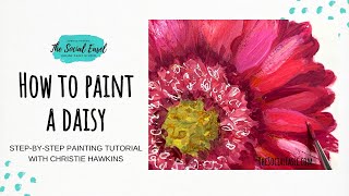
Christie Renee Hawkins paints a gerbera daisy in acrylics, showing how to extract colors from a photo using Procreate and Adobe Capture, transfer a sketch with tracing paper, and build layers from dark to light. She uses a filbert brush for petals, mixes complementary colors to desaturate, and converts reference photos to black and white to see where lights and darks belong.
Chapters
Hey everybody, it's Christie Renee Hawkins with The Social Easel, and we are going to paint a gerber daisy today. So I have my iPad out here to show you what I'm painting from, trying to not get that glare on it. So this is just going to be a quick, um, an easy lesson, kind of using this as our reference, and I'm going to show you also how I can help find the colors when I'm like looking at a reference image, how to find the colors of paint that are really in this, because in our brains we just see pink, right? But there's multiple shades of pink. So I'm going to use my Procreate app on my iPad to show you how I can kind of see what those colors are really like. It'll help me pick my paint colors. Um, and then we're gonna get to sketching and doing a quick version of a gerber daisy. So you may have seen my live a few weeks ago when I attempted to do this, and, um, everything that could go wrong in that live went wrong. So we are redoing it and doing a gerber daisy again today. So I had interruptions. I had to go pick sofa from school. It was like all the things. So that's why we're doing a redo. Um, and then this little guy I have here, I was just going to show you guys. I painted this last night. I just needed to just paint for me, not worry about whether I'm doing it as a lesson, and just wanted to come in here and paint and kind of, you know, have an escape for a little bit. So this was not even my plan when I came in the studio last night. I was just going to come in here and paint some flowers and just sketch and just do whatever. But I had my Farmer's Almanac garden guide sitting out. I love getting stuff like this for inspiration, and it was flipped open to this page, and I thought, I've never painted a bee before, so I'm just gonna sketch this out and paint it. And this was what I came up with. So this was Again, my reference photo, my idea, and then this was how it came together. So I posted this in my tribe, which is my VIP membership where I teach, and asked the ladies if they wanted to learn this, and it was an overwhelming yes. So I'll be teaching this inside of my tribe, um, over the next few months. So I'm excited about that too. But that kind of gives— people ask me all the time where I get my ideas from. So I just wanted to share that with you guys as well. And I just did this in my mixed media pad. So a lot of times people will say, you know, they don't want to paint because they don't want to have all the canvases around. Get yourself a mixed media pad. It's easy. You can keep it like an art journal, and you just have page after page of paintings or practicing brush strokes. So it's just really, really handy to have. So you could, if you wanted to, you could like print a photo off and, and then trace it on. When I did the bee, I just grabbed some tracing paper and just got— you can see that's not like super detailed, but it just kind of gave me where the lines were. So you could print that off and use transfer paper to put it on here, or you could trace over top of it like I did with the bee. So I'm going to see if this will cooperate with me and not move behind me, but it'll just kind of give me— oops— an idea of my shape and size. And again, I'm not going to get super detailed here. But I just want to kind of give you some ideas of how, if you're wanting to do something from a photo, how you can do that. But I'm just giving myself like the inner circle, then this, and then I have a roundabout idea of how far out those petals go. Hello everyone. Thanks for jumping on with me. So you need tracing paper for that, and then you need transfer paper, carbon paper. It's called several different things. If you haven't used this before, there's like a gray outside, and then there's a really shiny black side. You want the shiny black side. Down, and then you're just going to lay this over top of it. And again, these are just super, super loose, just kind of giving the idea so you're not having to freehand it. I know a lot of people are intimidated by drawing, and I don't want that to, you know, stop you from the creative process. So this is just a little tip for you. Hey Debbie, hey Nancy and Donna. Okay, so we've got our base design sketched on there and, um, you know, I could do this, this color, or you could make it whatever color you wanted to. And we could even— look how pretty that is. This is from a flower that was in a bouquet that I had. All those details in there. But anyways, I'm getting sidetracked. It's just really cool, all those tiny little petals. But what I want to show you— again, this is in Procreate. Another app you can get on your phone is called Adobe Capture, and you can do the same thing in Adobe Capture and pick colors. But what I'm going to do here up at the top I have my little color thing, but when you hold your finger down, see how that is— can you guys see that circle? That's changing that top half of that circle that I'm moving around with my finger, and it's selecting the color. So like, if I stop right here, let's go— I'm trying there. I want to go back to that dark color. So kind of like the shadow, the, the back layer of those petals is really like almost this like dark burgundy color here. And then I could make a new palette and then I can add that color there. The other thing that Procreate does, you can do that and select if you're wanting a specific color. But look over here under palettes. When I went to that, it did this for me. So it grabbed the greens and the different shades of pink and already created that palette for me. So this is super handy. And Adobe Capture will do the same thing on your phone. But this is really handy when you're looking at something and you're just not quite sure what colors you need. This gives you something to base it off of. So then I could, you know, grab— let's see what pinks I even have over here. Like, for like my lighter one, this is Cactus Flower. But you can start holding your paints up to those color swatches to kind of get a better idea. And then of course I'm going to color mix. I don't expect to find every single one of these colors in a bottle, um, but I know with any of these pinks I'm gonna add some different colors of red, maybe add some black to make it darker, um, and just try some different things. So I've got that pink. This is a really pretty pink. This is Berry Cobbler, Cranberry Wine. So you may not initially think when you look at this and how hot pink it is that you would want these colors, but those are kind of some of the more of like the background colors there. So we'll start with some dark and then do like the really pretty hot pink on top. See how I'm just selecting that and then adding it? So it doesn't pick every single color out, but that is— let me see, I feel like I don't have all my paints here. I think I'm missing the color that I want, which is just, just a really basic, um, pink. So I may mix my own. This is Watermelon Slice. We may play with that a little bit, but I'm just going to grab a couple different pinks and we're going to start playing. And see what we get. So let me know if that is helpful to you guys, to see kind of how I select colors, um, where I get my ideas from. And then I'm going to prop this up and get it out of the way, and I'll be live next Wednesday as well at noon. We're gonna try to make this a regular thing, Wednesdays at noon. You can sign up for text alerts if you want to get notified when I go live, and we're gonna do these quick little lessons. Next week I'm gonna do a tulip. So I'm going to start with some of this darker color here. I don't like where that is. I'm going to have to move it over here. And I'm just going to get these different colors on my palette. Good morning, Brenda from Montana. And if you like doing these, be sure to sprinkle this Facebook Live, share it with your friends, brighten up their day a little bit with a painting. So I'm getting those different shades I showed you, then I'm gonna grab some white and black as well. I don't even have my full brush set here. Let's see, this is what happens when you move from studio to home and back and forth. I still don't have all my supplies, so I'm going to use my filbert brush out of my set. This is— you can tell this is what I used last night. Um, this has the curved shape. This is really good for petals, and then also rounds are really good. So I'm not worried about making this super realistic, so it's not gonna look like that bee I showed you that took 2 and a half hours, and we're doing a quick like 20-25 minute session. But I'm gonna start by putting in some of these back colors, and we're going to have multiple petals. Most of what I'm doing right now is going to be overlapped. But see how I'm using that shape of that brush just gives me that petal shape. And we'll have some extra petals kind of come out here too. I'm going to lower this. You guys want me to lower this a little? Let's see how much I can. I feel like we're awful zoomed out here. I don't know if that's a little bit better. So obviously this is straight out of the bottle, so you can use it— I'm holding it on the side, or I could do flat. And don't get too caught up in what these look like right now. Remember, we're, we're building layers here, so usually when you start You're going to think, oh, this looks like a hot mess, and that's okay. That's how paintings work. You're definitely going to have moments where they look like a hot mess, and you have to be patient and wait for things to come together. But when you're looking back at— just going to pop this off and show you again— see all these different layers of petals. So maybe I'll have some kind of peeking out here and then We'll be adding more over top. When you do some on the side, they can be skinnier so they're not all exactly the same. Most of the time I don't like to paint too super realistic because I love just taking the idea of a flower and then kind of making it my own. So I picked this other berry up and I'm doing a couple brush strokes over top of that. You can see a slight difference. I'm going to take a little bit of my white. See, now we've got that really pretty pink color. We can throw that in. And this is more of like my more red, reddish pink color. Just mix that in there. So we're going to get some different tones of pink. I'm going to start coming in here. Doing that middle section. We may use a pen to kind of create some texture in there too. We'll see. Hey Barbara, the Procreate app is only on an iPad. It's not on an iPhone. If you're on an iPhone, you're looking for the Adobe Capture is what the iPhone has that can help you with those colors. So I'm just doing quick little pulls of color here. And I think we're going to want to let this dry a little bit. I'm going to put a couple brush strokes in here, but I don't want them to keep mixing with the colors underneath, so I'm probably going to let this dry. And we'll come in the middle, and this is kind of like a limey green center. You can hear my dogs wrestling in the other room. I was using my filbert from my brush set. Hey Kim, yes, everything I do on Facebook, there's always going to be replays. So if you can't stay with us right now, you can jump back over when you can and just go to the videos tab or scroll down to find it. So this was matcha green that I used here that I'm just kind of doing in that center. I was just using a round. If you are not sure what brushes to use for what, we did just create a brand new brush guide that is super helpful. Lynn, can you grab that link and put that in the comments? If you haven't downloaded the brush guide yet, I would definitely recommend it. It's not only gonna tell you what brushes to use for what, but It's also going to tell you how to take care of your brushes so that they last you a long time and stay in good condition. Tells you all the tips and tricks of how I use my paintbrushes. So this is kind of what it looks like up close. Lori, I'm gonna pull your question up here. Why is there an angry face on here? Who's angry? Lori said, is there a rule of thumb for flowers with color placement? To make it more dimensional, the outer edge darker, um, and the more central lighter. I struggle with them looking fat and can't figure out how to address it. So I'm gonna show you something that I do. Let me see, I might have to go back to— so this is, this is really helpful when your painting. And that question that Lori just asked— you're having a hard time adding dimension to things. So right now you can probably see some of the darks and lights in here. Again, I'm not gonna get too super specific with this painting, because we're just doing a quick, fun one. But I wanna show you a trick, and I did this when I painted the bumblebee that I showed you guys. I'm gonna go to— this is my Photos app. So just your photos on your phone, and I'm going to go to edit it. And I'm going to turn it black and white. So when you turn it black and white, it takes all the distraction of the color away, and it allows you to really see the contrast. So instead of you kind of guessing where those lights and darks need to be, you you can see easily right here. Okay, so it's super— this under petal is super dark right here, and then that edge is really, really light, and then you've got some mid-tone grays. So does that make sense? It's really helpful to turn your paintings black and white if you're struggling with that. And then what it allows you to do is see blocks of color. Instead of, oh, that's a flower petal. I'm not looking at that anymore. I'm looking at this shape right here is a darker section of that. So when I was— I'm going to flip back to this just to show you guys. So that's what I was doing here. Like, I was looking at the photo and I'm like, okay, look, there's the shadow. Underneath the bee, and that was just a shape. Then there was this shadow, so I just made those areas darker. Now I chose to do that in purple because it's not really gray, right? And I didn't want to use just black in this. I wanted this to have more life than that. So, and then same thing when I was like doing these little sections, I was looking at my picture and I'm like, oh, there's a little bit of a darker area in the middle of that flower. So I did one little brush stroke. So hopefully that makes sense and is a helpful tip for you. So I'm going to go back to my colored version though. And you can do that on any phone, any— anywhere you have your pictures, you can just edit them and do that. I'm going to get my little liner brush. This is the one out of my set. And even when, like, we were looking at the center of that Gerber daisy, it's not just lime green. Like, when we turn that black and white, you could see all the dark around there too. So we can actually play with this a little with color mixing. I'm gonna have to watch myself on time because I get— I'm getting sidetracked giving you guys many lessons. But I'm going to take a little bit of this reddish pink with this green, because they're opposite on the color wheel. So what that is going to do when I do that is it's going to tone this green down. So another way to think about that is, this is full saturation, right? It's totally saturated. It's, it's strong, vibrant color, and when you add the opposite color to it, it desaturates it. It takes that color away and it tones it down. So now I have kind of a darker, more muted kind of green, but that's going to be helpful because then it can give me some variation here. And I'm just doing little dots, then come back to the regular, add some of that in. And then of course you could also do a darker version by just taking a touch of black. A little bit of black goes a long way. And now we've got a shade of that. Maybe go a little darker around my edges. So that, by adding the black to it, it almost made it like, like an army green. And it's so funny, because when you mix that initially, you're like, oh, that's not very pretty. But actually, it's not bad. It's a pretty color on its own. It just depends on what are we comparing it to, right? So now you've got this new color that you've created, which is a nice muted green, and you got that from that really, really bright green out of the bottle. So it might surprise you what you're able to mix once you understand how the colors work together. Together. So you see, that just adds a little bit of detail and texture there. So I rinsed my brush and I'm just going to come in and do these little brush strokes over top of this, all those little itty-bitty petals that are in the center of that. So I'm going a little bit lighter, adding some white to my pink mixture here so we have some contrast. And I'm just coming in and just doing little dabs of that color. I don't want to cover up that whole section completely because I want that dark to come through too. So it's all about being patient, letting those things dry. Like, I wouldn't have this same contrast if I would have just jumped right into that while it was still wet. I need to let that dry first so then I can come and do this top layer with these little additional colors, right? And now we've kind of got that effect of all those little petals in there. Then I'm going to take some of that Berry. It's a little darker around the green. So the key is to just keep picking up and touching down with your brush to kind of create that texture. So I'm going a little darker around the outer edge too. So you can see the, the depth that that is starting to give to the center of the flower. And we're getting that depth because we're playing with the lights and the darks, and we're playing with the contrast. It looks almost 3D, doesn't it? Hey, Kellen said, off topic, but what is the keyboard case you have for your iPad? Okay, it's my— the best invention Apple has ever done. It is an actual— I mean, it's made by Apple. So your iPad is magnetic, sticks on here, and then it's like a book, but it comes with a keypad. So instead of typing on your iPad, which is not convenient at all, you actually have a keypad. I like this better than a laptop. It's just easier to use. So I'm going to start coming in with some of— I'm going to still use my small brush for right now. And see how I like it. And I may decide to switch to a different brush, but I'm going to get my brighter pink. I still really don't have the exact color that I'm wanting. That's pretty close. So I mixed my Watermelon Slice and my Joyful Pink. Pink. So it's just a really pretty, just hot pink color we've got there. And I'm going to give a little bit more detail now. So I'm keeping with the petal shape. And again, we have lots and lots of petals. So I'm just going to start going around, and they're all different sizes, but I'm not going to cover up everything behind. Grab a little white in that mixture. And keep in mind, like I was showing you with the black and white photo, each one of these petals is not just one color. If I was getting really, really super detailed with it, I'd be coming in and adding those darker areas too. Maybe we'll come in and add some darker in between. See how you've got that light and dark. But even if you're not going super realistic with this, we still know we're painting a daisy right now, right? So it's not about it looking like your photo. If we wanted it to look just like the photo, we just look at a photo. But it's a painting, so it's your interpretation of that. It's not about it being identical and capturing every little thing. Just quick little brushstrokes and it starts to come, come to life a little bit. And I'm constantly changing the color of pink. So every time I go down and grab more, it's just a little bit different. I'm not mixing a whole section of that color and keeping it the same throughout my entire painting. This is usually what my palettes look like. It's just a mixture of all these different fun colors. And this would be really pretty to just do a bunch of these on a paper, maybe overlapping different colors all around. I love all the different colors of gerber daisies there are. All right, so what do you guys think? We like how it's coming together. Give you some ideas. You can use this idea to go do your own or find a photo that you have on your phone. I'm always taking pictures, always taking pictures when I'm out. I even went out in the rain while we were camping. It's pouring down rain, but there was this really pretty daffodil. I'll show you the picture. And I was like, oh, I want to get that picture. And then I like purposely like got down eye level with it and got the angle I wanted so that it would— because it was on top of a huge hill, um, and we're up in the trees. So you get the close-up of the daffodil, and it was raining, it captured the raindrops. And then far off you can see down below, it's really cool. But anyways, I'm always taking pictures. I just need to get more organized with storing them on my phone so I can find them when I want them. But your— if you have an iPhone, inside your photos you have a search bar. So when I started this, I just typed in daisy and it pulled up all my pictures of a daisy. Here, let me find that really quick. I'll show you guys. Give this a second to dry. Can you guys see that? I don't know how much you can see, but in the background here is a river, and you can see the little raindrops. And then obviously the close-up of the daffodil— look at all that detail! I just thought that was a really cool picture, and I had to get out in the rain to get that, but it was worth it. So let's add a little stem on this guy. I have my pink already in my brush. I'm just going to go into my green So I can tone that down a little. Maybe add just a touch— that's too much black. I liked that color we mixed earlier, kind of like an army green. If you have a hard time doing lines, rest your wrist on your paper and try to get enough paint in your brush that you can do one pull of color. Then even with this, I could come in You can just keep playing, make a lighter version of that, add some white on. Got that a little thicker than I meant to, but that's okay. Now the other thing I was thinking we could do, and then I'm going to jump off here. What do you guys think? I was going to come in with— I have these little pens. I usually use my big Posca pens, but I have these other ones that I recently got too. These are all much skinnier. These are in my Amazon store. But they're made by Art Owl. They're super skinny. This one's an Arteza white pen, but they're really good for itty-bitty details. So like, if I wanted to come in and just do these little— I'm just doing little scribbles, but it kind of like accentuates the little shapes. I'll zoom in in just a minute. Show you. You could leave it the way that it was, or you could come in and add these little things. So that's in white, but I also like this gold one, especially for in the middle here. The gold kind of gives like an orangey yellowish look. I just like to add those little pops of color in, in different places. So up close it kind of looks crazy, but when you get further away it adds that texture. And then you could do the same thing, you could do, um, black or white around these if you wanted. Oops, I thought that was dry there and it wasn't. So you obviously want to do this when it's dry. And sometimes it's just nice to add just a touch here and there. It gives a little bit of separation of the petals. So I'm just going to add a couple more lighter ones, and then I'm going to be done for today. And next week we'll do tulips. Maybe some of these smaller petals that are in the front. Piper quit. I like that different color of pink added in there. So I'm going to go a little darker in between a couple of these petals, just creating a little bit more separation. And then a little lighter. Again, I'm not being— I'm not really going from the photo right now. I'm just quickly adding in some touches of color. But if you were wanting to be very specific and realistic, you could really look at each individual petal and add in those different darks and lights.