How to Add Lettering to Your Paintings | 4 Easy Methods for Beginners
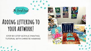
In this instructional video, Christie Renee Hawkins walks viewers through four beginner‑friendly methods for adding lettering to paintings. She begins by describing a scratch‑into‑wet‑paint technique where thick acrylic is applied and the lettering is carved directly into the wet surface, followed by optional highlighting with a paint pen. She then demonstrates freehand lettering using pencil on tracing paper, transferring the design onto the artwork with transfer paper and a paint pen. Hawkins explains basic typography concepts—serif, sans‑serif, and script—showing how each style looks and how to experiment with letter weight and spacing. She introduces Canva as a free digital tool for exploring font families, adjusting text styles, and printing designs to trace onto the artwork, emphasizing the importance of treating letters as shapes. Finally, she shares finishing tips such as adding white highlights for a 3D effect, combining up to three fonts, and using mixed‑media pads for practice. Throughout, she offers practical material recommendations, troubleshooting advice, and encouragement for beginners wanting to incorporate Bible verses, quotes, or personalized messages into their art.
Chapters
Hey everyone, um, today's studio technique session is gonna be on adding lettering to your artwork. So the first one I did on a Facebook Live the other day, but I'm gonna go ahead and do it again on here just so you guys have all of the techniques in one video. But I'm going to show you how we do this technique, which is really just scratching the lettering into wet paint. So right now my black canvas is drying, so we'll save that one until that's done and I can add some paint to it to show you how that works. This is one that we will be doing later this month, and I haven't added the words to it yet. So this came from a when I was studying the Bible, and I have a journaling Bible, so I was— I kind of drew this, um, image in the side column of my Bible, and I decided to turn it into a full-on painting. And I want to add the Bible verse to it, or part of the Bible verse, but I haven't done that yet. So there are two ways we could do it for this, for the, the way that I'm envisioning it in my head. I could freehand it on here and just start writing the verse out. I would recommend doing that in pencil. An easier way to do this would be to start with tracing paper. And so the beginning of this verse is, 'Though the waters roar.' So I could just start— and this is just my handwriting, I'm not doing anything fancy right here, um, So you could just practice your own handwriting. Um, though the waters roar— you can kind of change, you know, how you want your lettering. Sometimes I stagger my letters. So there's a lot of different things you can just do with just lettering, just kind of playing with it. Um, when you see a lot of Bible journaling too, you'll notice all the different types of, um, lettering that they combine in there. So like, for instance, taking the word 'the,' instead of just writing it out like I did, you could make it smaller and add, you know, a little— zoom in a little— add some little detail for it. Um, but this is— you can do this in a mixed media pad. I'm just doing this straight on tracing paper. But once you get your lettering where you want it. Um, and I'm just going to use this for an example. Let's just say I'm happy with this. This is a great way and how I would recommend doing it when you're freehanding and adding your own wording on. So I've got my verse, and now I can kind of just move it over my painting and just kind of eyeball. Do I want it down here? Maybe I want it over top of the clouds, maybe in where the waves are crashing. And so once I decide where I want that— I'm not going to do this right now because that's not how I want my lettering for this. I'm going to do that with you guys in the lesson. But once I decide how to do that, I would just take transfer paper and put it underneath here. So again, transfer paper, shiny black side down, same way that you would transfer a template, and you would just trace over your lettering, and then you would see it faintly on your painting. And then I, of course, would go over that with a paint pen on top of that. So that is one way. And while we're talking about lettering, I'm just going to keep using this same sheet. I want to talk to you a little bit more, um, just about typography, um, which is really like the study and the art of lettering. Um, so you have a sans serif— I'm going to write this down— you have a serif And then you have script. So a serif means the little lines that you see on lettering. So I'm going to start with this. Let's— because we're going to do another sign, um, that is for my lake house, so I'm just going to use this as an example. Um, sans serif would be without the little lines, so So it would just look like this. Very, very simple. And you could even play around with this. You could make that all lowercase, keep it uppercase, but maybe make it skinnier, make really tight letters, maybe really fat letters. So just decide Oops. And look at some different fonts to get inspiration, but decide how you want that to be. All of those are sans serifs. They don't have any lines on them. They're like— think of them like little accent marks. And then a serif would be adding those lines. So instead of it staying like that, we'll start here. Okay, that's sans serif. These are serifs. So you can see the difference between those. And again, I'm going to show you here in a minute how to also, instead of freehanding, how you can look at other fonts. But the difference between those is adding those little lines on the letters. And then of course script is kind of like cursive. It's really different today, you know, they don't even teach cursive in school anymore. It's really more of just kind of loose, um, whimsical lettering, um, with curves and stuff. So it'd be more like this. Gosh, it's been so long since I wrote cursive. So you could play around with that. So these are 3 different types of styles of fonts that you can play with. So I recommend, um, you know, taking your, your mixed media pad and just practicing some different lettering. Open an app like Canva. I'm going to show you here in a minute and use that as inspiration. Maybe there's a sign you have in your house or a book or a magazine that has like pretty lettering on it. Let me see if I can find one here. So I was like looking at this, even this, look at all these different fonts on this. Different styles you could practice doing on your own. I was flipping in the back of this and I wasn't even going to teach this, but it gave me another idea to share with you guys. Hold on. So you can see like on her example, c'est la vie is— this is her like script writing. This is what I was looking at. So I love this. This is fun. This kind of goes back to like when we did the tribe lettering I did with you guys a few months ago, but you could take your, your lettering on here, you know, and make it thicker. Do some— a lot of Casey, my friend Casey Hope with Pizzazz, who teaches lettering, you thicken the down strokes. So anytime you go down on a letter, that's going to be a thicker part. So you could start with doing that. See how they took some like pretty little lines from here. Like we could make this kind of go out and add little leaves to it. Of course, I wouldn't do this for this particular one because the leaves don't go with an ocean, but you kind of get what I'm sharing with you, um, how you can just add these little accent marks and everything to your lettering. So this is freehanding, really just kind of learning, playing with lettering. Look for inspiration and then try to copy it. You can also, if you have tracing paper, literally, like, if you have a magazine, you can put your tracing paper over top of it and trace that, that lettering as well. So that's an option. And then of course you could freehand directly on to your artwork too, but I think this is a safer way. That way you're not getting it on there and you're like, dang it, I got it off-centered, or whatever. This is kind of a foolproof way to get your lettering the way that you want it to be on your artwork. So the next thing I wanted to show you was on Canva. Okay, so this is in Canva, and, um, this is free. Anyone can get on Canva, but this is a fantastic place to get inspiration, um, for lettering. This is obviously a very generic one. Um, I just typed out the beginning of that verse. This is Poppins Light, but you can come down here and see all these fonts over to the left. This is literally what I do, like, when I'm trying to design a t-shirt or products or anything that— a sign that I want lettering on. I just come in here and I start playing You type out whatever it is that you want on there, and you can see the different, um, all different styles that you have here. One of the other things I love about Canva is that you can go up here to text styles. Oops, sorry, not that. You can go up here, and when you click inside this box, you can type out what you're looking for, or you can click Handwriting, corporate, display, which would be big and bold things, heading, just typical paragraph. Here's sans serif. So remember, all of these are going to be very basic, no lines added to any of the lettering. But you can see, even though these are all serif, they're all slightly different. Some are wider, some are skinnier. Um, so you can look at that. I'm going to X out of that. Then if you go to Serif, same thing. See how it's got now the little lines at the bottom, all with their own unique look. Let's see what else is over here. Rounded, Bold, Elegant. Retro. Retro is a fun one. Um, this is cool. This one was called Fun. So these are just— it's kind of like crazy lettering. That's a little bit much for me. Um, so when you're selecting ones that you are thinking about for putting on your art, make sure you're not picking one that is too extravagant like this because that's going to be very hard to transfer and copy. Um, but you want to pay attention when you're transferring it that you are going with the outline of the letter. Because if you just took this and then took your— printed this and then traced over it on your art, and you just put lines in the middle, just writing the letters out, it would not have the same look as this font. You would want to go with the thickness and literally follow those like they're shapes. Think of them as shapes, not letters. So use this as a source for inspiration, or literally type out what you want it to be, print it off, trace over it with tracing paper. So you would just— here, I'll just use this as an example. I have my Live Simply. Okay, so this is my Live Simply design that I've done. You guys do have access to this. This is a freebie, but, um, we can post that for you if you don't have it. So you would just take your tracing paper and trace right over this. And so you can combine, um, fonts also. You want to stick with a max of 3. 2 fonts works really well together. If you do 3, then you kind of just want that third one to be like an accent. But you don't want to do more than 3 different styles of fonts. But this works really nicely in this example. So she did a sans serif and then obviously a script, but you could trace right over top of this. And this is what I mean by outline the shapes. I'm not just going to come in the middle and just do that. That's not going to tell me how wide anything's supposed to be when I transfer it. So instead, I'm going to line this back up. I got it off just a little, so I'm going around the outline. So it's a little extra work, but I'm going to show you the difference that it makes. You saw what that looked like before. So now let's look at it. Ignore my duplicate lines, but basically I'm wanting to fill in that entire area. So now I know after I transfer this on my artwork, I know exactly how thick each section is supposed to be. And then you fill it in. Okay, so I'm not going to fill in the whole thing, but you get the gist of it. That way you know that it's going to look the same as the font that you're wanting to copy. Okay, so that's how you would copy from another font. I showed you how to freehand. I showed you how to practice on your tracing paper or your mixed media pad. Um, and then the last thing I'm going to show you is if you want to do the style that we're going to do in our workshop later this month. I did this on a Facebook Live already, but I'm just going to quickly do it with you guys again. The step one is painting it black. I should have prepped that before I did this lesson, but I didn't have time, so Um, we're gonna pretend that this is already dry. I'm— I don't really care because I'm just going to paint over this anyways. But I'm just going to put some— I'll pick a drier area up here. Put whatever color of paint you want on there, and I would be generous with it. The thicker it is, the easier this technique is to do. And you don't have to do black underneath. You could do— I would say a darker color though, but maybe you want to change it up and do navy or like a dark purple or something. You could do that as well. So I'm just kind of spreading that paint around. That was thick-bodied acrylic. I— you can use craft acrylic too, you're just going to want to work faster. So then after I've got it painted, while it's still wet, I'm going to go right into it and scratch out my lettering. Now you'll have to wipe off your pencil as you go, kind of go back over if the paint, you know, didn't go all the way through. Now you could do the same thing here. You could make it thicker if you wanted, or add multiple lines. You could do hearts and designs in it. So you kind of get the idea. And when I do this, I'm not, I'm not worried about being a perfectionist. I'm literally just writing the way that I write. You can change the lettering though. You could still do something like we saw on that example. Okay, let's do this. And if you mess up, this is what I love— just spread that paint back out and do it again. And then you can just scratch it into there. Now what I did on this one, a lot of times I just leave it like that. I don't ever come back and add any more black or anything to it. I just let the black show through on the canvas. So that's one way you can do it. On this particular painting, I tried to do something different. I really just wanted the lettering to stand out. I wanted the verse to stand out a little bit more. So on this one, I did exactly what I just showed you, and then once this was completely dry— this was the last thing I did on my project— I decided to go back over the black with a black paint pen, and then I decided to add the white to give it more of a lift. So if you do something like this, like I did in this, uh, you would like— whatever side you decide to start your white accent mark on, that would stay that way. So think of it like a shadow, although in this instance it's actually a highlight. But my highlight is on the left side of all the letters, right? So everywhere I went from top to bottom and made sure I was adding white accent marks to the left of each side of the letter. Now you could also do the left and top or the left and bottom if you want to add more of a 3D look to it. So that is an extra step that you can do and what I did in this particular painting. So I hope that this was helpful for you guys, just to kind of— I know lettering can be a little intimidating, and I just wanted to share some different ways and different inspirations that you can use to infuse it into your artwork, whether it be a Bible verse or a saying or a child's name. If you're wanting to do a personalized gift for someone, practice your lettering in a mixed media pad first. Practice different styles, different designs— serif, sans serif, script, find out what you're comfortable with and what you like, um, and then start there. Or if that really makes you uncomfortable and you're like, absolutely not, I don't even want to— okay, you can go to Canva and you can play with some different fonts and print it off and find one that you like for your artwork. And when you're in Canva, you can go back and, you know, make it bigger or smaller. If you print it off and it's still not the right size, you can change your printer settings to either make it smaller or bigger. So it's just a learning process, um, but that is— that's how I've used it all the years that I've added lettering to my artwork. Um, that is how I do it, is all of these different techniques that I shared with you today. So I hope you guys enjoyed that.