How to make a painting from a photograph
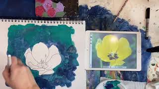
In this instructional video, Christie Renee Hawkins walks viewers through a complete workflow for turning a photograph of a tulip into an acrylic painting. She begins by explaining why her original plan to print a large photo failed and introduces two parallel methods: a digital tracing workflow using Procreate on an iPad, and a low‑tech workflow using printed photos, tracing paper, and carbon/transfer paper. She demonstrates how to import the photo into Procreate, add a layer, and trace the key lines, then shows how to replicate the same tracing on paper with tracing paper and transfer the image onto a mixed‑media pad using transfer paper or a graphite‑pencil workaround. Once the outline is on the pad, she selects acrylic colors (DecoArt brand) and discusses color theory, background color choices, and how to mix hues for shadows and highlights. She explains acrylic layering techniques, brush selection (flat, filbert, angled, liner), drying times, and the importance of letting layers dry before adding more. Throughout the painting process she shares tips on using non‑literal shadow colors, mixing paints directly on the canvas, and embracing an abstract, expressive style rather than strict realism. She also mentions troubleshooting (printer failure), community engagement (sharing results in a Facebook group), and encourages viewers to experiment with their own photos. The video ends with a finished painting, a recap of the process, and an invitation for viewers to try the method themselves.
Chapters
Hey guys, how's everyone doing today? You can use this to do a printed photograph with instead of printing it off. My plan was to print this off and make it larger, so I was gonna have it fill an 8.5 by 11 sheet. Obviously I can't do that because my iPad is not that big, but I'm gonna— we're gonna rig it and I'm gonna show you another way that you can do this. So the idea is the same, I just can't make this as large as I want to. I will show you guys again, um, how I got this and what everything I'm using. I'm gonna, I'm gonna show you everything and all the steps that I took to do this. Now I know not everyone has an iPad, um, and not everyone has Procreate. So this, the way that I'm showing you today may be a great solution for all of you regardless of whether you have that software. You can still do this from a printed photo. So now let's get back to this. If you missed the beginning, my printer was not kind to me today. We couldn't get it to work. So we are changing how we're doing this, but keep in mind you could do this with any photo or any thing really, like the COVID of a book, whatever you wanted to paint. So this is what we're going to do today. This was taken from a photo, so I'm going to show you this. We're going to turn this back on. I am using the Procreate app, okay? Um, it's— you have to have an iPad to be able to do what I'm doing, so it has to be done through an iPad. This is a photo that I took. You could do it this way. Maybe we'll do it this way— of a tulip that I had in the front yard. And, um, so all I did was put the photo in Procreate, and then I added a layer. So you can add multiple layers on here. I'm going to hide this one and show this. And then all I did— I have an Apple iPad— is I traced over all of those lines so I could get all the details that I wanted. So you could do the same thing with a photo. If you had a printed photograph, you could do the exact same thing. You would just be using tracing paper instead, which is what we are going to do today because I could not get my printer to work. So hopefully this doesn't move too much while I'm doing this, and this is going to be smaller than what I wanted. I wanted to do a big giant flower, but we're gonna make this work. This is tracing paper, so mine's obviously much larger than I need it to be. You can get this in any size, but you would use the same idea if you were tracing over a photograph instead of tracing on an iPad. And I'm not worried about getting these lines exact because if you know my style, it's not all about precision and perfection. I kind of paint in a more abstract way, but this is going to give me the lines I need. And we switched photos. And then I would suggest, you know, you still have your actual photo as your reference while you're doing this. This is just giving me some basic lines to work with here inside the flower up close. Okay, now I'm going to ignore that stem. I don't care about having that stem in there. I'm gonna restart Procreate so I can get out of whatever mess that was. Yes, Procreate is an app. So I'm just gonna enlarge this. This is gonna be my reference photo here. We'll put it over on this side. So I've got this on tracing paper. So the next thing that I would do is get transfer paper. This is just carbon paper, transfer paper, it's called a few different things. So I've got my traced image, I've got my transfer paper, shiny black side down, and then all I'm going to do is go back over my lines again and transfer this image on. Now, if you do not have transfer paper or you can't find it or it's out of stock in my store, You can also take your traced image on tracing paper, flip it over, and scribble pencil on the backside of these lines, so then when you trace over it, it transfers your pencil graphite to your canvas. And again, these are just rough lines. I'm not trying to be super specific or perfect here, but it's giving me the exact dimensions of that flower, so I'm not freehanding it. Okay, so it'd be the same thing with whatever you do. You need transfer paper and an image that you're transferring on. So that is step number 1. So now we get to do the fun part. Now we get to paint. What color do you guys think it should be? Should we do yellow? I kind of want to do peach, but we could do yellow. You guys have any— have any votes here on what you think it should be? And I think I'm gonna pick— I'm gonna start with the background color. And maybe pick some, like, bluish greens. This is a tulip. This was a tulip from my front yard. Yeah, I'm leaning towards, like, corally pink, reds. I'm, like, in the mood for some bright, bright colors. So these are gonna be my background colors. This is pretty. Maybe a little red and pink together. I want to play with these 3 colors. This is just what I'm thinking. I've got a coral— this one's called Watermelon Slice— Cherry Red, Dragon Fruit. These are by DecoArt. You can pick any brand, any color, it doesn't matter. Any craft Craft paint is fine. That's just what I'm gonna play around with today. So I'm going to start with my background, and you can use a flat or a filbert, it really doesn't matter for this. We're just going to get some darker background colors on there so that our flower really pops. Now you could— I forgot, you could if you wanted to trace over this with Sharpie. That would probably be wise, just so you don't lose your lines. So let's do that really quick, because when you start painting, if you just have your graphite lines on there, you may lose them once you start putting paint on, but the Sharpie lines kind of stand out a little bit more. I'm just doing this. This is gonna be that black in the center there. I chose a navy blue, and this is Bluegrass Green, so I think I'm just gonna mix those a little bit. Just be careful around my edges. So I like to go around my edges first. and then I can work on the texture of my background. So I'm not worried about obviously matching my photo exactly, but you guys can see they're similar in tones, similar dark colors. To the background there. And it doesn't have to be the same everywhere. A lot like I did with my abstract birds, if you guys painted that with me, we had areas of light and dark, all different tones, all the way around. Now my original idea for this was to have this much bigger where this flower was basically going to be filling this entire pad. So normally I would not have this much negative space, and negative space just means empty space behind your focal point. I wouldn't have this much negative space in a painting. So what I could do later though, if I decided to frame this, if I really liked it, I could cut it down and make it like a 5x7 or an 8x10. I'm gonna get a little more more dark blue on here. What do you guys think so far of the process, how it's coming along? So I just want to go far enough out that when I decide to trim this down, if I like it and I want to keep it, I've got enough that I can cut it and frame it. I am doing this in my mixed media pad, by the way. I love this navy blue, and I love these two colors together. So this is one of my favorite, favorite DecoArt colors, this Bluegrass Green. It's been one of my favorites for years, and I still love it. So I'm just continuing to add some layers in with dark blue. It's very transparent, so you need multiple layers if you want it to be really nice and opaque. When you are painting with acrylic and you're doing layers, you want to want to let one layer dry first before adding another layer, because if you just keep adding wet on wet, it just piles up and gets all clumpy on you. So because I'm painting on a mixed media pad, it's drying really, really fast, so I'm able to go back quickly to add that second layer on. All right, so we're gonna rinse this one. Yeah, I would love to— we'll post this, we will reshare this video into the free Facebook group. And we will make a separate post in there for if you did this lesson with me. I want you to share your photograph and then your painting that you did, because now is the time of year to get out there and take pictures of all your beautiful flowers. And hopefully now with this lesson, you will learn how you can paint them. Yeah, I'm really digging that background. So now let's do some of the fun colors here. I'm gonna put all 4 on there. I don't know if I'll use all 4 of them, but I'm gonna put all 4 on there. You guys should see all the pictures of the tulips I have too. I've got them for days. I think I want to use an angled brush here. I need a little bit of white, so I'm gonna start, I think, with this more pink color. Put this up here so you guys can kind of see the colors. I am working with. And this is one of those paintings— see, I'm just using the edge of this angled brush to just push against the edge of my lines here. But this is one of those where you trust the process. There's going to be lots of layers to this and adding to it, so there's going to be some base coats, and then we'll come back and add some more colors on top. So this is going to be my basic color of flower here. I'm going to grab a little bit of this red and pull it in over on this side. So I want to show you, like, why, why would I add red over on that side of the petal? I don't know if you guys can see that from your view. I'm going to hold up the photograph really quick and show you. So I'm using that red here to be my shadow. And you don't always have to think in literal terms. You don't always have to— just because this is a shade darker of that yellow doesn't mean I have to add black to yellow to get that shade. I can use a different color to work as that shadow. So this is where you can just get creative with the colors that you use. So anywhere I see the shadows on this tulip, I'll be adding a little bit of red to my pink to kind of act as that shadow and give it a little bit more dimension. Sorry for the glare of the lights when I'm showing you guys that. So there's a little bit over here, and don't worry if you like don't get it right the first time. It's fine because we're painting with acrylic, so anything that you do, you can paint over top of it. If you don't get your shadows or your lights right the first time you do it, you just let it dry and you can come back and edit it, come back and add to it. So there should have actually been another little line right here. This is going to be the darker part. And you could use a smaller brush for what I'm doing right now. I'm just sticking with my angled one, but you could definitely switch to something smaller. And again, I'm not trying to get this perfect, I just want to start adding some lights and shadows in here. So I'm gonna go back to my pink and work that in a little bit. We may have to get some more red back on there so they blend a little bit. Like I said, on a mixed media pad, this all dries really, really fast. But again, if you guys have painted with me before, you know I like bold brushstrokes, and I'm not worried about all of this being necessarily blended. Can think outside of the box a little bit and have some brushstrokes that show a little bit more. I grabbed a little bit of white up here for some highlight there. I'm gonna dip into this corner. See, I pulled a little bit of blue down in there. I'm not gonna worry about it. It's just gonna tone my pink down a little bit. So again, this is all just really base coat level. You guys hear me say it all the time, but trust the process. You'll start seeing this come together as I start adding more colors to it, but it's already pretty so far, don't you think? And you could be thicker with this. I'm blending quite a bit, but I could easily just leave big brushstrokes on here too. Now this part in the back, this is really, really pale, so we're going to add a little bit more white back here. Use that angled brush to flip it around to get in those tighter spaces there. Don't be afraid to mix your colors and play around with your colors too. It's your painting, so it can look like whatever you want it to look like. There are no rules. Okay, I'm gonna go ahead— I think I want to get the dark in there now. I could go straight black if I wanted to, but I think I want to play with a little bit more color. I may pull in like a dark plum purple. This one's called Purple Pansy. Maybe a little bit. I'm going to switch brushes and get a small one now. These liner brushes that you guys see me use, these fine detail ones, are in my store too. So I'm going to get a little bit of black, but I'm going to use some dark purple. I mixed a little bit with my navy, and then I'm going to get just a touch of black. So I'm just going to kind of feather these lines out. So this is just a really light touch. I'm not pushing down hard with my brush at all. And I'm just glancing back and forth at my photo, and again, it's not going to be perfect, but it kind of gives you an idea of what that center is going to start looking like. And I'm just going to grab some of this pink. I've still got the purple in my brush, so it's just going to give me a really toned-down, muted, kind of like mauvy pink color here, and we've got like these little shadows kind of peeking out in a few areas from that. So all the different colors you can make— maybe come back and add some of these into my shadow areas with the red. So just fun to bounce around and kind of play with it, watch it come together. Look at where your shadows are. Where do you need to go back and add a little depth? Now you could get really— like, when I was in art school, we had to turn a photo black and white, which is another really good thing that you can do because it helps you see the value change. —so I could get super technical, and I'm gonna try to tilt this so you don't see a glare. So any of these lines of shadows and highlights, I would do it with pencil, not pen, so that it wasn't, you know, didn't come through the paint. But like what we had to do in school was trace around each different value. Each different value equaled a certain color. So everywhere it was this really bright pale, that was the same here, here, here, here, here. Does that make sense? And then everything that's this muted color would be the same shade. So you can really, really get technical with it, but it's a good learning lesson. Like I said, if you turn your photos black and white first, it's really going to help that value stand out for you and for you to see the difference in it. So obviously I switched brushes now. You know, we started with that big one. I've got the small liner brush here, and I like this just for the detailing that I'm able to jump in and do here. I'm coming back and making my shadows stand out a little bit more. Maybe pull some of this purple into that while it's wet. That looks pretty. Maybe do the same thing over here. Let's pull some of that purple up just a little bit. We've got some darker areas even back here with the light, but I want you guys to notice how much I mix my colors while I'm painting. You don't have to just stick with the colors straight out of the bottle. And this is almost white right here. So now I'm probably going to get a little bit bolder in my brushstrokes, make it a little bit more how most of my style is. I kind of wanted to get the base down of like where my values and stuff were, but I want to add a little bit more texture and like movement to it. So I'm going to get a little bit thicker with my paint, a little bit messier. Maybe I'll use— I like this peach. Maybe use that as my highlight, start breaking it up a little. Yeah, I like that peach added in there. Just that other little pop of color, which is gonna look really nice against the background because we've got so much blue in there. That orange pops, and the reds and the pinks pop because we have so much green in there. So they're opposites on the color wheel. I think I'm gonna use a little purple and my shades down on that side. So see, it's kind of changing from where I started because once I added the coral in there, I really liked it. So I'm going back and adding a little bit more. So I'm really liking the way it is coming together. I'm going to play with this purple a little bit. And my lines are not perfect. Are they identical to the photo? No, not at all. So I'm grabbing some purple with my red on it. Start creating that separation between some of the petals. It's just so fun to play with all the different colors. Really, really subtle hints of light. I love mixing the purple with the red for that low light, for that shadow. That's super pretty. Okay, so I've got to add just these little— I don't even know what they're called. You botanists out there might know what they're called. I don't, but we're gonna add these little things that are kind of shooting out of the middle here, and they're kind of dark. I think I'm gonna do— let's just play with it. I gotta have it stand out enough. May need to have a little bit of purple mixed in here. That's a really pretty color, by the way. Purple and red made this really pretty plum color. Let's add a little highlight to that to get them to stand out. So we've got the dark, and then we'll come back and add the light to it. And again, nothing too exact. It just kind of gives the idea of what's going on there. All right, I think I'm gonna call it good. What do you guys think? I think I'm happy with it. Kind of put these side by side. And it's fun to change the color. You can make your flower whatever color you want. But that was really fun. Despite all the technical difficulties at the beginning, I think we have a great finished painting. Hopefully you guys enjoyed that. Hopefully that inspires you guys to go through some of your photos and find some that you can recreate with paint. Talk to you soon and have an awesome day. Bye!