How to Match Acrylic Paint Colors Using a Color Mixing Chart and the Color Wheel || The Social Easel
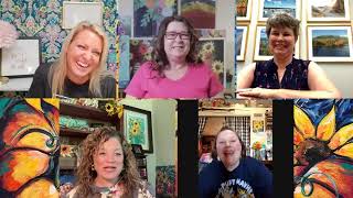
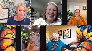
In this live Q&A, Christie Renee Hawkins demonstrates how to recreate specific acrylic paint colors—particularly a light purple/orchid and Colonial Blue—by using a color‑mixing chart and a color wheel. She walks through selecting base pigments (magenta, green, blue, burnt sienna, cerulean, etc.), adjusting ratios, adding white to achieve the correct tint, and testing mixtures against the target color. Throughout, she explains key color‑theory concepts such as complementary colors, hue, tone, tint, and how the wheel predicts color interactions. Christie also shares practical tips on mixing tools (palette knife, gel medium), avoiding muddy results, storing mixed paints airtight, and answers audience questions about paint longevity and specific color mixes. The session ends with a brief promotion of her Tribe program for continued learning.
Chapters
Hey everyone, we are going to do our second live Q&A. Give everyone a chance to get on here. So I still got some leftover paint here that we may use in our color mixing. Okay, I'm going to show you guys some color mixing because Apparently several people couldn't find this color. I got this at Hobby Lobby. It's the light purple. Um, one, I want to just show you another color and another brand that I think is really similar to it. I don't even know if they make this anymore. This is old. Um, Orchid, which is made by Craft Smart, is very similar to it. Let me see if I have another one. This is pretty close to— it's a little bit brighter— Light Orchid by DecoArt. But what I thought we would do today is use that as an example, saying, you know, you can't find an exact color, which I tell you doesn't matter, but I know you guys still want to be able to get to as close to the color that I used, right? So here's, here's how you use a color mixing chart. And they're quite fun, and I love them, and I could color mix All the Live Long Day. So let's do this. I want a little sample of it so I can really get a little closer. If you do not have a color mixing guide, I'm pretty sure Allison put the link in here for you. So let's just get a little bit on here. And so this is not going to be exact, but it's going to be pretty close. So the first thing I'm doing— better. So I'm just going to go along here and kind of eyeball what I think this is closest to. I'm leaning towards this color right here. So see, this is a little bit darker than what I have on the palette knife. It looks darker on the screen than it really is, but that's the closest one. So we can use this to get an idea, right? They're mixing a magenta and— what's this green called? Hold on. Oh, wrong way. I'm like, that doesn't make sense, why doesn't it have the name there? And a green. So they're mixing magenta and green to get this. Now there's no certain ratios on here, you just keep kind of playing with it until you get it the way you want. So I'm gonna scrape this on here. Now I want to test something first. Now this is just me playing, but we're starting with magenta, right? And I've already got this colonial blue, and I'm kind of just curious to see what these two colors look like when they're mixed together. So we're going to test this out first before I use what the color mixing chart told me to, because I know that if I add these colors together, it's going to give me a lavender. It's already getting closer to it, so I'm going to add a little bit more of that Colonial Blue to the magenta. I think we might, might have found a cheat here. Now, do you guys understand why I knew I was gonna get this color? Because that's important that you understand that as well, not just that I was just guessing. And it's okay if you don't know, but I'm gonna explain it to you. So let's just do a little test here with this color I've made. Okay, pretty close. It's not identical. Yeah, it's, it's basic color mixing, but you kind of have to know the color wheel and know how colors work together. So I'm So I know that if I'm starting with a pink here, a red violet on here, I know if I want it to be more of a lavender orchid color, I'm going to have to add blue to it. And when I add blue to it, I'm going to start getting purples. Okay, so a color wheel also is super handy to have. And again, you can print this off if you don't want to buy one. But I think both of the— both of these tools are very helpful, um, when you're getting started painting. Okay, so we're pretty close, but it's not identical, right? Let me change the ratio just a little bit here. So that had a little too much blue in it. Now let's see, that's closer. I'm going to see if I got any of this red. I'm going to put just a little bit of red in there. Oh, we are getting closer, my friends. Oh, that's almost it. That is almost identical. Can you see that? It's slightly darker, so I'm going to take some white. Now that we've got our tone right, you know, our tone is the color, the color itself. Now we're adding white to it to get the tint right. I did it! Can you guys see that? So using colors that we already had on our color list I was able to mix this light purple with the colors that we already had. So I don't know if you can see, right here is where they connect, and it is pretty much identical. I might need to add a tiniest bit more white to it. Okay, so that's one way you can do it. Yes, I do. Someone said, uh, Julia asked, do I ever mix mix up colors and put them in a jar for later. How long do they stay usable? As long as they are airtight, um, and it's very small. When I was in college, when we used to mix colors, we used film containers. You know, back in the day, film and a camera, those were the best things to use. Um, and it was— again, this was like my absolute favorite class I took in art school was color theory. And that's why I'm so obsessed with it. But it was my favorite class, and we— I had just a collection of film containers with all the different colors that I made. I wish— I need to have my mom send me a picture of it, maybe. So one of our projects that we had to do was create our own composition using only our own colors. We could not use anything straight out of a tube. And then you had to make sure that you mixed enough to last your whole painting so that you didn't run out of the color that you mixed, and then part of your painting had that color and part of it didn't. So, um, that's why I'm really passionate about, uh, color mixing, just because of all of that. Um, and then it literally makes your artwork one of a kind. No one else can create that color exactly like you did. Um, so I believe someone just asked me if I can mix Colonial Blue. Okay, let's try this one. Oh, did you guys want me to try this with the colors they recommended using the color guide? Let me do that first because that might be helpful since I'm telling you to use this. So again, they're using a really bright green like this. Okay, so I've got to find that color first in my collection of paints or something similar to it. Is this helpful to you guys? Let me know. So it's telling me that color and then this magenta. So this is the magenta that it's telling me, and I have a color I see it almost identical to that. This one— hey, guess what? It's called Magenta. Shocker. Okay, good, glad it's helping. So these are the two colors, just in case I need a little bit more, that this chart is telling me to mix together. Okay, so again, I found my color that I think is most similar to what I'm trying to make. Doesn't have to be exact, most similar. And I picked this one. So then I go over here and say, okay, I need a magenta color that looks like this. And I would literally take my paint bottles and hold it up to this. And then I need the green that looks like this. So green and green, magenta and magenta. Okay, so now again, it's all about the ratio and the consistency, and that is literally trial and error. So I'm going to start with mostly magenta because that's our main color, right? Like, if this is our end color, we know we want it mostly this. Just how I use red and greens as opposite, this is the same thing. By adding green to this magenta, it's toning it down. By toning it down, it's giving me this lilac color. Um, Danelle said, I just started with a black background. How important is it to stay consistently, paint the same way, up or down, side to side? On your black, it doesn't matter at all. It's just to get the black on there. Okay, so I'm going to start with just a little bit of green. You can see it's starting to tone it down some, but not much, right? Let's get a little bit more. Definitely getting that more muted tone now. So just picture this, like, once we add white to it, what's it going to look like, right? Let's grab a little white. I do recommend with color mixing, especially if you want a lot You can see that the craft paint obviously is super thin, right? It would be easier for you to color mix with gel medium in your craft paints as well. Sherry said, I'm always worried about making mud. This is awesome to watch. I'm glad. As long as you are not mixing the wrong colors together, and you can use your color wheel to tell you that, you're not gonna get mud. It's just learning how colors interact with each other. I'm going to tone it down a little bit more. See, it's still a little bit too bright, and it's just about doing a little at a time. You don't want it like— if I was just to take both huge globs of that paint and mix them together, it'd probably get a brown because it'd be 50/50, right? But this is not 50/50. This is like 95/5. Like, it's 95% magenta with 5% green. And I think this is pretty dang close. I'm gonna scrape it up next to this. We're getting there. Look how close that is. So it's still a little bit brighter. It's still got a little bit— like, if I compare those two colors, see how much richer that pigment is? It's still rich in its tone and its hue, so I still need to tone it down more. I think I did it. Oh my, look at that. It is like almost identical. There you go. So the difference between that and this is that I just added more green to it, and now it's almost identical to the color straight out of the bottle. So I got this two ways. I got that same color by mixing the magenta and green using my color mixing chart. It told me to do that. And then I got it by just knowing on the color wheel, here's my red violet, and I can use the color wheel to explain to me that if I want it to be more purpley— and this is more purpley— then I would have to add blue. Because think about, you're adding this and this, and then you're meeting in the middle. Meeting in the middle is giving you more of that purple color. And then you've got your blue violet and violet. This is more blue. This has more red in it, so it's more purpley. Okay, so hopefully that makes sense. So we did it two different ways. So Robin is saying how to tell what to mix together using the wheel. So opposites are always going to give you a neutral. Red and green give you a neutral. And there's also— this explains this when you buy a color wheel. It explains all this to you and has all this little information, this guide on here. So anytime, like, these are opposites on the color wheel, right? Just like red and green. So when I add them together, it tones it down. That's what I was explaining here. When you add green to the magenta or add green to the red, it tones it down. These are considered complementary— I'm not complementary, um I think my brain has, um, lost its ability to think right now. Let me see if I have any cheats on here. Harmonious. Thank you, color wheel. So when they— like, let's just say warm colors. Warm colors, they're all harmonious. You can mix any warm colors together and you're going to get a pretty color. You can't mix red and yellow together and get mud. It's impossible. You're just gonna get orange. Okay, so even going around that way, yellow is warm, right? But green is kind of a neutral. But we know if we mix yellow and green, we're gonna get a yellow-green and a lime green. So it teaches you by just the colors outside alone, it teaches you what you're going to get by adding the colors together. And then of course this is just adding white to it, going down lighter, lighter, lighter. So hopefully that helps. What do you guys think? Shoot me up a thumbs up if that's helpful to you, if it's starting to make sense. So someone was, yeah, asking about mixing Colonial Blue. Let's see here what kind of options I've got. Back to my color mixing chart. And Colonial Blue, I would say it's pretty similar. It's getting a little green. Okay, so for Colonial Blue, because I think these are too dark— Payne's Gray. All right, for Colonial Blue, I'm going to go with the cerulean blue, as close as I can find to this color, right? Because this is pretty similar. Again, I'm not going to find it exactly. You got to look for what's most similar. And then down here is burnt sienna. And here I'm going to explain this to you again. So you guys see what color burnt sienna is, right? Well, doesn't that look like almost an orange? And cerulean blue over here. So look at where my thumbnails are. Are they both on the screen? Okay, so blue and orange are opposite on the color wheel. Blue, orange, opposite each other. Burnt Sienna and Cerulean Blue, they're opposite each other. So because of that, when we blend them together, we're going to get this really neutral, soft blue color. So now I've got to find something similar to a burnt sienna. Thank you so much, Tori. Let's see, burnt sienna— what do I have close to that? And I like it too because it's like a challenge for me. I gotta challenge myself to be able to do this right. Burnt sienna is not one of my favorite colors, so I don't even know if I'm gonna have anything like it. Okay, um, I'm gonna look one more place, but if I don't find it, that's what I'm gonna use for that. And then the cerulean blue. It's so funny, like, I don't have these basic colors. Well, looky there, I have it! All right, I found burnt sienna, brand new, never opened. I didn't find that. I was going to use this Georgia Clay because it's pretty close. Okay, and then Cerulean Blue. This is just an Apple Barrel Bright Blue color. So I'm going to use these two colors and white to try to achieve the Colonial Blue. Sherry said, what blue-green that you always use? I can't think of the color name. I always want to see what colors to mix to get it. The blue-green that I always use Um, like the Bahama Blue, like that tealy kind of blue-green. Or is it darker, like this color? This is like a peacock teal. I like that color. All right, there's a mermaid too. They're all very, very similar. Oh, I gotta take the seal off this. Okay, this will be my last color mixing and then I'm gonna be done for the night, but I do want to just kind of show you it's not a one-and-done Ocean Breeze, probably. So again, like, let's think about it. You know it's got blue and it's got green, so you know if you've got a blue and you want a teal You got to add more yellow or green to it to make it more teal, because you'd either add more yellow and green to go the teal direction, or you'd add more red to go the purple direction, because red and blue make purple. I feel like this is really old. I don't know how runny this is going to be. And I'm going to go ahead and grab this white here, and I'm going to go ahead and make my blue lighter because I know it's going to have to be lighter anyways. This is also going to— because that white's thicker, it's going to make color mixing easier for me. Okay, let's add a little bit of rust. I said rust— burnt sienna. I think you guys knew what I meant. I'm going to go and take the rest of that little scoop there. I also do recommend mixing with a palette knife so you're not getting all this great paint stuck in your paint bristles. Can you guys see already how that's changing to a more subtle blue? Let's take some more of this white. Take what I already got over here. It's okay if it's got a little of that magenta in it. Let's lighten it up more. That Colonial Blue is almost like a gray, so I'm mixing more burnt sienna with it, a little bit more. Okay, that's that. And then that's Colonial, so it's a lot, lot lighter. I probably should have actually started with white first, but let's just add some white to it. It's getting better. Still really, really blue though, right? So I'm thinking more burnt sienna and more white. So I'm trying to mix a smaller ratio over here with more of the white. Not as much of the blue. You can already start seeing the color difference there. See, now we've got almost a gray, right? Getting closer. I'm going to take a little bit more blue. Needs a little bit more bluish tint to it. And then still more white. You don't realize how light that is. But we made a really pretty gray, right? I'm going to have to find a container to put all this paint in. Okay, so let's compare. This is the one I've color mixed, right? This is Colonial. Sorry, scrape it that way. So there's still a big difference here. So what I see when I look at that is that it needs more of like a purplish tone pulled into this to get to this color. So I think I'm actually going to take some of the color that we mixed and pull it into it. It's got more of a lavender undertone to it, so purple. That's much closer. So I think that's almost right. Adding that magenta in there helped a lot. So I think the one thing that's going to make it match is adding more white to it. I think I did it. Look. So I'm going to hold this up so you can see. So this was my original mixed color, way too dark. This is Colonial Blue. I'm actually going to get a little bit more there because that's kind of mixed up with some stuff. That's the Colonial Blue, and then this is the color that I mixed. So the tone is just slightly different. If I wanted, I could go back where it's a little bit more gray and add more white to it, but I think I'm pretty happy with that mixture, that just slight bit of that magenta color that we mix, that orchid color that we mixed. With our others kind of gave it the same tone. Can you guys see that? Okay, so pretty dang close. Certainly close enough that you would not know as a viewer or even a painter once you got this on your canvas that those two colors— look, when I blend them together, you can hardly tell where one starts and stops. So that's what I've got for you tonight, friends. As long as you're patient and you're willing to play around, and then just again keeping that— your color mixing chart was a good start, but then I still had to understand how light this color was, so I had— I knew I had to add a whole lot more white to it. And again, you can tell that by looking at your color wheel too. So I hope that helped y'all today, taught you a little something, and then, um, we will be back for our final day tomorrow. I feel like I need to find something to do with this paint. You're welcome, Kay. I'm glad you guys enjoyed it. And I hope it makes you want to mix your own colors and play around and see what you get. You might create your own color that you absolutely love. And also just want to remind you guys that Tribe is open for you, early bird special, um, only for those of you who are in this challenge with me. If you're having fun in this workshop and you want to continue painting and learning from me, you can join Tribe and you get all those bonus tutorials. All of that information is in guide number 4. In this group. All right, I will see you tomorrow. Bye!