Join me!! Color Wheel & Color Mixing Basics
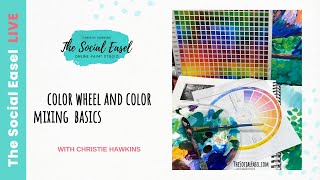
In this instructional video, Christie Renee Hawkins of The Social Easel walks viewers through fundamental color theory concepts and practical mixing techniques while promoting her online community, Tribe. She begins by defining the color wheel’s warm and cool sections, explaining how adjacent colors blend harmoniously while complementary (opposite) colors desaturate, creating muted tones useful for shadows and depth. Hawkins then introduces the value scale, showing how adding white (tints) or black (shades) creates a grayscale continuum that can be applied to hue to achieve contrast and dimensionality. Using leftover paints from a sunflower painting, she demonstrates real‑time mixing: adjusting bright greens with red, toning a vivid red barn with green, muting yellow with purple, and exploring analogous mixes (red‑red violet‑purple, teal‑purple) to produce new, vibrant or subtle hues. Throughout, she encourages experimentation and personal swatch creation. The latter part of the video serves as a preview of the Tribe membership, outlining its structure (monthly live lessons, 175+ tutorials, devotions, guest artists, contests, Q&A support) and pricing ($47/month or $470/year, enrollment deadline Oct 10). The overall aim is to teach basic color mixing while inviting viewers to join a supportive, women‑focused art community.
Chapters
Hey guys, it's Christie with The Social Easel, and today we are going to go over some color wheel and color mixing basics. And we are celebrating The Social Easel's 10th birthday, so all week long we are doing little inside peeks of what it is like to learn to paint with me inside our tribe, because part of that 10th birthday celebration is opening doors to new members. So this is gonna give you just a sneak peek inside what it is like to learn to paint with me on a monthly basis. We have some studio sessions. You'll get a more in-depth view of the color wheel and color mixing inside of Tribe, but it's really just something that we combine into a lot of the paintings that I teach, and we go back to these foundations when I am teaching you different paintings. So for today, I want to just explain the color wheel to you. Like I said, some very basics. I'm gonna show you with some of the leftover paint from the sunflowers painting that I'm working on this week, how colors work together on the color wheel, and to help you learn how to fully understand how colors work, how to make vibrant, bold colors, and how to create soft neutrals, and to maybe take away brightness, to desaturate a color if it's too bright in your paintings. We're also going to touch base on the value scale and what that means, the tints of a color, the shades of a color. This is just from a previous lesson that I thought was just a great viewing point for you to kind of see what we're, what we're talking about here. So So to begin with, um, I just want to go over the very, very basics of a color wheel. You've got your warm colors on one side. So when you think of warm, think of fire. You've got your reds, your red violets, red, orange, orange, yellow, and then it kind of stops right here. And if you forget, it even has a handy little guide that tells you those are your warm colors this way. So red violet all the way over to yellow. And then on the other side, our cool colors start, which is our yellow-green all the way to violet. So first and foremost, those are your cools and your warms. And you'll notice when I set up a palette, I like to keep my paint kind of in the same order as the color wheel. So I keep my warms up at the top, my cools down towards the bottom. And a part of the reason I do that is because I know these colors can mix together when they're next to each other on the color wheel. Anything next to each other on the color wheel, um, we know is going to look pretty when blended together, and it's not going to desaturate the color in any way, shape, or form. If I was to mix my yellow and purple together, however, they are opposite on the color wheel. So in that case when I add purple to yellow or yellow to purple, because they're opposite, it is going to desaturate. Um, let me switch over here and show you what that means. So when looking at the color wheel, it has this handy little guide. We've got the option to add yellow, so we know purple is across from yellow. They're opposites on the color wheel. So when I add yellow to purple, look what it does to the color. It takes it from purple and kind of turns it into a brownish mustardy color. So what that is doing when you add opposites, it desaturates. And you're going to see the same thing here in my examples. So you can see yellow and purple, um, on their own, and then what happens when they're mixed. Same with red and green, opposites on the color wheel. When you mix them together, you get kind of a burgundy color. Okay, blue and orange, you're going to get more of a darker, like slate grayish blue. So it's taking the vibrancy of those colors and kind of taking it down a notch. And that doesn't mean that's a bad thing. I just want you to understand how the colors work together. Sometimes we want toned-down versions of these colors. And you may not think of like this mustard as like, oh well, that's not a very pretty color, but it depends on the situation, right? Because when you see this color in a painting like this, all of a sudden it becomes very pretty, right? That mustard color that we see back behind here as some of our shadows of our sunflowers. Instead of the very bright and vibrant yellow. The next thing that we want to talk about is the value scale. Anytime you are adding white to a color, it is creating a tint of that color. So you have a value scale is from black to white. So on the value scale here, this is 100% black, value 1. All the way to 100% white on value 10. And then obviously everything in between is the grayscale. So even though this is in a grayscale, we can do the same thing with color. So we can go from our very, very darkest blackish blue all the way to our very lightest white blue. Okay, so a very, very pale version. And look at all those colors that you get. In between, just from your shades, which are with black, and your tints, which are with white. This is going to help create a lot of contrast and depth in your paintings by utilizing the value scale and making sure that you have variations of lights and darks in your painting. If everything was in the grayscale, the painting would look very muted, very boring, and it wouldn't have a lot of appeal to it. So that is where value comes in with your paintings. And then I'm not going to go over these extra things on here. I'm actually going to just show you some different mixing of colors and what it does. So keeping in mind, I've got my warms up here, my greens, my cools, and I do have white and black also. So let's flip the page here. Let me find a blank. Blank page. And this is one of my favorite things to show you, especially with greens and reds, because sometimes when we're painting with greens— I'm just gonna— this is a dark green and a light green. I'm just gonna mix them together for the sake of this. It's a nice, pretty, basic green green, right? Sometimes we have green that is just too bright. We want it to be more realistic, like if you're like painting a vase of flowers, for instance, like what, what I'm doing in this class that I'm teaching. So let's say I want to make this darker and it's just a little too bright for me. I'm going to take a little bit of red because it's on the opposite side of the color wheel. And when I mix those with that, it's going to tone down that green. And depending on the ratio that you put in there, this is obviously more dominant red, so it's going to create like a berry color. As I come over here and I've got less red and more green, it's just going to slightly tone that down a little bit. And make it not as bright, more of like maybe an army green. So hopefully you can see that transition. Same thing with red though. Let me just use this palette knife to scoop a little bit of red over here. This red is very, very bright. Let's say I'm painting like a red barn. Yes, the barn is red, but is that a very realistic color for it to be that bright? Of a red? Probably not. And then, like, what about where the shadows are? How would you create a darker part of the barn where the shadows are? You'd take a little bit of your green with that red, and look what happens. I'm just going to tone that red down, so now it's no longer so vibrant. It's a little bit more muted. So you can think of like a couple different words for it. It's going to mute down a color, it's going to desaturate a color, it's going to take the vibrancy away. This is what happens when you are doing opposites. Same thing here, I could come back and add more to that, and you could go just like you saw with the value scale, you could make all kinds of combinations of reds and greens mixed together. But that's what's going to happen to them when you mix opposites. So obviously the same would be true for our yellow. This is just straight yellow out of the bottle. But if I take a little bit, right, it doesn't take much, but if I take a little bit of purple and add that in there, it's no longer super bright. It's gonna tone it down a little bit. And now we've got more of a mustardy golden yellow. And again, the more you add to it, the more it's going to take away that yellow color and meet somewhere in the middle. But this is a great way for you to utilize using complementary colors in your artwork. So So this again, straight out of the bottle, and then once we've added a little bit of its opposite to it, it creates a toned-down version. Okay, now let's move on to colors that are next to each other on the color wheel. I know that this red and this red violet can all mix together because they are next to each other. Even this purple and red. Can, because they're analogous. They're all next to each other on the color wheel. And what we're going to get by playing with these colors a little bit— got straight red, we've got— this is like a plum color, and then of course we have our purple. Any of these colors are going to blend together, they're going to stay vibrant, they're going to be pretty, and we can just kind of see what happens when we mix This has got a little bit of all of them, and it's just gonna make a new berry color. What about if we just mix the purple and the plum together? Maybe add a little bit more dark to that. And what I would recommend doing is just making a bunch of swatches. So So just start playing with these different colors and seeing what you come up with. You're going to make your own brand new paint colors that are going to be unique to you because your ratio of what you mixed that paint is unique to you. So this is red. What happens when we add purple to it? We're going to get an even darker more burgundy-like color. So purple and red are going to make a deep burgundy plum color. So if you didn't have plum in a bottle, you could make your own by mixing purple and red. And then sometimes it's just fun to see what happens. I've got purple in here, right? A little bit of plum. I've got this teal. What's going to happen when we add those two together? They're not quite opposites on the color wheel. They're going to look really pretty next to each other. But thinking of— think of teal as blue, right? So what's going to happen when we mix them together? Blue and red make what? Purple. So we're probably going to get a pretty shade of of purple if we mix these together, maybe a bluish purple. So let's just see, teal and purple. Sometimes it's a little deceiving to see a color as you're mixing it, and all you're thinking is that was teal and purple mixed together, and that's what you see. But then when you take this swatch Let's add a little bit more teal in there. And you separate it from this, and you just come over and play with these different colors. Let's blend that together a little bit more. Now you've got this very subtle, almost grayish blue lavender-like color. It would even make a pretty color for water, almost like a cornflower blue. But what I encourage you to do, and what I encourage inside of my tribe, is to not be afraid of color. Because once you understand how it works, sometimes this is, for me, the funnest part of painting, is just blending colors together. And seeing what I come up with. So that is just a little bit to show you of one, how I talk about color, how the color wheel works, some basics for you. And if you enjoyed this quick lesson, this is kind of an overview of what you can expect inside of TRIBE. You'll, you'll learn these mini lessons with me in the group in addition to learning step-by-step paintings as well. And we are open right now. You have until October 10th to become a member, and I just want to share a little bit with you about what you can expect inside of Tribe. So this is where I teach all of my live paintings each month. I do this inside of our private community, um, for all of our Tribe sisters. That's what we call ourselves. So you get 2 new lessons with me each month, and you also get access, immediate instant access to over 175 tutorials that I have taught over the last 5 years inside of Tribe. Um, in addition to that, I do a devotional each month inside of the group. We also have a guest artist or speaker each month, and then all of the time throughout Tribe, we do contests and bonuses. And, um, I love giveaways. I love doing prizes, and it's just a great supportive community. Instead of you going at painting alone, you have a group of like-minded women that are there with you that may be going through some of the same struggles that you're going through, but also having the same wins that you are. And being a part of Tribe is gonna give you a chance to reach your goals with painting faster because you have that ongoing support through your entire art journey with our community and with me as your teacher and your guide. It's going to give you support, community, accountability. If you have trouble with something, troubleshooting, live Q&As, it's going to give you a chance to have someone to talk to and share those concerns with so that you can reach your goals faster and learning how to become a better artist. So we would love to have you become a part of that group. You have until October 10th to join us. It is $47 a month or $470 for the year, and that is the equivalent of you getting 2 months for free. And all of the information and all the details about what TRIBE has to offer is inside, um, the link with this video. So we look forward to having you, and I hope you enjoyed this lesson. Bye!