Learn to mix colors with Christie
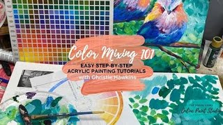
In this YouTube tutorial, Christie Renee Hawkins of The Social Easel walks viewers through the fundamentals of acrylic color mixing and basic color theory. She begins by introducing her mixed media pad and a color‑mixing guide (both sold in her Amazon store) as essential tools for practice. Using a limited set of craft paints, Christie demonstrates how to match desired hues by referencing a color wheel, then mixes teal, turquoise, and other greens by combining blues and greens, adjusting ratios, and adding white for tints or black/complementary colors for shades. She explains warm vs. cool colors, atmospheric perspective, and how color choices affect depth in a painting. Throughout, she shows how these techniques apply to an abstract bird painting, emphasizing playful experimentation and the value of creating custom colors. The video concludes with promotional information about a pop‑up paint party, her Tribe membership, and individual tutorials, encouraging viewers to keep practicing and share the video.
Chapters
Good morning everybody! So we're gonna do an aerial view today so I can show you some color mixing. This is Christie with The Social Easel if you haven't painted with me before. So color mixing is super, super fun if you haven't done it before, and hopefully I'm gonna be able to show you guys that today. We're doing color mixing today because I wanted to use this as an example. You may have seen my post on last week. I showed you a picture of just my palette. So it was this palette, all these different colors I've made here, and it was just from 3 colors, and it was 3 colors that I used in this painting. So as I was doing that, I thought this would be a great time to show you guys how to do your own color mixing and kind of use this painting as an example because I did it a ton in here. So there's a couple things that I would recommend getting. You guys are probably getting familiar with me talking about my mixed media pad. I just got a brand new one. I'm so excited. I ordered this from my Amazon store. The color mixing guide is also in my Amazon store. So I've got my new mixed media pad here, and the first thing we're going to do on the inside of it is some color mixing. So if you don't have one of these yet, this is what I use. I call it like a sketch pad for painting because it's this heavyweight paper. It can take acrylic paint. You can use it to practice in if you don't want to commit to a canvas. This is just a wonderful thing to have because you can just go through and doodle all kinds of stuff. And then if you love it, you can tear the pages out and you can frame these. So I just wanted to show you a few. This is my My little mixed media bird that I made. This was our 4th of July Americana painting in my tribe, and then one of my palette knife angels. So what I can do with these— if you do something in your mixed media pad that you love, you can tear it out and then you can put these in a frame with glass like this, and then you have a beautiful framed piece of art. So this is why I love them so much. Use it to practice in, and if you love it, you can take it out and frame it. So it's very, very functional, and it's great for saving space also. All right, so let's jump over and kind of go over how this, this works. If you guys want to sprinkle this video with your friends so they can learn a little bit about color mixing, that would be awesome because this is one of the number one questions that I get. So this color mixing guide And I printed off a color wheel too because I can't find mine. Both a color mixing guide and the color wheel are in my store. So just have one of these as reference and it's going to help you learn about tints and color and all of that kind of stuff. But this is why I love the color mixing guide. So let's say you need this color. This is Bluegrass Green by DecoArt. One of my favorite colors. But let's say you can't find it because either it's not in the online store or we can't go to the stores right now because of everything going on, and you want to figure out how to make your own. So hopefully you have some colors at home that you can come up with this. So here's what I do. This color mixing guide, like if you look on here, these colors like phthalo blue, cerulean blue, Sap Green. These names are not going to be in craft paint names, okay? This is talking about like, um, academic level acrylic that comes in the tubes. So that's what these names are from. So don't, don't worry about the names. The names don't really mean much. What we're going to use that for is if you have these base colors here that you're just gonna look and see. Like, mine is, uh, this is primary yellow, so that's the same as cadmium yellow. Can you see that? So don't stress about the names. You're just going to flip your bottle over like this and just hold it and kind of figure out which color that's closest to. So let's like say— I don't know if I have enough of my purples out here. That's close to that purple. Or maybe I have this one. This is like a pizzazz color. That's a little bit closer. So they're going to be slightly different. They don't have to be exact, but you're still going to use this as a guide. All right, so this color right here, I'm matching that. I think it's closest to this square. So then I'm going to use this guide and I'm going to say, okay, I need a blue, like a cerulean blue, and like a phthalo emerald green. So now I'm going to look through my paints and see what I can find that's close to these two colors. So let's see, I don't have this planned out, so you're literally gonna let me, um, go, go along with me and kind of like, let's see what I have. This might be— have you guys ever done this? I love, I love color mixing. That's pretty close. Let me see if I can find anything closer. Yeah, that may be as close as I can get. So we're gonna see, we're gonna use this as an example because you guys may have a limited amount of paints at home. So we're gonna see what we can make regardless of the colors that you have. So this one happens to be turquoise from Michaels, and again, these are just craft paints. And then I need like a phthalo emerald green, a little bit darker than that. I think it's gonna be this holly green maybe. Let's start with these two. So I've got like a holly green and turquoise, but I want a color like this because kind of this teal color. So that's why, that's why having the color mixing guide is helpful, so you're not just looking at all your paints going, well, I don't even know, I don't even know where to start. Like, if I want this color, how in the world am I going to get there? So here's where you get to just play. Let's do— I'm just going to grab a little bit of this. So we're going to try to achieve this color close to it, and then I'm just going to show you all of the different ways you can just keep playing and make different shades. I took 3 colors, um, for this bird painting that I was showing you. 3 colors of paint made this entire background, and that's what I love because that looks like a lot more than 3 colors of paint because of all the different shades tints, color combinations that I was able to make with those colors. All right, so I need this one. So you can use a palette knife to mix with, or you can use a paintbrush. I usually end up just using a paintbrush. It just depends on if that bugs you or not, or if you feel like it's too much paint in your bristles. I just like to kind of play with my colors with paint. I think I want something a little bit, a little bit bigger than that. Well, you know what, we'll go with my filbert brush here, which is what I used in my abstract bird painting. All right, so this is the color that we love, but we don't have it. So we're gonna play around with what we do have. And I've got some blue and I've got some green. Okay, so that's what they look like straight out of the tube. So I'm gonna leave that there for an example, and then I'm just gonna start with a little of both and just play. We're already getting kind of close, just that little mix. So this is where this is all just kind of like a game. You just kind of are gonna keep playing until you get close to your— you know, the color you're trying to achieve. But look, already that is so close, those two colors. So maybe you use more blue and just a tiny touch of green. But then what if we did a lot of green and and then just a little bit of blue. So you're going to get all these different colors. Now this is just kind of like a darker, darker green that was out of the tube. This is getting a little bit lighter, but we're pretty close to this. But I'm thinking what we want to do is add more blue to it. Maybe just a touch of green here. And you're just kind of playing. Let's go up next to it. Wow, look how close that is. That is off just slightly. Look how close that is to the color in the tube. Now let's take it a step further. Let's grab some white, and when you add white to a color, it means it's a tint of a color. Yes, uh, Laura said the only issue she has, um, if you don't mix enough and you have to do more, you may end up with different hues each time you mix. This is true. So yes, if you're doing this and you kind of like— for me, that was almost a 50/50 ratio to get that color. So like, I took color theory when I was in college, and one of our— and I actually was going to do this with you guys today— one of our assignments was she wouldn't let us use paints out of a bottle to make our painting out of, so we had to mix all our own colors and then make a painting out of the colors that we mixed. I loved this assignment. But yes, if you know you want this exact color that we mixed right here, then you're gonna need to mix a lot of it. So like, maybe get yourself like, um, you know those little like disposable ramekins or like an egg carton, an empty egg carton, and you know, it's pretty deep. You can fill that up with a decent amount of paint and then cover it and store it so that you have enough for your painting. So yeah, if you plan on— if you want it to be exactly the same throughout your entire painting, you're going to want to make sure that you mix enough to do that. Let me know if you guys have any other questions. I'm going to get a little bit of white on here, and then I'm just gonna pick some up. Throw it in here, and then we get another new color. Or maybe I do a whole lot of white with just a little bit of color still left in my brush, and I get this really pretty, like, minty teal color. I love that color. So that's two colors. It's these two colors mixed together, and then I added white to it, and it makes that color. So you see how you could just keep playing and just keep making different tints, how pretty that looks, transition. But this is a really good challenge for you to start playing with your colors, start mixing, and then seeing what you can create with it. So again, see how similar these colors are. Look, this was a separate color that I used on my painting. I had this aqua green was this color, but look, I just made that color with these two that I already had on hand. And so this is what I really, really stress to people that are in my membership. And there's nothing wrong with you guys wanting to know the brands and the colors that I use at all. Like, I will share them with you and tell you, um, but what I don't want to happen is for it to stop you from creating. I don't want you to get so focused on having to have my color that you can't move forward with your art. So this is, this is the lesson I wanted to show you today, is I took these two colors that I had on hand, and you would never think, right, by looking at these two colors in your supplies that you could make this, but I just did. All the different colors you can make with 2 bottles of paint and white. This is why I love color mixing. I mean, to me, it's just like, it's almost like magic. I'm like, oh my gosh, it's so fun. And it's like a challenge. You're like, okay, I need like a mint, a minty teal green. Let me see what I can play with. To get that. And that's why I love my color mixing guide, because I was able to look on this chart and give me a base. And I didn't even have those exact colors, but it was a— it gave me a place to start, and then I just keep playing. So if you can't find the exact colors you want for this start playing around and making your own. And maybe yours is going to be even prettier than mine because you made your own colors. And there's something cool about that. Like, no one can recreate what you made because you made your own color. And I don't know, like, as an artist, like, that's creating. You created your own color. So that's so fun to me. So was that fun? Did you guys like seeing that? So then I'll just kind of show you— this is what I was doing in my, my background here of this birds painting. I was just playing with my colors, just like you can see here, and just doing these brush strokes. And then I'd come in and I'd grab some of my blue and green, and I just mix right on my palette because I'm not trying to stay— like, I'm not worried that if it's this exact color the whole time. But look how close that is to the teal that was straight out of the bottle. And then I start overlapping That— maybe I want to pick up some white, and you start getting all these different colors. And this is just kind of how I did those, those brush strokes. And then this is what I really love, okay? So there's that kind of color mixing where you're trying to get a specific color, and And then I love these two colors together. This is any lime green, like any brand is like— they all have a color like this. So just a lime green, and then I've got my Bluegrass Green over here. So I got a little bit of that on my brush, get some of my lime green on there. And don't be afraid of your paint. Get lots of paint on your brush because that's how you get the fun brush strokes. And then look at these colors. Oh, I love them, I love them, I love them. And you can overlap and pull a little bit more green into your blue or blue into your green. I'm going to lift this up so you can see these pretty colors that it makes. And then I throw white into the green, and then I get another color. Look how pretty that is when that Bluegrass Green and that Lime Green mix together just slightly, not all the way, but where you can see the difference between the two. See all that, all that different, all the different colors of paint in my brush, and they all come out in a pretty brush stroke. And then I just kind of keep overlapping, not continuing to blend, so I'm not doing this because then it's just all one big blob, right? That's not very fun. So we just want to keep dancing around but they can overlap and they can pull into each other. But then I stop. So you see what I'm saying? It's like one quick brush stroke, not this. So that's kind of how you achieve that abstract look that I did in the background of this painting. Ready to mix some paints and go crazy? It's so fun. And if you're just like— you could just make an abstract piece of art out of doing this. So much fun. Jean, just keep practicing. If you don't get it the first time, you just keep on going. Like I tell my students, this is why I recommend getting a mixed media pad. You do a page and you're still not getting it, flip that page over, start again. It's just like anything we do in life. The more we do it, the better we're going to get at it, right? So don't give up. Don't ever give up. If you don't get it the first time, keep playing and just enjoy the— to me, this is just relaxing. Like, you're just playing, you're just having fun. Just enjoy the process of mixing colors together. I mean, it's like being a kid. Kids just have fun playing with their paints and seeing what they can come up with. And like, why are we any different? We should be the same way. This is why painting's so therapeutic and so healing, because It's just fun, and you kind of get lost in it, and you discover what is going to happen while it's happening. You know what I mean? Like, I didn't have a plan this morning. I had a basic idea. You know, I kind of wanted to show you how I came up with the colors for that. But other than that, it was just kind of like this color that I came up with. I didn't know that was gonna happen when I started mixing these colors together. So that was just a happy little surprise. But it's just fun to kind of get lost in it. Sandra bought an 11 by 14 and a 9 by 12, and she loves them. I'm telling you, I love the mixed media pad. Absolutely love it. So does that help you guys? I hope that was helpful. And then some of you were wanting to know a little bit about the color wheel. So the first thing, just very, very basics, is you want to know your warms and your cools. Okay, so your warm colors are obviously going to be the ones— think of like a fire— so red, yellow, orange on this side. Your cool colors are your blues, your blue, blue greens like we used here, blue violet, purple, and then even red violet. That's still considered on the cool side, kind of with the green. Green almost kind of like just lays in the middle. It can go either way because if you add yellow to it, it's going to start getting warmer. If you add blue to it, it's going to start getting cooler. Um, and when you are painting, just something to keep in mind, cool colors on this side of the color wheel recede in paintings. That means they go back, they look like they're further away. These cool colors look like they're further away, like maybe that's like some trees far, far away in the background back here. Warm colors come at you. So that's why this bird, these warm colors, why I chose to put those on the bird where I did, because they come towards you and it pulls those birds closer to you. So that is just kind of like to think about when you're painting, how to use color to make things seem closer or further away. Another thing I thought about doing with you guys, maybe later this week or next week, would you be interested in learning— like, I show you guys techniques all the time, but I started thinking about like some of the lessons I took when I was in college. Would you want to learn more about like perspective? Specifically for the way that I teach, I don't want to get all technical and show you how to do the lines and measuring and all that. I don't want to do that. But I can show you atmospheric perspective. So if you're looking at a painting, like if you're looking at a painting and you want something to seem further away than closer— I don't know if I can get this underneath here or not. I got too many bottles of paint next to me. Again, this is how I spilled my water cup that one time. So, so this is not— I would show you a more detailed version, um, but even here, look how these warm colors are more vibrant. This cool color of this mountain back here is further away, it's muted. So that's part of that atmospheric perspective that I'm talking about. This looks further away because it's— because of the color that it is, and it's not as detailed. It's all just kind of one note. And then this one, just a little bit more detail in it, but it pulls it more forward than this. And then this little boat down here, it's not gonna have as much detail as the trees and my grass do because it's further away, so it should be fuzzier. So if that was just like really perfect and crisp, it wouldn't make sense because it would— like, in real life, it wouldn't look like that to us. If we're looking at something far away, it's blurry, and whatever's closer to us is crisper. So you can use that same philosophy in painting if you're doing landscapes and stuff. But I thought that would be another fun basics in, you know, painting— not just acrylics, just basics in painting— that maybe I could do with you guys. Yeah, learning how to create depth and dimension, and then like shading. Let's do a little shading. I was gonna finish talking about this. What it's showing you in the middle is adding white to these colors. Again, kind of like what I showed you here, all the different colors you can get from one color plus white. So these are called tints. And then what it's not showing on here, it would have probably been on the back side of this color wheel, is shades. Shades are when you add black to a color. I could go on and on about this. We could do a whole other lesson on this because I could show you how instead of using black to get a darker green, you can use red to get a darker green. So let's just— I'm going to make this a quick one, but the reason why— okay, let me explain that first of all. These are complementary colors. Red and green, or red and green. I said those opposite. Complementary, opposites on the color wheel. Yellow and purple, opposites on the color wheel. Blue and orange, your opposites, when you mix them together, make a neutral. That neutral could be a gray, it could be a brown. It's, it's a muted tone when you mix those two colors together. So, and I do this a lot with my paintings, especially in greenery. Because sometimes I like the look of it more. I'm gonna get some green on here. I think I'm gonna flip the page to show you guys this. So I've got that green, I've got that black, now I'm gonna grab some red. So the first thing I want to show you— let's do this. Come on, paint. All right, green is going to be our base color. All right, so just like it was showing you on the color wheel, I can make tints of this by starting with just a little bit of white, then picking up a little bit more, picking up a little bit more, to where it becomes almost white again. I know that's probably getting lost in the white paper. Okay, so that's tints. Then green again. Now black is super powerful, so you just need a little bit. And this was a challenge I did inside my membership probably almost 2 years ago. It was towards the beginning of the membership. Was for them to pick a color and then make— they had to do little blocks, and each block had to be a different tint and a different shade all the way down. But you can kind of see how this goes. Blacks are a lot harder to work with than whites. Whites are easy. Black is super powerful. So I just kind of keep adding greens to it. But you can see how we're getting a darker green. So, and I use this technique a lot. Like, let's say you just have just a real basic green. This is just from Walmart, um, and I think it's called Grass Green if you had the one from Michaels. But like straight out of a bottle, it's like really bright green. Like very rarely would I use just that color straight out of the bottle. It's too green. So my favorite green is Dark Hauser Green, this color, but I make my own all the time if I don't have this color, and I make it by adding black to it just like I did there. And now I've got a really pretty dark Evergreen. And this is really pretty for pine trees and all that kind of stuff. So that's using black and white with one color. Now let's see what happens when we use red. So I've got my basic green again. Now instead of using black, I'm going to use red because it's opposite on the color wheel, and I just keep playing with my ratio, just mix it until it's the darker that I want it to be. It's pretty close. Can you guys see how close those are in color? I got one by adding black to it, and I got one by adding red to it. Isn't that cool? And I do the same thing when I'm working with reds. And then I want to tone them down and make more of like a burgundy color or just a darker red. I do this when I'm like making poppies a lot. So this is just red straight out of the bottle, and then I'll get a little bit of green. And then come in and do some darker colors, give it a little shading over there. Come back and add more red on here, but it's the same thing. You can tone down your color, so it's more of like a wine color now, and I got that by adding green. But see what I made when you mix red and green in equal ratios is kind of what that means when you get your neutral. So it's kind of like this— I'm running out of red— but it would kind of be like this taupey, like brownish color is the neutral that you get when you're mixing red and green together. So then this would be my challenge to you. Using what you learned today, go and play. Make yourself some colors and make a painting out of it. So maybe it's flowers, or maybe it's a landscape. Like, if you were messing with greens and reds, that'd be great to make, you know, like a field of flowers or something like that. And if you don't know where to start, Go back to some of my Facebook Lives. You can go visit my YouTube channel to kind of get inspiration of like, I don't even know what to paint. But first, just start with color mixing and just having fun with it and learning how to use a color mixing guide, learning how to use a color wheel to help you. And then if you want to learn more about painting with me specifically and learning specific paintings, we have a couple options. For you. So obviously the first one, this is the newest event that I have going on right now, is for my abstract birds. And we're doing a pop-up paint party because so many people wanted to paint this. So we're doing this Sunday and Monday night, and sign-up is open right now. It's $25, and you get to learn this step by step with me over the span of 2 sessions. And then if you can't make those times, you can go back and watch them whenever you want to. The second option is is this was already taught inside my Tribe membership. So I taught my Tribe sisters last week, um, so they already have this tutorial and they're already painting this and they're turning out beautiful. Um, but if you want to learn more about becoming a Tribe sister, that is my painting membership and it's $47 a month, um, and this is included in it. And you get 3 new paintings with me every single month, and then we have a guest artist or speaker. So that's your monthly content. And then we also have an entire library of over 65 tutorials, 20 technique videos, all, all kinds of stuff in there. So if you're really wanting to learn more about painting, and maybe you have the time now because we're on lockdown— I know a lot of people— I opened the membership back up because so many people were wanting in because they actually have time to learn now. And it's something good that you can do with your time during this lockdown, and you get to be a part of a community, and you have other women you can rely on. It's just, it's really, really awesome. So that's another option. And then if you just want, like, you just want to buy a tutorial, we also have our online store where you can buy individual tutorials if there's a specific painting that you want to learn how to paint. So I hope you guys had fun today. I hope this was a really good lesson for you. Let's flip back. A little sticky there. So if you came in late, I was showing you how to get these colors like I did in this painting, and then even showed you a little sneak peek of how I started working on this background in this painting. So if you're taking the class on Sunday night, this would be a great thing to practice this week until we take the class. So, um, you guys have an awesome day. Sprinkle it with your friends. Let's get people painting. Put some joy back in the world right now. Focus on happy things. So, um, that's it. You guys have an awesome day.