Let's Talk about Color in our Artwork
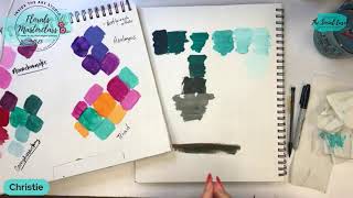
Christie Renee Hawkins teaches how to use a color wheel to mix and choose colors for painting. She covers warm and cool hues, complementary colors, tints and shades, and six color-scheme strategies like split-complementary and triad, with live demonstrations using DecoArt paints.
Chapters
Um, so we are going to be using a color wheel today, and I'm really just going to go over the basics of what to do with one of these. There is a ton of information on a color wheel, and even though it's there, sometimes it can just seem overwhelming. So I'm hoping by breaking it down for you today, it's going to start giving you a better understanding of doing this. So, um, and I have these in my store. You can purchase them as well as some of the other things, or you can get them at Amazon or your local store. But I do think this is an essential thing to have if you are wanting to continue your art journey, because color is a huge part of art, and it's important to know how colors work together. So let's start with some of the basics. I'm going to go ahead and flip you guys around that way, um, when I'm talking about it, I can show you some different paint colors as well. Let me set up my— the other thing I'm going to be using today, obviously I have like my tearaway palette, whatever palette you're using if you're playing with paints today while I'm talking is fine. And then I'm also going to be working in my mixed media pad. So you'll hear me talk about a mixed media pad a lot because I also think it is essential to have when you are practicing your art. You're going to use this to make colors in, you're going to use this to practice brush strokes, and even do full paintings. So it's just a great resource to have, and this paper is meant to handle paint, so that is why we are using our mixed media pad today. So I'm going to flip you guys around really quick. Okay, so let me know in the comments. We're going to start with the very basics. How many of you know which colors are warm and which are cool? It's important to know your warms and cools on the color wheel. If you don't know them, there's a handy little cheat guide on your color wheel as well. So cool colors, when you use them in your artwork, tend to recede or look further away. Warm colors tend to come towards you and feel closer. So you can use that in your artwork, depending on if you're trying to create depth. And in your— like, whether you're doing a landscape or whether you're doing flowers, it's also going to help you understand how shadows and highlights work together and to make things feel like they're coming towards you. And if you want things to go further away, how you can use cool colors to achieve that. So on the color wheel, I'm going to try to get this without the glare here. Um, at the top around all the colors, you've got these little arrows that tell you the cool colors start with violet and go all the way to yellow-green. Your warm colors start with yellow and go all the way to red-violet. So an easy way to just keep this in your head is think of warm colors like fire, think of cool colors like winter snow, anything that you would think of as cool or feels cold, those are going to be your cool colors. So the color wheel is split in half, cools versus warms. Um, okay, I'm just checking to see if I have any questions here. Um, then we're going to talk about the very basics. So primary colors, this is what all colors are made from. There are only 3 primary colors: red, yellow, and blue. And then from those 3 colors, you make every other color on the color wheel. The secondary colors are what you combine. So red and yellow would make orange. That is a secondary color. Same with purple, because red and blue make purple or violet. And then obviously green— yellow and blue make green. So those are your secondary colors. And your tertiary colors are then the ones made by mixing one primary and then an adjacent secondary color to it. So in this case, it would be blue and blue-violet. The other thing— so you'll notice, like, the, the color wheel has these different rotating wheels. These are super handy, and I'm going to show you why. One, you can easily just kind of test out, like, what would happen if I wanted to add red to this blue-green? What color would I get? And it's going to show you, you would get a purple color. Um, obviously yellow and blue make green, but you can move this around and look. Let's go red and green. So red and green By adding red to green, you now get this kind of brownish color, and that's important because these are complementary colors. So green and red are opposite on the color wheel, yellow and violet, and blue and orange. And when you add the opposite color to the color, then it is going to desaturate it or take that color away. So think of it as like toning it down or lessening its vibrancy. If I add red to green, it's going to pull that down and kind of mute that green down, and you kind of get this brownish color. So that is how you can create a neutral. Same with yellow and purple and blue and orange. But you can use the color wheel so you don't have to guess. Like, you'll know, like, okay, if I add, you know, yellow to red, I'm going to get this kind of orange. Of course, all this has to do with the ratio that you add. But even this is super helpful if you have like a red violet color and adding yellow to it, you get a really pretty mustardy yellow. So once you learn the keys to color mixing, you're not gonna feel like you always have to have the exact color that I'm using in a demonstration, and you're going to start feeling more confident in your color choices. So let me know if that is helpful. We talked again about some of those complementary colors, and I've already got some older— this is all dry paint swatches from a previous lesson. So you can see the red and green mixed together, yellow and purple, kind of get that mustardy color. And these colors, there's— it's not an exact science with art at all. You are going to make your own unique colors based on the ratio of the two colors that you mix. So most of the time you're going to have one color be dominant and one be secondary. And then blue and orange— so you can kind of see these are the complementary colors, and obviously this is just a mixed ratio from colors that I had. Now the other thing I want you to keep in mind is just taking a color on its tone and then adding tints to it, which means adding white to a color, you're going to come up with all these different colors. Same with adding black to a color. So this is a great example of how one bottle of blue paint can turn into all these different colors just by adding white and black to it. So when you add white, it's called a tint. When you're adding black, it's called a shade. And just keep in mind, like, think of like a shadow. So you're adding black to it, it's going to be darker, like a shade. So that's how you can remember the difference between, um, those two. But it's so fun to see all the different variations of blues you can make just with white and black. This is a great way to make a navy if like your blue is too vibrant and you want it a little darker. Adding a little black to it, you can get a beautiful navy blue. Um, let's see, what is the next thing I was going to tell you guys about? Okay, so that is value, and this is also important in your paintings because— and I'm going to be talking about this more over the next couple of weeks— about finding the values and the shades in your painting and having a decent amount of contrast in your compositions. So we're leading up to learning how you can make your own original pieces of artwork, and understanding the color and value scale is an important part of that. Because if all your colors— going back to the value scale here, we're gonna go back to our color wheel also on here. 100% black is value 1, all the way to 100% white is value 10, and everything in between is the grayscale. So in your paintings, you want to have variations of dark to lightness. Okay, and then again, you can use this— you've got adding white, adding black on your color wheel that you can turn and just see some of the pretty colors that you can make by adding white to those different hues. So a lot of times, um, Let's use these two colors as an example. This is— sorry, my hat hit that. This is Bluegrass Green, this is Bahama Blue, two DecoArt colors that I love. But you can, just by adding white to the Bluegrass Green, you can get a very similar color to this Bahama Blue. So I'm hoping by all the tips that I'm sharing with you guys today, you're going to start realizing you don't have to grab a different bottle of paint You can just mix from some of the basic colors that you have, and we will be releasing very soon— the Social Easel is going to have their own DecoArt Essentials paint kit. And with that paint kit, when it's released, you're going to get a special color mixing guide with that to show you all the different colors that you can create from my Essentials kit. So basically, this kit of paint is going to be all the colors you need to make all the different paintings that I do in my classes and in my memberships. So that is some basics about this. Now I'm going to— this is all the information on the front of the color wheel, but don't forget there's backside. And this is where you can really— I think probably this is going to be most helpful for you guys because it's going to help you start understanding what colors look good together. And, um, it's just kind of— for this part, it's a little bit of the science of a color wheel and, um, the differences where they are spaced on the color wheel and why they look good together. So we know for split complementaries, again, red and green, purple and yellow, orange and blue, we know that those colors just naturally look good together. Complementary colors means they complement each other because because they are opposite of each other on the color wheel. So that helps you make a really bold statement with your artwork. If you use complementary colors and then tints and shades of those complementary colors like we talked about here, you're going to have a very bold and eye-catching piece of artwork. And then we have— so that's split complementary. You're going to see a triad, And then you're going to see a tetrad, which is 4 colors. And then all of these notes are here on the color wheel too, so I can even cheat and read this to you while I'm talking to you about it. But then we have, um, harmonious color schemes. So what colors are going to look good together and create like a calm, a calm, harmonious type of painting? And then we have on the other side, this the split complementary, the triad, the tetrad, and key color. All of these are going to give you more of a contrasting and vibrant color scheme. So, um, use this as your friend. Use this to rotate and see the different colors you can make. On this side, it shows you tint, tone, and shade. So I only did tints and shades here. I honestly don't really mix with gray, um, that much, but mixing it with gray would be called a tone. But you can just try this at home. Pick your favorite color. Let's just start with one. I'm gonna pick my favorite color, which is a teal. We're just going to do this Bluegrass Green because it's a good one. Um, and I'm— yes, I'm going over top of my messy palette. You don't need to see this part or know what I'm doing because I'm going to show you on the mixed media pad, and then I'm going to get a little white over here, and then I'm going to get a little dot of black, and we're just going to play— oops, this needs to be shaken up— we're going to play with this and see some different colors that we can make. Sound good? Is this helpful so far? Is learning the basics giving you a little bit of guidance in how to read and use your color wheel a little bit better. So that Bluegrass Green would be similar to this blue-green on here, and again, that is showing me what that is going to look like— tint, tone, and shade. So if I want a darker teal, I'm going to go in Let's put our color swatch down first. So this is just straight out of the bottle, Bluegrass Green. Um, Linda said, if I were to use a limited color palette, like a maximum of 3 colors with black and white, what colors would you use? Um, so you would want your primaries most likely. So I would do— because all colors come from your primaries, so that's red, yellow, and blue. Um, there is a different color wheel that I recommend, um, inside my membership as well. This even takes it a little bit further, more of like printer colors. So this is like a cyan, magenta, and yellow. So that would be another option. I would either do red, blue, and yellow or I would do magenta, blue, and yellow if you were only going to start with 3 colors. Um, these are all acrylics that I'm working with. So this is the basic color, and then I'm going to come in and I just still have that in my paint, paintbrush. I'm going to come in with some white, and again, this is all about the ratio that you're mixing. Now we've got a pretty light minty, kind of like sea breeze color. And I could keep adding white to it and get lighter and lighter and lighter. This is— you can start playing with colors and making your own value scales, which is a really great exercise that I encourage everyone to practice and play with. I'm going to wipe some of that off and then go in with just more white. So you're basically going to go from that original hue to as light as you can possibly get, where it just has a tiny, tiny touch of that hue left in it. So now let's get the white out of my brush and see what happens when we add some black to it. Deb said it's very confusing to me. So, Deb, tell me what part is confusing that we've talked about so far. So when you are adding black to a color, you want to remember that black is very, very strong, so a little bit goes a long way. You always want more of your actual hue and then just add tiny touches of black until you get it to the darkness you want, because it's much harder to go back to the original color if you get too much black. So always add a little bit, um, and start from there. So I'm going to load up with— that's the original color— and then I'm just going to barely touch my brush into the black, and you'll see how quickly that changes that color to like a dark teal. And it's funny, initially I always think like, I don't really like shades that much. I love the pastels, I love going darker, but Actually love this color. This is just like a really pretty dark teal, and we could keep making it even darker. So pick up a little bit more. And this is another way, you know, when I was in art school, one of our lessons when I was taking the color theory class was that we could not just have white and black in any of our paintings. They all had to come from a hue. So every black we had in our painting was a black-blue or a black-green or a black-purple. Does that make sense? It was never just straight black out of the bottle. You can still create a very interesting, rich, deep, dark color without going straight to black. Um, Terry said, what if you start with white and add color? Does that have a special name? It's still the same thing. White and any color is a tint. That's just adding— so it would be easier if you were trying to make a really, really light teal. Let's go underneath here. This is pure white, and then if I just came in with just barely a touch of that teal and mixed it in there, you're just going to get a super, super light, light color. So it's still Got color in it, but it is almost white. Can you see that on the page? See the difference there, even between my lightest one that I had made? You can go super, super light. So it doesn't matter what order you add them in, white in any color is a tint. Um, Deb said, I guess it's that there are many colors. There are thousands of colors that can be mixed. So we're going to go further into it. Um, I want to give you the basics first on just like how to use a color wheel. So that was what we went over so far. And again, you're not having to retain any of this information. It's literally all written on your color wheel, and it will tell you what colors look good together. So we talked about the split complementary opposites. Okay, so what about a triad? You can turn— keep turning this. See, this is separated from all the colors. So let's say you want— let's just stick with teal, okay, because I've already got that out. I want to do a painting with teal because it's my favorite color. So what colors would look good with teal? I can use this color wheel to help me figure that out. I'm going to look at my little arrows here. Okay, so the split complementary— um, oh sorry, I keep saying split complementary. Complementary was the opposite. A split complementary is going to be this skinny triangle in the middle, so that's telling me that blue-green or teal, a blue-violet, and orange are going to be pretty colors together. The other option I could look at is a triad. So that's 3 colors that are spaced equally apart on the color wheel. So that is pointing to blue-green, it's pointing to red-violet, and it's pointing to yellow-orange. So then if you started playing with those colors and putting them next to each other, which I recommend doing a bunch of these swatches in your mixed media pad, and you can cut them out and then hold them up to different colors that you're playing with, or that you're thinking about using in a painting, and see what colors appeal to you. But the color wheel does help you just kind of know, by using the diagrams that it has on here, what colors are going to look nice together. Um, Let's see, um, someone asked— Vicki said, can you explain the tertiary colors again? So there are 6 tertiary colors, each made by mixing 1 primary and the adjacent. So for this, it would be the orange and yellow-orange. So it's 1— or, I'm sorry, 1 primary, so yellow, and then your yellow-orange, and that's going to give you tertiary color. So, and it's, it's an adjacent secondary color, adjacent on the color wheel. And then going back to, um, that kind of ties in to the analogous colors. So colors that are next to each other on the color wheel are called analogous, and it says using the colors that are adjacent to each other on the color wheel um, at least 2 but no more than 5. So an example would be yellow-green. Okay, so yellow-green, um, green, blue-green, blue, and blue-violet. So these colors right here, those are going to be analogous, meaning those are going to look good together. And you can rotate around the color wheel and stick with that. It doesn't just have to be those. So that's any 2 to 5 colors that are consecutively next to each other on a color wheel are going to be harmonious and look good together. Cynthia, you can purchase it from my store at thesocialeasel.com, or you can go to Amazon and get a color wheel, or you can go to any of like your craft stores, and I'm sure Walmart even has them. As well. So I hope that helps you understand a color wheel a little bit more. Color theory is not something that— this is not a lesson that can be taught in 30 minutes and you just get it. This is just a brief starter class to explain to you how to use a color wheel and how color works in your paintings. So if you came in late, you can start back at the beginning of this replay where I talk about cools and warms, and then we start going around the color wheel. And explaining what all the different things on here mean. Um, so let me know if you guys have any other questions about that. The other thing I want to show you too— so we talked about, um, this is just adding black, that's adding white, obviously. But I want to show you what it looks like to add an opposite color. So sometimes you don't— sometimes you want a more toned-down color. Like, I always compare, um, or mention grass when I'm talking about this, because when you're looking at like a landscape painting— I'm just going to pull this one over that I'm going to be teaching, um, my tribe tomorrow. If I just took green straight out of a bottle and put it on here and said, well, I picked green because green's the color of grass and that's what grass looks like, it wouldn't be at all because grass is not that bright, right? So we would not want straight up green right out of the bottle. We would want a darker, more toned down or desaturated. So saturation is its full vibrancy, the bright color, the original hue, and then we want to pull color away from that. To pull color away, you're going to go opposite on the color wheel. So again, we're going to use this as an example. Looking at the color wheel, this is our blue-green, and this does not have to be exact, you guys. This is to give you an idea. Don't think you have to say, well, that my blue-green is a different blue-green than that. That doesn't matter. It's showing you what is across from it. So the opposite of blue-green is red-orange, and I just happen to have one right here. So I'm going to take This one's called Tiger Lily, but any kind of reddish orange is going to work for this example. And we obviously are going to start with our pure color and then watch what happens as we add the opposite color to it. So let's start here, and I'm just going to mix straight onto this, um, mixed media pad. Now you can also mix like I did over here on your palette as well. I do a lot of pre-mixing over here to see if I like a color, and then I come over to my mixed media pad and I actually make a swatch. So that's just the color right out of the bottle. Now I'm going to take the opposite, okay, just a little bit of orange here, and I'm going to mix it together. And you can see already— I'm going to lift this up for you just a little. Because sometimes when it's further away it's hard to see that already. Can you tell on video that this is already a darker color than the swatch we made just above it? Let's keep adding some orange to it to see what happens. So going off what I've taught you so far, if we mixed equal parts of these two colors together, what color do you think we're going to get? I'm going to pause for a minute and let you guys answer that in the comments before I keep adding color to it. Yes, you guys can access this replay anytime. Um, if you're on my text list, you can go straight back to that link that I text out, or you can come to YouTube or the Facebook page. Hey Stacy, so glad you needed this. Cheryl, you are correct. I'm not going to mention your answer yet in case, um, there are some other ladies that want to jump in and comment. But keep in mind, when you mix opposites, so complementary colors, when you mix them, you are creating a neutral. So you guys guessed right, it's brown. And it's— each set of complementary colors is going to create obviously a different shade of brown, but basically you're creating a neutral. So when I add orange to my teal. Keep adding it. Now what you may be thinking in your head is, that's really ugly and you just made a really yucky brown color. It may feel like that when we are comparing it to these color swatches above it. This is why I mentioned cutting out color swatches. And placing them next to other colors to see what they look like. The more orange I add to that, the more brown I'm going to get. So that may look ugly, right? If you're thinking, well, I don't want a brown— if you don't want browns and you don't want neutrals, don't mix opposites, okay? But this may look like an ugly brown here, but it's going to make a perfect color brown on like a pathway, a pathway in a landscape painting. This is going to be a nice calm brown. And now look what happens. You've created a brown by mixing opposites. Now what if we add white to that? Now you've got this pretty, almost like khaki color of brown. And this is what I mean, like, you just keep playing this, almost like a grayish brown. Driftwood is kind of what I would call— which I love the color driftwood. But look at this really pretty neutral that we've created, almost like a grayish brown. And we got that by mixing opposites. So we started with a teal and we added orange to it. and then I added white to it, and now I've got this really pretty driftwood grayish brown color. So it's about learning that sometimes you want a desaturated color, sometimes you want a brown, and you don't want to have to go buy all these different brown paints. You can make your own by mixing opposites and mixing other colors. Um, sometimes you will just discover while you're playing. I was just doing a test. Like, take some of your favorite colors and start with, like, let's just say the teal, and then add yellow to it and see what you get. Add blue to it, see what you get. Add purple to it and see what you get. You'd be surprised all the different colors that you're going to come up with. And the more that you play with color and the more you experiment with it and, like, truly understand all the lessons, everything that I went over on the color wheel and how color works together, you're going to feel so much freedom in your painting and feel a lot more comfortable picking your colors. So I hope that helps. I hope it is something that makes— I mean, this, I say it all the time, but it really is one of my favorite things. Sometimes I like doing this more than I even like doing a painting because it is just You're making your own colors. Like, you're making your own colors. I'm gonna see if I can find my page in here. I'm gonna give you guys a sneak peek of some colors that I made, if I grabbed it right, which I think I did. But I have so many of these around the studio, so I can never remember which one what is in. I might have done this in a different one. All right, I'm gonna leave that here for you guys to see. Well, I did not find the one that I wanted, but I'm going to show you this. Don't worry, soon enough you will see the colors that I've mixed. And again, we're going to be talking more about this, so everyone stay tuned for, um, next week on Monday. We're going to be announcing what is coming next. I've got a free 8-day workshop that we are going to open the doors to on Monday, and again, it's free, so anyone can sign up for it. Tell your friends about it. If you want to make sure that you don't miss out on it, make sure that you get our free floral inspiration quick guide. This is something I created where I actually even included some of this color theory in there. Everything that we've talked about for the last 3 weeks is all on that inspirational quick guide. So let me grab the link for you real quick and throw it into the comments. And if you ever are like, I don't know where to find something, just go to thesocialeasel.com and we've got all the links there for you. And I'm The Social Easel on all platforms, so it's super easy to find. But I'm going to drop the link here. If you haven't grabbed this quick guide already, make sure that you grab it through that link. And if you don't see it, make sure you check your spam and your promotions folder. If you still don't see it, sometimes email's just glitchy. You can always email customer support at christie@thesocialeasel.com, and my team will send it to you. But this is, um, breaking it down with different paint swatches that talked about these different color schemes on the back of the color wheel. So this is an example for you. We did complementary, So reds and greens, and then again, what are these shades and tints of reds and greens? So all of that's complementary. Monochromatic means one color hue and then the shades and tints that go with it. So all of that, that's how you would make a monochromatic painting. It would only have one color and then various versions of that color made with black and white. Analogous— look how pretty these colors all look together. It's because they're next to each other on the color wheel, so they look very harmonious together. And then a triad— I love this. Look how bright and vibrant this is. These are very bold, bright colors, and it's 3 colors— that's why it's called a triad— that are spaced equally apart on the color wheel. So when you start putting these colors next to each other and playing around, in your mixed media pad, you're going to start seeing what colors you are drawn to, what colors you like together. Some people like me are more drawn to the bold and bright colors. Some people love pastels and muted colors. There's no right or wrong, and color theory and understanding the color wheel is going to give you the same outcome whether you want bold and bright or whether you want something more muted and more pastel. So the theories, color theory that goes along with it, remains the same regardless of what color schemes you prefer. And then last but not least, just choosing, like, another way to choose good colors together. I mentioned this in the very first lesson. But, um, you can go to Pinterest and even just type in color palettes, and you will have a plethora of different color palettes come up. And sometimes it's just nice to have that visual of seeing those different colors on Pinterest all next to each other, and then seeing a painting or a photo that they were derived from and how they look pretty together. Is something that you can use as a basis for a painting. So, um, I hope that helps.