Tropical Sunset & Palm Trees with Palette Knives
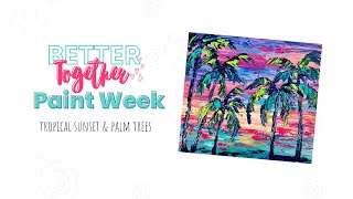
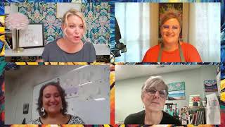
In this live YouTube session, Christie Renee Hawkins greets her Tribe Sisters community, checks in on their comfort level with palette‑knife painting, and then leads a step‑by‑step demonstration of creating a tropical sunset with palm trees using palette knives. She introduces both plastic starter knives and her metal set, explains how to hold the knife, and demonstrates short and long strokes, wet‑on‑wet and wet‑on‑dry techniques. Christie walks through her specific color palette—Cadmium Yellow Deep, Brilliant Yellow Green, Bright Aqua Green, Light Blue Permanent, Prussian Blue, Light Blue Violet/Gray Purple, Medium Magenta, Rose Pink, Fluorescent Pink, and white—detailing how she mixes them, avoids muddy colors, and uses the color wheel to keep warm and cool hues separate. She builds the sky by layering cool blues and purples, then adds warm oranges and corals, emphasizing playfulness and the importance of not striving for perfection. For the palm trees, she outlines trunks with a skinny knife, varies tree heights, and creates fronds using a “firework” motion, accepting the messiness of palette‑knife strokes. Throughout, she shares mindset tips, encourages viewers to embrace mistakes, and offers practical advice on flattening paper, using gel medium, and cleaning tools. Interspersed are promotional segments: a new line of branded t‑shirts, stickers, and a niece’s earrings, plus a detailed announcement of Tribe membership bonuses (mini‑courses, past workshops, monthly critiques, library access) with pricing and deadline information. She also previews upcoming Tribe workshops (hydrangeas, turquoise water, floral series) and reminds viewers of the limited enrollment window. The session ends with a reminder to join the next morning mindset session on embracing artistic errors.
Chapters
Hey everybody, how is everyone doing today? Okay, let me know if you can see and hear me okay and we will go ahead and get started. I'm excited for tonight, I hope you guys are too. So we wanted to throw together a quick little, um, intro video to show you what some of the Tribe Sisters have been up to. It's always fun to see everyone's stories and see what they're doing. Okay, good. I'm glad it's all good. All right, so a couple things before we get started. Um, one, how is everyone feeling about painting with palette knife tonight? Let me know in the comments if you are excited about it, if you're maybe a little bit nervous, if you love palette knife, if you've never used them before. I'm going to go over a couple different options for you. Bailey said a little nervous. Ingrid said nervous. That's okay. So we have a couple different ones here. I have some from my plastic set that you can get in my store. This, this is like a great— there's more than this. This is just 3 of the pack, but it's a great starter kit if you're not ready to commit to metal palette knives yet, but you still want to like try it out and play with them. These plastic ones are great. So I'm going to be using like the skinny sizes out of those. And then I also have my set that comes in 5 different sizes. I'm actually not using all of them tonight though. Setting those aside, I'm going to be using 3 different ones tonight. My really large one, or the largest one out of that set, then my long skinny, and then my favorite one is the itty-bitty little palette knife. Hello, hello. So I'm gonna kind of just go over with you before we jump in and get started on the painting, just some very simple basics on just like how to hold a palette knife and learning to experiment. This is definitely one— I see Ingrid saying she's a perfectionist. If you are a perfectionist, one of the fastest ways to break you out of it is to start using a palette knife, because when you use a palette knife, obviously you're getting, you know, this kind of look in your paintings. There's nothing super precise about this. It's supposed to be loose and, you know, freeform, and it's not about being perfect, and that's what gives it that really cool look that you can really only achieve with palette knife. If you don't have palette knife, I still encourage you to paint along tonight and use your paintbrush. Brush. It's just going to have a little bit of a different look, but it's still going to be a really pretty sunset with palm trees, so that's okay too. Um, so, um, when I flip the camera around, I'll go ahead and kind of show you guys some basic techniques on how we're going to use these and just like handling, how you can kind of get more comfortable with it. Um, general rule of thumb, I'll just show you while I'm like standing because it might be easier. You're going to hold it like this. The paint is going to go on the bottom. Okay, so not the top, on the bottom. And just like you're spreading icing or frosting on a cake, you're going to spread like that. And we'll do like short strokes, and we'll do some longer ones, and we'll blend together. But that's the proper way to hold it, and you're just going to kind of loosely hold that handle. So I'll probably be using mostly my metal ones tonight, but I may use some of my plastic ones. Okay, what else was I going to tell you? I'm getting ready to put my apron on. But before I do that, I have good news for you guys, because some of you were asking about this t-shirt that I was wearing this morning during our morning mindset, and I finally had time to get them added to the store. So I'm going to drop that. Let me pull it up really quick, and then I'm going to drop that link for you guys, and we have them available in multiple sizes and I did a couple different colors on them. I really love this, um, the one that's going to show up if you click this link. The first one on there is like this really pretty blue color that I think this design is going to look awesome on. Let me see if I can show this to you really quick. Back over here. Okay, can you guys see that? So this is, um, they're $24.95. They're available in the store, all different sizes, and we have this really pretty Columbia Blue, this Lilac Heather Prism, the other Lilac the Athletic Gray, which is like what I'm wearing, the Heather Prism, and the Heather Ice Blue. And then we have white. So we've got it, and I picked the colors that I knew that would look best, um, with that design. So those are up and available now for those of you that were wanting one. I finally got them added to the store. We also have stickers, um, that are like this as well, but I'm gonna throw my apron on really quick so I don't completely cover myself in paint, although the clothes I'm wearing right now already have paint on them. Yes, Leah, and another pair of cute earrings from my niece Olivia. I wonder if I shouldn't just pull her, um, site up really quick too. Let me see, because I wasn't able to give you guys that link the other day. This is her Facebook page, so I'm just going to drop that in the comments really quick. This is another beautiful pair of earrings that she made for me. I know that periwinkle is pretty, isn't it? Yes, that's exactly what I thought, Lori. I almost said that when I was like, it's like a periwinkle, but it is, it's like a periwinkle blue, that first color. I think I'm gonna have to order another one because it's good to have multiple painting shirts up here, and then I quit ruining the shirts that I actually want to wear when I go out. Oh, awesome! Thank you, Lisa, for buying some earrings and a bracelet from her. I text her and told her I gave her a little shout out. So she's a, she's a small business, so she appreciates it. All right, so let's switch gears and get to painting. Um, and then when we are done, I'm gonna go over some of the new bonuses that we have available for those of you wanting to join Tribe. We have a whole new set of bonuses today through Friday, and those are going to be available obviously all current Tribe sisters and then any of you that join. Are going to get access to these paintings. So I'll show you that. Stay around at the end for that one. Okay, let me get this off. I'm excited about this one. So remember, keep— oops, sorry— keep your, keep your mindset in a good place as we start this. For those of you who haven't worked with palette knife before, This is one I would definitely watch first and take your time with, because I don't want you to get frustrated in trying to keep up with me while I'm doing it. I think it's going to help you to just kind of practice in your mixed media pad, get comfortable with a palette knife, and, and then tackle it when you have time. So let's go over the colors first. Let me move these out of the way. There's lots of colors in this one. So we have the— and again, these are all on the color list, but I'm just going to lay them out for you as well. The Cadmium Yellow Deep, the Brilliant Yellow Green. We have the Bright Aqua Green, Light Blue Permanent, Prussian Blue Hue. I love this. This is like— I don't know if you can really see this, but it's just the most beautiful, like, navy color. It almost has a purplish tint to it. It's so pretty. That's what I used instead of using black, was that Prussian blue. And then we have— this is a different brand, but on your color list it's called the light blue violet. This is called gray purple in the Master's Touch brand, but same color. Um, medium magenta, rose pink, and then my other favorite I don't know if you guys can see that. This is the fluorescent pink. So those are the colors that I am using. Feel free to make it your own with your own color choices, but those are the ones that I used in the original. And I really want to— I'm going to do it, um, obviously small on a mixed media tonight, but I plan on doing this painting like a really big version of it because it's just so vibrant and fun. So I can't wait to do that. So I'm trying to decide if I want to— let me see if I have a different mixed media pad I can do this in so I'm not having to flip the page. This is my huge one, but I'm gonna, I'm gonna use this just to start with, just to kind of what you can be working on tonight just to kind of practice your strokes and stuff. So let's just grab a little aqua for right now. So I'm going to start with this long skinny one because this is really what I used for most of this painting when I was doing the background. You're going to load your paint up again on the back side. Okay, so it's the underside of the palette knife and you're going to pull it across again. I'm moving left to right because I'm right-handed. If you're left-handed, you would want to switch that. But this basic brush stroke that I'm doing right now, you can go back and forth like sawing, or you can pull one direction. But this is how the simple stroke is how we're going to build our actual sunset colors in here. So we'll lay down some base colors, and then we're going to go back and forth, and I'm going to talk to you about doing wet on wet with palette knife and how the colors mix a little bit, and then more how we do wet on dry. So after some of these colors have dried, how we're able to then go back over and add accent marks on top of them so that you're not getting too much blending and ending up with, you know, a bunch of colors that are mixed together. See all the strokes and all the different variation. In that sky back there. That's kind of what we're going for. Yes, these are all heavy-bodied acrylic that we're using for this. And then when I was switching to the palms, obviously we did the dark first, but I switched to the little palette knife. And you're going to have like these— say that's like one of the palms, right? And then they're just these quick little pulls, like curved pulls. That's obviously really big, but you kind of get the idea. You can use more of the tip to where you're pulling it down, putting more towards the tip of the knife. But again, these are all gonna be like kind of messy, crazy looking brush strokes, but they're still— when we get done, it's still going to look like palms. So you can kind of get the, the idea, the flow of that. But we're going to work through all that together. I just wanted to show you some basic, just kind of getting used to it, getting comfortable with putting paint on it and then adding it onto your canvas. So you can keep practicing that, practicing mixing colors while we're doing this one tonight. And that may make you feel a little bit more confident before you jump onto your finished piece that you're working on. Okay, so for, um, the sunset, I am going to focus on getting my cool colors down first. So let me see what I need here. I'm gonna do the light blue permanent. We're gonna do that light blue violet. We are going to do the medium magenta, the rose pink. And also, just fair warning, if you don't like to get messy, palette knife is messy, so, so be ready to embrace that. Um, I am going to grab some of the cadmium yellow hue. It may not Obviously, this is a lighter version, um, here in the painting, but we're going to use this color and it's going to mix with the white. And then we're also going to mix it with some of our pinks and our fluorescent pink to get these like peachy orangey tones that you see in there. And then some of our Fluorescent. So I'm just getting a little bit to start with, and then I'm going to add some white because I'll be using that especially with, um, my yellow colors. Try to scoot this over just a little bit so you can see my palette. All right, for those of you that are feeling anxious right now, don't forget to take a breath. It's all going to be okay. If your first one doesn't turn out the way you want it, you can just rip that page out and do another one. That's the beauty of this. So we are going to focus tonight not on the outcome. We're not going to think about how it's going to turn out. We're just going to have fun in the process. I want you to have fun practicing the strokes, and I want you to have fun just watching and playing and chatting and all those good things. Um, Lori, there was a supply list, um, for the entire workshop, if that's what you're asking. And then I usually, I usually say all the colors that I am using. So, okay, so I'm going to start with my long skinny one. And we're going to kind of bounce around in this sky in the beginning. Um, I've— so obviously I have like mixtures of like the blues and the purples together and then some pinks. All of these colors are fairly safe to mix together. Um, you might— like with the rose pink, it has a little bit more of an orangish tint to it, um, so it's a warmer pink, so I wouldn't overly mix that with that light blue permanent because you're gonna get kind of like a toned-down color. It's not muddy, but it's not bright and vibrant like the other colors. So I'm going to start with some of my light blue violet. And this is— and I can't remember if we talked about this earlier in the week, but if you're— obviously we're painting on paper, so when it dries you can see like these are like, they're going to curl up on the edges. That's normal because it's just paper. So if you want to flatten them, obviously making sure that it is completely dry when you do so, but once they're completely dry, I usually just— something heavy, heavy books or something like that, and you can lay them to flatten them out. I'm going to pick up a little bit of white with that Blue Violet just to make a paler tint of it. Okay, so I'm working some of that in, and I'm not trying to cover the entire background right now because we're going to come back in with some of these different colors. So I'm just kind of bouncing around the sky here. There's no exact right or wrong where you're putting these colors initially. As we move down, we're going to focus on warmer colors down here, and the cooler ones are going to stay towards the top. So I'm gonna— no need to rinse or anything. I'm just going to jump over to that blue. The other fun thing about palette knife is it's pretty quick. So palette knife paintings, because you can't really spend a ton of time on detail in them, they go— they tend to go a little bit faster than painting with brushes sometimes. We can do the same thing here. I can pull in some white into that if I want some variations and some lighter blues mixed in there. And then I'm just going to go ahead, even though there's some blue and white in this, I'm going to go ahead and add some of that base color down here. It's going to be a warmer sunset towards the bottom, but we can have some of this white as an under, underpainting down there. So when we add our yellow and stuff on, it'll be a little bit more vibrant. Add a little bit more blue. See, it's already looking pretty just like that. Karen, I am using— it's about an 8 by 8 multimedia pad, and this is the one that's in my store. Claudia, the replays, we actually are extending them through Sunday instead of Saturday because we have had a lot of requests from you guys to extend that. So the replays are available on the hub page. You can go back. Through Sunday evening to access those, those replays. So we're leaving it up through Mother's Day weekend for you. Okay, so I wiped some of that excess off just because I wanted a little bit more of the pure color here, not mixing. I'm going to go in with that medium magenta and start kind of working some of this in. And again, these— I want you to kind of notice, like, these strokes don't have to go all the way across the page. You can come in and just kind of lay them down here and there in certain areas. But I'm still holding this like flat, okay? So I'm not digging in, I'm not pushing into the, um, the palette or the paper when I'm doing that. Maybe just a up here, and then I'm going to start grabbing some of that warmer rose pink. Yes, Lori said, but if you join— try— yes, if you are a Tribe sister, if you join Tribe this week, you will have continued access to these. We are adding all of these lessons into your hub. Okay, so what I'm doing now is I'm starting to lay in that warmer pink. So what you want to be careful when you're doing this. I'm going to try to zoom in just a little bit here, um, because I don't really want that warm pink to mix with my blue. You don't want to keep going back and forth a lot, okay? So it's okay for them to overlap and mix a little bit, but we don't want to keep going because if you keep going back and forth, that's when the colors are going to blend together too much, right? So I'm just kind of lightly just dragging it across, and when I say lightly, I mean just like Very lightly, really lightly touching it, and just enough to let it pick up some of that color without continuing. Again, kind of like what we've been practicing all week, not staying, you know, attached to your canvas, to your mixed media pad while you're adding in these extras. Just kind of laying them in there. And it doesn't look— this is where I was when I was doing the original. I'm like, it doesn't really look super pretty right now, but I just kept going, and I was like, I know it's going to turn out. And it really starts coming together when we add these, um, these warmer bottom colors in. So I'm just going to come in with a little bit lighter blue, just kind of throw that in some spots. This really, um, this style and the sunset specifically that I'm doing really comes down to preference, where you want your colors. I want some more purple up here at the top. I always like doing my sunsets, you know, kind of darker. The further away from the sun, obviously, the darker that part of the sunset's going to be. So I always try to think about that when I'm putting my color down. That looks really pretty. I love that. I love that warm rose pink up against that medium magenta color. Okay, let's pick up some of our um, fluorescent. Okay, so I'm going to zoom back out just a little bit so you guys can kind of see what my palette is looking like here, how I'm just kind of scraping off these colors. We're going to do the same thing with the fluorescent pink and start popping that in, in a few places. I don't have it too crazy up at the top, but I do start working it in quite a bit more towards the bottom. Isn't that just the prettiest color? I just love, love, love this color. So I'm kind of sticking to the edges for right now because I know I want this yellowy orange kind of color here in the middle. And then I'm also going to take some of this and pull a little bit of yellow into to it, and we're going to make like that vibrant like orangey red color that we made with the fluorescent pink and that cadmium yellow. It's so pretty, almost looks like a neon orange. Um, that, the continued access is only for Tribe Sister, so we don't have— we won't be adding it to the Painting of the Month Club library, but you can upgrade if you want to upgrade from Painting of the Month to TRIBE. It's only a $27 a month difference. The sound is— okay, that's weird. Hold on, I wonder if my— let me check my mic. Maybe it's rubbing something. That's strange. Okay, hang on. Okay. Tell me if that sounds any better now, or is the audio still breaking up? Yeah, the batteries aren't dead, they're fully charged, but I'm thinking maybe something got— something got— no, it's not better. That's really strange. Okay, let me try. You know what, we're not— let me do this. I'm just going to take the mic off. Yes. Okay. What about now? This is with no mic and just the phone. I'm not sure what happened though. Okay. So it should be going off the audio of just the phone. Silver. Okay. Okay, so I'm using this mic now. Let me know if this sounds okay, and I'm going to try to get the phone switched. Okay, so this is good. The problem is, as soon as I come back in with this phone, which is how I show you guys the overhead view, it's going to mess this audio up. So I was— I'm hoping Maybe because I got out and I'm coming back in, it will fix the problem. So we're going to try that. So you'll just have to bear with me for a little bit. I don't know what's different. The only thing that I can think of is I was charging my phone through this, which you can do, but maybe it was— well, that mic, that's weird. Why is that not charging? Okay, we're going to try it one more time. If it's still messed up, we're going to have to get creative and figure something out. Okay, I'm going to mute this so we don't get that echo. Hang on. Okay, is the sound okay now that I've restarted this and come back in? I think we're good. Yay! Okay, you know what, sometimes there are technical difficulties and you just have to roll with it. I, I don't know why every— all the lights were on, everything was saying it was good. Now let's just hope my phone doesn't lose battery. I don't think it will. I think I have enough time. Okay, back to the painting. Okay, so we were in the middle of making that really pretty color, but since I was breaking up, I'm going to go over again. What colors I was mixing together to get this beautiful orange, in case you, in case you missed it. Um, I took some of the fluorescent pink with the cadmium yellow and mixed them together to get this really vibrant orange. And then of course we can even change that further. We can make it a little lighter. Look how pretty this is. That gorgeous light coral color, and I like to have variation in there, so I don't want to like mix that totally. I want there to be all of that in there. Now we're going to start laying in— look how pretty that is— some of this lighter coral color. Now here is an important thing to remember in your sunsets: orange and blue are opposite on the color wheel, so do not mix them. You will get brown. Okay, we don't want brown in our sunsets. So what I can do is, again, kind of like I was saying up here with this warm pink, that rose pink, I didn't want to mix it with the blue. We can still gently come in and like pull in. I'm very lightly dragging that across and not mixing it with the blue. The other thing, that mic issue that we had actually kind of turned into a great thing because it allowed this base layer of blue to start drying. So I'm not having having to worry as much about getting that orange mixing with that blue because that blue is pretty much dry underneath there now. But keep that in mind when you're doing yours. So just general rule of thumb, I'm going to grab my color wheel again. I'm actually going to grab this other one because it's not in a package. Now this may look like a little bit different color wheel, but just ignore that. For the, for the sake of the lesson that I'm teaching you really quick. A color wheel is a color wheel. All the colors are in the same place. This is just a C, cyan, magenta, yellow one instead of red, blue, and yellow. So it just changes it just a little bit. But anything that is opposite on the color wheel, we kind of talked about this on day one, but you don't want to mix those. Okay, so when you're doing your sunsets, you're safe to mix any of these cool colors together. Your pinks all the way to your blues, magenta all the way to cyan. You can mix all of these because those are the two primaries, right? Pretend this is red if this is confusing you, um, but from red to blue, red and blue make purple. Everything in between is going to be a pretty color. So I know all my cool colors I can mix together, and I don't have to worry about mixing anything muddy or yucky that I don't like. So, but in sunsets we have all the colors. We have warm colors, we have oranges and blues and everything. So you have to be careful when you're painting them because I don't want to mix my warms over here with my cools over here. Now we want them all on there, but we don't want to mix them together because that's going to give us muddy colors. Okay, so keep that in mind. So it worked out great. That we kind of had a little bit of drying time there, so I'm not having to worry about it as much, like I said. And we're just going to keep on going. So I'm also going to take some of this yellow and white and lighten that yellow up. I'm probably going to have to get some more white on here, and we're going to start throwing in— yeah, that's still too yellow for me. I don't want it quite that bright. I think I'm going to get some more. I'm going to clean— I'm going to get clean white because that has purple in it, and I don't want that purple to mix with my yellow. So now I've got this really pale yellow. It's mostly white with a little bit of yellow. That's more of what I'm kind of going for. You can see how much lighter that is. And now we're going to start laying that in here. And then I'm going to take some of that white back up here next to my fluorescent pink and my pink orange. We want all these like lighter warm colors now. So you can even see I have like some cool pink on the tip, and then it kind of transitions to that warmish orange color. So we're just going to start kind of throwing these colors into our sunset. And seeing what we get. This is where I talk about play. This is the importance of play. Let's just see what happens, see what we like. If we don't like something that we do, what are we going to do? Let me know in the comments. If we don't like what's going on in our painting, are we going to rip it out and just toss it? The answer is no. No, we're not. I'm going to give a few people a chance to answer. Yep, we are going to paint over it, but the important thing to remember is we're going to let it dry first. If there's areas we don't like, we don't want to keep adding wet on wet on wet, right? Because it'll just kind of pile up and start getting kind of crazy looking. So if you don't like what's going on, take a break away, go grab a drink. Go to the bathroom, let it dry, you can come back and paint over it. Okay, so I'm liking— it's a little bit different than my original, but I'm liking how this is looking. I think I'm going to go in with some of my magenta and fluorescent pink. Let's mix those together. Oh yeah, get that more vibrant pink on my sides here. I'm liking that. But now that I've gotten to this point, I'm also seeing that I want more purple up in my sky. Again, this is where it's good for you to stop and take pictures while you're doing this. I'm able to look up at the camera and I can tell that So I know I want to get some more of my, like, periwinkle color here. Isn't this just the most beautiful palette? I love all these colors. Throw some more of that in up higher in the sky, maybe a little bit more blue. And again, you don't have to— this is just like what I'm seeing in mine and what I want to change, colors I like in my original that I want to replicate here. But you see how now we're doing the wet on dry. Some of this has dried up at the top, so I'm able to go back and add some more color in up here. Let's add a little— if I want it wider, I can come in and kind of pull sections. That's pretty. And sometimes when you're working with palette knife, you kind of just get surprised by what happens. You do a pull one way and you get one color. You pull a different way, you get a different color. So it really is just kind of learning to play with it. So I'm going to leave that for now. I don't want to overwork it, so I'm going to move on, allow myself space away from this, and I'm going to come down and I'm going to add the aqua. I'm going to get some of my white with that just to lighten that up a little, maybe a little bit of that blue. And then we're going to put our water on. Now I'm scraping down right now just to kind of fill that in, but I don't want that to be my final strokes. I don't want those strokes to go down because that's not going to look like ocean water, right? Just kind of filling in that space. And then I'm going to come back and do the back and forth, so horizontal strokes as you're going. And this is— I'm going to need more paint. This is a mixture of the bright aqua green and the light blue permanent. Um, Dixie said, is there anything in the hub lessons or info about mixing regular acrylic paints with Golden medium? There's not, because that wasn't like a supply that I told you guys to get for this, but it's basically just super simple. All you're going to do is get gel medium and you just mix it into your paint color. There's no technique or anything involved in it. You just mix it in and then it becomes thicker. It's not going to change the color or anything of it. You just want to make sure you get gel medium, not modeling paste. Modeling paste will give it a white tint, so it will tint your color, not leave it the same. So all I'm doing is going back and forth between my teal and my light blue permanent right now, adding in some of these pretty ocean colors. And then I'm going to pick up some of my Periwinkle, it's always darker towards the horizon line, the back of the ocean. So we're going to go a little darker back here. And then it's also going to be darker towards the foreground where the sun is not hitting. So this is where I got on the original, and I was like, it's already pretty, and I could just do a, you know, like sunset. But then I got to this point, and I was like, but it'd look really cool if I added some palm trees over top of it. So before you add the palm trees, you want to decide, though, do you like your sky the way that it is, or do you want to go back and add any additional colors to it? So I think I want a little bit more of this, like, pale purple up here. So I'm going to mix a little bit of that. I'm taking my magenta and my periwinkle and just kind of making a new little color here to throw in. And I'm also making sure I don't have any white showing through. So I think I'm going to leave mine like this. I might, I might pull— just let me rinse this. Actually, I'm just going to use my skinny little guy. Um, Claudia said, how do I join the membership? So we have, um, a link. We can post it here in the comments, but it's also on the hub page. Um, it's on our website right now, it's in the email, so the links are live everywhere, but we'll make sure we drop that link in here for you guys, um, for you to join as well. So I'm just grabbing some of my white and these warmer colors again. I think I just want to add a little bit more, kind of extend it over here the way I have it in my original some of that light kind of bouncing that way. Okay, I'm liking that. What do you guys think? Good? I'm thinking good. So now we are going to grab some of this color that I am quickly becoming obsessed with, this Prussian blue. It's basically just a navy with a fancy name. And this is where I really started having fun. And I really— you actually don't want to wait too long for this part because you're going to watch what I'm doing here, but I'm actually going to kind of like carve into this, this wet paint we have here. We've got wet paint all over this. So I'm going to show you what I mean by that. I'm going to use my skinny palette knife again, and I'm just going to start kind of like laying in my outline where I want these palm trees. And I know it's going to make you a little bit nervous, but at least we're doing it with just a palette knife first and not color. So if you do like a line and then you're like, I don't like that, you can just come back and fix it. Okay, so a couple of things I want to show you. We have 5 palm trees, right? Because odd numbers are our friends. I also want to vary the height of the palm trees. We don't want just a straight line of palm trees, all the palms exactly the same all the way across. That'd be really boring. So we have staggering heights. I have one that's kind of going off the top edge, one that's a little lower. These 2 are kind of equal, and then we have a couple more still staggered. This is the shortest. This one's slightly taller. So when you're laying in your palm trees, just keep those things in mind. Alright, so I'm going to start over here, and I usually start like wherever I want the center of my palms to be. That's, that's kind of what I do, and I'm just going to pull right through that paint. Can you guys see that? Holder here is getting a little loose. We'll get this fixed. Look how cool that is! Then we're going to do the same thing here. I know I want this one a little bit lower and maybe straight, maybe not at an angle. Just wipe off your excess. This little guy, he's coming in over here. Then I have a taller one kind of leaning over here. And then my last one is almost right on that edge. And here's the great thing about palm trees. You see how that just kind of like gave like a wiggly line while I was doing that? That's okay because palm trees are not straight and perfect. Okay, so you're going to start by doing that first, and now I'm going to come back in I have to raise this up a little just so it's not hitting my hand, and I'm going to come in with that Prussian blue, and I'm just going to drag right over top of those lines that I kind of carved into the painting, and I don't want them to be perfect. So look at all the variations of colors in here. So it's going to pick up some of the colors of the sunset. And we're just going to like be okay with whatever variety it gives us. We're not going to try to make this perfect, right guys? We're not going to try to make this perfect. Say it to yourself. So what I'm doing right now is I'm loading up towards the end and I'm holding it more at an angle. Okay, so I'm using more of the point and getting more control of the palette knife that way. And then I came across the bottom and just kind of created like shadows. You can think it's a beach. I mean, it doesn't really matter what it is. We're just kind of grounding these tree trunks. So they're not just going straight off the page, and then these little dark blue areas can also represent the shadows. Okay, so. That's step 1, kind of getting our tree trunks where we want them. Now is the fun part, but I know can be a little intimidating. So here's like the easiest way to think about making palms is like a firework. Okay, so I'm going to start with this one and using again that end as a point. Think of just a firework exploding. Have all these different points coming out off of it. You can decide how far you want them to go out. Let's have one go this way, and some of these are going to overlap. Again, don't avoid overlapping. In nature, things are going to overlap. It's not about keeping everything separate. They're going to look kind of funny right now. This is where you have to trust me. These are going to kind of go down a little bit more. So do you see what I mean by kind of like a firework shape, like something like exploding? Let's have this one overlap that other, that other tree. This is Prussian blue. That's the only color I'm using right now. It's just picking up some of the other colors. And remember, not all palms are the same. There are so many different varieties, so don't get stuck in your head or start thinking, well, that's not really what palm tree looks like, and We're not trying to make a photograph, right? Okay, so I want everyone to look at this right now. and I want you to think, wow, that's really ugly, Kristi, because it's not finished yet. This is what we would call the messy middle, where you're like, is this what it's supposed to look like right now? Because it just looks like a 5-year-old drawing palm trees. This is what it's supposed to look like right now. And then this is my favorite part of a painting, is the last couple of minutes when it just comes together and you're like, oh, okay, now I get it. Okay, so bear with me, we're gonna get there. Zoom out a little so you can see the original. And yes, Lynn said hot mess. Original, hot mess. Okay, so I'm going to come in with more of the Prussian blue. Now this is— I'm not making each individual palm, right? I'm just kind of creating the idea of movement. So I'm going to go along those lines I created, and I'm just going to start kind of pulling down. I might do one of these on the mixed media pad just to show you guys, um, a closer up. But this is where you really have to kind of embrace the style and the messiness of this. I'm still focusing mostly on the tip of the palette knife and then kind of pulling down at an angle to make the idea of those palms. And it's still going to look messy for a while. It really came together when I do these last steps of adding that aqua and teal in there. Just remember, this is, this is not about a ton of detail at this point, so don't, don't start trying to make individual palms. You'll drive yourself crazy, and it's not going to turn out the way that you want it to. So we're just creating big sections of palms that then we'll come back and add some more color to. So see how they still are starting to look like palms. These are going kind of more down, and then I kind of accentuate that and pull some down even a little bit further. If you want. But I really think this is, you know, keep in mind this is just like an 8-inch square, so I'm really anxious to try this on like a big canvas because I think it's going to look super, super cool. And I covered up a whole lot more of my sunset in this one than I did the original. So that tends to always be the case when I do a second version of something. I think I might add one more. Let's pull this guy down. A little bit. That looks a little funny there. So you can probably still see— I'm still— some of this is wet behind there, so I'm going to hold this close so you can kind of see that, that texture that I'm still kind of like almost carving into the wet paint. Yeah, so you want to focus on the tip. I'm not using like the whole back section here. I'm going to show you. I'm going to set this aside and show you on just white paper, because I think it's easier to see. Which is actually fine, because that'll give that a chance to dry before we add the green and the aqua on. Okay, so let's do it again on this. And I'm going to even take it a step further and kind of draw the shape out. Okay, so you've got your palm tree, you've got that. This is the top here. That's your point where all your palms want to come out of, so you can decide what they look like. And you could even have them kind of then angle down if you want to. Like I said, each palm are all different. Some go straight up, and not always do palms go out both sides, right? So there's Just remember, there's a lot of variation in how you can do this. All right, let's go in. How I start out, just kind of— I'm going to need more paint here. We'll just use this blue instead. All right, so I'm kind of getting that line on there. And then I'm kind of pulling down. Use the tip. You can go— sometimes it's— I go both ways. You can go down and then pull up into it, or you can go here and pull down. It's easier. It was easier on my painting because I had so much wet paint on there. This is just like dry, so it's hard to kind of get it to catch the same way. But does that help to see me do it on this? So same thing, just kind of going over that. Now you can on these lower ones, sometimes I just kind of do these quick little pulls in. It really depends on how much detail you want your palms to have. Again, these— look at palm tree paintings, there are so many different ways you can do them. You don't have to show individual palms. They can be a chunk of color together, or if you want more individual ones, longer ones coming out, you can come back and you can add those in if you feel like there's not enough. But I just love this style. I mean, for me, this is just like— I think that's still a cool looking palm tree right now. This down just a little bit more. See how I can just kind of pull those curves back in. And I'm using the tip right now and kind of pulling that out. I think that's— I always like to have a mixed media pad to show you guys steps like that because it's hard when you're looking at the sunset in the dark and all the colors. It's hard to really see what I'm doing. So hopefully that is helpful by itself. Yeah, I love that palm tree too. I love it just the way it is. It's just a cool palm tree. Okay, so now what we're going to do— this is going to look different on here, but I'm just going to again continue on this as an example for you guys. If I want to add in accent colors on this, I can come in and again, just quick little pulls. We're not adding a lot, but that little bit— look at what that little bit of color does. And that's what we're going to do on the original, except we're going to do it with the lime green and the teal. But I kind of have an obsession with palm trees, so I love to paint them in just about every way possible, and I never get tired of painting them. I love them so much I'm painting a mural of them downstairs in my studio. Okay, so we're going to set this aside. This, this is why you have a mixed media pad, that exact reason for practice. Now let's come back to our very wet painting, but still beautiful, right? I mean, I think this would still be pretty even if I didn't add the green and aqua on. And you may decide you don't want it. You may just like the, like, silhouette look without the added color. But for me, I did like a test on just like one of these with the lime green, and I was like, oh, I love it. And then I decided to do it everywhere. But that's how I make decisions. Decisions in art. I don't have it all figured out ahead of time, and I think, you know, people need to understand that. Like, when you're creating, this is what I talk about, like, it's like a conversation with your painting. You're trying out new things, you're testing a brush stroke, you're testing a color, and you're seeing if you like it. Okay, you're not going to know until you try. So I am going to add just a touch. I'm going to try not to overdo it like I tend to do sometimes with the extra colors here. Still sticking with my small little palette knife, he's just my favorite. I'm going to start with the lime green first, and I'm just getting a little bit on here. And then again, we're not going to put it everywhere. We're just going to start— I would recommend starting with just a little and then seeing where you want to add it. The cool thing about this also is because this blue is still wet, you're going to get variations of green in there. Can you see that? So I'm kind of getting like mid-tone greens because the green is mixing with that Prussian blue a little bit too. And then this is like super thick paint right there, so it was like mixing with all those colors. And you don't have to put it in every single palm. Either. Okay, some don't have to have the green if you don't want them to, or some can just have like a slight touch. But this is the thing about palette knives also. Sometimes the palette knife just decides for you what it's going to be because it'll pick up different grooves. If there's wet paint or dry paint behind there, it's going to go wherever that groove is. And so that's the brushstroke, or I won't say brushstroke, but that's the palette knife stroke you're going to end up with. That's where I was saying, like, if you tend to be, you know, a perfectionist, you're really going to have to learn to let go of that when you start working with palette knife, because you honestly only have so much control. And a lot of it comes to— this needs more blue— to the tool itself and what it decides it wants to do. Oh, that one's really pretty. Um, Garisha, I'm not sure if I'm saying your name right, but she said, how do you know what accent color to use to complement the palm trees? So I have warm colors in the background. and then some cooler ones up here. I want it to contrast with that. I don't want any of the same colors that I have in my sky in my palm trees because they're all going to mix together too much. So you want something that's contrasting to that. And then the teal, I'm going to obviously keep up towards the top, any of my teal accents, because if I add them to the ones that are down here in the water, it's just going to be the same color as the water, right? But there's less teal than there is lime green. So this is truly just more of an accent, accent color. I'm kind of liking the way that looks. I just need to add a little bit in this guy. I think I want a little darker over here that didn't get as much dark blue as I wanted. Okay, so that is it, my friends. That is what we are going to call finished on this one. So it's messy, it's imperfect, just the way I like it. Isn't that pretty? I always think even taking the paper out makes a big difference to not have that barrier there. So there we go. We've got our finished palette knife palm trees in less than an hour with all the glitches and everything that we had going on. So much fun. I hope you guys really have fun with this one, and, and just remember, go back to those mindset sessions if you need a little boost before you sit down to get creative. Especially if you're new to palette knife. Don't, don't rush through this one. Oh, I just realized I didn't add the sunset colors in the water. I knew I was missing something. I'm like, hold on, I should have done that before the palms. I almost didn't even notice it. Hold on, we're going to add this really quick, and then I'm going to show you the bonuses if you join Tribe. Okay, so let's grab We're going to start with just really what colors I have left on my palette down here, and that may be what our accent colors are going to be. So I'm going to get some of the yellowy colors, might have to get a little bit more. And I don't know if you guys have ever seen my apron, but whenever I paint with palette knife, I literally use my apron to wipe off my excess paint. It's very fun to do if you haven't done it. So it's not going to look exactly like the original, but you can still add those little pops of color down there if you want to. Let me get a little bit more, maybe white and yellow, just right in that center. There, I'm good with that. No, that's what I was saying, Wilhelmina. I forgot to do the sunset colors first. I should have done the sunset colors before I put the palm trees on. Yeah, so you guys want to see what my aprons look like? They're like plastered in paint. But you can tell this is where I wipe all my palette knife marks on, and it's super hard because it's all thick-bodied acrylic. So these are really stiff and they have layers and layers of paint on them, but that's how I like it. All right, so new bonuses for Tribe. I'm going to pull this site up really quick just to quickly show you what newbies we have for you. You have until Friday at midnight to take advantage of these bonuses and then they will go away. Why am I not seeing the link that I want? Hang on just a second. I had it pulled up right before we went live. I don't know what I did with it, so give me just a second. We'll add that to the list of technicalities tonight. And now my website's not wanting to load. What is it doing? Sorry guys, bear with me. We're gonna try something different instead. Okay, finally got it, I think. Okay, here we go. So you can see the new bonuses we have starting today. Um, I'm really excited about these bonuses because it's going to be everything that you need to jump in and get started. Let me stop that. I think I could make this a little bit bigger. So, um, this is a really big bonus that we're doing for the spring, the rest of the open cart. You are going to get 2 essential special mini courses from me. So if you haven't done the Basics in Acrylic with me, you are going to get that. That is 4 lessons with a bonus painting that you see right here. You're also going to get Mastering the Color Wheel. If you are unfamiliar with color still and you're not sure what goes with what, how to mix, you're going to get both of those. These are just great basics for anyone getting started in acrylic, especially if you are a beginner. You're going to love those. And then you are going to get from last summer, may even be from 2 summers ago. My Summer Vibes workshop. So you get the dragonfly, the palm trees, and the tropical flowers. You get the spring truck, the wildflowers. Why did I just forget the name of that? Wildflowers. Spread Love Like Wildflowers. Then you get the Among the Wildflowers, which we did in the spring, in case you missed that, and the Bold Blooms Reimagined. So all of this is included. It'll all go into your library. When you sign up to join TRIBE, and this entire bundle is worth over $300. So these are no longer available, like I said, with the other bonuses anywhere else. This is your only chance to get them, and you have two ways to join. Doors close Friday at midnight. It's $47 a month or $470 for the year, and within TRIBE you get two new paintings with me each month. You have our amazing community of women. You have monthly critiques where, if you choose to, you're able to submit your artwork if you want help with it. I do monthly devotionals in there. We do Zoom paint parties. You get access to the vault, which has over 200 paintings, so 24/7 access to that. This is your Netflix for painting library. Um, you have painting rights, so you can sell the artwork that you make in Tribe. You can teach local paint parties with artwork in Tribe. And then of course we have contests and bonuses. So, so much fun stuff, um, that you are going to get. And then the last thing I want to share with you today, just in case you weren't with me yesterday, I want to show you the next 4 paintings that we're doing in Tribe. So if you weren't with me yesterday, you may have not seen this. So in May we are doing the hydrangeas That's next week. And then we are doing the Turquoise Water and Coral Skies. This one again is palette knife, so very similar to this on a bigger scale. And we're using some special art material in this. This is some of Justin Gaffrey's white textured paint that I'm using here. And then in June we're doing my new florals painting and My news— this is like becoming my new favorite, my new tropical sunset painting. This is from a picture I took in Cozumel. I told you guys yesterday I was going to share with you the original photo because I want to show you something and what I love about art and how you can make something your own. Okay, the idea of this was taken from a photograph, but when I show you the photograph, you're going to be like, well, that looks nothing like it. And that is the point of art, is to make it your own. And what you see and what you envision. Of course, I was there in this photo, and you guys ever notice when you take pictures and you're like, man, it just does not look at all what it really looks like in person? Like, photos never actually capture what it looks like, and that's how I felt about that sunset. So I'm going to pull my iPad over here because this was— I pulled the picture up on my iPad. And set it on my easel while I was painting it. Okay, so this was the inspiration photo, and this is— see if I can do this— this is the painting. So the reason I share that with you is because I want you to see how I don't want us to get stuck in just because what something looks like in real life, or what something looks like in a photo, doesn't mean that's what we have to translate it to in a painting. You can make it whatever you want to. So I wanted to get the vibe of Cozumel. I loved this photo that I took because I love the palms coming in on the top angle of the photo, and I loved the angle of the palm tree, but it wasn't the colors I wanted it to be. And in all honesty, this was not really what it looked like. Everything looked way darker in the photo. So instead of basing my painting off of that, I created it in my Christie colors, all the colors that I love, that I'm obsessed with. And this, this is— these are the colors that make me happy. And so that is what I put in the painting. So it's— I always think it's fun to like see Like, I love a behind-the-scenes story of a song, so I always think it's fun to share with you guys the behind the scenes of a painting. So this is how that one came about. So these are the next 4 paintings that we will be doing in Tribe. It was like, where'd my other one go? So that is your May and June, and I will not be doing any workshops over summer. So this will be your last chance if you're wanting to continue to paint with me. We won't be doing any workshops or anything until fall. So other than teaching my tribe over summer, I'm taking the rest of the summer off and teaching those 4 paintings to them. So again, if you want the new, if you want to stay with what I'm doing, if you want to keep on learning from me, joining tribe is your opportunity to continue to do so, because we won't open doors again until later in the fall. So you have until Friday to get those bonuses. All the goodies, and this is your chance to keep on painting with us, and we can't wait to have you in there. Hope you guys all have a good night, and I will see you tomorrow for our next morning mindset, and this one is going to be all about making mistakes in your artwork and how to embrace that. Alright, I'll see you tomorrow. Bye.