Water Painting an Owl with Christie
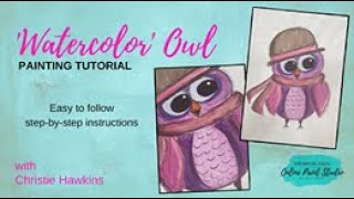
In this instructional YouTube video, Christie Renee Hawkins of The Social Easel walks viewers through creating a whimsical owl using a mixed‑media approach that treats acrylic paint like watercolor. She begins by showcasing her recommended mixed‑media pad and a range of paints—including Artist Loft, Michaels craft paints, and unbleached titanium acrylics—explaining why she chooses each. Christie then demonstrates a light, sketchy outline using waterproof black pens, emphasizing loose, muscular strokes and optional cross‑hatching for depth. She shows how to dilute acrylics with water to achieve translucent, watercolor‑like washes, mixing colors on a recycled palette, layering thin washes, and adjusting pigment concentration for highlights and shadows. After the paint dries, she adds ink accents with waterproof pens, timing the addition to avoid smudging. Throughout, she shares personal insights about her artistic background, her decision to leave formal art education for a profitable teaching business, and her philosophy that artists should keep learning and experimenting. The video concludes with a finished owl, optional stylistic variations, and encouragement for viewers to develop their own style.
Chapters
Hey everybody, it's Christie Renee Hawkins with The Social Easel, and I teach women how to paint with acrylic paint. So today we're gonna change it up a little. This is a mixed media pad. This is one of the products that I recommend you getting. So I thought I would do some different colors today with this, and possibly some different, um, different paint. So most of what we use inside my tribe is just the normal craft paint, okay? I use this on almost all of my paintings, but like my farm animal collection that I have in there, we used some of these paints from Artist Loft. This is a Michaels brand. This is a new color I bought. I haven't opened yet. This is, um, unbleached titanium. So we'll do— this is like a cream color. I love this paint. Yeah, this is just Academic Level 1, and they always have them on some kind of sale. Oh, I already had one over here, didn't I? That's parchment. That's a little bit different. This is like a deep magenta, beautiful color. This is vermilion. So we're just playing with these. There's no color list for this, guys, no specific colors. We're just kind of playing around. And I may even add in some craft paint with it too. Maybe I'll get It's already open. Let's get a little bit of yellow on here in case we want to do some color mixing. And I am using a recycled palette, so if you're seeing a lot of colors on there, um, that's why. Okay, we'll start with that. I may change my mind and add something else. I might put a little bit of white on here just to have it. I am not actually using watercolors. I'm going to use acrylic paint like watercolor. Now, I did say I already put all these paints on my palette, so I don't really want to, um, waste all of this paint. So I'm going to add some water to these colors, and we're going to water them down a little bit, and it's going to look more like watercolor. So for this same template, right, I'm going to do a really, really light outline. I don't want to push down too hard because I kind of want my lines— I just want the basic shape here. I want my lines to be light and sketchy, and I'm going to show you what that means. This is what I call like pen and ink and watercolor is the next technique I'm going to show you. And you need waterproof black pens to do this. Make sure they're waterproof. I traced this one. So we're just doing— I know you can barely see that. I'm gonna get my pins. My very favorite one is in this drawer that is blocked by my sign. So my favorite one out of my pin set is my one that kind of has a brush tip to it. We'll have to work with what we got, but I have a pin set in there and it has one of this— one of them in this set has more of like a felt tip on it. That's waterproof, but we're going to make it work with these pens and then treat our acrylics like watercolor. So we're just going to start with a basic pen. And when I do this again, I'm using a base outline for the template. You can do the same thing, but it's going to be very sketchy, so it's going to look like a sketch. It's going to have multiple lines. I'm not just staying connected. So this is a very loose style as well. So if you haven't sketched before, this is kind of what it's like. If you ever see me kind of like do this motion, a lot of that is like muscle memory. You're kind of like, before you actually put the brushstroke down, or before you actually put your pen down, you're kind of already telling your brain, here's, here's the shape we're going to make, and then you're going to do it. So a lot of like artist sketches, you'll see like this. They're not hard, perfect lines. And you can even take it a step further by, like, you could do, um, like lines along your edge. Like, if you wanted to add shadows there, you could do cross-hatching, which just basically means like going back the opposite direction. So you could do that. Or you could just continue to draw in more lines. But it really starts coming to life when we add the paints to it. So what do you guys think? See how it's like a little bit looser? This is just one pen. You could use multiple ones. I think this one might be a little bit thicker. Yeah, so this is a little bit heavier, more solid line. Can add in some details like that. And you can come back and go back and forth with the paint and the pens. You just want to make sure that when you come back to add your accent marks in, that your watercolor is dry before you do that. So for this, like I said, we're just going to water down those paints we already have. This is that Nik Pro brush set that I was telling you guys about. Trying to see if I have any other ones poking out there. Um, so they— it's several different size rounds. So I'm actually going to leave a fair amount of water in my brush here, and I'm going to come next to my paint, and I'm just watering down that pink. Now with craft paint, it's going to be even easier. This still, I may want to water it down more because this is thicker. This is thicker paint. We'll see how it looks once I get it on there. I may want to switch to craft paint to do it. So see how it's nice and translucent? And then when you're treating it like watercolor, We'll let it dry a little. You can come back, get a little darker around the edges if you like. So it's a little bit different with highlights. So if you want highlights, then you leave that part white. So I can even just grab a little bit more water here and go straight on my canvas with the water. And see how it just lightens that pink up that much more. And I love this style because it's not about like staying in the lines. Everything can go out of the lines a little bit. You can come back and add more lines later if you want. So completely different look, right? Let's go a little darker on the inside. I'm just getting a little bit of water, kind of water it down in the middle a little bit. To me, painting in this style is very, very relaxing. It's almost like coloring, like how coloring is relaxing when you're a kid. I still love to color with my girls. It's just a really simple, subtle kind of painting. Maybe we come around here and make this a little heavier on the inside. Maybe take a little bit of blue with it. Let's make a purple. So I'm just pulling some blue that I used in that last painting, pulling it in with that magenta and making it purple. So now I've got this really pretty purple. Add a little water to it, water it down. So we've created a whole new color with the colors that we already had on our palette. I kind of think I want this purple maybe around here, maybe make it a little feathery. So this is really, really watered down because I don't want it to have a really strong pigment. And you kind of just move your paint around. Oh, we're bleeding a little bit over here. I'm gonna get a little bit more pigment and less water, see if we can fix that edge a little bit. Thinking what color for the hat. I think I'm gonna do this scarf kind of a hot pink. So these colors are all in the same kind of color family, which you can also do in your paintings. You don't always have to have a big bold contrasting color if you don't want to. To add a little bit of brown to this. Just kind of make it more muted color here. I kind of like that. Let's add a little bit more water to this. It's pretty strong pigment right now. And then again, I can just go straight to my water. So we need a little bit more contrast before— or between these wings and that scarf. I always forget that ear, don't I? I didn't even draw it on this time. He may be earless. Maybe that ear is tucked up in there. I'm going to tone this down a little bit over here again. Kind of gives it more of a wine rustic color there. And your little owl can be whatever color you want. These are all little make-believe animals we're playing with right now, so we can make them whatever we want them to be. I think I'm going to make his wings stand out a little bit more, so I'm gonna get some of that magenta that I really like. A little bit of water here, and we can come back and make that a little bit stronger there. Um, now the big decision— the hat. The hat— what do I do with the hat? I don't know why it's always such a hard decision for me. Maybe I just don't like any of the colors on my palette for it. You guys got any grand ideas for me? Should I keep it— I guess I could keep it pretty neutral again and go with brown. So as an artist, um, and I don't have a degree, I have 7 years worth of college in art but no degree because I actually chose to quit and start this business instead because it was more profitable for me than going into further debt and becoming a graphic designer, which is not really what I wanted to do. Um, so I started this business instead. Um, but I think we never quit learning as artists because, um, like Helen was saying today, she— like I said, she's painted longer than me, but she said, I still learn things that Christie has shown me, techniques that I didn't even know existed, you know, different ways to paint, different ways, um, the words being used that are said that translate to different people that can change the way that you create. And myself, like, I'm in other creatives groups and courses and different things because I'm always continuing to learn as an artist. So that is my personal opinion, is like, you can always learn, you can always change, it can always inspire you to do something different in your art. Yeah, grays would have been pretty too. I kind of wanted to keep this one. I didn't want to do the teal. I have that on my palette, but I kind of wanted to keep this more, um, a softer tone. And even with this, I kind of don't like how much pigment I have in there. I'm going to water it down. A little bit more and even take some off. And then it's just smooth it back out again. And then once this is dry, I'm still going to come back with, um, my black pen and add some things in too. All right, I'm thinking I'm about done with the color. Trying to decide if I think maybe I'll add a little bit more purple down here. I kind of like this purple up against the wings. So see how you can just kind of keep layering? You can start out thin, and if you decide you want to add more color to it, you can come back and add more color. I think I want to do the same thing around the eyes here. I think I like that contrast. You guys like the contrast of the purple and the pink? Oops, I touched a little bit of black there. Let me see if I can get that really quick. So I'm just using my paper towel where it's— that black is really, really wet right there, and we're just gonna dry that a little so it doesn't blend into our other colors there. And these eyes, these black eyes may be a little bit bigger than our other ones, but that's okay. Sometimes I think they're actually cuter with bigger eyes. Now here's the other thing: if you're using acrylics instead of watercolor, you kind of get to cheat a little bit. So if we still want that white dot in there like we had in the others, we can add it in. Whereas normally, if this was strictly watercolor, you would not be able to do that, right? So we can cheat a little bit. So I'm gonna flip this over, checking the battery on my computer here. We got to give it some time to rest here in a minute, and we get to cheat and do that because if you were doing watercolor, you couldn't. So I think I'm done with this one. So this is dry in these areas, and if I want the black to stand out more, I want more of those lines in here, maybe a little bit of the movement on the outside. And these can be messy, like scribble lines. So you can decide how much you want to add in there. And maybe you don't like all that. Maybe you don't want all those extra lines in yours. Maybe you want it a little simpler than that. Again, this is personal preference. Your decision. My goal is to show you all the different ways you can create, and then you find your style, you find what works for you. Can you guys see the, the difference in the addition of the, the lines? This one does kind of look like Sherlock Holmes to me. I feel like it's a guy. I feel like this is a boy owl. Maybe he needs a little pipe. Maybe I want some crazy lines up here. And all the Type A's scream at home as I'm doing this. All right, I think I'm happy with them. All right, thank you guys so much for joining me today. So that's all I got for you guys right now. Bye!