Whimsical Tree || The Social Easel
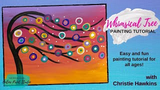
In this instructional YouTube video, Christie Renee Hawkins of The Social Easel walks viewers through creating her signature "Whimsical Tree" painting, the original design that launched her paint‑party business. She begins by blending a warm sunset background using a gradient of lavender, hot pink, coral, and yellow, explaining why certain color combinations must be avoided (e.g., mixing opposite colors that create neutrals). She then demonstrates how to draw and thicken the tree trunk, form V‑shaped branches, and add floating circles with layered accent rings. Throughout, she shares color‑theory tips, such as using complementary colors to tone down hues, and practical troubleshooting (e.g., thinning dried black paint, rinsing brushes to prevent unwanted browns). The tutorial includes recommendations for supplies like mixed‑media pads and specific paint brands, and showcases decorative touches like metallic gold highlights and white polka‑dot techniques using the back of a brush. Christie’s tone is conversational and enthusiastic, emphasizing simplicity for beginners while encouraging personal color mixing and experimentation. The video concludes with a recap of the finished piece and an invitation to use the design for future paint parties.
Chapters
Hey everybody, it's Christie with The Social Easel. We are gonna do the very first painting that I ever came up with for The Social Easel, a little more than 6 years ago, and this is the painting that started it all. Got us where we are today. So I thought this would be a fun one to do with you guys tonight. We are gonna do a whimsical sunset tonight. All right, we're gonna start on our background now. So I'm just— we're basically just making a sunset. So we are gonna do some blending here, and this was if you missed this at the beginning, when I very first started my paint party business, I sat in my kitchen and I came up with this design. This was the very first one, and it's just this really simple sunset. I wanted to make something simple because I wasn't sure— I wasn't confident enough in myself. I didn't know if I could teach people to paint, so I wanted to make it simple, but it's so fun, and I ended up teaching it several, several times because people loved it so much. So I'm, I'm transitioning from like this lavender to this hot pink, and then before I go down to the orange, which is actually coral, not orange, um, I'm gonna rinse my brush. And the reason why is because it still has a little bit of lavender in it, and if I leave that lavender in there and it mixes with the coral, it's going to turn to like this brown color, and we don't want brown in our sunset. All right, so, and obviously you can decide how far down you want your colors to go. Okay, so I rinsed, wiped off my brush really good, and now we're gonna transition to this coral. Now I am moving quickly because when you practice blending— and it really dries quick on a mixed media pad— but when you practice blending, you've got to move quick because you want the two colors that are next to each other to blend and together. So I'm going to get a little pink and a little coral on there at the same time because we don't want there to be like specific lines where you can tell where one color stopped and the other one started. And it doesn't all have to be in a straight line either, you know. I mean, a real sunset varies greatly. I mean, every sunset is completely different, right? So I can go ahead and transition to my yellow because we're in the warm colors now. So I can mix pink, coral, and yellow together, and I don't have to worry about it making any ugly colors for me. They're all going to be pretty even if they mix together. But if I mixed yellow and purple together, that would be bad because they're opposites on the color wheel. And what that means is when you mix opposites, they make a neutral. So a neutral could be a brown, a gray, you know, anything in between. It's a neutral. It's a very, like, not a color we want in our sunset. So you don't want any of that in there. So you want to, you know, I recommend everyone either printing off a picture of a color wheel or having a color wheel. So that you can start learning what colors can go together, what colors can't, what colors can mix, what is going to turn into a neutral, and how to use those to benefit you as well. So like red and green, for instance, they're opposites, which is also why they look so pretty together at Christmas. Purple and yellow look pretty together because they're opposites. So they're complementary colors, which means they complement one another, but You can use them to tone down colors as well. So when I'm working with reds and greens, let's say, you know, I'm doing a painting that has green trees in the background and a red barn, but my green is too bright and it's like holly green and I don't want it to be like that. I want it to be more of like a hunter green. I can mix red into that holly green and it's going to make it a hunter green. So instead of adding black to it, I can add red to it. So it takes a really bright color and it tones it down and it makes it darker. So that's just a little tip for you in case you didn't know that. So you can use them to benefit you. Okay, we're gonna— this black paint was from a little earlier and it's dried up a little, so I'm going to add a little bit of water to it just to thin it back out again. So my Whimsical Tree is gonna start on one side and it's gonna be kind of like it's blowing in the wind. I have to do this part— you guys are gonna have to watch this upside down and then I'll show you. So I'm just gonna start off the bottom of the page and it's gonna kind of come like a hook, and then I'll flip this around and show you the other way. So I'm just going to keep going back into my black paint. You want to have plenty of paint on your brush when you're doing something like this. So this is the first step to the tree. And then we're gonna— this is gonna be the trunk, so I'm gonna thicken this up. When you are painting a tree trunk, this is how you want to thicken it up. Go against the line you've already created and keep going back and forth, up and down, until you get it the thickness you want. You don't want to jump over and be like, oh, I want my tree to be this thick, because I guarantee it's going to be way wider than what you meant for it to, and the black is hard to fix. You can, but it's a lot harder to fix. So I recommend just going back and forth until you get it the thickness that you want. So we want this thicker down here, and then it's going to stay thin at the top. Let me pull this out just a little. And then we're going to add a couple more branches. So whenever I'm doing this, I want this— I'm going to show you guys upside down, but whenever you're adding your branches off of trees, you want them to be like a V-shape. So always think that in your head. It should look like a V when it's coming off. So you're going to start your line inside the tree. Okay. So inside the tree trunk, and then I'm going to pull it out like that. Now these are going to be shorter branches down here, but see how I'll put this right side up. I'm going to thicken that. See how that looks like the letter V? That's so your tree branches are nice and smooth. They don't look all disconjointed like they're just popping out all over the place. And then we're just going to add a couple more. I need a little more water for my black. Now normally I do not add water to my paint, just so you guys know that. I'm doing that because this has been sitting out and drying while we went to eat dinner. Tina, this is called a mixed media pad, which is one of the most important supplies that I recommend people getting. And basically it's like a sketchbook for painting. Have a couple little branches, so— and I'm gonna flip this around and show you guys. No, you're watching me do it upside down, but the paint does not go through it. So you can use watercolor, acrylic, everything. I'm adding some little branches, but what you're gonna see when I flip this back around is that, that tip I told you about always looking like the letter V, that's still gonna stand true even when I'm pulling the lines out on these branches. Fun little branches blowing in the wind. That's kind of how I think of them. Now I can leave it like this because the next thing we're going to do is add our little circles on here. Isn't the background pretty? I love this— these sunset colors. So the next part of the painting— let me refill some of my paints here. So I'm just refilling— I feel like a sneeze is coming— my colors a little bit. A sneeze, a yawn, I don't know. And I'm adding— so we want these— I'm going to be adding circles that are kind of floating off of the tree, and, um, and they're just— they're going to start kind of heavier over here and then just kind of drift off to the side. But I want to add— like, I'm adding this like teal mint color, trying to decide if I want to add a blue or not. I may just stick with this. This is just a number 2 round. Okay, so I've got the same colors I used in the sky, and then I grabbed some of this teal mint color. And I pick one color to start with, and I'm just gonna start doing these little circles and just kind of start in the middle and just kind of swirl around. So when I'm adding these circles on, my black is already dry, so I know I can do that without it pulling that color in. But you do want to have some overlapping. That's going to add depth to your painting by having some overlapping in it. So I'm going to leave that for now. We're going to switch colors. I will definitely be resting tomorrow, I can tell you that. So I do want to pay attention to placement of my colors. This is a number 2 round. Like, it wouldn't make sense for me to put yellow circles down in the yellow because they're not going to show up very much. So I can still get away with putting them right here. That'll have enough contrast, but they're gonna look really pretty up higher with the pinks and the purples. Can maybe have one here, and we're not just gonna leave these solid circles. We're gonna be adding accents to them. To make them even more fun. All right, so we did yellow and teal. Let's do some coral. I don't know how much I like this color up here. I don't think I'm gonna do very many of those. It doesn't stand out enough. We may have to come around with a different color on on that one. All right, let me grab some more of the hot pink. Let's see. I know because I only have so much room in my house. I have like 100-something paintings downstairs. That I need to sell. But sometimes you just don't want an extra canvas laying around. Like, if you're not painting it for yourself to hang on the wall or something like that, then you may want to paint it in the mixed media pad. And here's the other thing I love about it is if you do like something in here— now I have an 11 by 14, and I like that size because it's an easy frame size, so I can take something out of my mixed media pad and then frame it once it's dry. So you still have a piece of art without it taking up all of that room. Oh, here's what we got so far. Oh, I need to add purple. I'm like, I feel like I should have another color of circle on here. And we'll probably do some white too. All right, I think I'm gonna leave them like this, and then we're gonna start adding in some accent colors. All right, so we are going to start adding some accent colors in here. So I am going to give this a quick blow dry really quick just so my colors don't mix. Uh-oh. There we go. So here's how I add the accent colors. Let's start with— let's see, I did the teal first, and these are not all going to be the same, but I'm just gonna come in the side of them and just put like a little circle inside. And I'm gonna change these up. Like I said, not all the teal are gonna be exactly the same. Let's add some white into some of our other colors too. This is where I think it gets fun. You start seeing these color combinations come together. Mm-hmm. And some of the circles can be bigger, some can be smaller. They don't all have to be an exact size. So let's go to— what color do I want to do next? Let's go to the bright yellow. Um, maybe here. Then we'll switch to teal. So you guys kind of see what I'm doing, just kind of adding these accent colors in different colors. So using the same palette but just changing it up a little. What do we need? Purple. And I think I didn't do hot pink either, so we'll do some hot pink. This is called the Whimsical Tree. It is very whimsical. And then we've got hot pink left here. You guys notice the difference even adding that little circle on the inside, how it starts making, making them pop? All right, I think they're all filled in. Oh, I missed a couple up here. Let's do hot pink here. I think we'll do teal on this one. Did I miss another one? I missed another one down here. It's easy to miss these. Oh, I missed another teal one. So we've got our little dots in the middle. Now we're gonna start adding the circle around the outside. So I'm just gonna kind of lightly line these so they have like a little ring around them. And again, we're just going to kind of alternate colors as we go. All right, so I've got some white that we're doing now, and this is gonna be good for like this one. This was kind of getting lost up here because the pink was on pink, so then when I add that ring around it, it stands out a little bit more. Let's see, how many more do I want of the pink— or white? I can't get my colors straight now. What do you guys think so far? You liking it? I'm thinking I may add a little gold on this one too. All right, what color rings did we do? We did that. I do kind of wish I had a blue now. Where do I want to put this other pink one? Maybe it'll stand out enough here. I think I need another color for the rings. I need another color. I need a blue. This will be pretty. It's a really dark blue. It's called Peacock Blue. But I love it. It's bold and it's different, but I think we're gonna like this. I think this is gonna give us the contrast that we want. Tina said this would be fun for a paint party. So yes, Tina, I was sharing in the beginning, this was the very first painting I ever created for the Social Easel. So this was the painting that started it all, the very first one I did as a public paint night. And then we did like a different version, so we had this color sunset, and then I did a nighttime one where it was like blues and teals going down, and we changed the colors up on it. So it does make a fun paint party. Okay, what other colors do I want? I'm still not quite happy with my colors, but we're gonna make it work. I think I'm gonna do a little color mixing. I'm gonna take some of this hot pink with this blue, kind of get like a plum color. It's a darker purple. That's what I'm needing. I need a darker purple. Yeah, Melissa, the Peacock Blue is from Michaels Craft Smart. It's their brand of craft paint. You'll see it when you go down the craft aisle. So you guys see what I'm doing right now, just mixing those colors together. So you can make your own colors. Don't get too hung up on the brands and the colors and all that. I do give you color lists for all of the paintings, but I try to get you guys to not be so worried about that because I want them to be your own, and it's really fun to mix your own colors too. Like, this is— I'm gonna lift this up in just a second and show you guys, but this is a really pretty purple that I just made. didn't come out of a bottle, can't buy it in a store. It's only on my palette. Can you see the purples and the blues? And then I thought it would be fun— I've got this really metallic gold. We're gonna add a little metallic, a little bit of metallic gold around some of these. I love adding gold to almost everything. Oh, I don't think I did any yellow circles either. I may need to do some yellow. The gold is probably gonna take two coats for it to show up the way I really want it to, but it's still kind of pretty. And you could add gold into your tree if you wanted to. Do you like the gold in the tree? And if you did this and then you didn't like it, you would just let it dry and paint right over top of it again. Where am I missing? Circle. Starts being like Where's Waldo trying to figure out where your colors are. Maybe add— no, you know what, I want teal around this one. So that's about it. I think I want to add some little white polka dots with this, so I'm going to show you guys a little trick that I do. If you want really easy polka dots and you tend to be heavy-handed and you're worried your bristles are gonna push down too hard, flip your brush over. Use the back end and you just add your little dots and they come out perfect. It's a great tip to have when you're adding snow or you just want some fun little dots on something. This is the easiest way to do them. Can you guys even see that? It's kind of far away. I love the white dots on there. I think that made it even prettier. So I'm gonna leave that up for you guys. I hope you guys had tons of fun. So much fun. It was fun painting with you guys so much this week. I hope you enjoyed it, and I will talk to you soon. Bye!