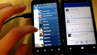
David compares Facebook on Android and Windows Phone, showing how Windows Phone uses pivot controls from the main screen while Android limits them to sub-screens. Status buttons stay in Android's top bar but hide on scroll, while Windows Phone keeps them in a persistent bottom Charms Bar.
Chapters
Hey guys, this is David, and this is a video comparing the two Facebook applications. Here we have Facebook for Android and the Facebook beta for Windows Phone on the right here on the Nokia Lumia 920, and on the left we have the HTC Evo 3D. And as you can see, they're fairly similar. Each one has the friends, friends option, the messages and the notifications icons along the top. And then on the left there's sort of the menu. The menus are very similar. Slightly more of a Windows Phone feel on the one on the right and more of an Android feel on the one on the left. And there's some pivot— there's some pivot controls as you can see. Pivoting on Windows Phone works from the main screen here as well, whereas on Android it doesn't work other than pulling from other screens. For example, if you go into the list of online friends, pivot only works like that. Also, you can see the status, photo, check-in buttons are up there and they disappear when you scroll down, whereas here these same buttons are here at the bottom on the Charms Bar and they stay in the view no matter where you are on the page. Both have a slide down to refresh, and they're very similar in a lot of ways. So what do you guys think? Do you think the new Facebook application is too much of a departure from Metro UI, or do you see the unification of Facebook across multiple platforms as a good thing? Let me know.