Leaked GoldenEye 007 XBLA beta (2007) - Differences from the Original N64 Version (1997)
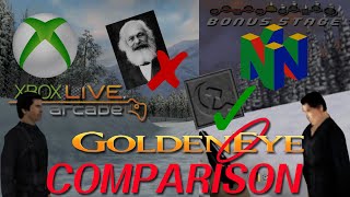
In this episode of the Bonus Stage series, the host explores an unreleased Xbox Live Arcade (XBLA) beta of GoldenEye 007 from 2007 and systematically compares it to the original 1997 Nintendo 64 release. Using an in‑game tool that lets him toggle between the two visual versions, he walks viewers through menu and option changes (audio sliders, 16:9 aspect ratio, cheat menu, Xbox‑style UI), graphical overhauls (high‑poly character models, new textures, altered lighting, and time‑of‑day shifts), environmental modifications (added trees, a restored distant island, new skyboxes, and altered water), branding and texture edits (removal of the Banco logo, changes to Soviet symbols, unchanged graffiti placeholders), quality‑of‑life tweaks (on‑screen indicators for missed items, green doors on the train for clearer navigation), and numerous placeholder or unfinished assets (unchanged graffiti, water textures, some missing textures). He also notes developer‑related Easter eggs (replacing Dr. Doak with Dr. Rachmanov), speculates on why certain features (the visual toggle, multiplayer usage) might have been omitted from the final product, and comments on the overall feel of the remake, concluding that while the visual upgrades are impressive, the beta feels unfinished and may never see an official release. The video ends with a call for likes, comments, and subscriptions.
Chapters
Bonus Stage! Hello and welcome to another episode of Bonus Stage! Today we'll be taking a look at the unreleased XBLA version of GoldenEye 007. Also, this screen is hilarious. Anyways, we'll be looking at this leak and dissecting the differences from it versus its original release on the Nintendo 64, and luckily for us, we actually have a tool at our disposal that'll help us flip between the remake and how the original one looks in real time. So without further ado, let's get right on into it. First off, note that it says "closed beta, not representative of the final product." And here are some examples of character models that are original and then switched to their new versions. So here we are on the main menu. One of the things I want to point out is if you go to Help and Options, you'll notice there's other settings under here. There's control settings for actually changing your controls. I think some of these placeholder arrows are really funny with these eyeballs. I'm sure these aren't final, but they look, they look really funny here. But the thing I want to show you is these other settings. You can actually change the music volume, you can change the sound effects volume. It's really awesome actually. And there's some other options here too. So I've changed screen ratio from 4:3 to 16:9, and that kind of makes everything look nice and not all stretched out. And so if you do end up getting a copy of this, I would recommend grabbing these settings and changing them to this right away. So pretty cool stuff right there. Uh, let's see, anything else noteworthy before we get into the game? I'm not necessarily sure. There's a nice cheat menu here, um, like in the old game. There's some similarities in multiplayer. There's, uh, it's changed a little bit for the Xbox UI, and, uh, it's— you'll notice some differences there also. So, um, we'll get into the game and I'll show you a few things that I found pretty entertaining, um, some of the differences. Alright, so the first thing, the most obvious thing to point out, is if you hit the RB, the right bumper, you can actually toggle between what it looked like on the N64 originally and the remake. And the difference is staggering. I mean, you might look at this and say, you know, like, wow, this looks great, but you know, it kind of looks like how I remembered it. But then as soon as you switch back to how it was, you'll notice it's night and day. And I guess they use the original resolution too because, you know, everything looks a bit fuzzier, you could say. And it's funny how like the lighting makes a huge difference in the— even changes the time of day in some cases. I love this toggle. It's hard to say whether or not they would have included it for the final game. I don't— I have my doubts for a few reasons. One, I don't think that they would include this because it's not included in the Perfect Dark remake they made for Xbox Live Arcade. And it seems like if they were gonna do the idea of this game, they would have done it there too. So that's just kind of speculation, but that's the main reason. Another thing that I think is, you know, during multiplayer you can use it. I feel like it's— that's prone to abuse a little bit. So I don't know that they would actually keep that around for that reason, because— or they maybe would turn it off in multiplayer, but I just don't really see that happening personally. But yeah, hey, if someone has a credible source that says otherwise, believe them, not me. That's just my kind of conjecture and my guess. So we have some interesting differences here, like for example the CTon image replaces the Benko one, and I'm not exactly sure like why they replaced some textures. We also can see something similar here, although this says CTon, and it seems like they changed this unique texture, which is pretty interesting. The lock changes completely in this design here. So yeah, it's pretty cool how they've changed it. They've even changed the environment, so they've added trees here that weren't here before. Before it was just like a basic water, but now they've added this distant island that was removed in the original game. So let's get a better look at that actually, because that's the Definitely interesting to look at. Okay, so this distant island was something that was in the original, but they actually cut it. But if you use a special action replay code, you can actually turn it on and see it. So it looks like they started to add it back, which is pretty cool. So here's another really good difference of the background. You can really tell. So if I go like this— oops, well, I didn't really want to do that, but still, look at the difference. Just, you know, on the textures, it's pretty phenomenal. So here it is in the new one. Here's the old. The new, the old. You see how the textures are all different. So yeah, pretty cool. Everyone's favorite multiplayer level. So I was expecting Rare being Rare to put something in the toilet as an Easter egg, but they look pretty— they look pretty standard to me. Nothing crazy in there. Yeah, this, this, this remake is just so good. It's such a shame that it can't be released in an official capacity, or at least it isn't yet. Hopefully someday we'll get it, but I'm not holding my breath. So the NPCs look worlds better too. They really took every model for all the characters and they replaced them with higher poly more detailed textures, and it looks super good. Every character in this looks worlds better than they did. Also, check this out. You'll notice this person who used to be named Dr. Doak, which was named after the Rare developer Dr. Doak, who worked on the original GoldenEye development. He's been replaced with Dr. Rachmanov. I could be saying that wrong, but Dr. Rachmanov is based on Sergey Rachmanov, who was the senior artist at Rare at the time the port was underway. So here's Alec in the old style, and here he is remade. Looks great. He looks a lot more like the actor, that's for sure. Although, you know what, I'm gonna give credit to the old model. The old model looks pretty good too for the old actor. Also, check out how realistic James Bond's hands look. They're almost eerily too realistic with the detailed texture work. I've also noticed that a lot of the green boxes have been replaced by yellow boxes. I'm not entirely sure what the reason for that was. We also have writing added to the top of boxes instead of just on the sides. The typeface of the number 2 here is changed. A lot of vibrance added to this, which makes it look a lot nicer. That's kind of a trend for a lot of these textures. Is they would take more drab, flat ones and make them more dynamic and increase the contrast. And man, they look great.
They look super great.
Again, look at the background. It is staggeringly different. We have walls of trees versus actual fences, a layer of trees, and these mountain ranges that look just gorgeous. It seems to literally change the time of day. You have this dark orange sky. They have like this blue wispy cloudy sky. It is just beautiful. Also, the, the differences on these NPCs have changed quite a bit. They used to have like some, like some kind of visors, and now they have just a hood going on. I would say the thing that hasn't really changed is how the game feels. If you've played the Perfect Dark remake, you'll have an idea about how this translates with a bit more modernized controls, but everything really feels the same like it did on the 64 version. But you have dual sticks to control and you have just more use— utilization of the buttons. And it feels really satisfying to play. Here's another example of those locks being a bit more detailed and adding a little keyhole, which is pretty cool. Even though in both cases you just literally shoot them off. Check out this hammer and sickle icon. Obviously an icon from the Soviet Union, but it's a lot more detailed and actually is flipped, which is interesting. And over here we have a bit more detailed sign here. This shows like a voltage and pointing at a person. This is just a simple like kind of voltage icon. So that's pretty cool. We got those, that improvement there. This box has been— has interesting added text, a lot more detailed. And again, that brand name Banco is gone. Interesting that they've gone out of their way to remove that twice now from this playthrough so far. Now this got quite a bit of changes. We have this top section used to have two lightning bolts out of the top, and now it's sort of a circle, an eye symbol. The key also looks a lot more detailed. Interestingly, this map doesn't change a whole lot. It just gets very, very clear. I'd say the biggest difference is the globe icon. The globe icon is definitely the clearest here. Some odd texture glitching here, which I'm sure is just part of it being a beta. But this has changed, this is quite a bit, this looks very much unfinished, but it is quite a bit different. So this rocket looks a bit different, a bit more detailed. The pattern on the back is very different in this section. They've also added a little— oh, I see. They didn't add the symbol, they just moved its place, which is pretty interesting. I'm not sure why they did that. So the water on this level doesn't appear to be finished. We have an actual water texture in the original version and nothing to replace it so far for the new one. I'm assuming this blue is just placeholder until they figure out a good water texture to use. The original one had a bunch of geometry here, which was a little interesting, and they removed it for some reason in the new version. They kept this one texture the same, which is interesting. They also have these, uh, pseudo doors here, which would always trick me as a kid. I thought you could go inside of them, but they didn't serve any purpose. So they replaced them with this blank sheet. They also made these more standardized, which is interesting. Got rid of the vents. So now what we have is the same area as before but a different time of day. You saw how the entire sky is just totally dark here, but here it's pretty actually similar, but the backgrounds are retaining a lot of what was there before. [FOREIGN LANGUAGE] It's definitely less visually impressive than the previous area. But since it's dark, it gets away with it. This level is probably the most similar to its predecessor in terms of visual style, just because everything's so dark. This helicopter got a serious upgrade texture-wise. The ground looks a lot better too here. Less flickering. This is the old Natalia.
This is the new one.
Old Natalia, new Natalia. Old computer screen, new computer screen. Wow, I see. I swear, right here, that looks exactly like Donkey Kong's face.
Wild.
Another quality of life fix they've added is if you miss something very important on the ground, it'll actually add a little indicator like this to direct you where to go, which I find interesting. Really big differences here with some of the statues. So in the original, these pillars look like this, and in the remake they look a lot more detailed and are actually Completely different models too. Both levels are dark, but I definitely prefer the new version. They did a good job of adding some light lighting cues. Otherwise it's pretty, pretty bland and drab in comparison. But they did replace this more interesting hammer and sickle with this generic column, which seems to be holding up these lights, which aren't in the final version. The lighting is, however, welcome. This face is barely— is barely understood as being a face in the original, and now it's a lot more clear. Also some textures on this. They added some color. They inverted the colors, it looks like, for the star, which is interesting. So they kept some of the— some of the communist imagery, and they left others out, which is interesting. Here we have an illuminated section, which looks really nice here. Here we have very simple cylindrical columns replaced with some— a lot more detailed broken ones. They clearly put a lot of work and love into this. We've actually lost this— I'm not sure what this says. Is this USSR? Is this KUP? I can't really tell what this says, but that's been completely omitted in the remake, so there's no letters there at all. We do have a hammer and sickle here. That have been retained in the remake, which is nice. This pillar stayed pretty much the same. So now we come to— so now we come to Valentine. It looks like this in the remake. He looks like this in the original. It's really impressive how great these NPCs look. They definitely swapped out the models, made them higher poly, added some detailed textures, and it really goes a long way. Really goes a long way. Looks like we have— we've placed this very boring block with some more textures and some— looks like some bullet holes, which is pretty cool. Not sure it was here before. Some kind of— it's very hard to make out what this texture used to be. Here we have the lighting. This area looks really nice. This is one of the most interesting changes. We have these very simple— these simple blocks on the new version. You might think this is from the old version, but no, this is from the old version. It's a lot more detailed. It has like this saw blade. It's got— it's got this, the— all these saws here. And some kind of, some kind of sign there and a strange, strange poster there. But they've been replaced with a lot more generic blocks, which is kind of disappointing. I wish they would have done the proper treatment on this part with the replacing these models with something more interesting. But the light really helps in this area, make this a lot more interesting. We've had this, we have this hand shape change from an open palm palm to a pointing finger, which is interesting. And then in the remake, we have some more hard-to-decipher textures on these blocks. It looks like artwork, but I can't really tell. And they've been replaced with generic cinder blocks, it looks like. This previously very unimpressive statue has been replaced with a pretty nice looking one with good lighting. The lighting makes a big deal. This hand also— the statue looks a bit different also. It's a lot better in the remake. Well, this level is still incredibly dark. It definitely got some welcomed lighting adjustments and adds. I would say makes it a much better level to navigate overall.
Mischkin in the old one.
Mischkin and the new one looks really good. Another interesting change, they change this BJ to an LB, which I'm not entirely sure why they did that, but it might be to avoid using this abbreviation in general. So in this room we have these posters and apparently newspapers replaced with these, which is interesting. So it used to be like a newspaper or something, and my guess is this was probably too much to recreate, so they picked something a bit more, a bit more generic with this advertisement about "Get your tickets fast!" We have this changed to a generic star, which is interesting. I wonder what the original texture was supposed to be here. It's not this replaced with a wanted image. I don't know, that's a reference to something or someone, but that seems pretty interesting. Hmm, I wonder what those are supposed to be. So this more detailed area seems to add something on the ground too, not just on the wall. I'm not sure if this is dirt or blood or what this is. Here we have a similar advertisement to replace the newspaper like before. Another one that's a bit easier to see but still pretty hard to read has been replaced by this: "Lil' Chris Woods." Another advertisement. One thing I find interesting is most of these are replaced, but this texture is the same between versions. One really big difference are these bookshelves. They're a lot brighter and a lot more detailed, which is— which really pops. We have a pretty crude map. Replaced with a much more detailed one. Now this is pretty interesting. We have a map and an actual photo, looks like of Stalin and something else, replaced with just a generic map, just a map of Australia. This is Africa and it looks like Europe. And then here we have this strange portrait. I don't know who this is referencing, if it's just some random photo or what. Then we have this replaced with this fellow. Whatever that used to be. Then we have one more portrait somewhere else. I'm trying to think of where it is. So we have this photo replaced with this fellow. We have this photo of freaking Karl Marx replaced with this fellow. I didn't even realize that was in the original game. We have this replaced with this portrait, which is pretty interesting. This image is replaced with this fellow. These are replaced with this. You actually— they're detailed enough to where you can actually read them, which is interesting. Looks like someone's workout routine, and this is just upside down, which is hilarious. We have an update. We have a style change from a wooden brown door to The wooden green door. Feel like this whole town has gotten a makeover, and man, this city looks a lot better with this new fresh coat of paint. I think the green really works here. The mines are a lot more distinct too, so you can actually tell what they are. Oh, sorry there, friend.
RIP.
A lot of these textures didn't change at all, as you can see. I'm sure they were just placeholders until they were able to get to it, which they clearly didn't before. This alpha build was done. So here's an example. So here's the original texture and here's the new one. They're the same texture, obviously the background's different, but a lot of the graffiti in this level has not gotten the HD treatment and it's exactly the same. This is one of the most distinctive graffiti I remember as a kid. It hasn't changed at all. Neither does graffiti. Even the R, the VR, backwards R, has not changed on this. And curiously enough, this seemingly reference to Disney or Mickey Mouse has not changed at all either. You think they might have censored this or gotten rid of that, which is pretty interesting. They kept it. It could be a big oversight. They haven't bothered to replace any of the graffiti elements yet, so that's entirely possible. This psycho text is the same. This looks like a knight is the same. Now we have one piece of graffiti, it looks like, that is— but has been replaced. Although I'm not entirely why the Kara one's been replaced. I don't know what's been replaced with. It's like some kind of inverted square texture. This is probably some placeholder or some kind of mistake, my guess. These have not been replaced.
This has not been replaced either.
Interestingly, over here the Carl texture has not been replaced, so that must have been an experimental location for them to try, uh, new textures. Looks like these are all the same too. The train is significantly more interesting to look for also, and notice they made just these doors green to make it a lot more obvious where you enter in the train, which I think is a really awesome cue from a game design perspective, because before you'd reach this train and you say, well, I don't really know how to get in, and now it's very obvious. You just open these green doors and you jump in and you're done with the level. So I think that's definitely a good change. Pretty happy with that. It's got a lot more detail and a lot clearer to see like what you're supposed to do here, which I also really appreciate. Interestingly enough, it looks like the train went back to its mostly green design after I mounted side of the ship, or outside of it. Interestingly, the numbers have changed on this part, which is pretty fascinating. I'm not sure why the numbers changed here on this train. Well, they're consistent, that's for sure. The ground's a lot more detailed. You can tell that there's actual moss and more than just plain old dirt, the poop brown, the classic N64 poop brown dirt. There's a lot more definition to the it. It just makes it feel a lot more like a forest. Big upgrade here for as far as environment goes. Also this cool light effect coming from the top, which adds a whole dynamic to the forest and makes it feel a lot more beautiful and like a forest. So this is what Xenia looks like.
This is what Boris looks like.
When it came to these computers that had like generic scrolling text, it's more generic scrolling text but with some actual names. I don't know if these are references to anything or just random names, but you can actually read them now, which is pretty cool. You can also see the actual keys on the keyboard, which is pretty wild. Notice the old Windows 95, 2000, XP the pre-era Windows logos on these too. You can kind of mic them out a little bit. This area's gotten a similar treatment from a change from this kind of electric shape to this generic I1. And of course the map is a lot clearer. Another dark level turned slightly more tolerable with the improved lighting of the remake. This area has changed a lot, got more detailed. Interestingly, in this area the water texture hasn't changed at all between the remake and the original, so it's mostly the same there. I'm not sure why they didn't just use the water from the dam level as a placeholder at least, since it was at least animating and looked pretty good.
Good.
The old doors and the new ones, obviously looking a lot more sophisticated this time around. This level has benefited a lot too from the environment change. Look at the background difference. Instead of this like empty blue void, you can actually see a surrounding with the dish on the bottom and the forest and everything around, which is pretty cool. And these bizarre yellow clouds aren't there. Of course, we have no clouds at all, so be nice to have some kind of skybox here instead of a big blue void, but this is definitely still an improvement. Yeah, Alica, where'd you go? You want to come down here and fight me, or— Alec? Oh boy. You okay there, buddy? So, uh, we have the original one here looking a little odd. Not sure what happened there. Then the new one, you'll notice that it literally has— it's literally not even connected to the helicopter. So pretty interesting changes there. I haven't gone to the trouble to unlock the last two locations, Aztec and Egyptian, but hopefully at some point I will and I can observe the differences there at that point. The other one I want to point out obviously is the button changes, kind of like the other XBLA titles that Rare released. Yeah. Something funny I want to point out in the credits too is that the background and the ground textures do not change at all for the credits scene. There's absolutely no difference there except for the lighting, which makes it look different, but obviously looks like it's just the same texture. So there's the Dr. David Doak reference. Interesting they removed his name from the game. Produced by Rare and presented by Microsoft at the end. At the very end, we have something a little bit different too. Bring GoldenEye back! MGM/Eon. Pretty interesting stuff. So there we have it. Hitting achievements or going to return to arcade either crashes or just does nothing in this case. Well, I hope you enjoyed this video. I certainly had fun making it. If you got value out of it, I'd really appreciate a subscribe, a like, or a comment if you are so inclined. Until then, I'll see you next time.