THIS 8-Figure Shopify Store Design Will EXPLODE Your Conversion Rates & Sales! (Step-by-Step) 🤑
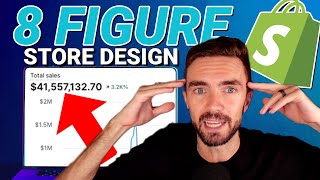
Devin Zander walks through how to design a Shopify store that generated over $40 million in sales. He covers homepage, product pages, cart, checkout, and collection pages, focusing on product images, social proof, upselling, and pricing to boost conversions.
So you've got your products, you got ads, everything's good. But your website sucks. Your Shopify store, it sucks. People see it and they go, eh, gross. I don't wanna buy from this guy. What do you do? Well, here's the deal. We've done over $50 million in sales on Shopify and today I'm going to take you behind the scenes of a 40 plus million dollar Shopify store and show you what goes into the design of a store. What pages even matter, where should your focus be and how you can design your store to make as much money as possible. Guys, usually this message is brought to you by Kratom. Oh my God, I almost spilled my drink. But today a Coke Zero and Kratom. And buying this Coke Zero was a little funny because it was like I bought it on a Friday night, everyone's in there buying beer and stuff and I'm like, can I get your super sized Coke zero please? But it makes the recording so much better. So all that being said, let's get into the design of an eight figure store and how you can replicate this on your own store so you can make a bunch of money. All right, real quick, the store is paws.com, p A W Z dot com. Here's our dashboard. 41 million sales in total. Let's go. And if we look in like the past 365 days we've done million dollars in Sal. So good stuff. Now what I've got here is sessions by landing page. So which pages on our website are even important? So I can tell you where to look, which, this is how you tell, okay, you can come here, you can see how many visitors a page has, how many ads the cart this leads to and how many reach checkout. So you can kind of see which pages are the most impactful on your website. Few things we're going to notice right away. This is where you should be focusing if you want to make a bunch of money. Your homepage. This is obviously okay. Most dropshippers, they've only ever been told to focus on their product page, which is ridiculous because your homepage is always going to be the most visited page of your website. Unless you're running some like direct response marketing thing where you only have a landing page. But I don't do E commerce that way. So if you're looking for info on that, you're on the wrong channel. Anyways, so the pages we should be looking at, guys, very obvious. We need to be looking at the summary. By the way, this tab all the way on the left. This is going to give us a basic overview like of the page type. So we're going to be doing some generalizations here. Our homepage is number one. Collections are huge. People sleep on their collections and their collection pages look janky as shit. Let me ask you, do you plan on having more than one product on your website? And if you want to make tens of millions of dollars, I hope the answer to that is yes, because you need to have a high quality customer lifetime value to do that. And you need to have more than one product or at least a subscription based product to do that. So if your product's not a subscription, you better have multiple products. Anyways, so homepage collection, of course we have our product pages, we have our cart, and we will have a couple random pages such as the checkout and of course the about us page. These are the main pages, so let's go through them one by one. The most important pages are going to be your product page, your cart page, and then your checkout page. Because this is your sales funnel. This is, you're obviously running most of your traffic to a product page. We run traffic to collection pages as well. But for our lead products, we're running your product pages. So people are going straight to the product page, then they add a product to cart, so the cart page, and then they check out. It's such an important stat that Shopify displays those three stats and calls it your checkout funnel. Right. So let's start with the lead page. This is where people are hitting when they click on your ad. This is without a doubt the most important page because people will make make a snap judgment decision on whether or not they want to buy right when they hit this page. Man, I hope I'm recording. Okay, few things here, guys. Number one, you want to have an attention grabbing product image. If you're selling apparel like we are, the image is the most important part, okay? And it needs to connect with your target audience right away. For every product on our store and we can go look at our homepage and we can look. We have what women who our target audience want to identify themselves as. Okay? So our target audience is like women between the ages of 25 and 50 and they want to see themselves as this like kind of countryish, beautiful girl. The avatar you have in your product image should be who your target audience identifies as the best version of themselves. On the flip side, if you were running a store like aaf, which I don't believe they do, a lot of people like what's it called? Models wearing their shirts. But you would want to have someone so they sell American patriotic gear. You would want to have someone who looks very patriotic. So like slightly muscular, blue collar American with a beard. Right. That is the target audience. Oh my God, look at this. What did I say? What did I say? Called it. You want to have that picture that your audience identifies themselves as. Okay. And that's what we have here. And it catches their attention. Another thing you might notice is we're using a lot of AI generated art on this. If you want us to teach you how to make models, wear your clothing or use your products with AI generated art, comment below, let me know and we will make that video. So big thing is the product image. Very easy. Next up, you want to have your product name, obviously. Just don't get crazy with it. Don't do anything wild. Just describe what your product is right below that. You always want to have social proof. If you do not have social proof yet, do not worry. It is not the end of the world. We started with zero social proof as well. Crazy, I know. It just doesn't magically appear when you make your store. Why not? God, please, you've forsaken us. But you want to have social proof. So at the very least, install looks. And if you haven't yet, go see our top Shopify app for 2024 video. It'll tell you which review apps to use as well as some other things that we'll get into as this video goes on. So you need to have your social proof, your price. By the way, a lot of people are selling way too cheap. Like people are selling hoodies for 40, 50 bucks. That's insane, dude. Respect yourself. If your prices are low, people will think your product sucks. If you raise your prices, they people associate that with quality. I know it's crazy for your SKUs, your colors and so on. You want to actually show the colors. Don't just have the names, show the colors. Give people a visual representation. This increases conversion rate. We've tested it and you know, obviously have your variants tied to the proper images. Now I have this AAF nation pulled up because I wanted to show you something else, which is that typically if you have variants that are different like SKUs, like if you have hoodies and you have tank tops and you have these all as variants on a single product, it's the same thing. You want to have visual representations of what the product looks like. Okay? So you don't just want to have something that says hoodie you want to literally show a product or an image of a hoodie. It doesn't have to be the literal product image like these guys do. I imagine this is custom coded and it's tied to the variant image, but at least have an image. And if you need our help with that, we do custom development because we are a theme company. So, you know, hit us up too. But display what the product actually looks like in the variant selector. So that's the whole reason I had this pulled up for pause. We have the hoodies and the T shirts separate and stuff. So, you know, a little different. We're not doing it that way. But if you do have the hoodies, the T shirts, the long sleeves under the same product, make sure you show the image. Close that, done with it. Size guide is not important. We have little checkboxes that we always put here. This is free money, okay? Not everyone's going to take the checkbox, but adding items to increase your AOV right here on the product page is a must do. Literally free money. So boom. Make sure you do that. And of course, watch our top Shopify app video if you want to see the plugins we recommend for upselling, cross selling and so on. You want to have tab descriptions. Super easy to do. There's a bunch of plugins for this also. Avatar. Shopify theme. Just saying our Shopify theme has this built in. We actually aren't using Avatar on the store because this is a store that we acquired. It wasn't one that we built. We acquired it and took it over. So you have your description. You always need to have your shopping or sorry, shipping information specifications, like what the product is made out of. And then we have our guarantee and frequently asked questions. Basically any question that would be asked or that could hinder someone from making a purchase, you want to have that here. You don't want someone to hit up your support and say like, oh, what's this size guide? How does it fit? Because by the time you get back to them, you might have lost the sale. So just have all these questions on your product page in tabs and then of course we have our mission. And the reason we do that is because at Paws, we donate money to charity and it helps increase conversion rates for us to have this. If you don't have a mission, if you're like literally in this just because you want to make money and sell T shirts or like drop ship crap, then you don't need to have your mission. But if you do support a good cause, which obviously with great wealth comes great responsibility, Uncle Ben, right? Delicious. It's good to donate to a cause. We donate to shelters. We also donate to the Veterans of Foreign Wars. So cool stuff. So that's all that. And then of course you want your trust badges. Again, this just increases conversion rate. Simple things. Usually it's about your guarantee and shipping times and shipping from the USA or made in the usa for us, because of what we do, we donate. So we have that trust badge 100% satisfaction guarantee. So know we have a guarantee and then together we make the lives of dogs better. Also, you always want to have related products. There's literally no reason not to have related products. Again, check out our Shopify app video if you haven't yet and you can see the apps that we recommend for related products. And then we have looks down here for customer reviews. You need social proof. And then again we have more trust badges, quality material printed in the usa, ships worldwide. Easy buy, easy return. Just making people feel safe in their purchase. And you know, all these little things add up and increases conversion rate. One thing I forgot to mention is you always want to have a huge, huge search bar. Huge search bar. We've tested this a lot and if we look here we can see that search gets, you know, we're hitting a ton of searches here. We want to have a huge search bar because when you have a lot of products, someone might come to your store and they're like, oh, I don't like this product. But what if they have a dog shirt that is like this? They'll use the search bar. You want to make it easy for them to see. You want to put that idea in their head that yes, you have more products, yes they should search and yes they should buy more things from you. That's a bit of a hot take because some people don't agree with that. They don't want people to shop around. They want people to buy the product they send them to. Well, all I'm saying is we got 40 plus million dollars in sales on the single store that proves otherwise. Delicious. Now we want to go here to our cart page. Now we use drawer carts. What are drawer carts? A drawer cart is basically a cart that pulls out from the side of the website so it doesn't have to redirect them to a brand new page for them to view their cart. You'll notice we have a lot going on here. Again, please check out our top Shopify app video if you want to see more about these upsells and stuff. So one thing we do on our store that you notice here is that we give away a free T shirt if they buy a hoodie. Now the reason we do this is because most stores, they'll offer like a 20% off coupon or something, right? And 20% off of 70 bucks is what, $14, right? Yeah, it's $14. So if we offered someone 20% off, it would cost us $14. We'd lose $14 in profit. Now, to get a T shirt printed and shipped, it only cost us about $10. That means we're four the profit and the perceived value here. Because a T shirt on our website, we sell them for $37. People view the value of a T shirt much, much, much, much higher than they do 20% off because this is the equivalent of 50% off. It's half the price of the hoodie and you get one for free. But in reality, our cost of goods to send a T shirt is much lower than just offering the 20% discount on the hoodie and it's got a higher perceived value. This is something to think about, guys. Something to think about. These are the things that people don't think about because they' and they don't make as much money because of it. So our cart page, really simple stuff, guys. We've got what's in cart. We have a bar here to get them to spend more money. Hey, spend a bit more money, you get free shipping. We have the free tea upsell. This is because we want to have a high aov. We want people to buy our hoodies. Hoodies equals good. These are like our highest profit margin item order. Now before your items are out of stock. This is just a little thing to push people over the edge. We've got a coupon code section. We've got the subtotal. And then of course, always be upselling. Always be cross selling, okay? Don't do it with annoying pop ups that interrupt the experience. Have it in line like this where it's just a natural part of the experience. And we have good text customers also buy. We're not saying like, hey, you might like this. We're saying, no, no, no. Other people, other customers, they like this, okay? And people can add it to cart right here. They choose their size and then boom. Didn't have to reload the page, didn't have to do anything crazy. Now they get free shipping. All is good. You don't want all these redirects. You don't want all these new page loads. You want things to be seamless because the more pages that have to. And the more it requires people to do work, the less likely they are to complete the steps we want them to complete. Right. So this is what our checkout page looks like. Very simple, but very effective. Now let's go look at the actual checkout. Did I say that's what our checkout page? I keep saying that's what our cart page looks like now. Not a lot to discuss here. We're just showing or using the default Shopify checkout page. So Shopify has done a great job with this. They've spent a lot of money testing it and perfecting it over the past like 12, 13 years. So you know, you're fine using the default Shopify checkout page now. Homepage. Let's go, let's go. This is the secrets of an eight figure Shopify store. I need a sip of kratom here. We've got our hero image. We always want to have pictures of our products, a model, and we want to give people a reason to buy right now. Always have an incentive in your hero image. And if we go back to AAF nation, right, you're going to see that they do the same. Buy two, get one 50% off. Buy three, get one one free. Always have a coupon code or a special in your hero image right here. What we do is we can't guarantee delivery before Christmas, but if you're still shopping, use late for 25% off the entire store. This is a little hack for you guys. For holidays, most people, they stop selling or they stop advertising as hard after the cutoff date. So when products will no longer arrive in time for the holiday. But that dude, we're trying to get paid. So we use a little bit of mental ninja ness where we say use code late for 25% off. And using the code late is important for, for multiple reasons because number one, it makes the customer acknowledge that yes, it's gonna be late. Like you literally use the coupon code late. You know it won't be there in time for Christmas. This saves you support headache because people, it lowers your support request a ton because people literally, they know it's not gonna be there. And then of course this is just gonna increase your conversion rate a lot because a lot of people, what they'll do is they're like, well, it's not gonna be here in time for Christmas. I'm not gonna buy it. But when they see like, oh wait, I can get a huge discount on this and it won't be here in time. But, but I wanted this anyways. And now I get a huge discount. Okay, I'll buy it. And it just works super effectively. So that's your hero image. Incentive images of top selling products. And then of course it should take to your bestseller collection page. Again we have our little trust badges and our mission. Really simple stuff. And then we have categories. You want to have your top categories right here. So your bestselling categories. So you have bestsellers, new arrivals, and for us it's hats. For you it might be something different. Then we have what's trending now. These are categories based on product type. You want to allow different types of navigation. Of course here we have product types we want people to look at hoodies and long sleeves first because that's our highest margin. Tees, little less margin. Tanks and crops, little less margin. And then of course, we just have a little carousel of our best sellers. Really simple. A lot of the time we'll have an opt in down here for our email list. We don't do that on pause. I wonder if AAF does it. Yeah, they've got the email list right here. And usually we have an email list at the bottom too. So you want to do that. And then of course you want your social media platforms down here. We do a lot of social media on this story. You see that we have over a million followers on this brand and then we've got 65,000 on TikTok. So pretty sick. So that's the homepage. Now we have our collection page. Really simple. You basically want to mimic Amazon's design. Okay, people are used to Amazon's search pages or whatever and you kind of want to mimic that. You want to have your filters on the left so people can pick out what they want. People want to know, hey, do they have it in my size? Can I search medium? Let's see. Oh, I want something that's camo. So do you have anything that's medium and camo? Boom. And then the last thing you need, this is really simple is you need to be able to have different sorting mechanisms. People want to sort by price, they want to sort by best selling. The alphabetical stuff is not like that. Great, doesn't matter about that. But people do want to look for new products and old products as well. So date old to new. New to old. Also really good for the product images. It's the same as always. You want to have a model that people aspire to look like who they see themselves as in a perfect world. Plus you want to have the design nice and big. The design is what's selling here. So you have to have the design nice and big or your product. If you're not selling print on demand apparel, you want your reviews, your social proof and the name of the product. Really simple stuff, nothing crazy. And the last thing is the about us page overlooked page. But it's going to be one of your top viewed pages. And people who view this page are extremely likely to buy. They're very into you, what you're doing and they want to learn more about you. So give them a reason to love you and spend money with you. We have our story here, our mission. We have images of again, what they aspire to be like. We prove to people that we are donating money right here. Donating 110,000 here, $200,000 here. And then we have a picture of my business partner Matt's dog. The reason that we acquired the store. Obviously we have a love for dogs. Myself, my dog Brutus passed away recently. The cutest little Boston terrier, Matt's goldendoodle here, Leo, passed away. And the reason this is so important is because our first products that we ever sold were of our dogs. So my first print on I'm going to cry print on demand shirt ever was my boy Brutus, you know, cute little Boston terrier. And Matt's first t shirt he ever sold was I love my goldendoodle. So this cute little guy Leo here. So we connect with people. Just be real. If you have a real reason to sell other than enriching yourself. Like, obviously we do this so we can make money, but we're supporting a cause that we believe in, that we love. We love our pets. And if you can give people a reason to align with you, like you and believe in you, they'll shop with you. And I've shown you our return. Customer rates 40%. Why do you think that is? It's because people like us. They like what we do and they like to come back and spe more money with us. So this is what goes into the design of an eight figure store. Guys, this is Devin Zander. Don't forget to like, comment and subscribe. See you in the next video. Peace.