What Apple, Netflix & Starbucks Know About Color (That You Don't)
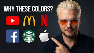
Dylan Vanas breaks down how seven colors shape brand perception and buying decisions. Red makes you hungry (Coca-Cola, McDonald's). Blue builds trust (Amazon, Walmart). Purple signals luxury. Each color gets a marketer's ranking for campaign effectiveness.
Questions this video answers
7.5
6
7
8
8.75
Chapters
Let's talk about one of the most overlooked concepts when it comes to marketing, which is color theory. Whether you're growing your brand, whether you're launching a new brand, whether you're building your campaigns for your brand, or maybe you're in a marketing role with a company, you need to understand how colors affect people's perception of your brand. So what I'm going to do here today, I'm going to go through color theory. We're going to rank all the main colors we'll see with different brands and marketing. What we'll do is I'm going to explain the meaning of the color, then we're going to talk about some brands, who it is. I want you to think to yourself also, if you can remember brands as we go through these, prompt you to think about a brand for each color and then to rank them. I'm going to rank them from 1 to 10 for each color. Me as a marketer, how I like to use them in my campaigns. And hopefully you can take some value from this as far as you building out your own campaign. Okay, so we're going to start at the top here with red. Now, red is bold. It's disruptive. It screams courage. A lot of times you'll see this with stimulants. Obviously, blood is also another association with red. So we need to be careful there. But it screams energy. And you'll notice appetite. A lot of food brands, a lot of food companies will have these. Or you'll see a pairing with yellow as well when it comes to food brands. But red is very powerful color. Now here's something you want to be aware of when it comes to marketing, specifically, anything you want people to take action on. You have to understand what red means, right? Does red mean go or What? In the U.S. in America, you know, we use red for our stop signs, right? So red has an association with stop. So I never use red for like buttons on landing pages. We want people to take action on. Don't make them red. But red can be very powerful when you want stuff to be bold and stand out and. But it can potentially prevent people from taking action. So before I give it a ranking, I want you to think to yourself, who are some brands that you know that are red? Okay, so you can go ahead and think to yourself right now. So we've got Target, cnn, Coca Cola, we got Nintendo. This is my really bad attempt at drawing the Coca Cola logo, which, by the way, if you've never tried drawing a logo, try. It's actually challenging. But Bold is a very powerful color and can be really great when used the right way. Just be careful in using it when it comes to websites and funnels that you don't use it and accidentally, subconsciously tell people to stop and not take action. So I'm going to give red a number seven. Okay, now, by the end of this, you guys will understand how to use colors the right way for your campaign so that you can make sure that you convert at a higher rate. All right, so let's go down to orange. Now, the meaning behind orange is friendly, fun, confident. There's vitality, cheerfulness. So yellow could be a color if you're looking for a pop. You want to have your brand pop, but you don't necessarily want to have the same bold energy as red. So think to yourself right now. What are some color? What are some brands that you know that use. Use orange? Now, you might be surprised. One of the biggest brands you know about, Amazon, Amazon, their arrow is orange. And that's something that probably would not immediately have come to mind. Now, here's Hooters. This is another one. It's a fun brand, right? It's a restaurant with a fun spin on it. And then if you can decipher the bottom one, go ahead and let me know in the comments, because this was a really hard logo to draw. If you try drawing logos, they're really challenging to draw. But if you can decipher what that one is, it's a really fun one. Go ahead and drop in the comments. Okay, so I'm going to give orange. Orange is a great color you can use. So how I use it in marketing is we'll use it in banners at the top of websites. If you want to draw attention to something, we'll use it sometimes in in accent colors if we want something particular in the page to pop. I don't like necessarily using it as, like, a primary color, because a lot of times the association it gives me is Halloween colors. And of course, Halloween's like one day a year, so we don't want to use it all the time. But for me, the color orange can be good for pops of color. Okay, so I'm going to give Orange A6. It's a great color, used sparingly, but used intelligently. All right, let's move down to yellow now. Now, yellow is about clarity, positivity, warmth. You'll actually see studies showing that yellow creates. Helps heighten levels of intelligence in people. They did a study in these schools where they actually took these dividers in between Students in the classrooms and when they used yellow dividers, they saw that the students scores on the test actually went up. So really fascinating how you could see how colors, certain reaction to colors. And you'll notice this yourself when you see certain colors, certain things react in your environment. Okay, and so that is yellow. Okay. Optimism, clarity, positivity, warmth. Now think to yourself, what are some brands? Go ahead and think to yourself right now that are yellow. Okay? Think to yourself. McDonald's is one of them. Golden arches. Yellow is another very popular color when it comes to food brands. Food companies, all right, Denny's, Ikea, Subway, the Ouai. They have green around their lettering, but the whey is yellow and Denny's are some brands, just to name a few. Okay. Yellow is a really great color you can use now when it comes to online marketing, what you'll find is a lot of times yellow will actually get washed out. When using it as a color in campaigns on funnels, especially in fonts, you'll see that yellow doesn't stand out. So yellow can be good if used as like a border for something. We also like yellow buttons. We'll oftentimes use yellow buttons because they're, they're really pleasing on the eye. An interesting thing for you guys to use is think about the massive companies out there that are constantly testing every single thing in their campaign. Okay. And one example is, is Amazon. And you can go and look and see what, what color Amazon's buttons are. And you'll notice they're oftentimes yellow and orange. So good, good button colors. So I'm going to give. I'm going to give yellow A7. Okay. And reason for that is because it's a great color. I need to lower the score slightly. What I need to do is I'm going to give red a 7.5. 7.5. And I'm going to give yellow a 7 because it's not as good as red, but it's definitely better than orange. Okay, let's go down to green. Okay. We still have green, blue and purple down here. So let's talk about green. So green screams freshness. It's about growth. You can picture health brands, right? Harmony, freshness, balance. You'll notice a lot of companies that want to represent themselves as green, organic or balance with nature will use green in their, in their marketing. Okay. Green is a really great color that we'll use in campaigns as a, as an accent color when we're trying to draw attention to health. When you're working with health supplements, anything to do with the body. Green is a really amazing color for that. Okay. Anything to do with wellness and health in the health space. So we'll use it usually as an accent color when tying in and doing marketing campaigns for brands like that. So think to yourself real quick, what are some brands think of to yourself? Some brands that use green. So surprise if you can guess this one. Now the irony of this is this is Monster, which is hilarious because it's not healthy. But you can see not only health brands use green. In fact, you got to be cautious. Some brands that are out there use colors as a way to trick you into thinking something that might not necessarily be true. So Monster uses green in their energy drink brand because they are tricking you to think it's healthy. Whole Foods obviously is green. And then this one is a big one, Starbucks, which I actually have recently had an addiction to, which is crazy. I started drinking their matcha iced teas and ice cream teas and they're so good. But Starbucks. And so the representation, obviously Whole Foods is a health brand, health store, but Starbucks is looking to be positioned as that. Right. They're a lifestyle brand. So green, I'm going to give the ranking from a marketing perspective. It's a really powerful color and you can notice how brands can use it to trick you to think something that might not necessarily be true, which is that they're healthy. So I'm going to give green an 8 because it has the ability to actually change your mind about a certain product and the way you perceive it. Okay, moving down to blue. Blue is about trust, security, dependability, long standing strength. So if you were a security brand, what color would you want to use? You want to use blue because it's, it has that strong connotation. Okay, so think to yourself, what brands use blue? Okay, I'll give you three seconds, two seconds, one second. Maybe I'll go like one at a time here. Okay, cool. So two at a time. Walmart. Walmart uses blue, right? They are creating the perception that they're a brand that can be trusted. Rollbacks, right. Long standing Ford. What Built for, I think it's built for Tough is there is their slogan. And so you can see how they're creating that perception. American Express. Right. A trusted bank. American Express, you can trust them, right? The colors there, Pfizer, you know, the most trusted company. Believe everything they say. Right. Don't think for yourself. But when you're trying to create perception of trust, you can see how that can come up here. Okay, so I'm going To Give Blue an 8.75. It's a really powerful color. You'll see almost too many brands using blue, which is why you have to be creative in how you use it because you don't want to get lost in just another blue logo. But it screams trust. Purple. Purple, what does it mean? Wise creativity, royalty. It's the highest level of colors. It's the crown chakra, it's imaginative. It's really the color that screams royalty. And you know, I believe that it's one of the most powerful colors. Right. And so think to yourself, 3, 2, 1. What brands use purple? Taco Bell. Okay, Taco Bell. Now Taco Bell, really fascinating brand because they've come in and used a lot of creativity in recent years. From a marketing standpoint, it's actually really fascinating what Taco Bell's been able to do. So you can take some inspiration from that. They've found ways to stay top of trends, top of media in the last five years by launching products. You know, they're doing collaborations with Doritos, they've done collaborations with other brands. They're doing their own product releases. If you've seen like Apple style product releases, keynotes, really fascinating what they're doing. So a lot of inspiration there. T Mobile, a cell phone company, they went from being one of the worst, I believe, ranked cell phone companies and now I think, I believe they're the number one cell phone company in the country in a matter of seven years, which is crazy. I remember when I moved to the US and I got T Mobile because it was like the discount line and I was trying to save money. And to this day, you know, I still have it and they're, you know, they're like, they're the number one. They have the most widest coverage. I think it's crazy. So they've been able to stay on top of things. So you'll see a lot of companies come in that are fresh, younger, with a creative perspective with this, with purple. Okay, let's see a couple more here. We got Barbie. That's like a pink brand. A little pink Roas, number one marketing agency on the planet uses purple. Obviously I'm a little biased there. And Cadbury Chocolate. Right. So there's some brands that are purple now. When can you use purple in your marketing? Well, I love purple. It's, it's my favorite color currently we use it. I'm using it on as many brands as I am able to now. You can make really beautiful designs. You have to layer it though, especially when you're using digital marketing campaigns, so I like to layer it with, like, purple gradients where you're pulling out the blacks and the whites on stuff. I'll use it on buttons, but I feel like it creates a really luxurious appeal to it. So because I'm a little bit biased, I'm going to give it a nine. But I love purple. Okay, let's screw it. Let's give it a 10. Let's give it a 10 because purple really is the best color. Okay. Yes, we'll stick with 10. Okay. Maybe black can beat it. Maybe we'll adjust some of these colors up above. So so far we have. Just to recap, we have red has 7.5, orange has 6, yellow 7, green, 8, blue, 8.75, purple. A 9 or 10. We haven't decided yet. Let's see how black. 9 or 10. We'll see how black goes. Okay, so black, black screens, prestige, powerful. It's kind of the standard thing. Serious. So let's see what brands have black. Think to yourself right now, what brands have black in them? I'll give you a hint. None that you can think of because black sucks and should not be your main color. I'm gonna give it a zero. Black is. Is a. Is a horrible color to use. You're gonna blend in. It's gonna be dark. I see all these. These companies trying to do, like, this luxury feel of black and white, but it doesn't stand, it doesn't pop. It doesn't give you anything to really write home about. So don't use black in your marketing unless you use it sparingly. In, obviously text, in font is when we'll use it. But I don't use. I hate the color black in my. In my marketing. Okay, so what does that leave us with? That means in order, we have number one, purple. Number two, blue. Number three, green. Number four, red. Number five, yellow. Number six, orange. That's the colors. So hopefully this was valuable. If you guys got some value, go ahead and like, follow, subscribe, and we'll see you guys in the next video.
More from Dylan

Why One Conversion Path Won’t Convert Everyone - Choose the Right Funnel #Marketing #Sales



Why Your Business Is Losing Customers Before They Even Get a Chance to Buy (It's Not What You Think)